“Sketch: Alpenglow, Mt Lefroy, Banff National Park”
acrylic on canvas, 11 x 14 inches
by Robert Genn
Archived Comments
Enjoy the past comments below for Colour choice and adjustment…
The use of Grisaille is my standard for oil painting by creating a greyscale painting of the subject first and adding glazes of transparent oil colour second it makes for less dead paint which can happen in oil easily. Acrylic paint I work mostly in glazes, the quick drying time of Acrylic makes this effortless for continued work time. Both these methods require more planning and foundation work as it is more complicated to go back and fix problems in the later stages.
www.staylorhedgesart.comLove the Airedale, had one as a kid, great dogs! Paint on.
I am fascinated by the complexity of tints I see within what seems like one pink coloured slope. This is a morning view…from my front windows….never the same …never dull.
Purist oil painters who follow old masters methods probably wont like this letter. I like the idea of the Higgs boson ten dimensions or whatever is there beyond our comprehension, waiting to be explored. Infinite play is what I enjoy the most, and overworking has value as well.
I think it’s best to pick the color(s) that “speak to me”…then it WORKS and I am happy.
“Taking care not to overwork, keep adjusting colour hue, intensity and tone value.” Suggestions about HOW to “take care not to overwork” would prove invaluable to many of us.
I have all of Richard’s DVD’s and they are EXCELLENT!! Highly recommended for artists at ALL levels.
I have the color course by Richard Robinson and it’s fantastic!
I have purchased the color course by Richard Robinson, and I am so pleased with the course. I would recommend it to anyone!
I’ve no hesitation in recommending Richard’s mastering colour workshops, he is an excellent teacher. He explains thing clearly with lots of practical demonstrations and illustrations. I’ve been teaching for 12 years and find his material most useful for my classes.
Richard and his work is outstanding. When delivering how he accomplishes what he does through his DVD’s it’s refreshing, inspiring, and accomplished. I feel, that I have improved dramatically with my paintings since I used the techniques he illustrates….I am always waiting to see more. I also love his forum where hundreds of other artists share their work, praise, and even help out with advice on how to solve any artistic problems you might be having. I live in the US and it is just an amazing opportunity to have an open communication with someone on the other side of the planet from me about painting.
This is a great DVD on colour. Information is well communicated and interesting.
I am currently working through Richard’s Mastering color DVD and have found it to be methodical and easy to understand. It is very hands on and the exercises build on each other as you progress through the DVD. It’s a fantastic learning tool.
I have Richard’s DVD’s and I think they are excellent also. He is a good teacher and he is interested in his students, cares that they truly are learning.
Easy to follow and understand without any arty descriptions. A must for Old Master transparent layers to finish a painting. Perfect for Impressionist realist impassto wet in wet and plein air artists.
Richard Robinson has the most worderful color course imaginable!
The class is easy to understand and will improve you knowledge of color immediately………Richard’s painting instructions have been very useful for me and I have been following him for quiet a while now. There is always something new to learn and I have found his latest videos tremondously useful. Keep up the good work Richard Robinson.
Richard’s mastering colour DVD’s are an invaluable part of my library, stuffed full of so much knowledge its a must have, with loads of easy to follow steps every level of artist can benefit from.
I have been following Ricard Robinson’s full course along with others, it has been the best one of all. Really worth to listen to all his videos.
Awe shucks thanks everyone! :-)
I bought Richard’s mastering color, and while I am still a beginner, my paintings have a much more professional appearance (say my friends and family.) I know it is because of what I learned from this course. I love being able to watch the videos on my ipod when I am waiting for my kids in the car or getting a pedicure. LOL, but I especially love the printouts that I can refer to anytime easily. In my opinion, COLOR is the most challenging and most interesting part of painting. If you get it right, the other dynamics can be a little off and the whole piece maintains it’s interest factor.
I have purchased the color course by Richard Robinson, and I am so pleased with the course. I would recommend it to anyone!
I have two of Richard Robinsons courses, he explains everything and it really makes sense. His DVD’s have become an important part of my library.
I bought the colour course by Richard Robinson when it was recommended by Robert Genn some time ago. It is a very worthwhile course to take. It demystifies all the problems you are having with harmony in your paintings and because it is on DVD you can go back to it for reference whenever you like. It is a wonderful guide.
I have Richard Robinson DVD’s and I must say, that beside the fact that Richard is talented and his painting are exciting, he has succeded in bringing color theory and simplify it so much, and now I feel that I really understand how to exmine and understand color and how to create my target color in a few steps.
What I like the most in Richard’s lectures in the DVD’s is that he doesn’t get the fun and the joy of the painting. He doesn’t take the painting into a technical borring process. I haven’t painted for about ten years and I must say that since I purchased Richard’s DVD’s I haven’t stoped painting and after I watched The whole package of DVD’s and all the demonstrations there I understood so much things that I had so much questions about. Moreover – I like very much Richard’s atitude to art and nature, and I follow constantly after his web site in order to learn and explore new things. Sometimes I even watch again parts of the lessons and I found out that even after 5 times you watch it there is always something new that “pops” out which I haven’t noticed at the first time I watched it. Thank’s Richard and keep up the good work ! Idan Solomon. Tel Aviv. Israel.Richard is a great guy and a great artist. By following his videos courses your skill get a steep improvement that otherwise it will take you a few decades of trials and error. I strongly advice every one to take the short-cut. After all why struggle?!?
Fantastico!! enhorabuena por tu trabajo, desde España.
I ordered Richard’s Master Course and I am still working my way through it…love and have learned so much. Great for all style and I can proceed at my own pace…I love Richards paintings and hope to paint as well someday.
The color course by Richard was very helpful. Especially the section on mixing colors! Previously, if I wanted to tone down a bright red (for instance) I added a green….Now I learned that its better to use a color close-by on the color wheel to do the toning down! The result is much more satisfying. That’s just one example…. much more in the course!!
I am only 1/2 way thru, but Richard’s course on color is the best I’ve encountered. As long as you do all the applications, you will succeed in painting quickly. It is well worth your effort and time. I give it a 5 star rating!!
Richard’s color course is really fantastic. I wish I had this available years ago. No one has ever been able to teach this as well, in my opinion. Richard has a gift for teaching complicated subjects in an easy, relaxed manner. I highly recommend his DVD to anyone who wants to move forward..and they will.
Hi Richard; fantastic courses and instruction, got so much out of all of them. Keep up the great work, particularly enjoyed the Arizona and Nevada lessons..cheers Joanne
I watched all Richards colour videos. They’re great.
Il mastering color per me e’ uno dei migliori corsi.
I am a self-taught artist who is serious about the development of my artistic skills and Richard’s Mastering Color course as well as his other demonstration DVDs have helped me tremendously to put my painting skills on the next level. The information contained in these modules is an investment for any novice painter that also helps you gain better insight into the theoretical information provided in sophisticated art books. The more your skill develops, the deeper your understanding becomes of the contents of his DVDs. I keep referring back to them even though I am not a novice painter anymore. Richard is a great artist and a phenomenal teacher.
i have all of richard’s dvds..the one on color is especially good!! and i’ve been enjoying his online workshops..for only $20 a month, you can learn a bunch, stretch your painting muscles and interact with artists from all over the world! quite an experience!!!
The creative use of color has always been my thing. Richard’s color course has really added to my understanding of color. Thanks Richard!
I was waken up by Richard Robinson’s book “Mastering Color”. It is in simple words to explain the concepts and technics which any serious painters should know. All the basic and important elements are there.
I bought Richards “Mastering Colour” six months ago, and it is the best purchase I have made in a long while. I struggled with colour before and this is what I refer to all the time now. This lesson is all that any aspiring artist needs, and Richards spells it out so clearly. I am so pleased that I have this DVD and cannot recommend it highly enough.
Since I joined Richard’s course online I have learnt so much, and I have been a avid reader of Robert’s letter, what a combination for all artist. The more we learn, the better the art. Marilyn Bonnett
Hi Bob: Many thanks for your letter “Colour Choice & Adjustment” I had just experienced exactly what you say. I won Honourable Mention in the Prince Edward County annual art show in June for a ptg which was done as you describe. I just gradually kept altering, (generally lightening more so than darkening) each area, without really knowing whether it was getting better or worse. Eventually it began to come together, somewhat exaggerated as compared to the real thing, but I learned a great deal about just putting down adjacent patches. Your letter really reinforced what I think I perceived.
I’ve been painting for 40 years. I could not tell you color theory nor would I bother wasting my time making a color wheel. I would sooner take an accounting course or bone up on quantum physics. The artist’s eye and sensibility is what it’s all about and putting down possibly totally unrelated color on the palette to be mixed on the palette or on the canvas — this is the discovery part of the adventure, like lacing up your hiking boots and choosing which trail to take, not knowing where each trail will take you. Every artist is essentially self-taught and we become the masters of our own technique. I think it important that the developing artist not get too caught up in the structure and exercises that so many teachers hold on to for dear life. I tell developing artists to spend their time making their work on their own, only going to class if there is a teacher who has a true gift to communicate and inspire. My great teacher/mentor, the late Alan Atwell inspired me to a lifetime of painting by teaching me how to see the world through the eyes of an artist. He never talked about materials or techniques, ever. Art making is a spiritual journey for me, not a another technical entity to try and get my arms around.
I truly understand that many jazz musicians are classically trained. You must play Chopin before you can play Monk. I am not so sure this holds true for visual artists, but that’s just my opinion, not necessarily fact. I do like the alpenglow reference!The alpengluhen technique or awareness took the Bugaboos to what I consider a valued, contemporary approach which honors the whole support (canvas) area. I like the ‘flatness’ that is anything but of contemporary art and try to paint that way color theories
aside. PieperIn studying values I ask my husband what he thought the color of shade was. He couldn’t answer for the longest time and then he saw it as a darker version of the subject. At that time we were looking at the shade beneath an evergreen tree. I see shade in purples and gray. This article on color was very helpful. “Colours change as the colours change around them–and you can’t know the colour of a passage until you’re picking up what you’re putting down. The situation is compounded by the presence of (or desirability for) reflected lights, silhouettes, local colours, broken colours, cast shadows, equal intensity lay-bys, etc. Finding the right colour can be like looking for the Higgs boson.” Yes indeed.
I remember Munsell torture class at Art Center, and while 4 color printing needs that, ugh; I went on a different journey. I honestly chucked that, and just use primaries and add white and black when I like. I found that shadows and colors are so image specific that just doing it, just painting it, as well as working from the Old Masters and especially from Sargent, served me most in color and art.
I bought the “Mastering Color” from Richard and would not hesitate to recommend it to anyone.
I just re-watched this video for the third time. every time I see it, I learn something new! Richard is a gifted teacher and a very, very talented painter. Now… i am heading to the studio to see if I can Do what I just learned. ( -:
I just didn’t realise how little I knew about colour until I purchased Richard Robinson’s dvd. Every aspiring artist should have this course.
This is my first letter to read and my first comment back. I started painting with whatever colour I could get out of a tube closest to what I wanted. Within 3 years I looked down at my palette one day, white, cad yellow, violet, ult blue, paynes grey, that was it.
I still use yellow ochre and switch back and forth between cerulean blue and ultramarine blue, and have taken to manganese and thalo of late. I can usually mix the colour I want, but if I get a colour I am looking for on the way to my intended colour, I will use that, as it just may be one of those colours that is very hard to mix intentionally, so dont fight it, use it. www.wilkens-art.com Love the newsletter so far. Kent WilkensI am printing and framing this email…at least posting it on my NOW board. I met Joseph Albers visiting at my college in the mid sixties – I smiled because he reminded me of my Grandfather with the white hair and kind mein, and he like that and called me up for chat – I will never forget it. That was a day of growth in my work. Just plain GOOD.
I have a few of Richard Robinson’s lessons, they are all fantastic. Mastering Colors is extremely helpful and gives so much information. I think I just found a teacher whose teaching resonates with me. I always have been a member of Richard’s on-line workshop as well.
I have a few of Richard Robinson’s lessons, they are all fantastic. Mastering Colors is extremely helpful and gives so much information. I think I just found a teacher whose teaching resonates with me. I always have been a member of Richard’s on-line workshop as well.
I just love his paintings.
Hello, I am Jan 67 years old.
A large part of my life was and is ,drawing and painting. I have follow many courses in the country and abroad. I bought last week the course — mastering colors… of Richard . I must confess that this course has really surprised me. I can only strongly recommend the course “mastering colors” to beginners and advanced painters . Jan NeggersWe are groupe of friends ,hobby painters,,,we find cost of “mastering colors ” prohibitive…


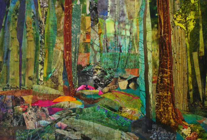
Enchanted Forest collage by Gayle Gerson, Grand Junction, CO, USA |


Rick I think you hit the nail on the head here. Your last two sentences sum it up perfectly.