Dear Artist,
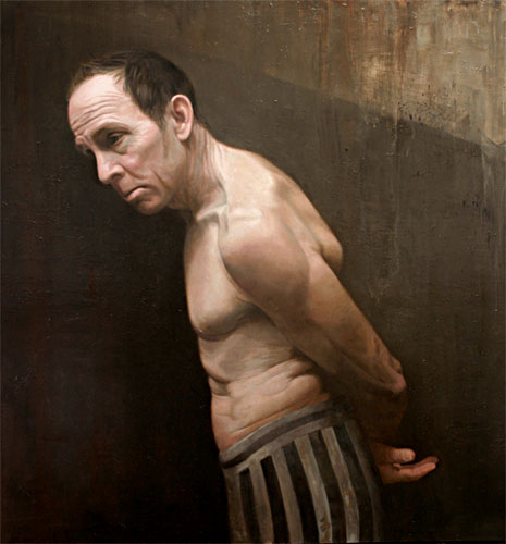
Among the more valuable skills is the ability to render forms. To get them right painters of other times laboured over spheres, cones and blocks. While it’s not always expected in today’s art, form-finding is well worth revisiting. Here are a few thoughts:
Complex forms need to be reduced to the simple and basic. The human face, for example, is a daunting combination of many. An experienced eye can see at a glance which figurative artists have an understanding of those basic forms. Also, there’s a difference between “observed form” and “developmental form.” To get an idea of this there’s a simple exercise: Lay your hands on an ordinary rock, set it on a ground, light it and copy it. Leave out ancillary elements like moss or texture. Just stick to copying the form. Now try painting a similar rock from your imagination. There are several things you need to do here. You need to let your imaginary rock-in-progress tell you what it needs in order to be more rock-like. Half close your eyes and let your painted rock talk to you. Let your brush find the form. Think of light, shadow, plane and heft. Very often it’s this second exercise that builds the more convincing thing called “rock.” Actually, this ability to produce developmental form is one of the main characteristics of professionalism. Call it “creativity” or just “thinking on your feet” — this is the action that gives both joy and integrity to your work. As the sculptor said, “It’s simple — you just chip away everything that doesn’t look like a horse.” Trouble is, it’s not simple — for most of us it’s hard won.
Here’s another thought: Form is an illusion. Picasso noted that “forms are more or less convincing lies.” No matter what an artist’s style or inclination, the idea is to find your own way of telling lies. I’m sorry to tell you this, but there’s truth in foolery. One way to do this is to “over-ripen” your forms. As the French cubist sculptor Henri Laurens said, “My aim is for ripeness. I want to make my forms so full, so juicy that one could add nothing more to them.” Another way is understatement. If you’re into exercises, try making convincing forms in as few strokes as possible. Paucity finds forms faster. As most everyone knows, I’ve just spent a couple of weeks with my nose up against the Russian masters. Sketches and exercises abound in the museums of Moscow. I learned that in finding form, it’s never too late for exercises.
Best regards,
Robert
PS: “Draw with the brush. Carve the form. Don’t be carried away with the subtleties of modeling and nice pigmentation at the expense of losing the form. (John Sloan)
Esoterica: There’s something to be said for getting into the “feeling zone.” This is where you experience the solidity and the weight of the rock. You sort of get inside the part of the work you are working on. Rock or feather, sky or water, tree or idea-of-tree, there’s a form to be felt. “Work from the pithy eye out. Swimming in language sea. Something that you feel will find a form.” (Jack Kerouac)
Expressing heft and weight
by Bob Martin, Boulder, CO, USA

“Upstairs Bedroom”
Cinema 4D
by Bob Martin
Today’s letter found me wanting to add weight to your list. On re-reading I spotted “heft.” I teach 3D animation and my students are required to approach a model by looking for shapes within the object, as many times this is the secret to creating good meshes. Once they progress I insist that they “feel” the weight of the object. When they can do that, the work immediately improves and is not just a slick computer image. This is particularly true when modeling figures (some of us sag and others don’t). They find the personality of the figure is greatly improved when they pull the points and polygons to express weight. It makes no matter what your medium is, your letter applies to us all. The image titled Upstairs Bedroom was inspired by my grandmother’s house when I was young.
Two dimensional dilemma
by Deirdre Fox, Chicago, IL, USA
I’m glad that you wrote in terms of spheres, cones and blocks. I have seen many 2-D artists focus on circles, triangles and squares (alone, not as slices of spheres, cones, blocks) and struggle on and have to come to terms with why they have difficulty creating a sense of three dimensions in their 2-D work.
Struggling with sense of place
by Sarah Spector, San Francisco, CA, USA

“Blue Smoke Hovering”
acrylic painting, 24 x 23 inches
by Sarah Spector
It’s interesting that I would receive this now. I’m an abstract painter working to fill my studio after a pretty long absence (with short periods of work) in preparation for a studio visit from a gallery. I love the things I see in my abstraction, and yet I know that what makes it richer is “a sense of place,” which could also be read as “form.” So I’m struggling a bit (while still in my head) with how I do that.
Large sign-work primes values
by Cristina Acosta, Bend, OR, USA

Cristina Acosta
Seventeen years ago, fresh out of university I secured a job as an outdoor advertising billboard lettering and mural artist. As a production painter, my job was to reproduce an image (a photo or ad illustration) on a billboard at least 11 feet by 24 feet or larger. The budget usually allowed somewhere between 15-30 hours per billboard. On any image, I would break each area down to no more than 3 values (not including a highlight) to describe a form. At 40 feet in the air and 60 miles per hour it always looked great! Anyway, I suggest you give this idea a try when practicing describing form. It’s a very valuable skill to own. Here are a few tips to get started: If you slightly squint your eyes, you will see that at least 2 and possibly 3 values of color make up any object in the natural world. Practice creating entire paintings with no more than 3 values on any object. Paint a few of those and you’ll discern a rhythm between areas of 1, 2 and 3 values. It’s a fun game.
(RG note) Cristina Acosta is the author of Paint Happy.
Keep feeding the brain
by Tatjana Mirkov-Popovicki, Coquitlam, BC, Canada

“Morning Mist Blanket”
oil sketch, 11 x 14 inches
by Tatjana Mirkov-Popovicki
I like how you brought up the pleasure of the second exercise. It is the second exercise indeed — preceded (and interceded) by thousands of repetitions of the first exercise — which is drawing from observation. Once your eye-brain-hand finally starts getting the observation thing, the second exercise may come as the reward — your brain finally starts giving back to the eye-hand, what a pleasure that is, the finest hour! But we shouldn’t ever forget to keep feeding the brain, not just taking back.
Creating illusions
by J M (Walt) Brown

“Winter Round-up”
original painting, 18 x 24 inches
by Harold Lyon
Speaking of illusion, painters may be interested in Creating Illusions, by Harold Lyon. This successful cowboy/horse/wild-west painter has useful ideas for all kinds of artists. The book is illustrated with Harold’s techniques and there are a lot of little drawings to help in the understanding. He deals with the creatable illusions of colour, movement, depth, density, composition and other idiosyncratic ideas of his own observation and devising.
Leaving in and leaving out
by Annette Waterbeek, Maple Ridge, BC, Canada

“Sunlit”
acrylic painting
by Annette Waterbeek
Similar exercises in my art classes emphasized light, shadow, reflected light and blending. There’s a lot of work on the market these days that is formless and flat. I have worked with clay and you do sure need to consider form. The good thing about painting is you don’t have to worry about blowing apart your neighbor’s masterpiece (while baking in the kiln) when you have air pockets in your form. I’m looking at an evergreen tree right now. Wow, that’s a very complicated form. A chair would be a lot easier. Flowers would be fun — you can get away with a lot there. How much to leave in — how much to leave out?
Working with Jose Bellver
by Mary Madsen, Henderson, NV, USA

Nevada Artist
Jose Bellver
The first week of Drawing 101 with Jose Bellver was spent doing nothing but drawing hundreds of lines within precise boxes, which we were instructed to draw without a ruler — no ruler to draw the boxes, no ruler to draw the lines. Vertical lines, horizontal lines, diagonal lines, lines that crossed. Just draw them, keep them consistent, and make each line equal in all ways to the others. He was training our hand to work with the pencil and develop fine muscle control. I later found out that early in his training, Jose bought 400 pencils and did this exercise until all of them were down to stubs. It was also from him that I learned to place my palette on the opposite side of the room from my painting. The purpose of this is to leave the visual of the painting behind and to feel it as you mix pigment, then turn, see the painting with fresh eyes, and approach it with energy. Jose never explained to us why he canceled classes for a week near the end of winter semester. He’d become a treasured friend at that point, so very humbly he told me in private that he had to attend a Christmas party at the White House, where several of his paintings were hanging.
Go underground
by David Wayne Wilson, White Rock, BC, Canada

Unfinished
original painting
by David Wayne Wilson
The case mentioned by SA Murray in the previous clickback may go to the Supreme Court. What ever happened to “one nation under God,” in whom “we trust”? There is no law in Heaven that forbids me from seeing, painting and showing what I have seen. But on Earth? This subject has to do with greed and people have been ‘spoiled’ by laws that ‘protect their rights’ to capitalize on you-name-it. The matter is complicated by the ever-increasing ability of technologies to reproduce and mass-reproduce things for human ‘consumption.’ How many times does an ‘artist’ have to be paid for the click of a shutter? If they don’t want us to see it, put it in a drawer! In the old days, we’d see trees and paint them. These days, we have to take a trip to find the trees. We are otherwise confronted by a morass of scantily clad blonde bimbos with implants who act or sing to justify their presence in newspapers and TV. And these photo presentations are ‘owned’ by the employers of ‘Poppa Rat-see.’ It is the Law. But it’s not my law. Be an underground artist. Be nervous. Get your Peeping Tom’s license. After all, Big Brother (Uncle Sam) doesn’t want you to upset the apple cart and appeal to common sense. Let’s not look for justice in an openly materialistic society: It won’t appear there.
Another deck of cards
by Curtis Long, Austin, TX, USA

“The Big Easy”
acrylic/collage on canvas
by Curtis Long
A deck of cards similar to Eric Maisel’s Everyday Creative is the Creative Whack Pack by Roger Von Oech, author of A Whack On The Side Of The Head : How You Can Be More Creative and other books. Von Oech takes a lighthearted and humorous approach to the matter of creative blockage. I have occasionally used them to help me push through particularly stubborn dry periods.
Provocative photo
by Stephanie

At the shrine of personal visual knowledge
At the Shrine of Personal Visual Knowledge is a beautiful photograph. It is a photograph of the act of looking at photographs. I see a pull into a corner, a place for the two of you to nuzzle. To nuzzle up close to each other, and the inquiry at hand. The two of you — two?
The two of you who have the same color of tan hair on the tops of your heads. (It may be, and probably is, the way the light shines on the Robert’s hair, doesn’t matter) The two of you whose tan color hair, as it grows closer to the napes of your necks gets darker and blacker, (and thicker?). The two of you who have a coat (sweater) made of a soft furry material to keep you warm. You both have a band of color around that material, at your necks; one red, the other yellow (ish). I see his left ear and ever so slightly a hint of his right ear, and vice versa, regarding his friend’s ears. Who is whose best friend here? Who or what looks like whom, or what? What do we really see here? What jumps out? How did that beautiful Airedale get his (or her) paws up there on those legs? Why is that dog on two legs? Why is that man on no legs? Isn’t it the dog who usually sits and the man who stands? And what about that other creature? Well, hardly a creature at all, some would (wood) say. The chair. Right there, on all four of its legs. Holding the weight of all. All three with their backs to us!
Let’s not go overboard. Oh, let’s. Crazy? Synchronicity? Magic realism? Fiction? Making a l-o-t out of “nothing”? Connections. The Spirit of it All? Whatever it is, it jumped out at me. And I welcome it as “The Muse.” I’m heading back to the studio.
(RG note) Thanks, Stephanie. And thank you to everybody who wrote to us about that enigmatic, dogmatic, photo. We finally voted to include Stephanie’s because of its classic deconstructionist analysis.

Peter oil painting |
You may be interested to know that artists from every state in the USA, every province in Canada, and at least 105 countries worldwide have visited these pages since January 1, 2005.


