Dear Artist,
Yesterday, Amanda Jackson of Bahrain wrote, “Lively greys! It’s a breakthrough. My work was over-coloured and sometimes in a trite way. I was working ‘en grisaille’ but lately I’ve actually started to see the world in paint — and wow! Some greys are a scumble of orange over a dry layer of blue, some browns are deep purple with a hot orange-red glaze. When Rubens said, ‘Forty layers are not enough,’ he wasn’t kidding! It’s absolutely everywhere now — these muted colours are in fact alive with the vibration of the stronger colours I’ve been seeing all my life. I’m joyful!”
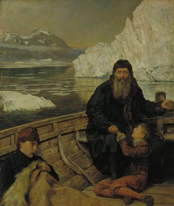
The Last Voyage of Henry Hudson, 1881
Oil on canvas
84 1/4 x 72 inches
by John Collier (1850-1934)
Thanks, Amanda. Greys are indeed the key to both painterly joy and advanced tonal quality. As you suggest, the best are obtained by using opposites on the colour wheel. Painters who feel the need to liven up their greys might consider starting with a light grey ground or imprimatura. This personal and predetermined tone, warm or cool, is a benchmark. It covers the entire canvas and sets the key so every “note” that plays afterward goes on either side of it — darker darks, lighter lights.
Early on, paintings develop a general tone that inevitably affects everything that follows. You cannot always go into a painting with a theory and simply execute. Each piece has to be worked out on its own. Improvisation is where art happens. In later stages, painters often need to search out and tone down loud colours and harsh passages. “Better grey than garishness,” said Ingres.
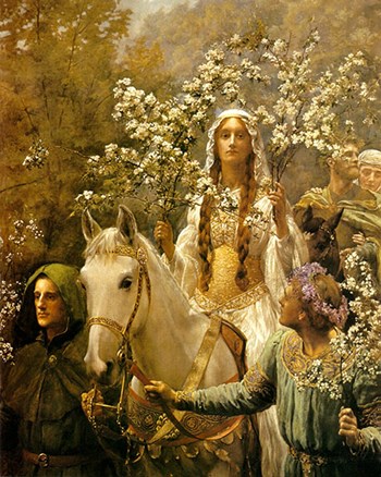
Queen Guinevre’s Maying, circa 1897
Oil on canvas
71 x 47 1/2 inches
by John Collier
Further, vibrating greys can be achieved with equal-intensity colours that essentially fight one another for attention. Pointillist and other impressionist techniques create light-effusing passages. These effects may promote “glow” or simply “character.” Used intelligently, they are some of the painterly sophistications that hold a viewer’s interest.
Grey is not only the key to classy work, it’s the key to understanding relative values. Advanced artists think in terms of the “grey scale” — a photographer’s device that determines relative tone values from white to black. Painters do well to develop a “grey-scale in the head” and an interminable willingness to make adjustments. Thus significant mid-range tones are born, laying the groundwork for lively greys.
Best regards,
Robert
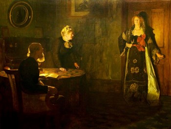
The Prodigal Daughter, 1903
Oil on canvas
65 1/4 x 85 1/4 inches
by John Collier
PS: “The fundamental grey, which differentiates the masters, is the soul of all colour.” (Odilon Redon)
Esoterica: There’s a difference between external truth and pictorial truth. It’s often the painter’s job to understand and craft this difference. Avoided at your peril, a “lack of luminosity” is the cause of many a dull painting. “The most basic, primitive and necessary visual information is found in luminance variations.” (Margaret Livingstone) It’s not always easy. “The real difficulty in painting,” said John Collier, “is in getting the general truth of tone and tint.” Restraint is valuable too.
This letter was originally published as “Lively greys” on July 31, 2007.
Have you considered a Premium Artist Listing? With each letter, an artist is featured at the bottom of this page. The Premium Artist Listings are a means of connecting artist subscribers through their work. Proceeds from each listing contribute to the production of The Painter’s Keys.
“Do not exhaust all combinations on one canvas.” (John F. Carlson)
Featured Workshop
 Join Ellie Harold for “Intuitive Painting: Permission to Paint Expressively,” designed especially for mature women artists of all skill levels who wish to explore this medium for soulful exploration. The retreat provides attractive accommodations (your own room!) along with lightly structured activities for centering, relaxation and low stress art-making. You’ll have plenty of free time to muse, paint, write and reflect while enjoying the colors, textures and flavors of San Miguel. This Retreat has the potential to transform not only your art but your life! You’ll return home with a specific art “care plan” to assure support for further creating. Details at www.EllieHarold.com.
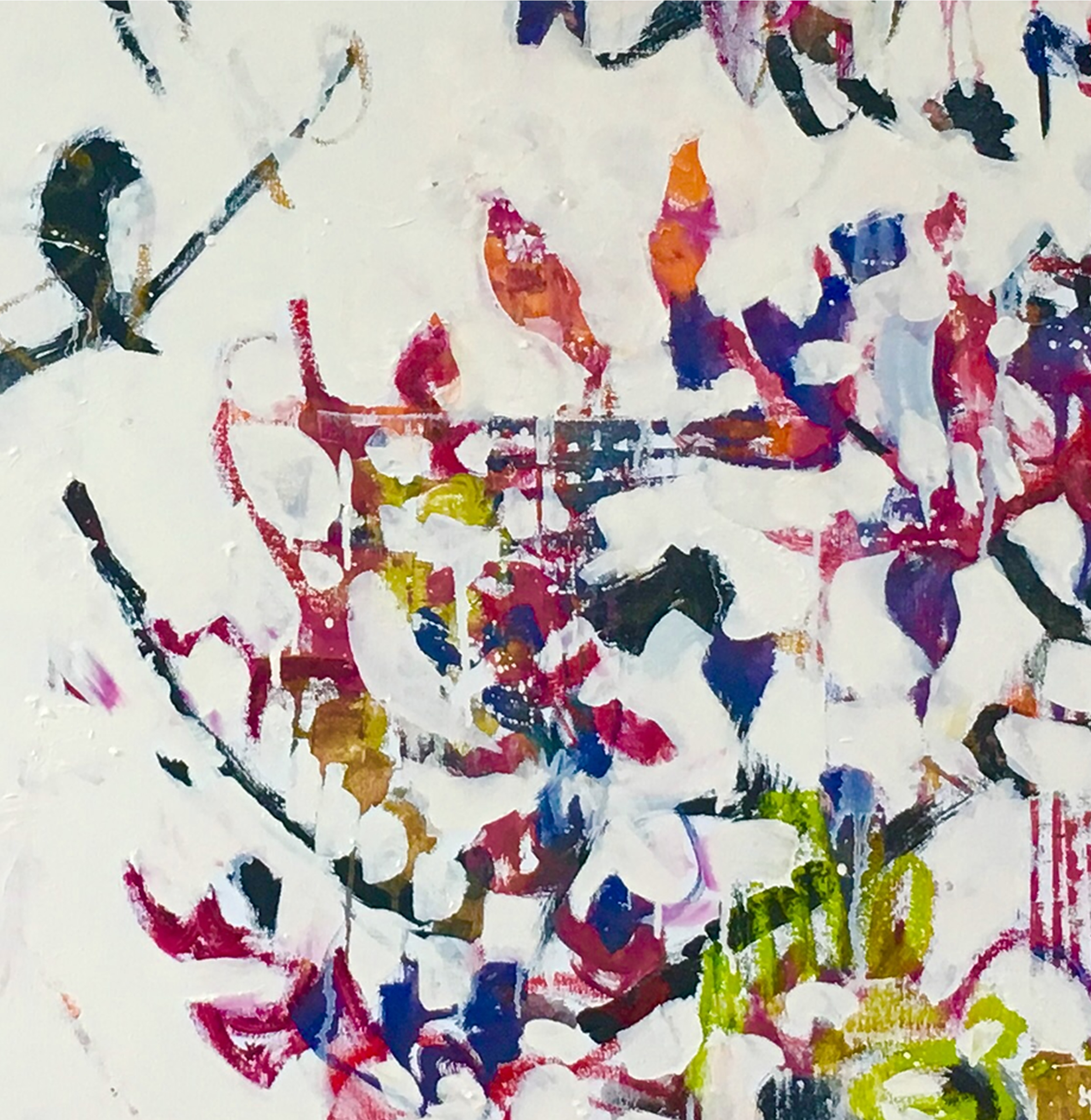
 Muskoka Beaver Pond
oil on board
30 x 40 inches
Featured Artist
My statement is pretty short. I love all kinds of paintings and I think Robert Genn is Canada’s finest painter. A great feature of his work are his designs — so beautifully conceived.


8 Comments
I had a real problem when I first started painting… I use oils. An instructor told me to put a layer of gray gesso over my canvas and wow what a difference… I always put gray on my new canvasses… made my work come alive.
I love the way this letter is written, with so many details from different painters.
I just taught a class for the international calligraphy conference called Exploring the Gray Areas. We worked with black and white first, but then moved onto complements. But my favorite exercise is working on a variety of grey toned paper, warm and cool, light and dark, with the same gouache mixture. It’s the Jospeh Albers lesson, in that your eye processes the color but the brain is the ‘film’ and sees the relativity of the gray on various grounds. The student KNOWS she had the same puddle of paint in her brush, but SEES differences among them, sitting side by side on the table. In the old days before digital cameras, we bought film that was warm or cool, depending on what we were going to shoot. Once I realized this in my own work, the world of color got huge, and my paintings got better.
Payne’s Grey has to be my most favourite colour.
Our art group mentor said that an artist who really knows their stuff, knows how to use “grey with a blush of colour”. So I set out to learn how to use grey with a blush of colour. This turned out to be incredibly useful to me since my main body of work would be painted on a black underpainting. Jurors have commented on my “sophisticated” palette. This is a remark that I am particularly fond of since I don’t consider myself to be sophisticated in any way! At times I go (what seems to me) overboard with colour but mainly I use small shapes of purer colour to draw the eye. It doesn’t take much amongst the colourful greys.
I admire your humility, Cheryl, but I find your use of colour to be ever so sophisticated, and always with subtlety.
Robert Genn was a master at midtones and greys that pop.
I am an artist who loves expressive color. I do not use black, brown or grey out of a tube. I usually use dioxazine purple as my initial dark, but I have found that I love to mix my own greys. I found a cadmium red/violet which I mix with some ultramarine blue. It is a beautiful dusky grey. I add white to lighten it.
I remember back in the mid 80s, when I knew very little about colour and what to do with it, going to Marshall Gallery in Victoria and seeing Robert Genn’s paintings. My nose must have nearly touched them from looking so closely in amazement, wondering how he could create such a wonderful landscape with (it seemed) so few colours. Breathtaking mastery of exquisite greys and subtle gradation of tones. Direct and confident brushwork, I was hypnotized. I wanted to paint like that. Didn’t happen, not meant to be I guess. How we use colour is another personal trait that finds it’s way into our work. I’ve come to accept this stage of my life is to appreciate, not seek to mimic, but appreciate. If I can’t sing, or paint, like the rest, I can still appreciate them. Good memories!