Dear Artist,
These days no self-respecting workshop instructor goes half an hour without mentioning negative space. So prevalent has this stylistic concept become that it’s currently central to practically all types of pictorial composition. In my own work, the “backwardosis” of negative space is as vital as breathing. Here are a few tips if you too would like to see it happen:

In the early stages — as in this one of Tsimshian funerary poles — foreground elements are moved around so as to provide the possibility of interesting shapes and holes where the totems press against the sky.
Negative space strengthens compositions by solidifying form and building design. It also helps work to look “painterly.” In order to make magic with negative forms you need to “set up” your positive forms. In the early stages of a composition these positive forms — in realistic work they are often foreground objects — can be juggled and juxtaposed with an eye to the potential shapes and “holes” that form around them. This requires what I call “one-two thinking” — the ability to think ahead to further moves that might happen later in the game. Watching some painters, particularly beginning painters, it’s this one-two thinking that is most frequently lacking. Simply stated, one-two thinking permits creators to make plans where lights or darks might later be spotted through foliage, furniture, figuration, or some other veil. If you’re not sure about this, try doing some regular “one-one thinking” — and see how relatively uninteresting the stuff starts to look. “One-one” is okay for sign painters, but not for fine painters.
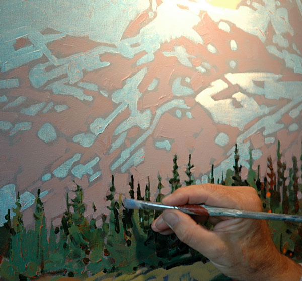
“One-two” thinking provides the set up here to go in and loosely describe the trees and the foreground meadow. Mountain scenery provides constant opportunities for foreground-background interaction.
Think of negative space as a sort of musical counterpoint. It’s an embellishment to a main theme, played in pianoforte, pianissimo, or somewhere between. Counterpoint adds a secondary motif that rings the clear bells of beauty, mystique and quality. Here begins the magic of abstraction. It’s this abstraction, subtle or strong, that makes your work live as a thing-in-itself and become something unique and different from what it represents. Taken to extreme, I call it “contrapuntal overemphasis,” terminology that when thrown around the studio, makes visitors groan. I have to tell you that high action around negative space is the moxie that brings noses right up to the work. Even though it’s “negative,” it’s good stuff.
Best regards,
Robert

These whaling schooners sit “over-shot” and ready to have their silhouettes “cut in” with negative areas around the masts, etc. Variety and counter-light in the background adds the potential for abstraction.
PS: “Spaces between the forms, or the negative shapes, play just as great a role as the positives. The positives make the negatives and negatives make the positives.” (Stan Smith) “A painter is a choreographer of space.” (Barnett Newman)
Esoterica: The rendering of negative space can be confusing. As Charles Reid says, “A positive object in relation to one background area can become a negative shape when another object cuts in front of it.” A simple exercise is to devise and execute a composition where you concentrate on painting the areas around objects rather than the objects themselves. Just keep saying this mantra: “Objects are held by the backgrounds that are cut into them.”
This letter was originally published as “Negative space” on August 5, 2005.
Have you considered a Premium Artist Listing? With each letter, an artist is featured at the bottom of this page. The Premium Artist Listings are a means of connecting artist subscribers through their work. Proceeds from each listing contribute to the production of The Painter’s Keys.
“Fill a space in a beautiful way.” (Georgia O’Keeffe)
Featured Workshop
 Powerful Design, Sensual Edges put Together with Exciting Color
Design is the foundation of any painting and you want your paintings to have powerful designs filled with exciting color. In this course we will discover designs two hidden meanings around where you put your center of interest plus how to use neutrals to make your paintings glow and finally add sensual edges that are the soul of the painting.
This workshop will be a live virtual event. I will be there with you during the entire four days. I can’t wait as I am excited. Please email me if you have any questions….gwen@gwenfox.com
August 31 – September 3, 2020, Location…Online
Register here: https://gwenfox.com/retreat/powerful-design-sensual-edges-put-together-with-exciting-color/
 Against the Wall
oil on canvas
24 x 30 inches, 2017
Featured Artist
My aim as a painter is to bring to life a slice of the world as I experience it. Light, color and form are my vocabulary.


5 Comments
This is a lesson that’s not easy to explain and articulate but Robert did a masterful job. Now the beginner/novice has to put these words into action and practice, practice, practice.
When my students would do a thumbnail for their work in 3 or 4 values, I would have them look at all their small sketches upside down. “Choose your strongest, most graphic and abstract study. If your negative space is interesting then your positive shapes should be also.” I am honored to say that my mentor is the amazing personality, painter and teacher, Jerome Grimmer.
+/-
There would be no positive without a negative.
A negative underlines the positive in life.
Yin and yang.
Now to reign in, settle down, get a handle on that one-two thinking!
This is my sense: A good painting has to have above all a great composition and along with that comes the positive and negative spaces, which defines the piece.
This seems to be beyond me. Can anyone shed any more light on positive/negative space?