Dear Artist,
On the day of return from cruising in southern climes, I turned to the challenges presented by previous trips. The reference and ideas from more recent travels will bubble away in the holding tank. So I was back up at Yoho Park and thinking about the Northern Rockies.
I had an idea — probably not original — that I might paint a small mountain lake with its depth and glacial water. I’d have it surrounded by snowy fingers and the boulder and talus patterns, enfolded in mountain fastness — mostly in the shade — with what was seen in the water reflection in bright sunlight. In a way the main action would be taking place outside the picture-plane, but be re-framed in the solemn edges of the ice-water lake. Essentially a skyless abstract pattern with truthful light and shade, a sense of place and what I like to call “aficionado vision.” This might be a painting for one of those hikers of high places who knows these sorts of spots.
I rate my ideas as they come in. The majority are sub-standard but this one seemed above average. Fresh back and still rocking from the boat — my inclination was to go small or middle-sized with it. But it’s important to grab the good and make for the most. “Go big,” my cricket said — 30″x 40″ seemed appropriate. There are several reasons for this decision: A sense of pride that even though I have been temporarily rusting, my prop can still turn. A feeling that this particular idea was worth it. The need to swing out after the barons of beef in the cruise-ship dining room. The knowledge that the better ideas don’t just float up every day — and when they do they deserve to be optimized. Big is more in more ways than one — besides, the Visa bill from the ongoing family-wide shipboard casino will soon be in.
Best regards,
Robert
PS: “There is a right physical size for every idea.” (Henry Moore)
Esoterica: The better ideas breed the next round of better ideas. This is one of the reasons it’s good to jump on whims and push them through — if only to get on with the next. Every once in a while a gem is discovered that begs optimization. In many of our studios, this, and simply this, is the main process. Arnold H. Glasgow: “Ideas not coupled with action never become bigger than the brain cells they occupied.”
Acrylic painting by Robert Genn in progress… Opabin Lake, 30 x 40 inches

Layout

Near final…
Using black
by Lance Regan

“Evening at Sombrio Bay”
oil on canvas, 30 x 40 inches
by Lance Regan
Using black to create interesting greys is something I’ve never done. I’ve always used complements and earth tones. I’m painting vineyard and landscape scenes. Talking with some artists they say never mix your colours but glaze to keep them pure and avoid the mud. I have looked at paintings of Sargent and they appear to be using black with three colours mixed to produce grey tones. My paintings sometimes appear to be lacking those nice greys. I need some direction here on how to use the black or if it is a good idea or not.
(RG note) It’s a good idea. The guy who said never use black, whoever that was, ought, for punishment, be made to camp out, nude, with only black-bean gruel, in the Rothko Chapel. Definitely use black. Black produces magnificent greys. To vary your black and white opaque mixes, try B, W and Phthalo blue; B, W and Yellow Ochre; B, W and Cad red. With regard to the business of glazes keeping colours pure and unmuddied, don’t count on it. Glazes must be kept simple and there ought not be too many of them or the result will also be mud.
Glazing in oil
by Karen Pettengill, Pownal, Maine, USA
What mediums do you use for your glazes and why? I’ve just started using oils and think they are an exciting medium but need advice on glazing techniques and materials.
(RG note) I seldom glaze in oil because of the length of time it takes to dry. Acrylic is my choice because you can be glazing literally in minutes, even over impasto passages. In oil glazing it’s a matter of mixing the colour to be glazed with any of a number of media. Copal oil medium and turpentine or other thinner makes a good vehicle. Linseed oil together with turps is a common and traditional one too. Varnishes work. I got the idea during the dark ages using a commercial product called “Mahogany Varnish Stain.” Before embarking on a life of glazing I suggest you pick out some old and failed oil paintings and do a few glazing experiments: Rag all over, rag partly, brush strokes over, semi-scumble, stipple, blot, pattern with sponge, scrape away, etc., etc. Find out which glaze colours foul underlying colours. Find out which glaze colours positively enhance underlying colours. Try glazing opposites on the colour wheel to the underlying colours. Try glazing analogous colours. Try glazing transparent black. Put on, wipe off. Try warp and woofing glazes and opaques.
Love of smalls
by Jerry Lucey
I love to work small, mostly 8×10 acrylic on paper, but when something exciting comes along I go big. I need the room to get inside these visions and explore the possibilities. In these cases, the rest of the world is shut out… the vision (idea), the support and paint become all… I have the same feelings when I read a truly good book. It becomes self with a world of my own creation… GO BIG!
(RG note) Yessss. Big is more involving, but also think of it this way — small is not so involving — and this too can give an advantage of greater confidence due to expendability. Small works have “greater ease of chuckit.” Smalls are the stepping-stones to the precious island of big. See below.
Make small first
by Sharon Coverstone, Salem, OR, USA
Every artist brings a part of themselves into their work so the expressions you feel should indeed be painted. However, I would make a smaller painting first. Then move back to your large one. By doing the small one 15 x 18 you will see what you intend to express. After that, you will paint not with excitement but with a more peaceful attitude that will enhance the grand painting.
Difficult to move
by Yaroslaw Rozputnyak, Moscow, Russia
Non-standard are often necessary to think: For example nice snow/ice musters — many tints of light blue and rose and white-grey and embellishment with colours — picture of fresh winter cold in window with warm room plants; white snow in window and white quilt at the bed with nice model; painting depicting a cinema hall during film — nice contrast of screen image and public in hall; Russian white bear and Canada white bear are speaking the same language. Really, large is more large than just large size. You may know that Russian artist Ivanov made a large painting “Jesus Christ Appearing in Public” that took him 25 years to paint. Large picture is more stable to keep because difficult to move often.
Content determines format
by David Blanchard

“Cabin”
photograph
by David Blanchard
“There is a right physical size for every idea.” (Henry Moore) While retaining the essence of this quote, I’d modify it to: “There is a right physical size and format for every idea.” Why? Some photographers have a specious pride in “filling the frame”, meaning never cropping an image. This leads to bad photographs as the artist allows the image to be dominated by format instead of content.
(RG note) One can only speculate on the effect of the (particularly horizontal) aspect ratio of the standard 35mm camera, and how it has influenced pictorial thinking for the past 50 years. You are right — one should generally let subject matter determine a format–square, nearly square, long, tall, round, etc.
Must take action
by Carolyn Smith, Victoria, BC, Canada
“The better ideas breed the next round of better ideas.” I thought I was chasing a rainbow of ideas or having an attention deficit disorder when working on one project and getting an adrenalin rush for another great idea. Sometimes I act on them–or sometimes I don’t know that something is in me pushing out for attention. It will niggle away so strongly I have to drop everything and take action on those brain cells that are ready to explode with that idea. When I first started playing with my art, I brushed away these thoughts or ideas, because of self-doubt. I now understand the process and allow the gems to shine through.
Avoiding picture postcard
by Shirley Dickinson, Grand Junction, CO, USA
Composing ahead and using an unusual viewpoint are techniques we frequently ignore when we are carried away with the beauty of the scene. Then we turn out a “picture post card” painting. Later, sadly, we may find that by cropping we have a small jewel — too small! I like your boldness of going for the big size right off — taking chances that your intuition will pay off, or at least be a good learning experience.
Will create again
by Jo Vander Woude, Sioux Falls, SD, USA
For thirteen years, up until 3 years ago, I had been painting or drawing every day. I have not been able to continue with my art due to my day job and family needs. I had been at a breakthrough point with my work — finally achieving the mix of abstract and realism that I was striving for. Requests for commissioned work were frequent. At this point in my life it would be more difficult to live with the fact that I didn’t meet my family’s needs than to live without creating. I will create again when my obligations lighten up and hopefully reach the point where I left off. In the meantime, I paint with my eyes and continue to store ideas.
Success story
by Lorna Dockstader, Calgary, AB, Canada

“September Aspens”
original painting
by Lorna Dockstader
I was working full time and raising a family still holding on to my dream of becoming a professional artist. During a downturn in the industry, I chose to leave and painted full-time for four years. I then participated in forty group shows, almost one a month. Then a phone call from a former employer lured me back. I had reliable part-time income and the time to paint, an ideal combination. The Painter’s Keys book changed what I believed and helped me realize that anything was possible. Most importantly I reconsidered how I wanted to be perceived as an artist; as someone constantly struggling or as someone successful? Taking my newly acquired knowledge I decided to do the following:
1. To become a person who could be trusted to be loyal to the galleries that represented me, not to sell any work behind their backs or to steal sales from them and keep their commission.
2. To paint and frame in a unique way, with only the best materials.
3. To price my work fairly, based on my achievements and length of time painting ie. to keep my work affordable.
4. To be confident and to be successful without becoming obnoxious.
5. To find out what was of interest to my clients and to be willing to talk to them about my work and myself.
6. To say prayers of gratitude for my health, my friends and my family.
7. To work hard every day to make my dream become a reality and to market myself via the internet.
7. It has been four years since leaving my part time employment and I’ve already experienced the success I’ve imagined. We are indeed blessed.
Crossing a desert
by Linda Muttitt
There are certainly times that unfold like great beasts that have been hibernating through a long winter, and others that burst forth like meteors. I often feel that the ones that unfold slowly are sometimes more emotion than subject. They come after a sleepy, tucked away time when no big inspirations seem forthcoming, and many times bring sweet relief from a drought where the thirst to paint is overwhelming. I’ve been crossing a desert the past months, after the death of my mother. To wake from this long sleep will feel like a Great Awakening. At the moment, I’m only looking out from the cave and noticing that there is light again.

 Po Pin Lin, San Francisco, CA, USA  “Golden Cove” |

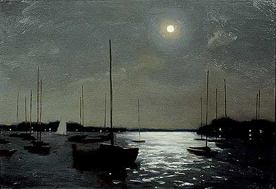
Moonlight Sail oil on canvas painting |
You may be interested to know that artists from every state in the USA, every province in Canada, and at least 115 countries worldwide have visited these pages since January 1, 2004.


