Selection and rejection

0
Dear Artist, Norman Rockwell never called himself an artist. When I met him in his studio some years ago, he made it clear to me that he was an “illustrator.” I told him I loved cruising his paintings up close because his surfaces were so interesting, and that made him a “painter.” He told me he didn’t think painter was a bad word.
011111_robert-genn2

“Thanksgiving”
oil painting by
Norman Rockwell

Over the years Rockwell has come under fire for his use of photographs. Norman Rockwell: Behind the Camera shows how Rockwell set up models and employed professional photographers to give him big black-and-white reference. That’s when Rockwell’s eye for selection and rejection took over. It’s the sort of thing all of us need to do whether we are looking at a picture of a human figure, the human figure itself, or a tree. The Runaway, (1958) was set in a coffee shop with a little boy, a cop, and a soda jerk. Some pens in the soda jerk’s pocket coincide with the boy’s nose. Out! The burly cop is beefed up into a real heavyweight for greater contrast with the puny kid. The kid’s arms are pulled in to show he has something to hide. Rockwell knew that in silent media, body language counts. The photo also shows the background to be cluttered and indistinct. In the painting it’s simplified with the addition of a wall-radio and a blackboard menu — two icons of American life. We’ve put the painting and the photo he used at the bottom of this letter. I invite you to cruise for yourself. If it were your painting, you’d probably find other things you might have changed. Some selections and rejections can appear to be arbitrary, perhaps merely the result of whim or preference. The brim of a hat may be wider or smaller; a hat may be on or off, or even replaced with another hat. This individual choice is the personality of art, no matter how it’s derived. Rockwell’s personality inclined him to show a loving, benign, optimistic America, where good things happened regularly. The great artists, illustrators or not, leave a trail of their own personality.
011111_robert-genn

“Roadblock”
oil painting
by Norman Rockwell

Best regards, Robert PS: “Even if it isn’t an ideal world, it should be. So I painted only the ideal aspects of it — pictures in which there are no drunken slatterns or self-centered mothers. Only foxy grandpas who played baseball with the kids, and boys who fished from logs and got up circuses in the backyard.” (Norman Rockwell) Esoterica: In my book, it’s the cultured ability to select and reject that makes or breaks a painter — and it mostly comes from within. Sometimes a second opinion can be valuable. When I visited Norman Rockwell he was painting a portrait of Richard Nixon. Quite openly he surprised me by asking if his depiction of Nixon was “not threatening enough.” Intimidated, I missed an opportunity. I told Rockwell I thought his President was just fine the way he was.   Norman Rockwell’s Photo Realism
010711_robert-genn

“The Runaway”
photograph (left) oil painting (right) 35 x 33 inches 1958

                  The misnomer of ‘illustrator’ by Mike Jorden, Osoyoos, BC, Canada  
011111_michael-jorden

“Chopaka Rodeo”
original painting
by Mike Jorden

As a realist, many of the painters I have most admired — N. C. Wyeth and Howart Terpning immediately come to mind — started out, or always admitted to being — illustrators. Many also studied at the Arts Student League of New York which seems to produce brilliant craftspeople. I have never understood the disparagement the so-called art establishment feels towards mere illustrators. (A critic of Robert Bateman once described him as ‘no more nor less than an illustrator’.) The distinction to me is moot as long as the painter can paint. Rockwell is interesting because he typically sketched his roughs in detail first (he could draw!) then photographed his models to get the details right which suggests a strong streak of perfectionism. Perhaps it’s what his clients expected? There are 2 comments for The misnomer of ‘illustrator’ by Mike Jorden
From: Jan Ross — Jan 11, 2011

Love your painting, Michael! Great job of capturing a moment in time at the rodeo!

  Illustrator envy? by Marilyn Kousoulas, Gambier, OH, USA  
011111_marilyn-kousoulas

Untitled
original painting
Marilyn Kousoulas

Regardless of all the remarks about Norman Rockwell’s “Illustrations,” I found the Rockwell Museum quite enjoyable. To be a profitable illustrator, one must know art basics and kick it up a notch. That, Rockwell did. He may have used photographs but, so what! As a painter, I do the same. It just takes a bit of imagination to embellish upon the photographs that can be flat. Rockwell painted real people and each of his illustrations told a story. All artists paint their feelings in different ways. If a painting “doesn’t talk to me,” I consider it worthless. Rockwell was a successful, profitable illustrator/painter. Perhaps that is why some artists pick his work apart and do not recognize Rockwell as an artist. He made money while he was alive. A bit of jealousy may be in the wind. There is 1 comment for Illustrator envy? by Marilyn Kousoulas
From: Susan Holland — Jan 10, 2011

Not only do I admire greatly Norman Rockwell’s remarkable talents as an artist, but I also admire his purity of heart, not only in making the subjects of his work evoke wholesome goodness, but also in painting within the strictures of what would in the olden days have been a patron. (Like Michelangelo did, among others.) That he used process printing colors in his work, so that the printed version would be entirely faithful to his original, speaks to this. The magazine giants he painted for (Saturday Evening Post, famously) were his patrons and he and the SEP were symbiotic thrivers if there is such a word. If I were a popular illustrator, would I paint in pink only for a commission? If it were Saturday Evening Post, I would, and I would try to make every pink painting the best in the world, to keep my job. He did a wonderful series of studies of IKE back in the day.

  Photographic stigma since art school by Martha Anne Corkrin, South Carolina, USA   When I was in art school, the professors frowned on using photographs or ideas we gleaned from graphic publications, etc. If not a classroom still-life setup, or the live model drawing class, our themes and subject matter had to come from “within.” Perhaps that is why I have been suffering such a creative blockage. I have lots of photographs that I could use to break through the creative block; or, I could go out and take some new photographs. All this time I thought I had to dream up something totally new. However, I have a feeling that by the time I start work on sketching and painting those photographs they will, indeed, be something “new.” Thank you for freeing me up! There are 5 comments for Photographic stigma since art school by Martha Anne Corkrin
From: andrea — Jan 10, 2011

I get crazy when I hear about artists whose work suffers because they take the words of their art teachers as rules that cannot be broken. Another one is “never use black”. No great art was ever created without breaking so-called sacred rules, even those made by so-called rules breakers.

From: Anonymous — Jan 10, 2011

When I teach, I ask my adult students to post remembered words blocking their progress. Quite often the messages carried into adulthood are negative. The best/worst one was, “Never put pink next to green, the two together never are seen!” When we review the quotes as a group, laughter fills the air and we see more clearly. Nancy Scoble, Washington, NC

From: sherry purvis — Jan 11, 2011

I used to plein aire paint, use live models when I could, but have found I am a studio painter and love it. I take lots of photos and work only from my own photos. But, if you look at how I paint and what I used as a reference, you would be hard pressed to see them even being close to the same. You do need to know how to use photos, but by limiting yourself to the nonuse of them……what is the point. People shouldn’t put “shoulds” on you and you shouldn’t let them. Go for it, use whatever works best for you. Because, you have to remember, the painting you are painting is yours not theirs and yours to make the decisions about.

From: Ron Ruble — Jan 11, 2011

I am for the most part in Sherry’s camp. My work is almost exclusively based on found photos. I love the process of rendering them in a realist manner bringing them to life. That is the craft aspect of my work and it fulfills a need. Then I place the image in a different setting or environment, totally out of context of the images initial intent, and it gives them a new life and meaning. When I am able to pull it off, it satisfies the creative aspect of my work. I firmly have always believed that art has no rules and the only measure is the final image and not how you arrived at it. So do whatever blows your skirt as you will end up true to yourself.

From: judy lalingo — Jan 11, 2011

If Michelangelo, or Vermeer, or DaVinci had access to capture images & freeze the light, the movement, the moment, don’t you think they would have taken advantage of it? Yes, be aware of the distortions & do not be a slave to the flattened image. But at the same time, do not be afraid of it, either! ;)

  Personal ‘pay-back’ by Jeanne Marklin, Williamstown, MA, USA  
011111_jeanne-marklin

Untitled
died scarf
by Jeanne Marklin

Raymond J. Steiner has written a thoughtful essay in Art Times on illustrator Jerry Pinkney, whose work is on exhibit at the Rockwell Museum. Both Rockwell and Pinkney used composition and color to tell the story. But more importantly, in Steiner’s words “If the author and the illustrator have both had their “say” we still have to consider the viewer as we move from one painting to the next. It is an axiom that the author’s or, for that matter, the painter’s — intent is, in aesthetic matters, largely irrelevant. In other words, what Shakespeare “meant” in, say, Hamlet — is of less intrinsic value to the individual reader than what Hamlet says to that reader. It is this personal, individual “pay-back” that makes all art not only relevant but of inherent value to us. Therefore, when we stand before one of Pinkney’s watercolors, we not only “hear” the author and the painter, but — if we are in any way sensitive to what we are seeing — also “hearing” our own reactions, ideas, opinions, and evaluations — in brief, communicating on our level with the work of art before us, irrespective of what either the author or the painter “intended.” There are 2 comments for Personal ‘pay-back’ by Jeanne Marklin
From: Elaine Deyo — Jan 11, 2011

Is the Untitled really meant to read died scarf? Not dyed? Perhaps there is deeper meaning here???????

From: Shirley Fachilla — Jan 11, 2011

You have expressed so well what has been rattling around in my head for awhile. A painting, or for that matter any work of art, develops its own voice, separate from that of its maker. It’s that voice that matters. It may be interesting, even illuminating, to know what Shakespeare intended; but the real meaning is what Hamlet says to the viewer of the play. The real meaning of any painting is what it says to its viewer and that is different for everyone who truly looks.

  The art is in the seeing by Diane Leifheit, Paul Smiths, NY, USA  
011111_diane-leifheit

Untitled
pastel painting
by Diane Leifheit

The definition of “artist” is really up to the viewer. One should call oneself a pastel painter or watercolorist, a sculptor, a graphic designer, an illustrator, a dancer. Certainly there are plenty of us who consider Norman Rockwell an artist — as certainly as Michealangelo was an artist. Doesn’t the Sistine Chapel have the notion of illustration about it? Yet the work is bar none excellent painting — evocative of the emotion of the story. Was Michealangelo a great artist or hired illustrator? Think about it. As for using reference and adapting information to the interpretation of the work — go for it! Even photographers, whose equipment by design sees everything, in the making of the work will add and remove elements, light, dark, edges, color, etc. It is artists’ ‘seeing’ that lets viewers finally ‘see’ not just ‘look’. “Artists today think of everything they do as a work of art. It is important to forget about what you are doing then a work of art may happen.” (Andrew Wyeth)   A storyteller in paint by Paul deMarrais, TN, USA  
011111_paul-demarrais

“Sunlit pasture”
pastel painting
by Paul deMarrais

Why do people malign Norman Rockwell? I think it is because he goes against modernism in every regard. He represents American values found in the Bible and the Constitution more than any other artist I can think of. He’s a humble worker doing his job without fanfare. He is the anti-Picasso and the anti- Pollock, the anti-Warhol. He loves people of all stripes with their quirks and individuality. He celebrates our differences and tries not to bash anyone. I think the reason he is so often lampooned and harpooned is because he spoke to so many with his paintings. His images are optimistic, sentimental, nostalgic and romantic and even religious. He and his paintings are about what is GOOD about America and the world. Today that is not fashionable. BAD is often what is GOOD. Murder and mayhem make more interesting movies. Ugliness is the ultimate beauty to the modernist. he obtained his design is irrelevant now as it was then. Cameras are machines and it is the artists’ job to humanize them, to make them a tool of their own vision. Norman Rockwell was true to his vision and an artist in every sense of the word. He elevated our trade and our image. He made the world good with his good works. He would hate it, but we should celebrate and revere him. There are 7 comments for A storyteller in paint by Paul deMarrais
From: Sandy Tucker — Jan 10, 2011

Well said Paul.

From: Diane Artz Furlong — Jan 11, 2011

Thank you, Paul, for saying all this. Of course it’s true.

From: Kris — Jan 11, 2011

To love all people is to include Picasso, Pollock and Warhol as well.

From: Jan Ross — Jan 11, 2011

I agree with you 100%, Paul! While there is truth in ugliness, do we really want to look at it time and again, as we do a Rockwell work? The only ‘flaw’, if it can even be considered one, with Rockwell’s paintings, is that the majority of American’s whose holidays are less than idyllic feel a bit cheated.

From: judy lalingo — Jan 11, 2011

The problem is polarity. Either, Or. Black or white, not both. Why can’t I like BOTH Rockwell & Warhol???

From: List — Jan 11, 2011

I agree with Kris. Norman Rockwell was a counterpart of the Soviet Union ideological propaganda artists.

From: Kay Christopher — Jan 14, 2011

You consistently write such interesting comments. They are artful. Thank you.

  A new take on judgment by Nancy Hall   Let me share the world I would like to continue creating for myself where people can communicate to each other directly with honesty, compassion, without judgment and most importantly — for the one reason we are all here, love. I’ve had the feeling for a long time that every soul on this planet is here primarily to learn how to love and be loved. A pretty simple task really, but not so easy to accomplish. Judgment is just more of what some people dole on themselves most of the day — an internal chatter pattern, ingrained from critical parents. For some of us, it takes a lot of work to quiet that inner critic. It has been a challenge in my own life, but I see so much more gentleness for my life, for this New Year and going forward. It’s human to hide from certain things but I challenge myself to not do that. To tear down the barriers I put up from having experienced a good deal of abuse I read, talk to people and sometimes see a counselor. I also have that as a wish for the world — which we can ALL tear down the barriers between us and speak from our hearts. No confusion able to sneak in there. There are 2 comments for A new take on judgment by Nancy Hall
From: Rene’ Seigh — Jan 10, 2011

AMEN, preach it, sistah!

From: Karen — Jan 11, 2011

You said it so very well……….

  Canadian clones? by Sandra Bos, Cookeville, TN, USA  
011111_sandi-bos

Untitled
original painting
by Sandra Bos

Is it just me, or do the paintings done by folks who live in Canada, seem to have a very similar look to them? I’ve been watching these paintings from Canada for a long time. At first, I thought it was just coincidence, but these painters have something in common. Actually, Robert, I guess what I’m trying to get at, is that they seem to have the same kind of ‘flavor’ as your work. They are sort of fractured, and some have the same kind of color palette going on. Could it be that they are all your students, one way or another? Anyway, it’s not a bad thing, but I’ve wanted to ask this for a very time. (RG note) Thanks, Sandi. Canadian painting was greatly influenced at the turn of the last century by Scandinavian art and what is now known as the Nordic Style. Canada’s legendary “Group of Seven” who flourished in the 20s and 30s were champions of this type of painting — strong design, thick paint, dramatic patterns with less emphasis on atmosphere, mood and impressionist effects. Many, but by no means all, contemporary Canadian painters paint this way. Certainly many more are influenced by it. There are 5 comments for Canadian clones? by Sandra Bos
From: Kim — Jan 11, 2011

I’ve also noticed the similarities in the Canadian painters. Thank you for the history of the Nordic Style; I’m glad to know about this. I LOVE this garden painting. It reminds me (in feeling tone) of Romare Bearden’s collage “Maudell Sleet’s Magic Garden”, one of my favorite pieces.

From: Brenda Wright — Jan 11, 2011

I love your painting … the impressionistic style, the colours, and the subject! I’m also Canadian, ey? However, my style (if I have one) would lean toward this … delightful.

From: Liz Schamehorn — Jan 11, 2011

Good question and sharp eyes, Sandra! Many Canadian art buyers love the style too. I did a “Pine Tree” series myself a while ago. Partly it’s a reaction to our landscape. For a contrasting style of Canadian art, try searching “Painters Eleven” or “les Automatistes”.

From: Terry Rempel-Mroz — Jan 11, 2011

Ha Ha! Good joke Sandra. At first I thought you were serious — the question smacks of provincialism and small-town ignorance. It’s like saying all American singers sing like Michael Jackson, all British painters do watercolours, or all Russian fashion is fur coats and high leather boots. But I’m sure that you were not serious. Artists in every country create works influenced by other artists. What you may see regularly in these letters are those artists who are willing to comment and show their artwork, and happen to have been influenced by the Group of Seven. But if you’re not kidding, then I suggest widening your experience by visiting some of the online museum/gallery sites and seeing what other Canadian artists are producing. You might be surprised to see that there is a great diversity out there, and it is difficult to tell between Canadaian, American and European artistsoften .

From: Anonymous — Jan 12, 2011

Well said Terry, I also thought she was kidding and you made some very good suggestions.-Lorna

  Changes, changes, changes by William Turville, Arlington, MA, USA  
011111_william-turville

“Fanned Door Lowell Open Doors”
sculpture
by William Turville

I noticed many, many changes from the photo to the painting, well-chosen additions and rejections, such as aging the soda jerk (a more fatherly figure?), giving him a smoke, and, importantly, giving him well-painted clasped hands between the cop and the boy, slightly mitigating the energy between the two main figures. BUT, as a sculptor, I noticed, to me, the strongest dynamic of the painting is created by the BIG changes (but to some eyes possibly very subtle) he made to the body language of both the cop and the boy. He widened the cop’s shoulders (making him overall bigger and pushing him deeper into the seat cushion) and dipped/turned/leaned him more toward the boy (lengthening and sharpening the cop’s left elbow, tucking his left shoulder lower and tucking his right arm into his side more), and intensified his look at the boy by sharpening and directing the angle of his gaze and directing his energy at the boy. The boy (whose “hiding” body language and obvious arm changes you mention) has been made smaller overall (especially in relation to the cop), his head is closer to the line of the counter, his weight has been shifted slightly away from the cop, nearer the right side of the seat, he is not stretched up to the cop but is more “shrinking” away from him (and his shirt and it wrinkles are well-painted to show his shape and reinforce his more collapsed posture) and again, seems to be pressed into the seat (by his own weight or the weight of the cop and his stare) and his focus on the cop remains very strong. As you note, many details of the scene have been obliterated and/or grayed/washed out. The overall effect is to increase the importance of the two central figures, the drama of the scene and the dynamic between the two main figures, all EXACTLY what Rockwell intended. His changes are painterly and sculptural, especially sculptural. And in making these very careful changes and doing them extraordinarily well (illustrating a weight shift, redoing the folds in both shirts, redoing the shapes of the seat cushions, subtly altering the boy’s posture and scale, etc., ETC!) are signs of a real master. If one can get as much mileage and inspiration from a photo and then bring as much expression and solidity to work derived from a photo, as Rockwell does, I cannot see a problem in working from a photo. (RG note) Thanks, William. And thanks to everyone who wrote with a list of all the changes that could have been made and some things that were changed and needn’t be changed. Amazing! Thank you so much.    

Archived Comments

Enjoy the past comments below for Selection and rejection

   
From: Richard Smith — Jan 06, 2011

But that’s what makes the difference between an artist and someone who simply makes note of what they see. Not everyone who has a camera is a photographer. Not everyone who wields a paintbrush is an artist. It’s the picking and choosing and the combining of elements that makes a work of art. R.

From: Eric — Jan 06, 2011

This letter’s one you should run every three months. I have no problem with painters using reference photos, but it makes me wince every time someone defends their own painting by saying, “Well, it was in the reference photo I used.”

From: David Westerfield — Jan 07, 2011

I too learned as a commercial artist: all that matters is the end result, how you got there makes no difference.

From: Marvin Humphrey — Jan 07, 2011

For Rockwell, and other illustrators, the camera is a valuable, efficient time-saving tool. It provides the basic foundation. The fundamental composition is quickly set up; from that point on, all the modifications and creative decisions will come into play.

From: Kelly Borsheim — Jan 07, 2011

I WISH that I had had someone steer me to learning the art of illustration when I was a child or teen. I think that is a savvy way for a young artist to get going … draw everyday, learn the classical skills to the point of quality work, learn how to connect with your audience, the discipline, meeting deadlines, and … did I say DRAW everyday? Really, I cannot think of a better path to take for a professional artist. That … and attending theatre (especially if one could draw during rehearsals).

From: Paula Christen — Jan 07, 2011

Another reason I love to paint. It is my kingdom, which is not ruled by democracy, but a benevolent dictatorship. Like Rockwell, it is the world as I see it and as I feel it should be. If you don’t agree, go paint your own kingdom.

From: Louise Francke — Jan 07, 2011

The very small digital camera is a great enabling device for artists! We can now capture the action when it happens. We don’t have to pose models as if they are in natural situations. The computer allows us to manipulate the figures into compositions which work, as Rockwell did with a little more tilt of the cop’s torso, more defensive placing of child’s arms and raising his feet, and simplifying the background. Knowing what to keep, to change and to eliminate make a more powerful tale. This knowledge is innate and can’t be taught completely. My bread and butter paintings are portraits of deceased pets. People want it all in the one painting! Recent case was Rosie. Client wished to have a sunset and sailboat in the background which was impossible since the photo’s perspective was looking down at the dog sitting on the floor. In order to enliven the comp, I asked about the things Rosie did and her favorite objects. Rosie apparently had a particular liking for her mistresses socks. So, I found an old pair of my fanciful socks to put on the ground surrounding her. It worked and captured both the dog and some angle which endeared her to her mistress.

From: Joela Nitzberg — Jan 07, 2011

Oh how I wish I could paint like Rockwell! He referred from the photos but didn’t copy. There is a world of difference.

From: Barbara Noden — Jan 07, 2011

Today’s letter was very special as I was able to see the exhibit in Washington DC at the Smithsonian this summer of the private collections of Norman Rockwell ‘s work–you are absolutely correct about the brush work and the attention to detail–he was a consummate painter. Thank-you for noting his techniques.

From: Lyn Crawford — Jan 07, 2011

What else do you know about Norman Rockwell???? That was a fascinating newsletter!! Norman is my absolute favorite ARTIST!!

From: Alex Nodopaka — Jan 07, 2011

Norman Rockwell was a gentleman and a scholar when he said he was an illustrator and not an artist. As to him using photography as a tool was simply using the available technology of the day. I respect his self-description as being honest with himself. His true artistry was in the signature inimitable facial expressions of his subjects that were skillfully drawn by his adept hand. The important cue here is in the word skill. There are many skilled craftsmen but few artists. What I mean is the difference between those who execute art and those who create new directions.

From: Sandra Marucci Weisenhoff — Jan 07, 2011

I receive many art related emails, blogs, newsletters etc. in my inbox, but your letter is the only one I rush to open. Thank you for your insights and wisdom so eloquently put.

From: Mark D. Gottsegen — Jan 07, 2011

By the time I lived in Lenox, that little Stockbridge diner in the Rockwell photo had become the original Alice’s Restaurant — when she became a success, she promptly moved to a bigger place. My former high school English teacher, a friend of the Rockwell’s, was the Director of the Rockwell Museum for about 5 years in the 1970s. I helped him curate a few shows, and got to see the store room. Looking at Rockwell’s studies for his paintings, I could see that he was much, much more than an illustrator. But he was very modest and private.

From: John Burk — Jan 07, 2011

If you read N.C. Wyeth’s Journal, he places a great distinction between illustrator and painter, declaring himself an illustrator striving to be a painter. He regarded himself eventually as successful, as well he should have. I believe this is a thought more common to the era common of these men, though I often wonder if I am more illustrator than painter. It’s a good question. I would hope to resolve it by having no doubts of myself as a painter.

From: Tim Vickers — Jan 07, 2011

A show of Rockwell’s work and photos is at The Brooklyn Museum in Brooklyn, NY until April 10, 2011 in the Robert E. Blum Gallery on the first floor. It’s a spin off from the Rockwell Museum in Stockbridge, Mass.

From: Jim Cowan — Jan 07, 2011

There’s a museum/gallery devoted to Rockwell on the island of Awaji in Japan. I hesitated before going in as this was after all Japan and I wanted Hokusai and Hiroshige and not some American illustrator. Once inside however I was soon under the spell of this man Rockwell . He saw things that many pass by and isn’t that just what makes the artist tick? As for his use of photographs. There is too much unthinking snobbery attached to criticism of the use of photography. Some can use the medium to turn out excellent paintings..Some can’t. There again some can confront an actual tree and make it look like a rootless stick.

From: Dennis Fairbairn — Jan 07, 2011

If Mr. Rockwell could unintentionally intimidate you he was obviously as much a presence in life as his work has become to history. It strikes me that the photographs are really quite unremarkable . There isn’t much in the photos that really holds my interest but I can marvel at his `illustrations` endlessly. His work to me anyway, has a life of it`s own. In my journey to become a painter I`m finding out how inadequate my rather expensive camera is, or perhaps how inept the operator of said camera is. What I can paint, even with my limited experience, is so much more…or less as the case may dictate than any photograph I can produce. I find it a rush to be able to play God just a little bit, to alter reality, to select or reject, as my mood or whim dictates.

From: Darla — Jan 08, 2011

Several of us have remarked on the perceived difference between artist and illustrator. When I was in college in the ’70’s, illustrators, even Norman Rockwell, were looked own on as being mere commercially driven technicians. Of course, realism was considered to be unartistic as well. The tragedy of N. C. Wyeth was that this very compelling painter considered himself to be inferior to “fine artists”! We should all be so inferior. Anyway, about selection — that’s what it’s all about — choosing what to use, how to use it, and what to leave out so that we can communicate what it is we have to show.

From: Dorcas M. O’Reilly — Jan 08, 2011

The two photos of Rockwell’s selection and simplification, as the saying goes, “speak volumes”. Thank you for this wonderful analysis and commentary.

From: LD Tennessee — Jan 08, 2011

It’s kinda like this…a gemstone is just a rock until the artist cuts, polishes and places it into the perfect setting that will let its true brilliance show through… I love the brilliance of Rockwell’s art, making the ordinary extraordinary…

From: Dorenda — Jan 08, 2011

Beautiful…I think Rockwell is a grand example of an artist using tools to assist (but not aid) his skill level and great knowledge of his subject matter. I am forever telling students that any tool is fair game until the tool starts using YOU…then you must put it away! :)

From: Linda Myers — Jan 10, 2011

Aaaahhh… Give me a break. I can’t stand it when ‘so-called experts’ (wherever they get that title from) or non-experts, for that matter, feel that they have the right to diminish an artist’s talent and creativity by trying to find something negative about their work. In the case of Rockwell they had to really grasp at straws. If he’d painted every item in the photo they would have complained about that too. Artists have the right to paint whatever subject however they choose. It is the ability to choose and interpret that gives them the right to be artists. Some artists are good at this process and some struggle. But no one should have the right to judge an artist’s creative decisions. It is such an personal/internal process. Sometimes that is why I think some artists go on to explore abstract art because it is harder for others to criticize… And then you get the Emperor’s clothes syndrome… Where if an artist is really good at rationalizing their artwork and can sell the concept to influential people then the artwork is considered ‘wonderful’. Aaaaahhh… The debate never ends.

From: Henry Wong — Jan 10, 2011

Lets face it, some creative people have what Robert calls “the cultured ability to select” and others do not. Those that have achieved this ability are properly called “artists.”

From: Jennifer Twilley — Jan 10, 2011

What scares me is the unintended social impact of work like Rockwell’s. I see soda fountain and this idealized, perhaps romanticized, scene. Some people see this– or read something like it– and believe that’s the way the world is (or was). I see soda fountain, I think lunch counter. Unfortunately I know too many people whose view of the world was partially sculpted by Rockwell, who knew better. One of my parents adopted a world view that did not include the awkwardness of political polemics, seeing “the other” as dangerous as the ebola virus, and discounting its very existence. This isn’t Rockwell’s fault, and as long as the viewer understands what he was doing– his selections– the work is harmless in this regard. However, the washed and ironed world view can be a dangerous siren to so many that Rockwell’s work– despite having laudable qualities– makes me nervous.

From: Andy Rellic — Jan 10, 2011

And, in contrast to the “washed and ironed view,” which admittedly has its faults, there’s the “unwashed and un-ironed view,” which undoubtedly has more faults, one of which is that most people don’t want to look at it, let alone think about it. At least the previous shows an “ideal,” as Rockwell said.

From: Sinbad Jason Quinn — Jan 10, 2011

The expression should not be “the cultured ability to select,” but “the inculturated ability to select.”

From: Nigel Glendenning — Jan 10, 2011

Notable is that Rockwell’s reference photos were in black and white. Relative gray scale is a very handy thing to have–colours, in many cases, are arbitrary. UK

From: anne parker — Jan 11, 2011

enjoyed reading your comments on commissions as especially with portraits, it has always felt like a grey area just how much its my interpretation and the clients opinion. i mostly work from photos, often given by the client so attempt to get as close as possible but its sometimes easy to think that its just not good enough when someone asks me to change something.( sometimes it has been not right, other times it is just someones opinion.) and i do think that a little artistic cosmetic surgery is a good thing.

From: Helen Opie — Jan 11, 2011

Since the solar panel does nothing to enhance the composition, and the commissioner does not want it, definitely take it out. This oughtn’t to be difficult: you can obviously paint precisely, and so there’s no reason you’d need to repaint anything but the roof itself, and you can feather any mismatched colour into the roof, maybe suggesting a little dappled shadow or something – something VERY subtle!

From: Helen Opie — Jan 11, 2011

To webmaster: I cannot see the boxes to write in, which is why I neglected to put in my name in previous post. A very plain page looks nicer, perhaps, but is much harder to navigate. I opt for clear navigating markers over elegant simplicity in these cases; slightly darkening these boxes would make them visible without falling into my screeen.

From: toni williams — Jan 11, 2011

I solve the commission dilemma by refusing them…too many years of trying to satisfy the client and being a mind reader. The requests that are made (by the client) are always legitimate. I prefer the freedom of interpreting a scene or figure rather than trying to make a buck. Difficult decision but I had to draw the line at some point.

From: Purell — Jan 11, 2011

Jennifer Twilley, you got it right. Every great power used art for propaganda. What we create touches people’s hearts, and that weapon never fails to be used. Artists are responsible for their work, same as scientists.

From: Bob Cardinale — Jan 11, 2011

I really enjoy reading your letters. And although I’m a sculptor, I gain a lot from your insights about painting as they have a universal quality that applies to all art work. I especially liked the “cruising” of the Norman Rockwell photo and painting of “The Runaway”. In my opinion, Rockwell was a master illustrator whose ability to portray universal human emotions puts him in the class of major painters/artists of the 20th century. In my own wood sculptures (see http://www.jsauergallery.com/sagemoon/artistPages/BCardinale.html) which are inspired and guided by historic photos of church buildings, I attempt to capture the spirit, feeling and history of the structure. Many of my most positive supporters refer to my works as “models”. If appropriate, I gently suggest that they are sculptures as they are an expression of my emotion and strong feeling about an ecclesiastical structure. I use no scale, patterns or measurements and work totally by feeling. So in a similar way to your analysis of Norman Rockwell, as he went beyond illustration to expression of emotion, I hope that I have gone beyond being a “model-maker” to a sculptor of rather specific subject matter, churches, temples and synagogues. Do you have any suggestions about how to set up an atmosphere and scenario to help your art work be perceived and talked about in the way that it was conceived and produced.

From: GINA — Jan 12, 2011

I THINK THE PAINTING IS BEAUTIFUL ENOUGH , BETTER THAN THE PHOTO.. I WOULDN’T CHANGE ANYTHING .

From: Rick Rotante — Jan 12, 2011

The dictionary defines “Fine Art” as: “a visual art created primarily for aesthetic purposes and valued for it’s beauty or expressiveness”, The dictionary also defines Illustration as: ” ..Something that illustrates, as a picture in a book or magazine, to make intelligible with examples of analogies; exemplify.” Now in an age where we are breaking new ground in science and genetics and political correctness; where the secrets of life are being discovered and documented and finalizing everything and everyone; where history is challenged and turned upside down with new scientific information, exposing our origins and personal coding, I can imagine also questioning the correctness and validity of the Dictionary itself as not being current or correct in light of the way views are being altered on a daily basis by all these sciences. Television and movies greatly influence our thoughts and shape our opinions. Many see these mediums as the crystal ball where we now view our world. Mass media is dominating our very being so effectively it’s hard to know if I’m having an original thought or have my decisions been made by someone else. Art today has undoubtedly been undergoing a major change due to mass media and television in particular since most of us are more exposed to television than the movies. I’m intentionally leaving out the Internet…for now. I am going out on the proverbial limb I find myself so many times the older I get and the more I see, and say that much of what is passing for Fine Art is in fact Illustration. Or a version of Illustration that has little to do with fine art. This troubles me on many levels. I enjoy good illustration. I have nothing against it and I know it has meaning and value. What troubles me is Illustration passing for Fine Art. I am fully aware that today even Fine Art is having trouble being defined. This may be in part due to the fact that few are practicing Fine Art and are in fact creating Illustration instead, adding to the confusion. The line between each gets more vague with every passing day. Many current artist in the art community were illustrators and good ones at that. They have reached the pinnacle of there profession and have decided to make the move into fine art. One reason for this, I think, is Illustration is not as in demand as it was once. Another is photography. During the forties and fifties illustration had reached it’s Zenith and has been on the decline ever since. Norman Rockwell is the name most remember as well as Dean Cornwell. There were many more who made illustration what it was. I believe when you look at these artists you clearly understand what Illustration is. Thought you can say without doubt the work was fine, it was illustration in its execution, definition and purpose. To illustrate. I feel this transition into an illustrative mode is detrimental to fine art as well as fine artists and moves fine art further into the shadows. Art, especially in America, is not tops on everyone lips these day unless of course it has the word “Spectacle” attached. I love much of what is being produced today but worry that true fine art is being eroded by what is passing for fine art. If we don’t teach fine art and produce more fine artists, plus separate it from illustration, many future artists will be unable to produce fine art. What we will produce is what we come to know as fine art which will be illustration if the current trend continues. I may be alone here (I usually am) but I would love to see a resurgence of “true fine art” as defined in the dictionary “a visual art created primarily for aesthetic purposes and valued for it’s beauty or expressiveness…”, There are a few artists at the top of the economic market today creating “fine art.” Most other artists are trying to find their niche and in so doing create something between fine art and illustration. Partly because the influences today lean more to an illustrative form of art. There is little art, much less fine art being taught in public schools. Public schools teach students to interpret the world they live in. They teach what a student can relate to and not to how the student relates to the world. Art throughout history has influenced people and made them feel better about their lives. As we move into the future many increasingly find the art of the past old fashioned, antiquated and thus out-of-touch with what is happening now. The more art is turned toward illustration, the more fine art we lose. The more fine art we lose, the more humanity loses. Art is always in transition and fine art moves inexorably into the twenty-first century and may be made new again. The world is changing more rapidly than I remember when I grew up. Maybe it’s changing too fast. I hope there are those who feel that fine art is worth saving and needs to be nurtured and encouraged and developed. Lines are being blurred more and more with everything in our lives with the information highway. We watch the tube at home as entertainment and we watch the tube for work. All information is being transmitted via the “tube.” With that, information blurs. If the move to illustration helped fine art stay in the forefront of our conscience, I feel some comfort. Fine art is being taught and preserved in some private art schools. I see it happening. I hope the more will educate themselves to see fine art for what it is and not as Illustration.

From: Grace Rankin — Jan 14, 2011

By all means remove the panel. It becomes a focal point and takes away from the beauty of the house.(Even tho’ it is in the photo)

     Featured Workshop: Heli-painting with Robert Genn in the Bugaboos
011111_robert-genn5 
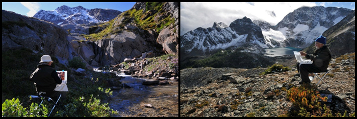
Painting Kick Off Falls (left) and Don Cavin (right) Heli-painting with Robert Genn in the Bugaboos   The Workshop Calendar provides up-to-date selected workshops and seminars arranged in chronological order. 
    woa  
010411_brian-lasaga

Corner Refuge

acrylic painting, 11 x 14 inches by Brian LaSaga

  You may be interested to know that artists from every state in the USA, every province in Canada, and at least 115 countries worldwide have visited these pages since January 1, 2013. That includes Duncan Long who wrote, “What a wonderful look at Norman Rockwell (my great guiding light for the work I do). Once one starts to think of himself as an illustrator, there’s a real change to not only subject matter but also to the story being told in each painting that is done.”    
Share.

Robert and Sara Genn Twice-Weekly Letters

Subscribe and receive the Twice-Weekly letter on art. You’ll be joining a worldwide community of artists.
Subscription is free.