Dear Artist,
After my last letter about Dewain Boyce’s analysis of Cezanne’s paintings, we were inundated with letters from artists who “didn’t get it.” Dewain was widely condemned as theoretical and arbitrary in his overlays of cones, cylinders and ovals. One subscriber simply wrote, “All you painters are nutz.” So what else is new? Many writers were suspect of the whole idea of overlaying paintings with any form of geometry or diagrammatical devices. While Dewain’s “research” may have been flawed, there’s no point in throwing the baby out with the bathwater. Most artists would agree there’s valuable stuff in “hidden scaffolding.” I’ve picked seven creative ploys you might consider:

Paul Cezanne
1. Straight-edge lineups. Take a long straightedge to your work, pick out significant linear design elements and pick them up in another area of the painting.
2. Curve-edge lineups. Same as above, but follow the curve.
3. Motif edges circulating through varied subject matter. In the Cezanne-template manner, circular or oval motifs are picked up and dropped off.
4. Activation and petering spotisms. Think of puffs coming out of the smokestack of a steam engine–diminishing or evaporating as they go on their way.
5. Rhythm and counterpoint. Varied and repeated rhythmic motifs that echo one another–together with their smaller, reflective grace-notes, both negative and positive.
6. Graphic recessions and protrusions through interlocking gradations. This ploy sets up minor tensions that invite visual curiosity and pictorial intrigue.
7. Edge stops. A compositional element or line near the frame that stops the eye and sends it back toward the center of the work. This ploy also takes the form of “edge areas of diminished interest and complexity.”
If some of those items seem a bit obscure, I apologize. Like Wells Fargo, I don’t always express myself too well. We’ve put some photo-demos of these ploys at the bottom of this letter. It’s worthwhile to keep in mind that the presence of hidden scaffolding doesn’t go unnoticed in the primitive recesses of the human mind. As with the work of Cezanne, we are struck by the feeling, “There’s more to this than meets the eye.” This insight builds the magic moxie of “fascination” — something you may find worthwhile for your own work — a quality that most of us will admit Cezanne’s work has in spades.
Best regards,
Robert
PS: “With an apple I will astonish Paris.” (Paul Cezanne, 1839-1906)
Esoterica: And then there’s all the talk about whether this sort of thing comes intuitively, or whether, as I’m implying, it comes as a calculated ploy. Cezanne gives us the idea that it’s a conscious function of an applied mind. While any number of ploys may not be fully understood or may indeed be a perverse diversion to avoid painterly boredom, they arise from the simple and honourable desire to give something more — to do more with less. “Modify, little by little, our vision, and at last comprehension comes to us.” (Paul Cezanne)
Photo-Demos

Straight-edge lineups. Take a long straightedge to your work, pick out significant linear design elements and pick them up in another area of the painting.

Curved-edge lineups. Same as above, but follow the curve.

Motif edges circulating through varied subject matter. In the Cezanne-template manner, circular or oval motifs are picked up and dropped off.

Activation and petering-out spot-isms. Think of puffs coming out of the smokestack of a steam engine — diminishing or evaporating as they go on their way.

Rhythm and counterpoint. Varied and repeated rhythmic motifs that echo one another — together with smaller grace notes, both negative and positive.

Graphic recessions and protrusions through interlocking gradations. This ploy sets up minor tensions that invite visual curiosity and pictorial intrigue.
What’s not to understand?
by Sandra Langer, New York, NY, USA

“Woman with a Guitar”
cubism portrait
by Georges Braque
I take for granted basic intelligence when it comes to art. Clearly, I am mistaken. What Cezanne was trying to do was return the two-dimensional integrity to the surface. Do I now have to explain what surface means???? Absurd. This is the most fundamental lesson of design in the 20th century. A surface is two-dimensional before it is 3 D — illusion is the only one way to paint. Geometry, as Cezanne understood it, was the fundamental building block of painting. The Cubists took this into another dimension, riffing (that’s a Jazz term for inspired musical doodling) on Cezanne’s original theme. So what’s not to understand???? Duh!
Never heard of him
by Mary Susan Vaughn, Weddington, NC, USA

“Mount Ranier Horses”
oil on panel, 16 x 20 inches
by Mary Susan Vaughn
I still don’t get it, and to tell the truth, Robert, if I put that much thought into every painting I wouldn’t paint. Actually I don’t paint at all — I just do. I sit myself in front of my canvas and I paint what looks right to me and what brings me joy and satisfaction. All this ‘cones, cylinders, and ovals’ discussion is for someone with too much time on their hands. I love Cezanne and I don’t think I’m going to be analyzing his paintings for cones, cylinders, or ovals anytime soon. But thanks anyway for sharing Dewain’s observations. I had never heard of him until now and now I know why.
‘Composition 101’
by Charles Peck, Punta Gorda, Florida, USA

“The Good Year”
portrait painting
by Charles Peck
What is this — Composition 101? Anybody who takes serious their art and isn’t just some Sunday duffer knows this stuff. All good realistic art starts out as an abstract construction. Yes, it can be intuitive if one is a natural but even then without a proper study of composition it would most likely be no more than a blind pig finding an acorn every now and then. I liked those 7 ways of looking at a composition and would add the dynamic balance bar (where a small shape balances a larger shape at the proper distance) but if people have been squinting while looking at nature or human-made imagery they would have seen these various shapes all over the place. Hard to believe one would consider oneself an artist and not go to the trouble to read about it. As if the point was to become some kind of soft tissue pantograph slavishly copying what one sees without noticing underlying patterns or intricate similarities.
Cezanne’s methodology
by Stanley Horner, Victoria, BC, Canada

landscape painting
by Paul Cezanne
I too visited several of the Cezanne sites, and concluded that it was on the canvas rather than in the site that he was a pioneer. I suggest that there are three vital stylistic strategies that Cezanne came up with and used consistently: one was the ‘passage’ (the original French term), a process of interrupting the continuity of lines and thus leaving the eye to fill in the form that is vaporized in key places along contours; and other was the use of a limited palette that bathed the overall surface in a single unity; a third was to modulate the surface in a series of small facets of varying tonalities of the few colors used (each one as well carrying the residue of the brushwork, not only in tone but in directional energy).
Scaffolding must exist
by Donald Demers, Eliot, ME, USA

“Spring Torrent”
oil painting, 9 x 12 inches
by Donald Demers
In spite of the fact that I too thought the Cezanne illustrations did not adequately demonstrate the concepts that were presented in the last letter, there is no doubt that the underlying scaffolding or architecture of a painting as I refer to it, not only does exists, it must exist. When a painter begins with a white canvas there is a requirement that a visual structure or armature be created upon which to hang or present the subject. Some artists do it intuitively and some do it consciously, but regardless of how it is done, every accomplished painter from Franz Kline to Andrew Wyeth employs this method of pictorial development.
Scaffolding makes perfect sense
by Mary Buergin, New Boston, NH, USA

“Late Light on the Canal”
pastel on paper, 16 x 20 inches
by Mary Buergin
I want to apologize for any of my fellow men who may be accosting you with such remarks only because they don’t understand what you’re saying. That’s why we’re painters and others are scientists. What you said about “scaffolding” makes perfect sense. We know the importance of form and “massing” in our paintings. Without the strong patterns in our composition, our paintings are no more than a scattering of color, value and detail. There has to be structure… be it intuitive or calculated… the shapes are what hold the work together. I thought the article was so interesting I printed it out to share with my pastel class on “massing.”
State of denial
by Edward Powell
I am amazed that there were many folks who denied the fascinating and significant aspects of compositional construction methods that have involved geometry and sight principles, used by artists from very early painting history forward. That simply implies the lack of education. I think we are mostly too lazy today to consider the hard work and intellectual involvement in the possibilities of composing. Making work has become more about having fun, expressing oneself and trusting intuition to consider the complex thinking of the past. It is too bad that art history courses in the colleges and universities stopped teaching about the formal analysis involved in “masterpieces.”
Degas did it too
by Jackie Simmonds, UK

“Marciac Garden”
pastel painting
by Jackie Simmonds
Anyone who says “you painters are nuts” clearly has done little or no study of the fascinating subject of composition and design within a painting, and this possibly applies to all those who wrote to you having been baffled by your letter. However, I would point those people in the direction of the works of Edgar Degas. If anyone ever used “hidden scaffolding,” he most certainly did, and in fact, it is not so hidden! Look at some of his dancers and turn them upside down. You can clearly see how the angles of legs and arms and skirts echo each other. Look at his interiors and pick up lines and curves, see how the eye is held within the rectangle, and how rhythmic and well-balanced these images are. Degas’ works were the first to reveal to me the language of underlying composition and design as clearly as can be. They may help those who simply do not “get it.” For those still struggling, The Simple Secret to Better Painting by Greg Albert is valuable. He claims to have been inspired by the teaching of two other modern painters, Tony Couchand Tony Van Hasselt, who are also able to express themselves in a clear and accessible way. Greg Albert says that his goal is to make pictorial composition simple to understand, remember and apply. His “One rule of Composition” demystifies the subject.
Scaffolding for writers
by Steve Day, Blandon, PA, USA

photo of Dan Brown and his book, The Da Vinci Code
Please note Dan Brown’s (also seven) formula ploys for writing:
CHECKLIST
1) Setting: Does my setting reveal a “new world” to my reader? Does it have the potential to teach?
2) In-and-out scene building: Do my scenes start late and end early? Does my plot keep moving? Can I trim excess fat from lead-ins and wrap-ups?
3) Dramatic question: Is the fundamental question driving the action a simple one? Can my plot be summed up in a single sentence?
4) Tension: Do I employ the three C’s? Do my characters exist in the shadow of a ticking clock? Are they constrained by some sort of crucible? Do I make contracts with my reader… and then follow through?
5) Research: Do I know enough about my topic to write a manuscript filled with specifics? What (specifically) will my reader learn?
6) Weaving information: Is my background information “woven” into my story, or does it occur in long blocks of description?
7) Revision: Have I reworked my manuscript many times? Have others read it and offered criticism? Have I tightened dull scenes? Have I seasoned the stew?
Drop the theoretical baggage
by Paul deMarrais, TN, USA

“Akard Lane”
pastel painting, 24 x 30 inches
by Paul deMarrais
Theorists seem to quiver over Cezanne’s paintings and puff them up to mythological proportions. This latest cone, cylinder, sphere overlay is reminiscent of the ideas of Dynamic Symmetry — the Greek Vase by Jay Hambidge. Many artists adopted the composition ideas in the book and it became a bit of a cult phenomenon. Paintings produced this way looked formulaic — the feeling of interior design abstracts perfect for decorating the tasteful modernist living room. Cezanne’s paintings, on the other hand, are full of the quirky mannerisms of a quirky person. I believe it would be easy enough to mimic Cezanne’s style. He was known to outline the forms with Prussian blue which gives his paintings an overall cool look. He was known to work from the contour “in’ with square brush strokes. Thomas Wolfe in his satiric look at painting, The Painted Word, said that modern painting was more about literature than painting. If you stripped away the dense layers of verbiage, you were left with zilch. Cezanne’s work has been singled out for much of this ballyhooing about theories of rods and cones etc. We ought to look at them without this theoretical baggage and appreciate them for their actual qualities.
Eye wins over Golden Mean
by Duncan Long, Manhattan, KS, USA

“Sword in the Stone”
original illustration
by Duncan Long

“Sword in the Stone”
illustration with
imposed golden ratio
by Duncan Long
I suppose the Golden Ratio is REALLY out of date. Yet it is still employed sometimes (and the current release of Corel Photo-Paint even added it as part of the bells and whistles). I suppose the Golden Ratio might fit into your “curves” ploy category, yet I find myself thinking it’s actually a bit more complex than that and perhaps deserving of a category of its own. In decades of creating, I have (consciously at least) used it only once, to create a formal look to a fantasy picture. I found the system both helpful yet stilting. And in the end I moved the hilt of the sword upward so the jewel in the handle, one of the main interest point in the piece, is actually outside any grid points. Thus, my eye won out over the “rules” of the system that had inspired the layout, perhaps defeating the whole purpose of the exercise. I can say I used the Golden Mean twice in the same picture — the first and the last time.
Rain Man
by Kittie Beletic, Dallas, TX, USA

“Ivy Fairy”
original art
by Kittie Beletic
How does anyone create? I am reminded of the movie Rain Man with Dustin Hoffman. During the rolling credits at the end of the movie, the director chose to show Raymond’s snapshots taken with his camera throughout the story. The pictures were never discussed or shown before this time. Subtly, used as a prop (whether intentionally or not) the pictures he takes beautifully illustrate Raymond’s interest: Numbers. Pictures of street signs with numbers, license plates, addresses above doorways … Raymond saw them as beautiful and chose them as his subject. What and how a person ‘sees’ and then chooses to express is as individual and as valid as anyone else’s choices. On road trips, see what people notice … especially if the people all have the same occupation … say, artists. One will notice architecture. Another will notice the trees, the landscape. Some will see the people. Others, animals or a single blooming rose. What we notice matters. How we see the same subject might also determine how we put it onto canvas.
Got it
by Evie Wray, Luray, KS, USA

“Hollywood Love 1963”
illustration 8 x 10 inches
by Evie Wray
My heart swells and I would weep except that I need to type. I so got it. In fact, I thought you must be of the angels sent to me when I receive a letter from you and it transforms my artist life. I am indeed in appreciation to powers greater than the scope of all our work. While I am a simple beginning artist and as yet have little bearing on our industry market, I know myself. The cones and cylinders and little squares that hide behind the stage of my work not only give it taste (volume, depth , texture) but those little shapes give my work hidden entrance into the energy that bears all form.
Archived Comments
Enjoy the past comments below for Seven valuable ploys…
Congratulations for exposing the gaps in current art teaching methods. Yours is what ‘Art School’ should be about. I had forgotten most of these ploys over 40 years but I guess they creep in subconsciously, having been inculcated in the grey brain folds.
Ha! This is brilliant – Vittorio of Sutton, QC, Canada who wrote, ” ‘With an apple I will astonish Paris.’ (Paul Cezanne, 1839-1906) Was he referring to a computer?” Wonder if Steve Jobs hangs out with squares, triangles and cylinders….
E E Cummings wrote, “While you and I have lips and voices which are for kissing and to sing with, who cares if some one-eyed sob invents an instrument to measure spring with.” Thanks very much for your wonderful letters…Al
Reading responses to Robert’s wonderful letters is almost a fascinating pastime as long as I read them at the golden mean distance from the point where incident light rays traveling parallel to the principal axis refract and converge with the principal axis. Sometimes the responses are fiercely individualistic and at times they are of the mob mentality. Composition is a good thing. But the question is how do you define, describe, and eventually, teach “good” composition. It is sorta like describing the “best” color. How do you teach “the best color”. Both are kinda personal ideas and what may be a composition I like may not be one you like. Kinda like English Lit. There are some far out ideas that those Eng. Lit teachers think the authors are “really” trying to put over on us. Needless to say, many times I must have had that “deer in the headlights” look, because I certainly didn’t get the same sense as they did – maybe because I didn’t use the Cliff Notes! I’m a relative newbie artist of absolutely no merit – one of those despised hobbyists (and a watercolorist at that) that play with paint to the detriment of all “true” artists – however, I do have a lot of experience with photography. Compositional theory is all nice and fine, but it can almost be thrown out the door – some of the most exciting and visually stimulating images that I have viewed disregard the “rules”. Compositional theories are one way to get your idea across, just not the only way!! Sometimes you just put it where it looks good and sometimes you just don’t have a choice!
Sword in the Stone illustration with imposed golden ratio – Where can I find the graphic overlay shown in the article?
Operator error: this didn’t paste over to the little window: You ask 20 different, but successful gardeners how the “best” way to grow tomatoes or roses is, you will get 20 different answers. They apparently all work – just different routes to the same end. Just as in compositional theory. What may be flow to you and the route your eye takes may be totally different than what the route my eye takes. Colors, reflection, glare, distractions, subject, etc… are also very important as to how a piece is viewed compositionally, and a few of those are transient and not a constant and cannot be taken into account during creation.
The diagram(s) used on the “Sword In the Stone” can be found in the book on Greek vases also cited above. It’s interesting to discover that Figure Two in that book (published ‘way back — 1920?) is very reminiscent of illustrations of the mid-eighties “Mandelbrot Set” of numbers predicting the order that underlies or is inherent in chaos.
Paul de Marrais, in “Drop the theoretical baggage,” noted Thomas Wolfe as the author of THE PAINTED WORD. Actually, the author is Tom Wolfe.
Dear Robert: Your vocabulary just blows me away. I was thinking to myself, “what is a ploy”, I’m thinking, device, trick, tool, is that correct? Is it along the lines of David Copperfield slight-of-hand, now you see it now you don’t? What about fool the eye Trompe-de-l’oil (can you tell I’m an American and can’t speak French, do know some Creole from Haiti). Anyway, I was once really stumped in art class at U of M by a teacher who talked about planes. So I drew some planes and basically pissed him off, I think I flunked that class cuz I had some surgery, which the same teacher made an obscene remark about the operation I had. But I do understand planes when they talk about surgery. I do understand sagittal planes and axis, and did an illustration of such for a biology text. Volar I understand. Linear I have a harder time understanding, why is that? Well, take care,
Thank you, Mike Hill, for a good laugh and some insightful comments. Couldn’t agree more. I loved your opening sentence “…as long as I read them at the golden mean distance from the point where incident light rays traveling parallel to the principal axis refract and converge with the principal axis…) Laughed out loud. Good way to start the day.

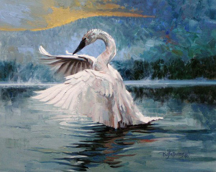
Trumpeter Swan at Twilight pastel painting, 16 x 20 inches |
You may be interested to know that artists from every state in the USA, every province in Canada, and at least 115 countries worldwide have visited these pages since January 1, 2013.
That includes Joanna Mersereau of Riverside, CA, USA who wrote, “Amazing! I’ve been doing this for several years, but I call my style “Narrative Structuralism.”
And also Vita of Sutton, QC, Canada who wrote, “‘With an apple I will astonish Paris.’ (Paul Cezanne, 1839-1906) Was he referring to a computer?”
And also Marianna Pfeifer who wrote, “Maybe the answer is: there is abstraction in realism and realism in abstraction.”
And also Bridget Busutil who wrote, “I have a PhD in Comparative literature and Art and thus am teaching this year at Bilkent University in Ankara, Turkey. Your precious pearls of information falling in my lap are wonderfully refreshing. Lately Art has become such a difficult subject, i.e. Art is dead!!! Art for What!!!! and so on. It’s not easy. Thanks.”
And also Karl Leitzel of Centre County, PA, USA who wrote, “A large part of our unique existence as human beings lies in the seeking out, recognition, and creation of patterns. It’s how we create, learn, and use language. It’s how we learn to relate to and size up other people. It’s how we know what clothes to put on in the morning to be ready for the day. And, the individual’s awareness of patterns in their most subtle forms probably is what most defines a great artist.”
And also Elizabeth Seltzer who wrote, “Leonard Shlain’s Art & Physics, Parallel Visions in Space, Time & Light. Shlain postulates that revolutionary art is the harbinger of new thought in mathematical physics and that the Post Impressionists, particularly Cezanne are preparing us for Einstein’s theory of relativity.”
And also Mark Mueller of Richland, MI, USA who wrote, “Nutz to the guy who said painters are nutz. I am an executive/business coach and I get so many analogies and metaphors out of your letters. And I reached my artistic peak in kindergarten with the fat crayons!”
And also Jamie Lavin of Gardner, KS USA who wrote, “This just in from the front counter at Creative-Coldsnows Art Supplies in Kansas City & Overland Park, Kansas. It has been widely speculated and debated that painters are in a word, ‘Nutz!’ This statement has been evaluated and amended to include ‘all artists & their mediums’ as it has been held to be a self-evident truth that, in fact, ‘ALL ARTISTS ARE NUTZ!’ ”
And also Dewain Boyce of Huntington Beach, CA, USA who wrote, “Hey, I’m an iconoclast, I expect denial.”


I learned to use these compositional elements in college. I want to thank you for the reminder of them in your article of 7 valuable ploys. I use most of them when I paint, however I had forgotten a couple. Recently, I have been stewing over a painting of mine and these 7 ploys created a check list for me and it was just what I needed to jump start my creative process and add life to my painting composition. -Happy Little Painter