Dear Artist,
Yesterday, Ken Flitton wrote, “It has been pointed out that all of my paintings have a center of interest on the right-hand side. Generally there’s a dark blob on the right because that seems to be how I like to compose. Is this something to do with one side of the brain? Do other people have the same problem? Is it serious and in need of correction? I’m sure it occurs entirely unconsciously.”
Thanks, Ken. This is known as right or left weighting and you’re right, it’s unconscious, but it’s also a habit due to handedness. We all favor one side or the other. I don’t think it has anything to do with right- or left-brain dominance. While there are exceptions, right-handed people tend to start on the right-hand side of the painting and work toward the left. The reverse is true for lefties. Particularly for those who use a mahlstick or other hand-leaning device, the habit can bring a stultifying regularity to compositions.
Getting control of and understanding right-left weighting is a valuable compositional ploy. Compositions-in-progress are puzzles that need to be worked out. To hit the reset button, you’ve got to consciously put that “dark blob” in a different spot. And you’ve got to do it early on. This sets the old brain into neural paths that enlighten compositions in a new way. If you produce a lot of similar works in a series, just alternating your rights and lefts is valuable. Weightings tend to run in flocks. Particularly when sending a bundle of recent paintings to a dealer, it’s a good idea to line them all up and give them the old “boring” test.
A problem that arises with habitual placement is the tendency toward traditional and tired academic ideas of balance. I call it “standard plonk” because you plonk down a compositional element in a habituated way. The antidote is to consciously think out and invent variations — extreme decentralization, edgemanship, symmetry, interlock, patterning, action outside the picture plane, and other devices. While it’s okay to just let it flow and to depend on intuition for your compositions, it’s also worthwhile to know that all of our individual pictorial pathways are loaded with traps. When I’m on jury duty, indeed, when I’m looking at my own stuff, I’m constantly amazed at how we fall into these traps with stunning regularity.
Best regards,
Robert
PS: “A work of art is a collection of signs invented during execution to suit the needs of their position.” (Henri Matisse) “Composition is the art of controlling the observer.” (Robert Henri) “A composition is the organized sum of the interior functions of every part of the work.” (Wassily Kandinsky)
Esoterica: There are similar compositional quirks that you may be interested in: The West-East Convention. The business of composition is a precarious balance between trusting your intuition, understanding the needs of the work at hand, recourse to universal norms, and the minefields of unconscious habit. Start well and do well. “A well-composed painting is half done.” (Pierre Bonnard)
Correcting righteous habits
by Gregory Packard, Ranchester, WY, USA
I have caught myself composing to the right many times. Looking at a painting using a mirror or photographing it and flipping it on the computer makes it easier to recognize and correct compositional habits. It’s the same concept as putting it in the closet and seeing it anew a few weeks later — it creates separation so you can see it more objectively.
Left to right to avoid mess
by Mary Jean Mailloux, Oakville, ON, Canada
I’m right-handed and always start on the left-hand side. Even with a maulstick, I always work from left to right and so it is the right-hand side of my work which is sometimes weak. I think I work the way I write from left to right and also so that my arm, hand and brush don’t cover the work already completed.
Left to right reading convention
by Edward Abela, Markham, ON, Canada
I was under the impression that right-hand weighting has to do with our way of reading from left to right and therefore the person looking at the painting tends to start from the left of the painting and expects the painting to lead him to something interesting on the right.
Right light source for lefty
by Mayanna Howard, Las Cruces, NM, USA
I am aware that I design my work with the light coming from the right. This is probably because being left-handed, I can drag a shadow from right to left easier. I disagree, however, that left-handed artists start at the left. I do just the opposite. Writing or drawing or painting from left to right is very unhandy. But right to left allows you to see what is going on much better and the brush flows.
Left light source a signature
by Dorit Pittman, New Orleans, LA, USA
I’ve put quite a bit of thought into right/left center of interest. I paint still life and I always set my light source on the left side. The right side is pretty dark. I do this because I see it as a signature. I sell my paintings on “the fence” at Jackson Square in New Orleans. And with so much other work around me it gives my work a unity and a sense of calm.
Weird stuff
by Jeff D. Sparks, Austin, TX, USA
All of my Still Life paintings compose to the “book,” quite legally (legalistically) according to the myriad of compositional studies I have seen. Recognizing this, I began the last set of Still Life compositions with the subject matter to the left — surprising me was this insight: they have become “essential” paintings, to mean it captures the “essence” of my work in its simplicity. Funny, I never noticed how much detail I subconsciously attempted with the right-leaning composition. Isn’t that weird?
Different strokes
by Mark Hope, Wasaga Beach, ON, Canada
I have noticed weighting in my still life but I try to look at things differently in my landscapes — taking worms’ eye view or some unusual angle to make things interesting. I found using the camera viewfinder helps in seeing things differently. I’ve noticed something in my landscapes that is related to handedness (in my case, lefty) that my brush strokes tend toward a similar direction. It’s particularly noticeable in skies. I’ve attempted to vary brush stroke direction by being conscious of my hand and in some cases actually changing hands to create a different look. That is a weird feeling though. Do you or readers have any other thoughts?
(RG note) Thanks, Mark. Personally, I’ve never found an automatic solution other than to consciously take the time to vary them.
Fighting north wind compositions
by Isobel McCreight, Orillia, ON, Canada
I went through the pictorial view of my paintings and not one was from the right, but the persons, when there were people moving within the painting, were all moving to the left. (Where we live, all the winds, storms come from you, Robert…thanks so much.) So these people or pets seem to fight the winds and trudge along to the left side of the scene. I think I will try to move some of these entrances to be from a different direction in my future work.
Two ways to overcome weighting
by Ted Berkeley, Portland, Oregon, USA
There are two ways of overcoming R/L weighting: Try to paint with either hand, despite your handedness. You’ll be surprised how many people are ambidextrous or ambisinistral. Also try at times to paint the picture upside down.
Two kinds of people
by Yaroslaw Rozputnyak, Moscow, Russia
People are of two kinds:
- those who are mixing teaspoon anti-clockwise.
- those who are mixing teaspoon clockwise.
For artists statistic might be shifted to some side. For correspondence of right-handed composition for right-handed worker is working convenience to reach near to canvass with right hand. They tell about workers that used double-hand changeable sequences and have less tired after work. For artist it has other advantage — artist can use brushes in both hands simultaneously. Namely 2 hands is not final possibility — the appliance has name pantograph. (why not paintograph?)
Jarring things loose
by Nyla Witmore, Boulder, CO, USA
Although I’m known as a representational painter, my alter ego creates some large format abstract compositions. Doing these prior to my more realistic work helps me keep my focal points fresher for representational compositions. Regardless of whether I’m working realistically or abstractly, I do the following — I turn the painting upside down and sideways so as to be jarred afresh into really seeing it. It helps me spot those places that are the “comfortable defaults” or a potentially hackneyed repeat of old habits or sameness in focal point placement. This also often helps me to change the photo resource’s “natural focal point” by choosing something else — maybe something in the foreground instead of the mid or back ground. Jarring things loose is good for the eyes and the spirit.
Use of eye patch
by Scott Pynn, St. John, NB, Canada
Oh how I was plagued by placing everything on the right hand side of my canvas. I found there are two ways to cure this problem.
1. Simply cover your right eye with a pirate style patch, if you are right-handed switch to left, only paint by looking into a mirror at your picture, and fashion a brace that allows your neck to swivel to the left side only. Give it a couple of months and voila you are cured.
Or —
2. Spend more time thinking about your composition before you begin painting, this method is equally effective but an eye patch makes you look cooler.
Listening to one’s proclivities
by Mary Lapos, Danville, PA, USA
Traditional construction and all that stuff considered, each of us has innate proclivities that with the right blend of skill and interest, produce uniquely and singularly differentiated work. It’s important to distinguish between formulaic inclinations and true or intrinsic (beyond training, traditional concepts, etc.) leanings. If Van Gogh or Monet had not listened or paid attention to their “proclivities” we would have been much the poorer. I think it’s just important to stop and look inward to what we think is truly from ourselves and that which is culturally or socially influenced.
Finally ‘centered’ in Mexico
by Constance Cavan, San Miguel de Allende, Mexico
I am left-handed and nearly always start on the lower right-hand side. If I started on the left-hand side, my whole arm would drag across anything I had done, and it would end up smeared. On the other hand, when I have painted landscapes I seem to focus in the distance, more or less to the center, and the foreground is out-of-focus. Now that I live in Mexico, my work has totally changed focus and I don’t believe you could tell whether I was right- or left-handed. Maybe I have finally become “centered.”
‘Plonking’ with care and planning
by Eva Kosinski, Louisville, CO, USA
There are some real compositional issues about where you do the “plonking.” Those of us who have done some small amount of study in things like advertising and magazine copy, have been told ad nauseum that you never, never plonk something important in the upper left of a piece. Never.
And this is because of the way the eye moves. The claim is that the upper left is the place that most folks (regardless of handedness) look first. Who knows what old habit that came from (maybe that’s where one was most likely to see the deer out the cave door), but the claim is that it’s pretty much ubiquitous.
Eye movement is the name of the game in these illustrative pieces. If you put something in that upper left corner, it stops the eye movement right there, and they move on to the next page. If you keep the eye moving around the piece (diagonal lines, weighting the right, but then putting in something that pulls the eye back around the entire piece, etc.), you can get folks to look at your piece longer than they will look at someone else’s. When your piece is in a big show with hundreds of pieces, that can matter.
I like to work (and don’t always remember to do this the way I should) by keeping these compositional issues in mind when I do the initial drawing. Seems pieces always come out better when I draw them in detail first. Part of that, I think, is that when I paint “by the seat of my pants” I’m not always remembering the composition as I get caught up in the color; when I draw, composition is always foremost in my mind. Line and shape and movement catch my attention to a much greater degree when there’s no color to distract me.
Withholding and flipping, etc.
by Duncan Long, Manhattan, KS, USA
I suspect there’s another important reason for “right weighting,” at least in countries that read from left to right: A picture can “unfold a story” if the dramatic elements are to the right of the picture. This results because most literate viewers tend to take in the details of a picture from left to right (and, an interesting side note to this is that cultures that don’t have a written language have to be taught to “read” two dimensional pictures before they can recognize what they are seeing, something we take for granted in a TV/picture book childhood that occurs in a literate society).
I recently saw a good demonstration of the profound change that results with a simple reversal of picture layout. A friend had created a picture with a menacing wolf staring at a small child – both on the left of the picture with a nature landscape scene spreading across the picture. To my mind, a much more dramatic effect results by flipping this scene horizontally so that the viewer first sees this very tranquil, sunny landscape and then is jarred by the sight of this impending attack on a small innocent child. Of course if the artist wants to make a comment about how savage things happen in the most innocent of places, then the original layout is perfect.

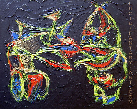
Crazy man meets a crazy fish acrylic painting |
You may be interested to know that artists from every state in the USA, every province in Canada, and at least 105 countries worldwide have visited these pages since January 1, 2005.


