Six compositional boo-boos

0
Dear Artist, Last night, while on jury duty, my fellow juror and I agreed the most common fault seen among entries was in composition. Well drawn, well rendered and well coloured — all came to naught when the composition had significant faults. I’ve often written about what an artist should do. In this letter I’m giving six common pitfalls. Last night we noticed them all. Weak foreground — The foreground appears as an afterthought. Wishy-washy, unresolved or inconsequential — it fails to set the subject onto a reasonable ground or to lead the eye to what the artist would have us see. Even in abstract or mystical work, a foreground needs to be implied and understood as a vital contributor to the whole. Homeostatic conditions — Homeostasis means equidistant lineups of trees, rocks, blocks of colour, or other patterns that are too mechanical or regular. It includes trees growing out of the tops of people’s heads. While sometimes seen in nature, homeostasis is a natural human tendency — a subconscious reordering and regularizing within the brain. “Even in front of nature one must compose,” said Edgar Degas. Amorphous design — The general design lacks conviction. A woolly, lopsided or wandering pattern makes for a weak one. Often, the work has unresolved areas and lacks cohesiveness and unity. “Everything that is placed within the enclosing borders of the picture rectangle relates in some way to everything else that is already there. Some attribute must be shared between all of them.” (Ted Smuskiewicz) Lack of flow — Rather than circulating the eye from one delight to another, the work blocks, peters out and invites you to look somewhere else. “Composition,” said Robert Henri, “is controlling the eye of the observer.” Effective compositions often contain planned activation (spots like stepping stones that take you around), and serpentinity (curves that beguile and take you in.) Too much going on — Overly busy works tire the eye, induce boredom and make it difficult to find a centre of interest or focus. Less is often more. “Take something out,” said the American painter and illustrator Harvey Dunn. Defeated by size — Effective small paintings often work well because they are simple and limited in scope. But when artists make larger paintings they often lose control of the basic idea and what is ironically called “the big picture.” “The larger the area to be painted,” says Alfred Muma, “the harder it is to have a good composition.” Best regards, Robert PS: “A well-composed painting is half done.” (Pierre Bonnard) Esoterica: The path to stellar composition is spotted with potholes. Further, compositional design can be unique to the individual, and intuitive. This approach can be unreliable. Habitual poor composition can have long-term effects on otherwise excellent work. After our engaging juror effort (there were many excellent, compositionally sound paintings), over a straight-up gin Martini (for a change), my friend and I loftily decided to found a “School of Composition” — where only composition would be taught. Like the tattoos on the girl’s back, it seemed like a good idea at the time.   The pit of compositional doom by Carmen Gardner, Haiku, HI, USA  
030612_carmen-gardner

“Na wiliwili o ka aina II”
watercolour, 16 x 29 inches
by Carmen Gardner

As an art teacher, I see so many falling into the pit of compositional doom and, often, when pointing out what I see as an obvious “obstacle,” I get an argument and must allow the person to move forward in “compositional sin.” Your “School of Composition,” should be well attended if the “bar is open” at, say, 8 a.m. for teachers, and served up some classes on how to avoid those red flag tattoos!     Common artistic sensibilities by Glenn Mitchell, Comox, BC, Canada  
030612_glenn-mitchell

“Snags”
watercolour painting
by Glenn Mitchell

I’m an amateur watercolour painter and a professional home designer but my passion is writing and recording music and I’m struck by how often your excellent advice pertains to the other arts. My wife is a painter and amateur musician and we have excellent conversations on the subject. Perhaps it’s no coincidence, due to common human artistic sensibilities. Perhaps a good way to know one has a basic truth is to see it if applies across the arts.   There are 4 comments for Common artistic sensibilities by Glenn Mitchell
From: Norma — Mar 06, 2012

I love this painting… if this is an example of “amateur art” it raised the bar for me.

From: Patricia Warren — Mar 06, 2012

First glance at the painting, I heard myself say “aaahhhhhh”. Amateur? I think not. I live among trees, and I ‘felt’ this grove.

From: Jan — Mar 06, 2012

Glenn- I want to add a resounding AMEN! to your observation on R.Glenn’s advice. Painting is not the medium I’m most familiar with, although I’m taking lessons. My background is in Fiber and Metal and I’m a singer. The words written on this blog apply to life.

From: Raynald Murphy — Mar 07, 2012

Excellent watercolor! Please try to not label yourself and your art. Leave that to bureacrats and organizers of events. Creative people are just that and do it for the love of creating and art whether others label them as beginners, amateurs or professional.

  Intuition or rationality? by Jeanette Paul, Longueuil, QC, Canada   While you have given great pointers on what to avoid, what I would really like to know is how other artists’ hearts and/or brains are working when they compose. Does the composition just come to them at once, intuitively, while they are viewing a natural scene, or is it more of a mechanical, rational process of adding in and taking out? Must the entire composition be visualized or thought out before starting to paint? Is it possible to repair significant defaults in composition after the fact? Your school of composition sounds like a plan to me. There is 1 comment for Intuition or rationality? by Jeanette Paul
From: Nancy — Mar 06, 2012

As an art teacher myself, I have to say “yes” to your question: all of the above applies. You have to have a basic understanding of compostition in the first place (triangle, etc.) but after that, I feel that a lot of inspiration determines the rest. You “know” if a composition is pleasing and will pull your viewer in.

  ‘Know-nothing’ jurors by Gilda Pontbriand, Ottawa, ON, Canada  
030612_gilda-pontbriand

“The road ahead”
original painting, 16 x 20 inches
by Gilda Pontbriand

I had been a representational painter for many years, but at one point in my career I decided to step into abstraction. Without a focal point, I found myself confused about composing my painting. I decided to enter a competition to find out if I was going the right way (composition-wise). The jurors would probably steer me in the right direction, I thought. I was expecting the kind of critique that you mentioned in your letter, clear the boo-boos and work from there to improve my pieces. To my surprise the jurors knew very little about critiquing art. My painting was not accepted in the show and, among the three jurors, the only reason they could come out with was this: “not accepted – pink color looks chalky.” I could not believe my eyes. They were three good painters who decided to become jurors, but probably knew very little about composition; otherwise, they could have mentioned whether it was good or bad. Therefore, a “School of Composition” is definitely not a bad idea. Your letter could have helped me a lot. There are 3 comments for ‘Know-nothing’ jurors by Gilda Pontbriand
From: Marilyn — Mar 06, 2012

Gilda, I find “The road ahead” to be intriguing. You have a great imagination and not afraid to use it. I’m not a great artist and certainly not a juror. I’ve wondered about abstract art and how and why great artists reach into the abstract realm. This work is sort of surrealism, if I can offer that. Immediately I see a tree that has human form. If you meant that to be or not, that is what I view. As for the ‘pink,’ it lends to some mystery which I find well distributed and compliments the other hues. (We never know for sure about “the road ahead” if we have never been there.) I am drawn to your focal point immediately because you have used the background colors very well to bring out the center of attention in the painting. I would say there is composition with this painting. I hope you don’t mind that I took the privilege of commenting but when I saw your painting, it really stood out as a very nice art work.

From: Frank — Mar 07, 2012

Keep in mind that being a juror is not a career that someone goes to school for. It’s typically a casual task that an artist takes on for a loose change, after being pestered by some organization. It’s a charity work. So take it that way and don’t expect to get education from jurors. These people give what they can and they would probably rather spend the time in their studio, creating their own art.

From: Marilyn — Mar 10, 2012

Frank> You are so right about jurors. I have been a juror for an Arts and Craft Festival in our home town and I certainly am not one to judge the many works of art. Famous painters as jurors is another matter. But, in many cases, it depends on their chosen medias and art interests. I have seen many wonderful paintings/drawings ignored because a juror was a professional photogrpher; photograpy drew his attention and won First place or Best of Show. It is not an easy task and, as you said, “…would rather be in my studio..”

  Thoughts on composition by James Kissel, Canton MI, USA  
030612_james-kissel

Untitled
watercolour painting
by James Kissel

There seems to be a dearth of good information on pictorial composition. There are no end of Web references that explain the 7 or so elements and 8 or so principles of visual design, but try to find one good website /book /video /dvd /workshop on composition and/or any visual composition process. At best I’ve found a number of good compositional check lists although most are of a negative inflection such as your ‘Six compositional boo-boos.’ Nothing wrong there. I agree with everything you said in this post. I just wish for a lesson on composition in the positive vain. e.g. “Here is how to apply the ‘L’ armature to an urban landscape.” Along those lines, I have come to realize that there isn’t ‘a composition process’ though there may be schools of thought on how to compose a picture in a particular style. I’ve found a compositional framework that I find useful and that I can work within. Ian Robert explained the 5 picture planes in his book Mastering Composition: Techniques and Principles to Dramatically Improve Your Painting. 1. Format: square, landscape, portrait… The Four Most Important Compositional Lines are the edge of your painting and size. 2. Armature: the direction or flow of the main movement of the painting. 3. Abstract Shapes: the main masses, their relationship to each other, and their interaction. 4. Subjects: Bottles, mountains, people, a river… 5. Details: A street lamp, a pearl earring, a distant figure, trees. Therein is the outline, chapter by chapter, for a good composition book — Unfortunately, the one Ian didn’t write. I’ve tried to explore the deciding factors for choosing a particular size and format with a few like-minded painters, but the idea of having some rules/ guidelines to a process for picking a particular size-format seemed to be beyond the comprehension of my small discussion group. Perhaps you might like to take up this particular subject. In closing, I would like to add another chapter to the above list. I call it the 0. Chapter: In the beginning… It would try to illuminate the thought process of picking a particular subject to paint. Painting what I feel as opposed to painting what I see. Before the sketch. Before the thumbnail. Before even unpacking the easel if one is painting en plein air. (RG note) Thanks, James. To that I’d add the classic Composition of Outdoor Painting by Edgar Payne. There are 2 comments for Thoughts on composition by James Kissel
From: Jackie Knott — Mar 06, 2012

If there is one practice that benefits an artist in visiting museums and galleries, it is pausing at a painting not just to admire it, but break it down to it’s elements: WHY is this a great painting? Because _____ painted it? No, but because he or she employed all of this discussion in the composition. I’ve gone so far as to take a tiny spiral blank notebook and drew the composition in basic form, pyramid, circles, rectangles and trapazoids, stick figures, zags in a river, direction of a line or road, etc. In doing so, deliberate structure becomes obvious. It is an exercise, a composition class in immediate real time. Try it, if not on paper, mentally.

From: Kathleen J — Mar 06, 2012

I like your idea Jackie – I am a visual so it makes more sense to me than reading rules. I can see a good composition almost intuitively but it is much harder for me to understand rules in written form.

  Finding the anchor by Elizabeth Bertoldi, Toronto, ON, Canada  
030612_elizabeth-bertoldi

“Golden woods”
acrylic painting, 24 x 36 inches
by Elizabeth Bertoldi

As a mainly abstract painter, I often struggle with composition, as there is no anchor to the reality of images such as landscapes or portraits. I find myself turning the painting around as I paint, striving to make sure the overall design “works,” i.e. has balance, unity, harmony, from every point of view, landscape and portrait orientations. However, some of my paintings have been critiqued by juries as “lacking focus” or “lacking composition ?” Should I use the “golden mean” of 1/3 – 2/3, and find a focal point at the intersections of the grid? Often that seems forced to me as I get into the “flow” of a painting. What advice would you have about the challenges of composition in abstract / non-figurative paintings? (RG note) Thanks, Elizabeth. Even though you are making an abstract, it’s best, as you say, to start with “an anchor.” I find this to be often a motif such as a bird, a car, or whatever, and then “abstract it,” as the saying goes. The end result may look nothing like what you originally had in mind, but that’s okay. The other way of starting is with nothing much and “finding the anchor,” akin to stream of consciousness writing. This system is also viable and a lot of fun.   Turn of phrase by Lisa Schulte, Traverse City, MI, USA  
030612_lisa-schulte

Untitled
acrylic painting
by Lisa Schulte

My ten year old neighbor was visiting a couple days ago. The kids had a snow day from school; it seems winter has finally come in time for spring! I had written out a quote from a past letter which I had on a sticky note on a cabinet. “The noon balloon to Rangoon.” He was quite taken with the concept and we made up a few of our own. Midnight mover to Vancouver Morning motor to North Dakota Evening elephant to Ethiopia (RG note) Thanks, Lisa — and your ten year old friend. I’ve always liked “Hypothermic catatonia in Patagonia.”   Nature’s art critique by Tom Relth, Casablanca, Morocco   My studio is on the third floor. Yesterday, I took some finished works out onto the balcony. I brought them all back but got distracted and forgot about one of them. About two hours later I remembered and opened the door to the baloney to go out… the wind blew into the studio and slammed the entrance-to-the-studio door closed with a big BANG! I went back in to see it and found that I was locked inside. That was when I noticed that I needed to use the bathroom. Note here that there is no other access back into the house from the balcony. I checked all other doors and windows. They were locked up tight. I banged on the studio door to get help… no one came. I phoned the house-helper: no answer… and phoned Leslie… no one answered. (Oh right… Leslie went to the store) Oh great. After ten minutes of bathroom panic, I looked back over the balcony and noted that while I was banging around Leslie had come back, so called her again. She came up and let me out (no comment). I went to use the facilities. Returning to the studio, I took the complete door handle and all of the hardware off the entrance-to-the-studio door. There is still a door there, but it won’t do that again. I went out, got the remaining painting and brought it in and set it on the floor in the hallway just outside of the studio door, out of the way but facing out so I might look at it later. And later I did. There was an accent stroke pretty much right in the middle but just off center enough to look very deliberate and adding a new kind of asymmetrical balance. I did not remember painting that. I approached. It was a kind of grey-black oval, very textured almost encaustic. I guess nature was making a critique of my work. I considered leaving it, but in the end scraped it off. I went back into the studio, encouraged. There are 2 comments for Nature’s art critique by Tom Relth
From: nan fiegl — Mar 06, 2012

I laughed and laughed! Just like a Three Stooges movie, without two of the Stooges!

From: Tatjana — Mar 07, 2012

Loved the story and especially the punch line, thanks!


Archived Comments

Enjoy the past comments below for Six compositional boo-boos

   
From: Daniela — Mar 01, 2012

Thank you Robert for another great letter. Sadly, there is too much awful work out there. Composition and color mixing were once, 2 of the most important subjects in art, along with endless drawing, drawing, and drawing. I find more and more that I only go to exhibitions and keep books that have old content, I honestly believe any really worthwhile art instruction I found was in books, art college’s only worth was it kept us fairly constantly drawing.

From: Violetta — Mar 01, 2012
From: Mary Sheehan Winn — Mar 01, 2012

Well said and sadly, true. The next worst thing is poor color selection or garish color ‘dis’harmony. Both instantly kill any positive attributes in artwork.

From: Marvin Humphrey — Mar 01, 2012

True. As in construction, correct support is a priority. Everything must be balanced, straight, level, plumb, and square.

From: Gabriella Morrison — Mar 01, 2012

It does sound folksy to refer to ignorant compositional practice as “boo boos”, and slightly pretentious to use the scientific term “homeostasis” in improper context. I don’t know where you learned terms and methods of composition Robert, but may I humbly venture that what visual appearances you refer to as “homeostasis” in this current letter is an incorrect, or perhaps idiosyncratic, use of that word.

From: Sarah — Mar 02, 2012

I also agree with the poster who stated that color is another weakness I see in so many works today. Garish colors are used so often and they can over power a work completely. Rarely do I see a mastery of the use of gentle transitions in color tones, which make a work much more interesting.

From: Diane E Leifheit — Mar 02, 2012
From: Lorraine — Mar 02, 2012

Good composition is a result of preliminary sketches and a lot of thought. So many of us are too eager to jump in with color because it can be intoxicating.

From: Nina Allen Freeman — Mar 02, 2012

I love this letter and thinking of copying it for my students. You have made the same comments I have over many times, only in an interesting and unique way. I have been to many workshops and find that so many teachers focus on technique and that design or composition is usually added only as an afterthought; as though the artists are supposted to know that already. Many do not. I make design a part of all my classes, using critique time as an opportunity to teach design, giving handouts and short talks about it as well. You can have wonderful technique but the painting will fall apart if the design is flawed.

From: Doug Mays — Mar 02, 2012

Realtors preach – “Location, Location, Location”, while artists should preach – “Composition, Composition, Composition”.

From: Carole Mayne — Mar 02, 2012

100% agree– There is a huge difference between ‘studies’ whether small or large scale, and ‘finished’ works. The opportunity for ‘anyone to post (and sell) their art’ on the internet has created a need for an educated critical eye, now more than ever. Student art has mixed in with professionals artists, and the public is saturated with images. For quality control, I like to ask myself a tough question: Will this artwork be loved and relevant in 500 years?

From: Doug MacBean — Mar 02, 2012

Good composition is a must, for a good painting. I always find the basics easy to follow in all my work; circular, triangular, serpentine, help move the observer, to the focal point of interest, in two dimensional works. Doug MacBean

From: Ann Trainor Domingue — Mar 02, 2012
From: Sherri — Mar 02, 2012

I totally agree… And, if you decide to create the “School of Composition”, I’d like to sign up!! :)

From: Luc Poitras — Mar 02, 2012

Thanks for reminding me of the basics. Keep it basic. I find that as I’m getting older, I need the reminder more often.

From: Vicki Ross — Mar 02, 2012

I would LOVE a composition only school! Too many artists want to get the pizazz before understanding in depth the foundations, i.e. wanting a pretty picture to frame before they learn how to mix color, or plan composition, or draw. Everyone could slow down a bit and do their homework.

From: Tatjana Mirkov-Popovicki — Mar 02, 2012

And yet, one can find inspiration and excitement in finding ways to break the rules. From some reason, I feel extremely bored with the idea of following rules in creation.

From: Bill Stephenson — Mar 02, 2012

So after reading today’s letter on composition, my next question was “where do I sign up for the class on composition?”

From: Karen Bray — Mar 02, 2012

I read your letters often and I am sad to see that all your quotes in this letter are by men. Surely……

From: Alana Dill — Mar 02, 2012

I really enjoyed reading this. I know I have composition problems. I tend to get too busy in too small an area. Do you have a favorite source of “do and don’t” comparisons to help train my eye? I know what I like to see, but often, I don’t know exactly why.

From: Sue Turnbull — Mar 02, 2012

If you and your fellow juror did found the School of Composition, I would be most interested in attending. I have taken classes and read books and, over many years of drawing and painting, I have gleamed various aspects of composition. To have a truly knowledgeable source, with no hunting and guessing, would be amazing!

From: Marilyn — Mar 02, 2012

Your words of wisdom are well received. I wonder about “wild abstract art” and what composition means to the artist? Is composition simply ignored? Other than colors that compliment, I can’t begin to tell you what some abstract art means to the artist let alone the viewer. I’m not knocking abstract art, just trying to find out why… Also, I look at some art work and it would be the same if I painted without my eye glasses. The blurs are very disturbing to me. Help! me understand.

From: Gavin Logan — Mar 02, 2012
From: Daniela — Mar 02, 2012
From: Brenda Behr — Mar 05, 2012

First we ask, what’s the center of interest, the dominant element; where do I want the eyes of the viewer to go? Once this is established, the placement of that element in the format is crucial. Equally important is the arrangement of the supporting elements and where we want to crop our view. As a painter who prefers to work from life or en plein air, a tool I find extremely helpful is a viewfinder. There is one on the market called a View Catcher that I can’t recommend highly enough. Among other features, the View Catcher has a slider that enables one to set the viewing frame at most standard sizes. Whether I’m working in the studio with a model, or in the open air, I don’t like to design a painting without the help of a viewfinder. Call it a crutch if you want, I find it crippling to design a painting without one.

From: Suzie Althens — Mar 05, 2012
From: Barbara J Carter — Mar 05, 2012
From: Sheila Minifie — Mar 06, 2012
From: Janet bergeron — Mar 06, 2012

As an art quilter, I have found so many of your Letters extremely relevant. Love it! Janet inIowa

From: Randy Davis — Mar 06, 2012

Robert- Reading your letter towards the end and your idea of a “School Of Composition” sounds fabulous!! I for one would sign up in a heartbeat! I to think composition is the main deal in a good painting. If you have any resources you may recommend on the subject, I’d love to hear about it. Would you mind listing the little “ploys” you use in your workshops?

From: Tom PIROZZOLI — Mar 07, 2012

Diagonals are so important in a painting and I did not see them mentioned in your compositional directives

From: .Kim Weers — Mar 07, 2012

I’ve just read your blurb and the comments on boo boos, and there are obviously many of us who would love to participate in a composition course–and learn about your ploys. Add my name to your list. Thanks

From: Helen — Mar 10, 2012

Love your letters Robert, a source of ongoing inspiration and food for thought. It would be exceptionally useful if you could provide images to accompany the ‘compositional boo boos’ that you describe. Context always helps, Cheers, Helen

     Featured Workshop: Brenda Boylan
030612_robert-genn Brenda Boylan workshops   The Workshop Calendar provides up-to-date selected workshops and seminars arranged in chronological order. 
    woa
030212_eloise-giles

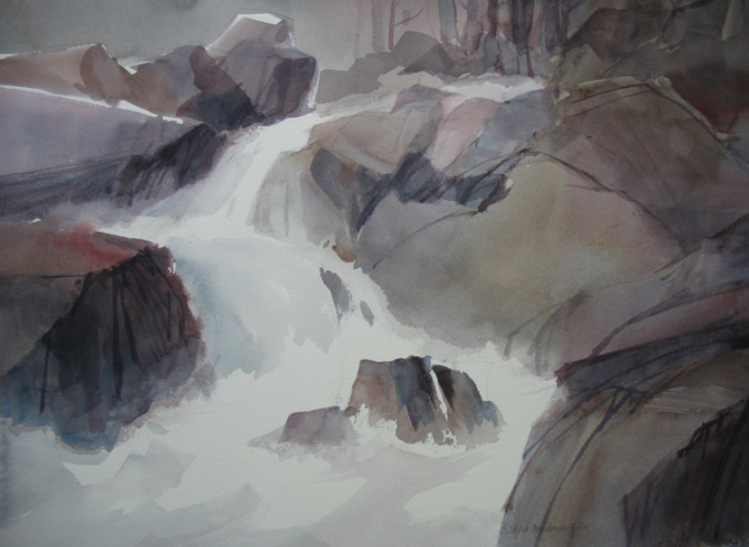
Mountain stream

watercolour painting, 14 x 21 inches by Eloise Gardiner Giles, USA

  You may be interested to know that artists from every state in the USA, every province in Canada, and at least 115 countries worldwide have visited these pages since January 1, 2013. That includes Shizue Cooper who wrote, “I appreciated receiving six common pitfalls. Could you also give me tips for backgrounds next time?” And also Dag Bellow of Facebook who wrote, “I am doing far more wrong things than six.”    
Share.

Robert and Sara Genn Twice-Weekly Letters

Subscribe and receive the Twice-Weekly letter on art. You’ll be joining a worldwide community of artists.
Subscription is free.