Dear Artist,
One of the problems with talking about palettes is that those little blobs of paint are a moving target. What’s happening one day may be replaced by something else the next. Further, pros are often able to make successful works out of practically any combination. Actually, the game of “palette handicapping” is a fun exercise and wildly energizing. You play “PH” with any screwball colours and, by hook or by crook, you make them work.

“The Forge of Vulcan” (1630)
oil on canvas, 223 x 290 cm
by Diego Velázquez
Having said that, there were times when palettes were rigidly set and students had to mix in a certain way. Carolus-Duran (1837-1917), a name that may not be familiar, was a significant Parisian portraitist who also ran an art school. An admirer of Velasquez, he spawned John Singer Sargent and other illustrious painters. For both students and pros, Duran insisted on a minimal palette: Black, emerald green, raw umber, cobalt blue, “laque ordinaire,” light red, yellow ochre and white. The colours were placed on the palette in this order from left to right. As well, students were expected to pre-mix three gradations of yellow ochre and white, two of light red and white, and two of cobalt and white. Another pre-mix was black and raw umber.

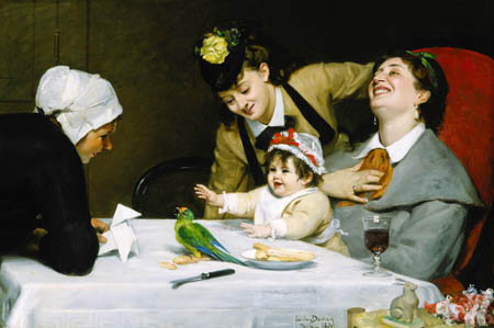
“Equestrian Portrait of Mademoiselle Croizette”
(1873) oil on canvas
by Charles Carolus-Duran
Duran was an interesting guy. He didn’t allow small brushes in his school. He appeared at his “atelier” on Tuesdays and corrected drawing. He reappeared on Fridays to crit the week’s work. Duran didn’t charge his students. A successful and upwardly mobile painter, it was his way of helping young people whom he considered talented.
Authentic information on traditional palettes and academic methodology is hard to dig up. Snooping around in a dusty London bookshop, I recently found an 1890 Manual of Oil Painting by the Pre-Raphaelite painter John Collier. While it’s loaded with all kinds of charming ignorance and archaic writing, it gives an idea how people of a certain station thought in those days. The book is also filled with valuable technical info. Speaking of charm, at one point he recommends cleaning brushes by taking a little soap and scrubbing them into the palm of your hand. Oh, yeah, I do that with my emerald green all the time. But Duran’s portrait instructions, as reported by Collier, were remarkably modern — heavy blocking-in at first — “a coarse wooden head hewn with a hatchet — in fact — a big mosaic.” Better advice was never given.

“The Cheat” (1905)
oil on canvas
by John Collier
Best regards,
Robert
PS: “In setting up the palette, economy should be studiously avoided.” “There is no difficulty in painting detail–the real difficulty lies in getting the truth of tone and tint.” (John Collier), (1850-1934)

“The Favourite Poet” (1888)
oil on canvas
by Sir Lawrence Alma-Tadema
Esoterica: Another palette-wizard, highly successful in his day, was (1836-1912). His palette, locked in and disseminated by London’s Slade School, Collier and others, was brown ochre, yellow ochre, Naples yellow, flake white, orange vermilion, light red, Chinese vermillion, rose madder, cobalt blue, burnt sienna and ivory black. Raw umber and Cadmium yellow deep were reserved for emergencies. Painters who used these sorts of palettes were not only able to make remarkably wide-ranging and harmonious effects, but they also made paintings that held up. One might conclude that guys like Duran, Alma-Tadema, Collier and Sargent knew what they were doing.
Palette Pointers
“Merrymakers” (1870)
oil painting
35.5 x 55 inches
by Carolus Duran
“Welcome Footsteps” (1883)
oil painting by
Sir Lawrence Alma-Tadema
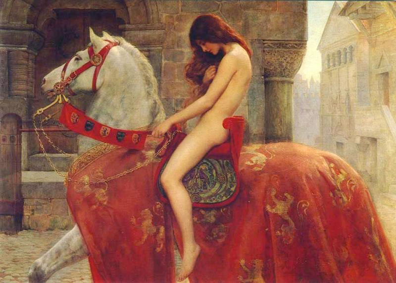
“Lady Godiva” (1898)
oil painting by
John Collier
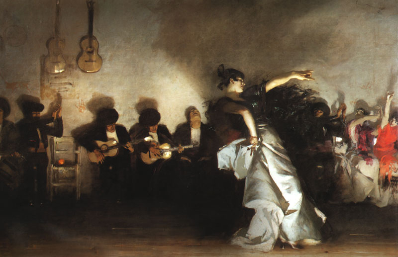
“El Jaleo” (1882)
oil painting
93.5 x 138.5 in
by John Singer Sargent

Mrs. William Astor” (1890)
oil painting by Carolus Duran
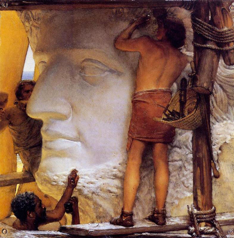
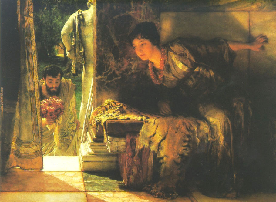
“Sculptors in Ancient Rome” (1877)
oil on copper by
Sir Lawrence Alma-Tadema

“In the Venusberg Tannhauser” (1901)
oil painting
by John Collier

“President Theodore Roosevelt”
(1903) oil painting
58.5 x 40.5 inches
by John Singer Sargent
Palette of CMYK
by Richard Nelson, Maui, HI, USA

Digital colour matrix
Why do artists find it so difficult to recognize that color and color palettes need not be arbitrary? Why all this mystery and colour cults? The printing industry relies on the scientific fact that with their palette of CMYK (Cyan, Magenta, Yellow and Black) all colors can be produced. Every computer printer should remind us that this is not an arbitrary palette, but “THE PALETTE.” And when will artists recognize this is not a limited palette? All other palettes are arbitrary and limited. Find me any color that I cannot reproduce with a CMYK palette and I’ll be silent, once and for ever.
I’m attaching a color matrix produced with only the four CMYK colors as visual evidence of what the printing industry has been telling us for decades. I can see my matrix on a computer screen which translate CMYK into RGB (Red, Green and Blue-Violet), or light primaries. We can also print the image with little or no variation, using compatible printer setting and paper.
Even when presented with these facts, many artists choose to hear not; see not; do not.
There is 1 comment for Palette of CMYK by Richard Nelson
Thinking and not thinking
by Andrew Baker, South Downs, UK

Self-Portrait
by Andrew Baker
Controlling a palette has been one of those bugbears for me. I never really know what the priorities are and from the beginning lose my head in random disorder. Too much colour lazily selected. Control it seems is bad preparation for making the unexpected. Alas, chaos often has predictable results and these are seldom good. Perhaps it is not chaos at all. It’s the time spent in thinking and then not thinking about the thinking you have just digested. Relative values are surely at the heart of the painters striving and the palette should perhaps intuitively follow this notion.
Colour and nudes
by Elizabeth Nees, Long Beach, CA, USA

“After the Rain 3”
acrylic, oil, and oilstick on canvas
48 x 48 inches
by Elizabeth Nees
While I was taking life painting in art school, painting the nude model, I was very lazy about mixing colors. I was in a rush to get the paint to the canvas, and even though I squeezed out every color in my paintbox onto my palette, I always ended up using the same four colors: cadmium red light, cadmium yellow pale, black, and white. Believe it or not, this worked for me. I had a good eye for value and intensity, and this (and simplicity) were all I cared about anyway.
The key to figure painting, or any “realistic” painting, in my mind, is not the figure, but the space around it. Get that right, and the figure will take care of itself. This is the main problem I see in the work of students and amateur painters: They separate the “thing” they are painting from its context, which is space and light. It’s all one. But “realism” is a slippery little fish too, isn’t it?
Tell me, what on earth is laque ordinaire? Is this a pigment?
(RG note) Thanks, Elizabeth. Laque ordinaire is undoubtedly Carmine Lake, a discontinued, fugitive colour that has been replaced with Napthol red, and others. Laques or lakes were derived from lac and were made into a wide variety of colours that were largely phased out in the 1920s.
Stick to your palette
by Larry Moore, Orlando, FL, USA

“Streaming light”
oil on canvas, 14 x 18 inches
by Larry Moore
I teach a limited palette in workshops but that’s to help the student really learn how to mix color and not rely on whatever comes out of the tube. However, I know artists’ palettes are as varied as sunsets. Anders Zorn did a pretty spectacular painting using yellow ochre, black (ahem!), red and white in “self-portrait with model.” In fact, he included the colors in the painting just to say, “See?” Some paint with 3 primaries, some with a palette of 17 colors and then the prismatic approach is off the charts. But the point is, whatever palette you are using, stick to it for a long while and learn it so you no longer have to think about mixing. I’ve attached a painting I did as a limited palette challenge; yellow ochre, ultramarine blue, permanent red and white. Next up… the Zorn challenge.
Palette evolution
by Heather Horton, ON, Canada

“Palette 2006”
by Heather Horton
I have made a personal contract to paint my palette once and only once each year.
The point is, at the end of my career I would like to look back and see how my technique, the palette colours and various other elements of my palette, change and evolve over time.
Another reason for undertaking this exercise is that over time we are in different places emotionally/physically/spiritually etc. The paintings will be little indicators of where I am from year to year, literally and figuratively.
I have no real rhyme or reason to where I lay down my colours on my palette. I also “cheat” by using cad orange… sheerly for time economy do I use it.
Famous students of forgotten teachers
by Paul deMarrais, TN, USA

“Portrait of Carolus-Duran” (1879)
oil on canvas, 46 x 37 inches
by John Singer Sargent
Carolus-Duran was a well known artist of his day but if it weren’t for John Singer Sargent and the portrait he did of his mentor, it is likely you would never even see his name mentioned in art history texts. I guess it is the hope of every teacher that one of his/her students becomes famous and passes on his name and methods. Gerome was another famous teacher and artist of his day who was teacher and mentor of Thomas Eakins whose fame far outstrips his mentor. Gerome’s name also crops up in the background of various now-famous impressionist artists who spent brief, often unhappy, periods at his atelier. Otherwise he too would be long forgotten. Speaking of palettes it is intriguing to look at Sargent’s “impressionist” paintings and how his palette made them vastly different from Monet’s. A lot of it has to do with Sargent’s love of black and his more traditional portrait painter’s palette. So many painters were influenced by Velasquez in the pre-Impressionist era… Manet, Carolus-Duran, Courbet, Sargent, Degas are but a few. Velasquez’ paintings are more about keen observation of values than color, and Sargent took this art to a very high level. Simplified palettes like Velasquez give a natural boost to color harmony. The brighter palette introduced during Impressionist days can take a lot of skill to manage color harmony effectively. Look at Cadmium yellow as compared to Yellow Ochre or Naples Yellow. Cadmium yellow is so much more powerful. In the end I agree with you and disagree with the great palette manager Whistler. Palettes are great fun to study but, a great knowledge of palettes will not make you a great painter!
Learning to mix primaries
by Pat Kelly, Ramona, CA, USA
Many of my students find the use of color mysterious and intimidating. I try to set them on the path of learning with a good understanding of color theory and how it applies to the paints on their palette. I encourage them to use a limited palette of primaries, two of each. This way they are forced to learn to mix all secondaries and grays. The problem with some of the traditional palettes that include ochre, umber etc. is that they necessitate mixing formulas, they do not work well using color theory. I always ask where is ochre on the color wheel? The answer ends a lot of confusion. (It’s not on the color wheel: it is a gray.) In this week’s letter you touched on specific palettes. In ages past, knowledge of these palettes was as much a matter of economy and availability of pigment as anything else. These days, we have the luxury of squeezing out ultramarine and cadmium yellow to our hearts content.
Black secret
by Pepper Hume, Spring, TX, USA

“Blues”
mixed media doll
by Pepper Hume
Letting go of the “official” palette that one is taught in art school can be a little traumatic. Actually buying gasp — black watercolor or acrylic paint felt disloyal the first time. Recently, I forcibly liberated my palette to one red, one blue and one yellow. At the moment I’m playing with cad red medium, Prussian blue and yellow ochre. Why am I amazed that I can produce pretty well all the colors I want from three primaries? I’m really having fun letting the three colors play in the water. Shh, don’t tell, I do have a little dab of black on the palette sometimes, too.
Palette habits
by Luke Charcuk, Surrey, BC, Canada

“Woman with Parasol, Madame Monet and Her Son” (1875)
oil on canvas, 100 x 81 cm
by Claude Monet
Old Masters may have used limited mixing formulas due to lack of availability in ranges of colour pigments. They also related to the conditions of the technology of light in which they lived, such as oil lamps and candles in studio conditions. The advent of plein-air by Corbet, The Pre-Raphaelites and the like may have simply brought daylight spectrum to the eyes of the creators. Quoting from about.com:
“To recreate a typical Pre-Raphaelite palette, use the following colours: cobalt blue, ultramarine (substitute French ultramarine for natural ultramarine), emerald green, madder (natural madder fades in sunlight; substitute a modern alternative such as alizarin crimson), earth colours (ochres, siennas, umbers)”
Asked in 1905 what colors he used, Monet said, “The point is to know how to use the colors, the choice of which is, when all’s said and done, a matter of habit. Anyway, I use flake white, cadmium yellow, vermilion, deep madder, cobalt blue, emerald green, and that’s all.”
According to James Heard in his book Paint Like Monet, analysis of Monet’s paintings show Monet used these nine colors:
Lead white (modern equivalent = titanium white)
Chrome yellow (modern equivalent = cadmium yellow light)
Cadmium yellow
Viridian green
Emerald green
French ultramarine
Cobalt blue
Madder red (modern equivalent = alizarin crimson)
Vermilion
Ivory black (but only if you’re copying a Monet from before 1886)
Learned habits
by Albert Seaman, Port Hope, ON, Canada
Presumably, the old saw “first learned, longest remembered…” will suggest that what we were taught as students will usually have a bearing on our choice of colours later, and the way we lay them out on our palettes. When I was at Art School, painting instruction was primarily with oils in life and portraiture. The colours that we were allowed to use and, to a lesser degree, their arrangements on the palette, were dictated by the instructors. Whether they were following orders from on high, or expressing their own particular beliefs we knew not, but under threat of excommunication we did as we were told. Initially, only “earth” colours were allowed. Burnt and raw umber, burnt and raw sienna, yellow ochre and French ultramarine ensured that we all worked from the same base. Note, no black! If black was necessary, it was obtained by mixing burnt umber and French ultramarine in the required amounts to give a cool or warm effect. Once we had learned which end of the brush was applied to the canvas, we were allowed to add terra verte to the palette, for either sketching in the rough draft, or for adding in small amounts to other colours as a siccative. White of course, was not considered a colour, but a large blob of flake white (that lead-based material that disappeared when it was established that artists who ate their paintings could possibly develop “painter’s colic”) was positioned at the left side of the palette. The colours were laid out from “cold” on the left to “warm” on the right. That was for right-handed painters. I don’t know how lefties managed; perhaps they weren’t allowed. In retrospect, it would seem that the discipline of working within strict limitations provided an excellent foundation for later work.
Colour knowledge
by Paul Foxton, UK

“Still Life with Hanging Garlic”
oil on panel, 17 x 12 inches
by Paul Foxton
In my view, severely limiting ones palette can be a revelation. It forces a painter to get the absolute most out of each colour, and to learn all possible combinations of just two or three colours plus white. It’s a difficult exercise at first, but if you want to really get to know a colour, there’s no better way. More colours can always be added once you’ve come to know a handful really well.
For a little while now I’ve been painting with only two, three or four colours. Ultramarine is constant, sometimes only with burnt sienna (lovely complement greys) or raw sienna (more of a challenge). The addition of one or two other earths, say yellow ochre, raw umber or transparent oxide red can expand the palette into a veritable kaleidoscope of possibilities.
Harold Speed, in his book Oil Painting Materials and Techniques, written in the 1920s, advises painting portraits only with black and an earth red to begin with (with white of course), only adding yellow ochre when all the possibilities have been exhausted. His reasoning is that, as well as forcing the student to get everything possible out of a limited range, it provides a thorough grounding in the balance of warm and cool. He also gives some very interesting examples of the palettes of various British painters from this period.
I would encourage anyone to try painting with just two colours at least once, it can be quite an eye opener. Sometimes you don’t need yet another bright cadmium on your palette, you just need to know a single colour better. Employing a limited palette also neatly sidesteps the problem of lack of harmony in colour. I defy anyone to produce an ugly, jarring colour scheme with only raw sienna and ultramarine blue! I think that placing restrictions on your palette can expand your colour horizons, not limit them.
I’d like to link to a couple of examples: This small study was painted with only raw sienna, burnt sienna, ultramarine blue and flake white.
This one went really wild — raw sienna, ultramarine blue, yellow ochre and raw umber. I barely had room on the palette for all those colours!
Methodology
by Ron Elstad, Anaheim, CA, USA

“Dawn of Assurance”
oil on canvas, 14 x 18 inches
by Ron Elstad
I prefer a minimal palette of primaries, white and a few secondary colors, laid out from warm to cool. However, this is an individual choice, because the colors that work for one don’t necessarily work for everyone. It has to be what an individual is comfortable with.
A few suggestions that may be helpful:
One, lay out your palette the same way each time with the same colors in the same place and order. This is for the same reason a piano player needs the keys in the same place. You don’t waste time and thought looking for a certain color.
Two, and this and following are mainly for oil painters, I find it helpful and economical to extract your paint from the very front edge of a particular pile leaving the remainder of the pile fresh. Then periodically pull the contaminated pigment forward away from the original pile of pure color — leaving a large enough space between the piles for mixing — into a secondary pile. This leaves a pile of grays of a particular primary hue. I find these colors work well when mixed with other pure color.
Three, when you’re through painting for a period of time, return your colors to a roundly heaped pile. This is so if your paints should dry before you can get back to painting you can open the piles up like a cocoon. You do so by making an incision the length of the pile with a palette knife, then by pulling the skin to each side you expose the fresh usable paint within.
Journaling
by Janis Ni, Reno, NV, USA
I have recently discovered a simple tool that helps keep me on track — a journal. I spent years bouncing all over the place, experimenting with techniques, subject matters, and other peoples’ ideas. I had a difficult time settling into a series and fully exploring an idea or mood. With a journal I write: my goals for a painting; what works; what doesn’t; what I would do differently; what I want to build on. Ta Da! I have the next painting! Whenever I feel that I’m thrown off my game, I have my journal to remind me where I’m going. After reading your letter, I had another idea to add to my journal — a space for feedback. It doesn’t mean that I have to change the course of my painting based on another person’s comments, but sometimes it is good to look through another pair of eyes.
This brings up another issue. I used to think that in order to truly appreciate a painting, I had to crawl inside the artist’s mind. Lately that view has changed. A painting moves me because of a personal connection. Sometimes I like my interpretation of a painting better than the artist’s! This makes me think that a painting is like a mirror. When I am moved I am seeing a part of me reflected. I recognize it and acknowledge it. Back to the issue of feedback… When someone comes into your creative space and comments, is it in response to a reflection of himself or to what’s actually there?
DVD on color space
by Aliye Cullu, Gainesville, FL, USA
I would like to share a DVD that my painting instructor, Jerry Cutler, recently shared with me. It’s called Navigating Color Space from Robert Gamblin. I found it informative about painting palettes, with ways of thinking about and mixing colors.
Brush cleaning
by Jennifer McIntyre
I was taught to clean my brushes with a little soap in the palm of my hand too, while at university. The reason was that the palm of your hand is soft and will not break or bend the bristles as you gently rotate the brush. I guess also the soap is mild and when the suds remain white you know the brush is clean. Now that we know about absorption of hazardous chemicals through the skin it’s not such a great idea, is it?
(RG note) Thanks, Jennifer. And thanks to everyone who told us about this habit. Trace elements of arsenic, lead, and other toxic chemicals can get into the bloodstream with persistent habitual use of this popular system.
Archived Comments
Enjoy the past comments below for Palette pointers…
Palettes from pictures. There is now a simple way to see the colors used in a picture. You can upload the url of the picture in www.pic2color.com and get a palette. This will be very useful for artists. You will see that the older paintings used a very limited type of colors but to great effect. Editor Pls do so and provide a screen shot. I’m not sure how to do this in this forum.
One small comment from all the preceding comments sticks out for me from Monet. (Sic). its not the colors one chooses, its how you use them. This was made clear to me when one of my teachers showed me that one could make a naturalistic painting using any color combination or limited palette. What he made clear to me was the underlying fact that if you key the entire painting to one color, the result, due to the faithful adherence to this scheme, will result in a naturalistic painting. To better clarify, you see this in the nocturnal paintings of Whistler, Remington, Sargent, Dean Cornwall and others. This can be accomplished with landscape as well as figure painting. Color choice is also relative to the artist. If you examine all the palettes mentioned above, they all had (versions) of the primaries. A red, yellow and blue no matter the hue or name given to it by the artist or manufacturer. If one chooses any variation of these primary hues one can produce a believable result. One can achieve a believable result with one color. The artists arsenal contains value. One color has as many values as the artist wishes to use and skill to handle. History has shown us that art can be created with very limited means. Its the eye, mind and ability of the artist to take whatever they have and use it to its advantage that ultimately effect the result.

Old Peria acrylic painting |
You may be interested to know that artists from every state in the USA, every province in Canada, and at least 115 countries worldwide have visited these pages since January 1, 2013.
That includes John Fitzsimmons of Fayetteville, NY, USA who wrote, “In many ways Victorian Academic painting is the height of the craft but represented a dead end for Modernism and was reacted against. I can only imagine how revolted the appreciator of Collier or Alma-Tadema must have been when they saw a Picasso or even a Monet.”
And also Marion Dinan of Sydney, Australia who wrote, “What a joy it is to read the thoughts of other readers, people I’ve never met, and yet feel they’re Kindred Spirits. It’s early, but I’m off, inspired by the letter, and I’m off to my studio, to lose myself, to immerse myself in dreams and plans and action!”
And also Joseph Askew of France who wrote, “Palette pointers was your first letter that interested me.”
And also Doug Mays of Stoney Creek, ON, Canada who wrote, “One wonderful ‘life adjuster’ or ‘career advancer’ that can make the transition from day job to life in Art, or drudgery to delight, is a book by Robert Fritz called Your Life as Art, which talks about restructuring your life from an oscillating pattern, in which successes are followed with failures, to an advancing pattern, where successes are followed by more successes.”


I’d very much like to see one of your paintings done using this “CMYK” palette. Many thanks.