Dear Artist,
Each of these exercises should take no more than 30 minutes.
You will need Phthalo Blue (Green Shade), Phthalo Green (Blue Shade), Hansa Yellow Medium, and Quinacridone Magenta, plus a mixing white such as Zinc White.
Begin by spacing three primaries in a circle and filling in the secondary and tertiary colours by mixing them from the primaries.
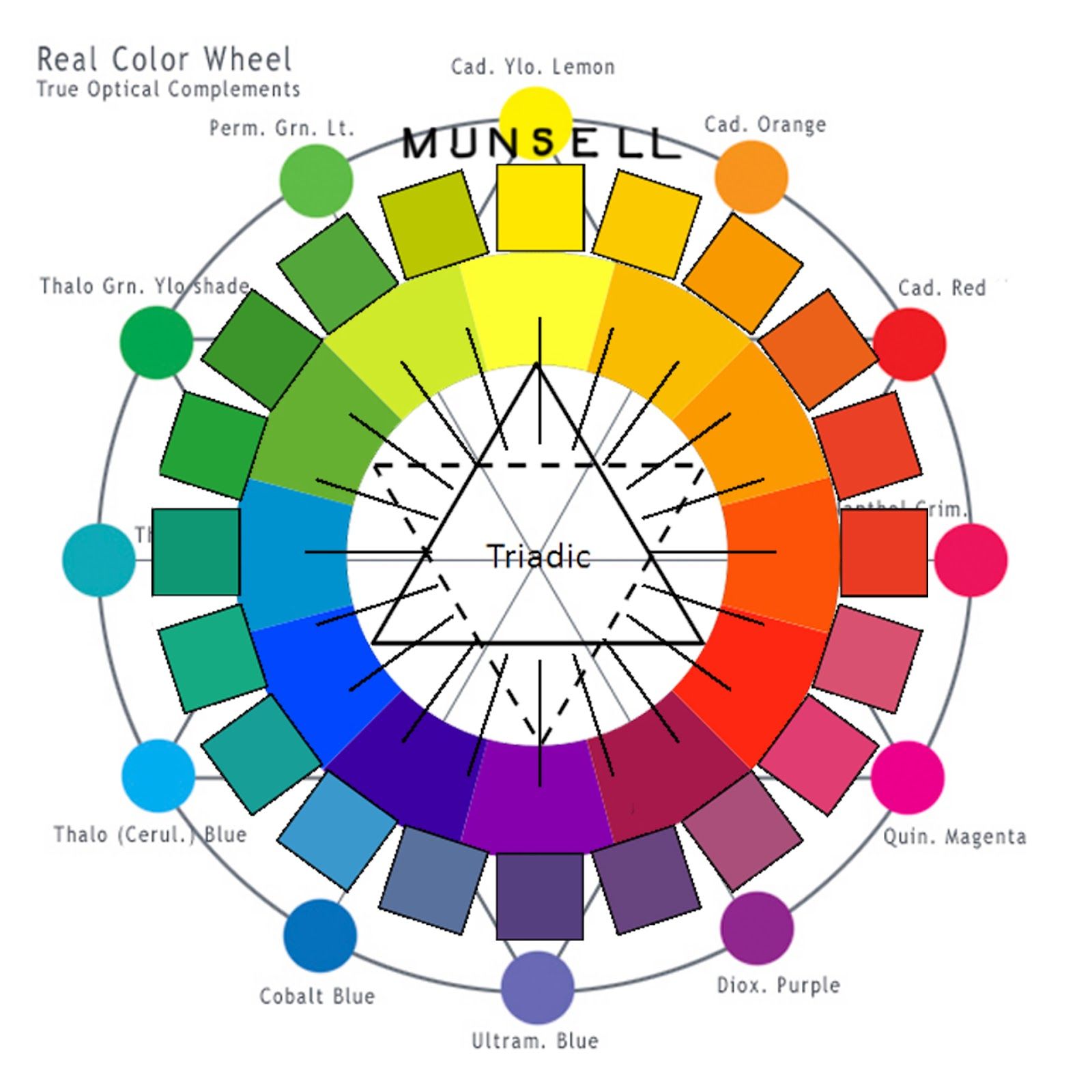
Day 1. Make your own colour wheel. It won’t be perfect. Google “Munsell Colour Wheel” if you need help. This isn’t about having a colour wheel, it’s about making one, and what can be learned by doing that. Begin by placing three primaries (choose one of the blues) equal distance apart in a circle and fill in the secondaries and tertiaries by mixing. Add a second, interior ring that moves up in value (lightness) by adding white to each colour, and so on.
Day 2. Make three small sketches using a larger brush than usual, using only three colours from one side of your colour wheel.
Day 3. Make three small sketches using a smaller brush than usual, using only three colours from the opposite side of your colour wheel.
Notice the value (or lightness) of each colour moves up in the interior rings of the wheel.
Day 4. Make three small sketches using any brush, using complementary colours – colours drawn from opposite sides of the colour wheel.
Day 5. Paint three gradations which move up and down the colour wheel on one side, for example orange to red, yellow to green, blue to purple.)
Day 6. Paint three gradations that span opposites (the middle of your gradation will be a mixture of these opposites, producing a grey, for example orange to blue, purple to yellow, red to green.

The Munsell Color System specifies colours based on three properties: hue (basic colour), chroma (colour intensity), and value (lightness).
Day 7. Mix 5 whites, from warm to cool.
Day 8. Mix 5 darks from warm to cool, but don’t use black.
Day 9. Mix the colour “pepto bismol.”
Day 10. Mix the colour “avocado.”
Day 11. Mix the colour “clay.”
Sincerely,
Sara
PS: “Artists do not live in an opaque Munsell world.” (Golden Artist Colors)

Mix grey by mixing opposite colours on the colour wheel.
Artist Carol McIntyre illustration.
Esoterica: Day 12. Arrange your sketches in such a way as to create a vibration when viewing them together. They should relate to one another, as all on the spectrum rely on each other to build the language we know as colour. In the science and technology used to quantify human colour perception called colorimetry, the Munsell Color System specifies colours based on three properties: hue (basic color), chroma (color intensity), and value (lightness). Created by Art Professor Albert H. Munsell in 1902, the Munsell Color System was adopted by the USDA in the 1930s as the official colour system for soil research. When making your own colour wheel, the experts at Golden Artist Colors suggest the most transparent and organic pigments — Phthalo Blue (Green Shade), Phthalo Green (Blue Shade), Hansa Yellow Medium, and Quinacridone Magenta — for their purity, strength and mixing ability. While they do not perfectly match the prism and therefore what our eyes are doing with light, they’re less muddy when mixed than the inorganic primaries of Cadmium Yellow Medium, Cadmium Red Medium, Cobalt Blue and Cobalt Green. “Remember, we are taking the perspective of wanting to be able to create color mixtures, and we are not really concerned about trying to match a prism. It would be interesting to make such a set of three primaries that would perfectly make the secondaries and complete the ROYGBIV (Red, Orange, Yellow, Green, Blue, Indigo, Violet), but if we are given the task of mixing color, we’ll take the above colors any day. We would also add Titanium White, Zinc White and Raw Umber as well. Raw umber is great to lower chroma and Zinc White is excellent to increase value without turning the original color pastel.” (Golden Artist Colors)

Paul Cezanne’s Aix-en-Provence studio.
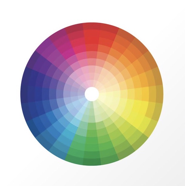
This handy colour wheel and colour chart for studio reference is here.
Have you considered a Premium Artist Listing? With each letter, an artist is featured at the bottom of this page. The Premium Artist Listings are a means of connecting artist subscribers through their work. Proceeds from each listing contribute to the production of The Painter’s Keys.
“There is no model; there is only color.” (Paul Cezanne)
 Purple series #1
Oil on canvas with pyrite and amethyst
48 x 48"/122x122cm
Featured Artist
Candace studied at the Ecole des Beaux Arts in Angers, France but it is her travels in the deserts of Africa and Oman, Antarctica and the Arctic, and sacred sights of Machu Picchu and Petra that serve as her true place of learning. A desire to combine these experiences with a deeper understanding of her own spirituality has provided the underlying focus and inspiration for her paintings.


7 Comments
When you mix complements mix same value with same value. This then allow you better control of chroma. Sometimes you may have to adjust the value slightly. To reduce the chroma by mixing comps try violet and yellow. You will quickly see violet is too dark. Lighten the violet to the same value as the yellow and then mix. This works with all comp mixes.
Great, helpful post, Sara!
This artist loves having an “assignment”, and this is a great one. I’m working with watercolor, trying gouache, and dipping into iPad. I can see doing this three times through!
I like the Munsell wheel as, like the Quiller wheel, it does not use red, yellow and blue as triadic opposites as do the colour wheels sold in most art stores. In the former, the red is shifted closer to the yellow resulting in a wheel that is roughly equal parts warm and cool. Using the triadic wheel to create complements results in browns rather than greys.
This is just a great idea. Thanks. It’s been awhile since I have done this. It will be a renewed learning experience. I can use that in these crazy times.
I really enjoyed this post . What a coincidence. I just finished teaching a class called “Color Mixing” using many of these Golden paints. For years I have taught color theory and have now decided that learning to mix colors is equally as valuable. I’d love to share more LMK if there is interest.
Just a reminder, that Indian Yellow is the one and only transparent yellow. It works fabulously with the other transparent colors and mixtures, and when layering with under-paintings, etc.
Happy Holidays to you Sara, and your artistic and wonderful family (at home and online!). (-: Carole