Dear Artist,
After our mother tongue, colour is, perhaps, our second language. Unlike words, though, colour enters only through the eyes and, as a result, is subject to our perception by way of temporal conditions like light, atmosphere, distance, the materiality of the object, and perhaps most importantly, what’s next to it. These conditions create distortions that are individual to each of us, yet we share in our experience of them and develop visceral and cerebral preferences and prejudices.
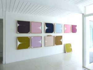
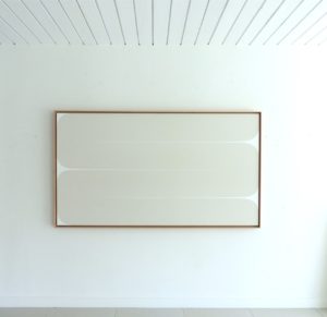
My Heart is a Thousand Colours (work in progress), 2021
Acrylic on canvas
57.5 x 180 inches
by Sara Genn (b. 1972)
Colour’s proximity to other colours especially obfuscates what we call, in painting “local colour” — the colour of an object without the effects of light and shadow, the casts of other objects, or what our eyes do when colours are grouped. When painting the landscape outdoors, for example, local colour is practically non-existent. Painters en plein air practice long looking — so they might identify the colours in nature they’re actually observing, as opposed to what their brains have already told them they’re seeing. In other words, snow is never white.
In my own work, the motto has been, “Never underestimate the power of an obsession.” In abstraction, one must understand the mechanics of the trifecta of hue, chroma and value just as painters en plein air do before they can bring convincing life and light to a landscape. In my case, these tenets are formalized into building blocks for exploration and eye-play. I’m really just striving to achieve a sense of longing and intuitive enjoyment in looking, while removing representational touchstones. Form replaces life-objects because the eye will travel and rest on any form, if graphically sound. In representational painting, colour’s colours are the backbone for creating a successful illusion of reality. Looking is the most important step. The next is mixing. Nature is the guide. Here’s a reminder:
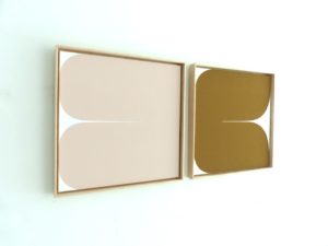
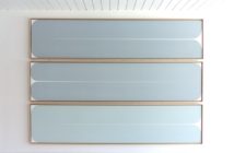
My Heart is a Thousand Colours (Gifted) and (Earned), 2021
Acrylic on canvas
25.5 x 53.5 inches
by Sara Genn
Hue: the colour.
Chroma: the intensity or saturation of the colour.
Value: the lightness or darkness of the colour.
Sincerely,
Sara
PS: “The actual basis of colour is instability. Once you accept that in lieu of something which is stable, which is form, you are dealing with something which is unstable in its basic character, you begin to get a way of dealing with it.” (Bridget Riley)
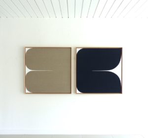
Everything Will Be Okay (Mother) and (Child), 2021
Acrylic on raw Belgian linen and canvas
37.5 x 77 inches
by Sara Genn
Esoterica: Within these nuts and bolts, every painting’s colour story will benefit from a splash of “counterpoint.” Counterpoint is the big sister to “complementary” — opposites on the colour wheel which create high and low-key vibrations, mix sophisticated greys and spice up dull monochromes. Where complementaries can be used stealthily and as a colour surprise throughout a composition, think of counterpoint as an intention, built into the work by way of unexpected visual undercurrents. If you’re still with me, in music, “counterpoint” is the relationship between two or more musical lines which are harmonically interdependent yet independent in rhythm and melodic contour. Its use is especially masterful in the compositions of J.S. Bach, but the device is prevalent in all kinds of art, including writing and painting. Counterpoint is different from harmony in that it doesn’t ride the same line to make one harmonically sound melody, but rather weaves in and out of a dialogue, providing tension with its own voice; like a punchy sky, cut between trees. In abstraction, counterpoint can be thought of as a pulling away from obvious or resolved relationships of form and colour. It’s all in an effort to create a rhythm to looking, and to conjure a sense of pleasurable longing within opposing intensities in saturation, lightness and darkness and warm and cool associations. Personally, it’s perhaps also an effort to stabilize a mutable force: to play at ordering nature while embracing its mysteries. In doing so, we can strive for a delicate joy; in the pleasure of the travelling eye, in reorganization, in preference, in separation and connection, and in togetherness.
“All colours are the friends of their neighbors and the lovers of their opposites.” (Marc Chagall)
The exhibition Looking for Colour opens at Gallery Jones, 1-258 East 1st Avenue, Vancouver, BC, Canada on October 14th, 2021. If you’re in the neighbourhood, I would love to see you.
Featured Workshop
 Join Ellie Harold for “Intuitive Painting: Permission to Paint Expressively,” designed especially for mature women artists of all skill levels who wish to explore this medium for soulful exploration. The retreat provides attractive accommodations (your own room!) along with lightly structured activities for centering, relaxation and low stress art-making. You’ll have plenty of free time to muse, paint, write and reflect while enjoying the colors, textures and flavors of San Miguel. This Retreat has the potential to transform not only your art but your life! You’ll return home with a specific art “care plan” to assure support for further creating. Details at www.EllieHarold.com.
Featured Artist
Capturing the beauty of nature and expressing those impressions in oil paint is a joy. Every hour of the day presents new possibilities and keeps even the same landscape location, same composition, an ongoing and beckoning challenge. For this reason, I love painting series: it is exploration made visual.

12 Comments
Your work has intrigued me for years. I’m entranced with your allusion to 1000. There is an old Chinese adage (at least that’s how it came to me): “to learn to draw, you must draw the 10,000 things.” I sent a drawing and a note to a friend a few years ago who took on this task and actually did it, drawing a few ‘things’ every day, and numbering them in about 50 little sketchbooks. When she achieved it, we had a big party celebrating it in my studio. She continues this practice and has inspired many of us to do the same. I find that I can’t understand someone’s thread in their work without seeing a lot of it, and to see your work, as well as your title, “My Heart is a Thousand Colours” brings me to a higher state of reverence for your work. My friend, Gwen Diehn has written a number of books on journaling, printmaking and drawing, including a little book with many of the 10,000 drawings.
Wish I could come to Vancouver to see your exhibit. And react to the scale as well. I love the photos that show the ceiling, as I can then put myself in that place and really ‘see’ the work.
I teach color theory (first at a college here, and now on the road for workshops) and will tell the story of your work to my students. Thank you for all you do, especially for continuing this blog. I’m a fan.
Dear Sara.
I have never posted a comment anywhere before. Today, I must.
I have been moved by your very loving writings about your mother. I have been moved by your thoughtful and generous writings about art. I have learned from you and from your father before you.
This piece really speaks to me – your visual art and your prose are masterful and fully complimentary.
Like Annie, I too wish I could come to Vancouver to fully appreciate your paintings in situ and to meet you….
I thank you for sharing insights gained as a result of contemplative way of living, and for openly and freely teaching us all. Thank you
Sarah Rochon
Colour is a complex language that you communicate so well Sara. Thank you for the reminders of how colour can offer so much to both the artist and viewer, En Plein Air or into abstraction, in play and in relationships. Congratulations on your latest artwork and exhibition! Looking forward to seeing it.
I see tulips, buns, bums, butterflies, leaves, and I could go on. It looks like fun as well as well thought out placement.
Seeing a body of your work and reading your view on colour deepens my appreciation of your art.
I’m very figurative in my style and though I can like abstract work, I often don’t get it.
For 25 years I worked in the wall covering industry. I belonged to the colour marketing group.
Subtleties in shades were constant conversations.
But understanding how colours and applications interacted with one another, well, not so much.
Colour in its wildest contrasts appeals to me. I’m French-Canadian after all.
I learned its not for the decorating masses.
I had just been thinking about how I want my work to have the counterpoint quality of the music on Buena Vista Social Club. You described it so clearly, it really made it understandable.
Thanks for explaining local color and it’s changeability. Very useful. Your quotes from Bridget Riley and Marc Chagall were perfect. I wish I could meet you at your show and see your work in person.
Color is our second language – wonderfully put! We so often forget how deeply color is rooted into our daily experiences and even our purchasing decisions. I had in internship in color forecasting company in London a few years ago. They would provide guidance for large companies on which colors to make their products. (It’s a real thing!) Since so often, manufacturing timelines are rather long, it only made sense to try to look ahead as far as possible to try to predict which color stories would be fashionable. It was fascinating to see how much effort is invested in choosing the right/stylish color schemes for products like refrigerators, or furniture, or even automobiles. A company can make a wonderful product design, but if the color is off, they may not sell as many. It’s truly one of the first things most people look at when making a purchase decision. Thank you for another wonderful article! Hope everyone has a terrific weekend!
Happy weekend everyone! Our group mentor says “you can use any colour as long as the value is right.” My husband says (of me) ”any colour as long as it’s blue.”
Thank you for your ability to express the nuances of color by relating it to music. I find this connection essential !
“After our mother tongue, colour is, perhaps, our second language.” I beg to differ. If humans have a ‘second language’ it would be Music. And at that, it is a language we all have in common, despite whatever linguistic barriers that may exist.
Music and color are both vibrations – one we see as light and the other as sound. Mathematically they are identical. For years I have been asking why is it that music can be produced using mathematics,why not paintings?
Any suggestions?
Sara Genn! Best wishes for your art exhibit! I have followed your genius and entertaining words for years. And of course, your Father’s. I really respect and appreciate your art, your word art and insight.
I love the photos that show the ceiling, as I can then put myself in that place and really ‘see’ the work.
I teach color theory (first at a college here, and now on the road for workshops) and will tell the story of your work to my students. Thank you for all you do, especially for continuing this blog. I’m a fan.