Dear Artist,
Jane Appleby of Burnaby, B.C. wrote, “I’m thinking I may like to put more “calm” in my work — a pause, an element of pure simple colour, and then the canvas seems to think otherwise. I try adding neat brushstrokes, limiting my palette and larger areas of one colour and the painting just doesn’t seem to work for me. 37-stroke and 37-minute paintings have helped me refine my technique and I keep exploring new ways to express the landscape; however it seems that all my “brushstroke experiences” end up on the canvas. Any suggestions on how to simplify a good thing? I do recall you mentioning your dad advising you to have one neat area in your painting. Any suggestions on how to restrain one’s own exuberance or do I keep delving into this emotional experience and see what happens? Should a painting hold one particular experience? Your thoughts? My process seems to involve painting en plein air, then a landscape from photo/memory and then an abstract expression. I welcome your thoughts on this process and advice moving into abstraction.”
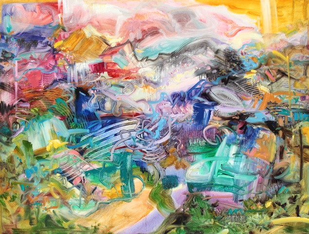
Jubilation, 2021
Oil on Canvas
30 x 40 inches
by Jane Appleby (b. 1964)
Thanks, Jane. Your paintings are a riot of colour and brushwork, providing surface interest, vibrating lay-bys, juicy satisfaction and overall painting joy. In this regard, they are the embodiment of action-painting and are successful in abstracting the landscape into a painterly, human-felt object. What you’re longing to achieve now is a stronger, calming sense of design and perhaps, a feeling of “paucity.” If you think of painting as a place to “go,” you may be yearning for more moments of rest within all that exuberance. Here’s an idea:
Your three-step process of 1. A plein-air study then 2. A landscape from photo reference or memory and then 3. Your studio abstraction is an excellent way for any artist to pull an interpretation in abstraction from the landscape. For the moment, however, suspend these steps and instead, focus solely on design from the get-go. This will anchor joyous, brushy expositions and can lead the experience of looking for the viewer. It may help at first, to choose a subject with a lot of form; a lake or blocky building like a barn, a sparsely furnished room or a grouping of household objects on a table. A wide, encompassing landscape, busy garden or dramatic sky are too tempting here for the brush-happy. Select a small handful of key forms — like three or five — and make a total design that zeros in on their shapes and how each connects. Pay attention to the negative space — it’s one of your key shapes. Block everything in, relatively flat, in a limited palette of no more than three complementary colours. Do you see where I’m going here? Can you connect a few of these forms to make one of the shapes considerably larger than the others while still communicating the essence of the subject? How, in this minimalist poem, can you give us a lakey lake, or the barniest barn? Do it only with form. “The best way to be a bore,” wrote Voltaire, “is to leave nothing out.” Now rise from your easel and squint at your design from the other side of the room.
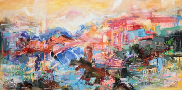
Invitation, 2021
Oil on Canvas
20 x 20 inches
by Jane Appleby
Have you held and led the eye around your picture? Is it still exciting, even in the absence of all your delicious brushwork? Are there pleasurable spots to stop along the way? Where are you relaxing?
How do the three colours you’ve chosen relate to one another? Can you improve upon this ménage à trois?
Is the negative space performing with equal and important magic?
Can you beef up the contrast in one of the colours? Try a super-dark.
Can you soften some edges and sharpen (or neaten) others? Vary the size and detail of the edges of the shapes, their corners and how they meet their neighbours. Cut in, lay-by and lay over for “neatness.” Step up the size of your flat brush. Step back with regularity to check the strength of your composition, understanding that the eye needs to rest and delights in spaces of emptiness. “Design,” wrote William Merritt Chase, “is everything.”
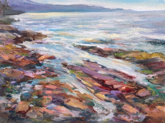
Galiano Shoreline, 2020
Oil on canvas board
8 x 10 inches
by Jane Appleby
Sincerely,
Sara
PS: “Things alter for the worse spontaneously, if they be not altered for the better designedly.” (Sir Francis Bacon)
Esoterica: Good design invites the eye to travel, linger, travel and linger. You are at zero risk of losing, in the long run, your fabulous and agile, action-packed brushiness. A 37-stroke or 37-minute painting are both terrific exercises for getting designs established early and runaway brushwork stopped, but they are not a perfect formula for avoiding overworked or under-composed paintings. If not careful, a painter risks laying strokes here and there until the target number has been reached. This leaves out planning; with strokes fat and thin, forms large and small, contrasts strong and subtle, in as many or few as required. What we are after is a composition worth crossing the room for. Once there, the eye can close in — to relish the swooshes, slubs, scumbles and zips of the most exuberant painter.
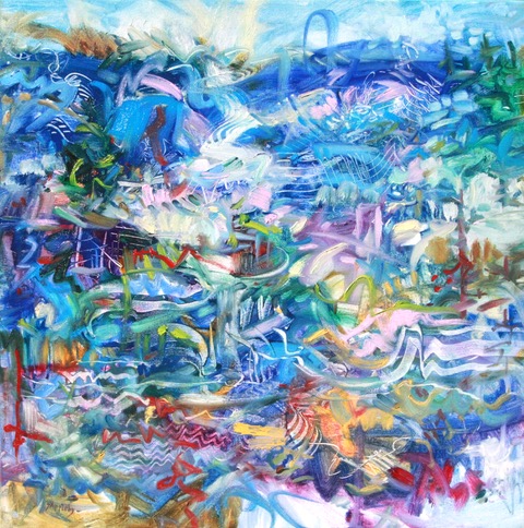
Island Rhapsody, 2021
Oil on Canvas
24 x 48 inches
by Jane Appleby
Have you considered a Premium Artist Listing? With each letter, an artist is featured at the bottom of this page. The Premium Artist Listings are a means of connecting artist subscribers through their work. Proceeds from each listing contribute to the production of The Painter’s Keys.
“Color does not add a pleasant quality to design – it reinforces it.” (Pierre Bonnard)
 Southern Gulf Islands Afternoon 48 x 36 inch oil on canvas by Terrill Welch
Featured Artist
I am a landscape painter exposing the mystery in an ordinary day.


31 Comments
What wonderful advice! Useful for any painter, and a treasure-trove for Jane Appleby, who clearly has wonderful vigor and a great color sense.
Thank you for the kind words on my vigor and colour and I agree, a treasure -trove of great advice for painters….and “keys” to open new doors.
“Any suggestions on how to restrain one’s own exuberance or do I keep delving into this emotional experience and see what happens?”
Jane: I’d love to see what happens if you don’t restrain your exuberance until your emotional experience (i.e. the painting) guides you to do so. Maybe that means painting all-out, all-over action paintings that, later, you might be guided to revisit and simplify. This is a very different process than trying to design a simpler canvas by restraining your impulses. As one of my teachers (not an artist) once said, “Simplicity before the Complexity is worthless. Simplicity after the Complexity is the Pearl of Great Price.”
Ellie Harold, Your advice struck home to me, as exuberance always wins over restraint. Over the past year, I have reworked art that did not sing its siren song to me, and sold several pieces. And it was through simplification after an over-exuberant beginning that the piece emerged.
Thank you, Ellie and Sara, for this insightful discussion!
Can Exuberance and Simplification meet in one piece – now that is the question! Thank you for sharing your reworking successes.
Thank you for this encouraging comment the amazing quote by your teacher about the Pearl of Great Price…I trust the canvas also may have the wisdom to reveal this to me in time. I see you do wonderful expressive work and teach workshops as well. I may like to take one sometime.
Wonderfully insightful comments and advice, Sara. You do your father proud.
I agree… the brush doesn’t fall far from the painter and glad Sara picked it up to do her work with it. I continue to cherish the Painter’s Keys.
Loved the advices thanks
Very insightful advice. Thank you!
Excellent suggestions!
A teacher I once had always said, darken the darks and lighten the lights.
The other suggestion I was given was to make a small frame using two L shaped pieces o f white cardboard, and move them over your piece until you find a very pleasing small section. Your eye is drawn to good composition. Then repaint THAT bigger. This has helped me a lot!
Thank you Eva for those reminders – They are great tools! And focusing and zooming in could definitely help find interesting compositions and train the eye to see simpler forms. Repainting the forms bigger may need different paint application techniques that could be fun to try but I am not sure I can restrain that exuberant brush! Good things to keep in mind. Happy painting to you too.
Good advice I shall try myself… but I just love all that clean fresh rioting colour! .May I suggest ,Jane, that you do them huge… 2×2 metres for example?
Great suggestion … The challenge would be to find a big enough space. Thank you for the comment and glad you like the rioting colour. It was a riot to paint :)
First, I must say I love Jane’s painting style. I think the exercises Sara suggests are interesting to try, but overall agree with (what I think) Ellie is suggesting, for Jane to continue as she is til maybe she naturally moves onto a simpler style. The more I paint the more I believe that the work is a reflection of who the painter is ad she is painting.
Also, it is good sometimes med to go back to earlier pieces and maybe tweak them to more currently reflect how the artist is now. What had worked for me is to do some negative painting to simplify.
Thank you for this comment as I believe trying some of what Sara suggested may give me a “pause ” from the way I work and to also continue to let the canvas speak. Perhaps we need a balance of ways to get to the next painting expression and series; Complex processes that eventually form refined work. Negative painting and space may indeed be a great focus. Thank you.
Great advice Sara! Jane, I love that you’re not afraid of high expression or the raw materials of paint and brush. So much good energy comes through your work, I’m sure if ‘harnessed’ and led into a more collected forms, your work would become even more powerful and enthralling…like watching high-level Dressage championships vs wild horses being moved by pure instinct only. Both are beautiful, but gives the artist and viewer two different experiences.
I appreciate your mention about the good energy you see in my work and the lovely analogy of horses highly trained and running free. Courage, rawness, harnessing, collecting, power and enthrall…Hmmm great words to ponder and maybe the titles of my next work. I do not see “calm”
arriving just yet. But they may get me there. Thank you!
Dear Sara, thank you for this thoughtful reply to my letter and all the valuable suggestions on painting paucity…and all the comments.
I also wonder how other artists have put “calm” in their painting space and how important it may be to have calm in one’s own life.
So far “Complexity” has invited me to seek calm in areas of my life and perhaps will eventually make its way to my canvas.
It seems to be a “great pearl” indeed.
Thanks again, Jane
Oh what great questions we need to ask ourselves as we embark that treacherous journey into making artwork, Sara. If those who don’t make art only knew the battle ground we forge into before we step back and call the piece DONE!!! or DONE?? We only have ourselves to answer that question. To take time to ponder all those questions you wrote is a must. I get lost in my own brusherly exuberance often, and step back see nothing but a mess. Doesn’t mean the “mess” doesn’t hold some good characteristics that I will want in my final painting. After many years of doing this, I suppose I’ve learned how to build and improve. Always good to go back to the questions when I get stuck, tho, great letter.
Jane Appleby, love your work, such joyful movement and pleasing colours!!
Yes, what great questions we need to revisit. And thank you Mary Ann for speaking on the struggles and battles to forge and the mess we may find ourselves in. These can become a message to build on and move forward in our work…gladly armed with Painter’s Keys.
The challenge here is that I LOVE your work…though not all of it. “Invitation” doesn’t do anything for me, but “Island Rhapsody” does and I’d hang it on my wall in an instant if I had the money. Reminds me of Dufy and a few others. I also agree with letting the changes develop naturally – naturally but consciously – does that make sense? However, that is a way, if you listen to Sarah’s good advice, to achieve what she suggests. Paint with her principles in your mind so that you preserve the parts that really ARE restful as you do them, yet allow your delicious exhuberance to have it’s way as well. You aren’t going to make those changes if you don’t let your inner eye explore and grow into that style change, and the only way to do that is miles of canvas. Keep exploring, you’ll get there! And if you do it organically, it’ll be truly yours. Or something else good, without regrets.
Hi Gwen, I am very happy to hear that “Island Rhapsody” resonated with you and mentioning my work has a similarity with Dufy Fauvism.
To me that remarkable artwork demonstrates what I am after: vibrant colour play along with a delicate seasoning of exciting line and patterns supported by calmer areas of relatively larger vibrant colour placements which offer a sense of whimsical joy.
As for my painting “Invitation”, it is in fact an invitation for more calm, and intentionally offers continuous movements, being less serene, except perhaps for the water-like blue dominance.
“Island Rhapsody” was painted after an island getaway which included exciting adventures that with met solitude and peaceful moments all within the same day and then within one painting. This painting does seem to have more deliberate forms and restful areas.
I also appreciate you mentioning to paint with Sara’s suggested principles in mind (I intend to actually practice them for gained insight) and also allow my exuberance to have it’s way, since that is where the joy is expressed.
So I am looking forward to exploring some more and traveling through “miles of canvas” (this made me smile). That long and winding … canvas!
May these miles be a continued inspired journey not only for me but for those that I meet along the way and the artists who happen to be traveling along similar paths.
To be ourselves and keep it going without regrets is right on! Thank you.
I’ve only recent found this site and started receving the bi-weekly emails. I’m a wanna be artist, newly retired, so more time to explore this. I love your writing nand suggestions Sara. I also check out the links of people who respond and it was very interesting in this particular one how many of the artists are from BC, as am I.
Glad you are now exploring with us artists and enjoying Painter’s Keys Letters. Robert and Sara have offered these “keys” for years. I find them timeless and often timely. And as for this letter – I am especially grateful. Now off to the canvas!
Great discussion! And so many ideas to explore! Jane, to speak to your wondering on how others put calm in their painting space, and its importance in life: personally it’s very important for me, and I strive for it in my life. I think it just manifests in my work, as that is how I approach things. I seek it out, and seek to disseminate it as well. But the energy in your work is so palpable, I can’t imagine that you don’t have times of calm in your life in order to facilitate the expression of that energy.
Thank you for sharing that seeking calm and trying to put it into your work and share it is very important. I do see a peacefulness in the mindfully considered shapes in your watercolour landscapes.
I do make a point to put “calm” into my life as well, but into my paintings seems to be another matter. Or is it?
Interestingly, painting my exuberant expressions helps to bring calm into my life.
Which comes first the calm or the exuberance? Maybe it’s just another important Rhythm in our lives.
Try mixing all your own colors instead of right out of the tube. (Look at Robert Genn’s marvelous command of color for example) For Sara’s exercise, use not only 3 colors, but mix them to make others, as well, but don’t add any others outside of the 3 initial, except perhaps white. When you limit your palette, the forms, shapes, action, become more pronounced. When each color is deliberate, the painting holds together much better.
Hi Leslie, Thank you for the comment. I agree minimal colour, deliberately mixed, deliberately placed, and deliberately spaced, can offer a specific feel.
I can see that simplification in the weight of forms, through their colour and supporting negative space, can have a tremendous hold on the viewer, as in Sara’s work.
I am trying Sara’s suggestions using watercolours which is already adding a calm to the way I work. And interestingly, switching media seems to be retraining my exuberant brush (for now).
I am thankful for this opportunity to share and discuss this journey with so many of you fellow artists. Thank you!
Hi Everyone, I have sent my Exuberant Brush on holidays and started a series of “calm” watercolours following Sara’s guidelines. You may get a glimpse of these first expressions exploring the “calm” in the landscape in my Latest Art Newsletter Here: http://createsend.com/t/r-A9FBCA2AA83035F92540EF23F30FEDED.
Please subscribe if you would like to follow this journey.
It’s another episode of “The strange case of Jane Appleby” that occured at Holly-Hock with the Genns, as in the “37 Club” letter of August 20, 2013 https://painterskeys.com/hollyhock-strokes/
The Painter’s Keys continue to inspire!
I really enjoy reading your articles!! Thank you.