Conversation piece

0
Dear Artist, Yesterday, Anne Swannell of Victoria, B.C., wrote, “A couple of years ago one of my paintings sold in a group show and also won the Viewer’s Choice Award. The other day, I printed a copy of it to be made into a card, when I noticed it had an error. It’s a painting of people walking in the rain, with reflections of them and their umbrellas. But one of the reflections is missing an umbrella! Would you call up the buyer and offer to paint a blurry upside-down umbrella in, or would you consider that mistake part of the picture’s mystique and leave well enough alone?” Thanks, Anne. There are times when you need to repair your sold paintings, but this is not one of them. You have produced what is known as a “conversation piece,” that is, something the owners and their friends can talk about long after it stops raining in B.C. My guess is your customer will want it left just the way it is. Whether by intent, intuition or error, artists do well to take liberties in their work. Art has the potential for another kind of truth — the truth of illusion, distortion, anomaly, enigma, exaggeration, paucity, understatement, embellishment and error. If everything in a picture were exactly as in nature, there would be little to engage anyone, much less give them something to talk about. Art fascinates for reasons the artist and the viewer cannot always define. We sit in front of our work and say, “There’s something funny about this, but I don’t know what it is.” Just the thing you can’t figure out may just be the basis of its charm. Further, with the exception of a short hint in the title, your work is mute. Here are a few ideas to encourage your viewers to speak up on its behalf: A personal connection to either you or the owner. An intriguing style that has them wondering. An incongruity that begs the question, “What’s this?” Artists are supposed to be the ones with imagination. A good part of our job description is to get regular people to use theirs. Best regards, Robert PS: “Those things which are most real are the illusions I create in my paintings.” (Eugene Delacroix) Esoterica: Recently, I was a guest at one of our exclusive men’s clubs, an establishment I’ve visited a dozen times. There’s a painting in there that shows a steeplechase horse knocking down part of a fence. The cast shadow of the fence shows the fence in perfect shape, as if the picture was painted faster than the speed of light. Our host delighted in asking, “Can you see what’s wrong with this picture?” I pleaded ignorance, of course, so that he could get the upper hand in the conversation. It was kicking a dead horse for me, having seen it before, but his other guests were mighty impressed and continued to discuss the painting at length during dinner.   Charm and perfection by Gerti Hilfert, Langenfeld, Germany  
020411_gerti-hilfert

“Gollum”
mixed media
by Gerti Hilfert

What an interesting point; charm and perfection! I imagine Anne’s feelings about producing and even selling a mistake from her own view of perfection. Catherine Deneuve once said, “Charm and perfection hardly cooperate. Charm premises little mistakes which one would like to cover.” In Anne Swannell’s painting both charm and perfection meet and complement one another. I believe most will overlook this missing umbrella reflection. But once discovered it makes the painting something very special. Guessing from that fact this painting could be once all the more interesting for art collectors or museums. This painting is brilliant work and what counts is the special spirit that makes the point; I can feel the wet as if I am part of it. Why not make a series of such conversation pieces, each including a mistake. There is 1 comment for Charm and perfection by Gerti Hilfert
From: Rose — Feb 04, 2011

Your painting is fascinating…How can I see more???

  Never spoil the magic by Linda Anderson Stewart, AB, Canada  
020411_linda-stewart

“Blush”
oil painting, 30 x 42 inches
by Linda Stewart

Never spoil the magic. Folks love to think they see something wonderful in an image whether planned by the artist or not. I often want to hide at openings so no one will ask me to “explain” what I was thinking when I put in a certain touch. Inevitably it will be way off what they hoped for and it loosens their connection to the work.     There are 2 comments for Never spoil the magic by Linda Anderson Stewart
From: Jackie Knott — Feb 04, 2011

Wonderful texture and color contrast.

From: Mary Bullock — Feb 04, 2011

Gorgeous painting!!

  Dragon with two right feet by Warren Criswell, Benton, AR, USA  
020411_warren-criswell

“St George and the dragon”
oil painting
by Warren Criswell

I made a worse mistake than that once. I painted two right feet on the “dragon” in my St. George & the Dragon. I must have been looking at my own left foot in the mirror while I painted it. The painting was in a traveling museum show that visited four museums in four southern states. Nobody said anything about the anatomical anomaly. A year or so after it returned, my local gallery hung it in a show. At the opening, my friend took me aside and whispered, “Warren, did you intend to give him two right feet?” That was the first time I saw it. If anybody else did, I guess they were too polite to tell me. I took it home and fixed it. If it had been two left feet, I might have left it as a comment on my subject’s gracefulness, but two right feet made no sense. Fortunately it had not been purchased yet.     There is 1 comment for Dragon with two right feet by Warren Criswell
From: Mary — Feb 04, 2011

There are plenty of ways to differentiate left and right aside from gracefulness/gaucheness. You have the left-brain, right-brain concept. Also left being identified with Female and right with Male in Eastern culture. Never underestimate the human ability to rationalize a seeming discrepancy. Cool painting, either way.

  Sly foxes by Barrett Edwards, Naples, FL, USA  
020411_barrett-edwards

“Marsh Harmony”
oil painting
by Barrett Edwards

Several years ago I painted a larger oil commission of a Colorado landscape. The client’s only request was that I show a bit of wildlife in it, and in particular he loved foxes. I painted in two not-very-obvious foxes and titled the painting Three Foxes. A week after receiving the painting, the client phoned: “Where is the third fox?” He had an entire dinner party searching the painting. And he loved my answer.       There are 3 comments for Sly foxes by Barrett Edwards
From: Kim — Feb 04, 2011

??….what was your answer?

From: Kim — Feb 04, 2011

OKAY, just dawned on me like the rising sun…very nice for almost Valentine’s day….!

From: Larry — Feb 04, 2011

Marsh Harmony: This is the first marsh I see on a hill….

  Mistakes by the greats? by Joseph Hutchinson, Santa Fe, NM, USA  
020411_joseph-hutchinson

“Nocturne in Red and Gold”
oil painting
by Joseph Hutchinson

Anne Swannell is not alone; even the greats have their moment. There is also a “mistake” in The Last Judgment fresco on the end wall of the Sistine Chapel at the Vatican by Michelangelo. He neglected to paint the colors of a hand of a figure in the central group. The hand may have been “corrected” when the fresco was restored in the 1990’s. Perhaps Michelangelo never intended to paint the hand, who knows? It makes for fine esoteric discussions in art history classrooms.     Intentional omissions by Sonia Gadra, Frederick, MD, USA  
020411_sonia-gadra

“City Hall”
original painting
by Sonia Gadra

I recently painted several pieces en plein air for judging in a competition. I sent 5 images of the pieces I created to a group of friends in order to have them help me choose 3 which they thought to be the best. The favorite was a piece of our local city hall, which surprised me because it was not my favorite, but I left out something which could be considered a very important element, the flag pole with the flag flying at half-mast. I painted it on the day of the Arizona shooting. I left out the flag pole because I couldn’t see it very well from my vantage point and because I thought putting it in the painting would take away from the focal point. It would have had to be placed right in the center. My intention was to bring joy to the viewer not sadness.   Anomalies engaging by Barbara, WA, USA   In my kitchen hangs a series of 4 prints. Each depicts a small vintage kitchen appliance. They were purchased for their style and bold colour. Quite some time after hanging them, we noticed that the toaster was made to hold three slices. We looked farther, and behold, the blender control dial has three speed settings, but no ‘off’ setting. Hard to say, but it seems the stand mixer may only have one beater. The real “conversation piece” is the kettle, because there doesn’t appear to be anything irregular about it. Many kitchen conversations have begun with a casual comment about the pictures, then the ahah!s as the anomalies are discovered and, always, the kettle’s mystery becomes a puzzle. The simple blue panel with its rotund electric appliance gets more than its share of consideration, scrutiny, speculation and discussion. Guests, friends and family visitors aside, after all these years I still sit sometimes with my tea and am drawn to study this fat enigmatic kettle who certainly hides an imperfection that I cannot perceive. Thanks to a three-slice toaster and its friends, my engaging kitchen prints have yet to become wall flowers. There is 1 comment for Anomalies engaging by Barbara
From: Dean Wilson — Feb 04, 2011

Perfect

  Seeing diamonds by Mac Grieve  
020411_mac-grieve

Untitled
oil painting
by Mac Grieve

Awhile back I attended your two-day workshop. The third day was offered to paint en plein air in the area of the Stewart Farm House. The weather was not great so I opted to take camera and shoot reference material. With one eye on the view finder and one on your method, you sat on a bench and began to paint what was in front of you. I could have sat in that same spot until they declared Bentleys non collectable and never saw a thing to photo or paint. When I see a turnip truck I see turnips not diamonds. This ability to see what others do not could be why some make it in this game and others don’t.   The artist’s dilemma by Tatjana Mirkov-Popovicki, Port Moody, BC, Canada  
020411_tatjana-popovicki

“Vancouver Reflection”
acrylic painting
by Tatjana Mirkov-Popovicki

At first I laughed thinking that the question was silly, but on the second thought, I think that I understand the artist’s dilemma. This kind of thing actually pops up quite often. Just the other day a gentleman criticized my painting saying that not all the trees reflected accurately in my lake. Reflections are notorious to get wrong. Some of the old masters studied them in the gory technical detail, such as Leonardo and Thomas Eakins. I think that realist painters shouldn’t get away without a thorough understanding of reflections. Even when we paint what we see, we should be able to consciously choose when to be technically precise and when to leave things ambiguous or intentionally inaccurate. This artist seems to have wanted to be accurate so she sees this detail as a mistake, but as you say, it’s water under the bridge and a conversation piece by now. There are 2 comments for The artist’s dilemma by Tatjana Mirkov-Popovicki
From: Judy Lalingo — Feb 03, 2011

Just wanted to say that I love your work, Tatjana! I can always spot your paintings. This one’s a gem. :)

From: Tatjana — Feb 04, 2011

Thanks very much Judy Lalinigo and Brigitte Nowak and Quin Sweetman!


Archived Comments

Enjoy the past comments below for Conversation piece

   
From: Mike Barr — Jan 31, 2011

I recently painted a yacht with the reverse numbers on the sail and one of them was the right way around – I was going to change it but thought, no, I wonder if anyone will notice!

From: Eric — Jan 31, 2011
From: Sandy Sandy — Feb 01, 2011

The exclusion of the reflection is probably one of the reasons the painting is so powerful. Like Robert suggests, accomplished artists leave room for the viewer’s own imagination and interpretation.

From: Dwight — Feb 01, 2011

If the reflections are also some of the tulips in the title, then the missing reflection is just a picked tulip. Really nice painting!!

From: Fitz — Feb 01, 2011

What about that poor woman with no umbrella — you’d think someone might share? The man walking away from us probably just came out of the local pub and doesn’t want anyone to know he’s been drinking — and he may also be trying to whistle on his end which is not getting good results. Ah yes, rain has a way of bringing out the best and the worst in us. I like the painting.

From: Dan Young — Feb 01, 2011

This could be a missed opportunity to sell another painting…. I would contact the owner….. offer to paint in the missing umbrella…. Then try to sell another painting…. People who have purchased a painting are your best potential clients…..

From: Tatjana — Feb 01, 2011

On more than one occasion I had a wrong number of fingers in a portrait, but I fixed them rather than leaving it for conversation. No offense intended to the people with 4 fingers!

From: Thierry — Feb 01, 2011
From: Kamoos Obomor — Feb 01, 2011

Robert’s claim that “We know that women in general tend to have better art brains [than men]” is not only laughable, it’s a cynically sexist attempt to cater to his mostly female audience. Shame on you, Robert.

From: Richard Mazzarino — Feb 02, 2011

I think the irregular perspective on the base of the lamppost is what draws my eye not the lost shadow. Unless this is a purposeful design ploy that really tells me the artists needs to learn to draw better.

From: anonymous — Feb 02, 2011

I was taught to never leave anything wrong on your canvas that you can notice. It’s too late for the shadow but I agree with the angle on the lamppost. Not good.

From: Jean W. Morey — Feb 02, 2011

I was at a demonstration by a nationally prominent artist, several years ago. He neglected to cast the same reelected light from the umbrella of his main subject as was prominent in the rainy street. To me, it spoke of the use of a separate photo for the figure. It was a very successful painting otherwise and no one else found this unsettling.

From: Kathleen Bezy — Feb 02, 2011

I liked the anomaly of the parasols. Years ago I painted a series of cow heads, followed by the rear view. Sold the pair, and discovered after they were framed in a friends bathroom, that I was short one cow behind. True, what a conversation piece! It’s still one of my favorites.

From: Edna V.Hildebrandt — Feb 02, 2011

What made some postage stamps draw so much money in the philatelic world is when there is a flaw or a mistake at their first issue and were withdrawn from circulation and only a few exist anymore. They are a rarity which makes them a novelty. Perhaps this is in the same way what makes Anne’s painting unique and makes it an interesting conversation piece. Was it intentional, an oversight or error? The more people wonder the greater the interest. Serendipity also plays a part in the game. It is beautiful painting. For all purposes we would like our work to be perfect but once in a while we may overlook something or make extra brush strokes which made the painting more exciting and more appealing that piqued the viewer.

From: Sandra Donohue — Feb 02, 2011

I agree with you that the painting is fine and shouldn’t be adjusted. Enough people liked it to vote it as their favourite, and someone liked it enough to choose it for their wall. Weavers have a saying that only the gods can produce something perfect, and if a weaver wove perfect cloth, the gods would be angry. In my painting and weaving I do strive for perfection, and have yet to anger the gods.

From: Janet Austin — Feb 02, 2011

It’s much better not to mention the “error” and let the owner discover it on their own. You’d be amazed what people don’t notice. As a tapestry weaver, and owner of many Turkish Kilim rugs, it’s always a wonderful surprise when I see an error (be it intentional or not) in a rug that I’ve owned for years. Kind of like a gift that keeps on giving, it always brightens my day.

From: Anne Hightower-Patterson — Feb 02, 2011

In viewing a watercolor show in SC a couple of years ago, I was admiring a nice, clean painting of a shrimp boat when my boyfriend, who in not an artist, pointed out the the name of the boat was reflected in the water right side up. I wondered if this was just a joke the artist was playing on the viewers or did his senility just kick in and he forgot that the reflection should have been up side down.

From: Ted Lederer — Feb 02, 2011

Shadow, or not, is completely unimportant. It’s the mood and feel that makes this piece appeal to the buyer. Incongruity is at the sole and soul of life. God protect us from too much congruity.

From: Claudia Warren — Feb 02, 2011

Please pass on to Anne Swannell that I LOVE that the umbrella’s reflection is missing. Had I the painting, I’d be delighted with the discovery and think it perhaps intentional, just to draw us in further to wonder why. What a wonderful, whimsical detail, even if unintentional. By the way, if she does print the cards, I would love to know how to buy some. Capture that ‘mistake’ and just think of it as a symbol that somewhere, somehow, it’s not really/always raining even if it may seem so. Life is like that some times.

From: Kirby — Feb 02, 2011

I found one of those mistakes in my paintings and after I considered changing it I just felt I’d leave as is. Your right it adds interest and that’s why I opted to leave it alone.

From: Bruce Bridge — Feb 02, 2011

I once painted a picture where the person had no arm. I was working from a photo where the arm could not be seen and this is the trouble with that system. It’s good to understand how things work.

From: Jens Nygaard — Feb 02, 2011

Fess up, Anne, and make a friend for life.

From: Jackie Knott — Feb 02, 2011

I would insist on adding the umbrella to this particular painting had I painted it. I’ve missed some things over the years but such incongruity in a representational painting is jarring. We can make deliberate decisions on eliminating detail or adding interest but this isn’t Salvador Dali. It’s like watching a figure who doesn’t cast a shadow … something isn’t right. The overall excellence of the painting loses its impact because the viewer is distracted from the mood of the painting. A conversation piece is one thing but I would prefer a painting of mine be noted for its quality rather than “she forgot the shadow!” The viewer does not know your mindset: only the painting in front of them.

From: Melinda Gretler — Feb 03, 2011

Works for some people. Others, when they realize the reflection of the umbrella is missing, won’t be able to get past it. I’d broach the subject with the current owner of the painting.

From: Nancy Warren — Feb 03, 2011

Robert has dealt with the creative ability of women in many letters that can be found on this site or in his books. The main thrust of these arguments is the bicameral nature of the brain, the tendency of more women to be right brained than men, and the evidence of a larger corpus collosum in women — the conduit between the hemispheres. He also notes the lack of stubbornness in women, their excellent networking ability, and willingness to take advice from others, including men. (As opposed to men taking advice from women)

From: BobbyJoe E. — Feb 03, 2011

Everyone who has written about leaving mistakes or not being bothered by mistakes is just another sign of the mediocrity of women’ art today. Listen to yourselves making excuses for someone just to be politically correct. Come on! Also, being a women, I have to say that if 78% of artists are women and not rich and famous maybe we should take a better look at what we are passing off as art! Men succeed at this because they are dedicated to an art life whether they have wifes or not. They don’t do this on weekends as a hobby or to make pretty pictues to put in the kitchens of women who search the local art shows for something that matches their curtains. I feel women need to get real and stop bitching as to why they can’t make it and get on with it. This is one reason men don’t take us seriously.

From: Pink — Feb 03, 2011

Bobby, you spoiled your tirade with your last sentence. why do you care if man take you seriously or not?

From: Dottie Dracos — Feb 04, 2011

I’m commenting on the workshops page. It would be so much easier to read if in addition to the dates, the location and medium would be up front and center for each listing. As it is, it wastes a lot of time trying to wade one’s way through it.

From: Susan Kellogg — Feb 04, 2011

Not everyone uses umbrellas.

From: BobbyJoe E — Feb 04, 2011

Pnk – ’cause they currently have the power! AND we are the only two species on this earth and need to get along with each other.

From: Michael — Feb 04, 2011

Cute story. It reminded me of the time I sketched a young lady’s portrait and left one of her eyebrows off ! We were admiring it together afterwards when I realized my mistake, so I was able to fix it on the spot.

From: Mel Malinowski — Feb 05, 2011

I learn much from your letters and from the responses you give to questions. Ergo, here’s one from me. What, if any, legal pitfalls might there be if one creates paintings using images from books or magazines as inspiration? Have a great, painterly day. Mel

From: Rick Rotante — Feb 05, 2011

Mel- With the way you phrased your question, I think you already know the answer. There are copyright laws in force that if you are found to be using copyrighted material, in all likelihood there will be litigation against you. And in many cases it will be obvious to those who know that your work is a copy. If you live in a little town and only enter local shows with no national attention. I wouldn’t worry about it. The only ones you would be cheating are going to be your neighbors and those foolish enough to buy your work. But on a more serious note, Why would you do that in the first place if you have any talent at all.

From: wilma irwin — Feb 05, 2011

not everyone uses an umbrella when it rains .

From: Patricia G. White — Feb 06, 2011

“Artists are supposed to be the ones with imagination. A good part of our job description is to get regular people to use theirs.” R. Genn This is a Genn Gem, I believe.

From: Jackie Irvine — Feb 07, 2011

Your comment makes think of Velazquez’s Venus at Her Mirror. The reflection in the mirror is totally wrong but did anyone care?

     Featured Workshop: Barrett Edwards
012811_robert-genn Barrett Edwards Workshops   The Workshop Calendar provides up-to-date selected workshops and seminars arranged in chronological order. 
    woa  
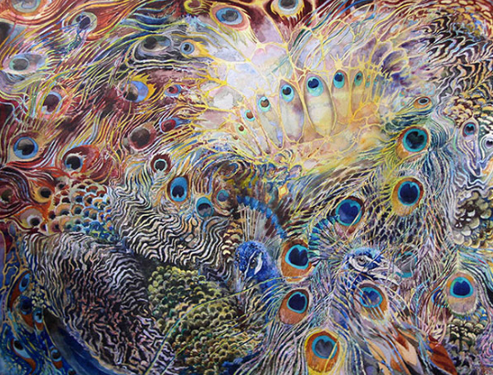
020111_oleg-korolev

Peacock

watercolour painting by Oleg Korolev

  You may be interested to know that artists from every state in the USA, every province in Canada, and at least 115 countries worldwide have visited these pages since January 1, 2013. That includes Bobbo Goldberg of Orlando, FL, USA, who wrote, “I really like Anne’s painting from last week’s clickback. The ‘mistake’ takes an everyday experience and lifts it suddenly to the level of the surreal. Done is done, but Anne’s ‘flub’ is fun.” And also Ken Paul of Eugene, OR, USA, who wrote, “Some art answers questions, and some asks them. Hemingway was quoted as saying that leaving out what you know is OK, but leaving out what you don’t know is cheating.”    
Share.

Robert and Sara Genn Twice-Weekly Letters

Subscribe and receive the Twice-Weekly letter on art. You’ll be joining a worldwide community of artists.
Subscription is free.