In praise of inexpensive materials

0
Dear Artist, When buying art materials, it’s almost always wise to get the best you can afford. This is particularly true for supports — the surfaces you work on. Nothing is as disappointing as paper that yellows after just a few years, or cotton canvas so thin and threadbare that it wouldn’t pass for a prison bedsheet. At the same time, quality and high price don’t always come first when it comes to pigments. There are many cheap colours, particularly earth colours, where the raw materials are so readily available and dense enough to begin with that they work well for most jobs. Further, the fillers, extenders and other additives that go into a lot of cheaper paints can actually be a benefit in sullying the garishness that comes easily in high-density, expensive pigments. A lover of Golden Acrylics (I’m not on their payroll), lately I’ve been adding squeezes from the fat tubes of Winsor and Newton Galleria (student quality) and even Chinese Pebeos that come at a fraction of the price. But it’s not about saving bucks. It’s about volume of paint and the potential for juicy creativity. Expensive paints bring out your resident miser. Cheaper paints, used discretionally, are more likely to be lathered on in abundance and bravura. Fact is, for some of us, inexpensive materials bring out the magic of playfulness. Take my friend Toni Cavelti. One of the most honoured jewelry designers in Canada, he’s spent a lifetime working with precious diamonds, rubies and emeralds. In his workshops, gold and platinum were the metals of choice. Now retired from serving the rich and famous, Toni has made a new career making sculptures using 1.5 mm iron wire that costs him less than ten bucks a roll. In paint, the most important thing is the binder or medium. In acrylic media, rough stones and pieces of found junk can probably be held together for millennia if there’s enough binder. I wouldn’t skimp on quality acrylic medium. In oil, you can think about the admixture of quality materials with student materials, as well as appropriate amount of the current, not too smelly media designed to take the place of the popular (and yellowing) Linseed oil. In watercolour, particularly, you need to be aware of the fugitive nature of some pigments. Reading the permanency guide on most labels will keep your colours the way you want them. Best regards, Robert PS: “I work in a very humble material and that suits me just fine.” (Toni Cavelti) Esoterica: Questions regarding the mixing of paint brands on the same painting often pop into this inbox. While there are some variations in the molecular makeup between the different manufacturers, they seem to me to be homogeneous, and getting more so. In acrylic, favour a quality medium or gel — it will carry most pigments. Materials permanency expert Mark Gottsegen warns, “All the fillers, extenders, and other ingredients used in ‘professional’ paints — oils and acrylic dispersion paints — have homogenized what we get in stores today. They are necessary, in the case of the acrylics. They have made today’s oil paints into white bread.”     Choosing the best by Mark D. Gottsegen, Greensboro, NC, USA   From my point of view, we (me and the AMIEN Staff) could never recommend an artist use cheap materials unless they are completely aware of the inherent vice and potential for early failure. Today’s paints are nothing like the oil paints available to artists before the industrial revolution. If you want a taste of what oils paints were like then, especially the mineral colorant oil paints, try Natural Pigments’ “Rublev” oil paints. I know the maker, and his mineral colorants are minimally processed so they retain their naturally variant particle sizes — they are not ground into an homogeneous powder, like, say, Winsor and Newton’s oil paints — and this is his unique market: to make “traditional” oil paints. The same may be somewhat true for Williamsburg’s paints, though they have a new owner (this means the paints will be better and more consistently made, but not necessarily that the variant particle sizes of the mineral colorants will be retained in the new formulations). As for the vehicles in the acrylic dispersion paints, there are cheap-o binders and there are preem-o binders. The former may contain resins other than methylmethacrylate dispersed in water; for instance, a yellowing styrene resin, or microscopic polyethylene spheres that don’t last unchanged for long, or much less expensive acrylic resins made for, say, the house painting or commercial paint industries where longevity is not as big an issue. As for mixing paint brands, adding a cheaper brand to a better brand cheapens the better brand whether we’re talking about oils or the acrylic dispersions. It’s better for everyone to just use the highest quality materials — and we have to know how to pick them. That’s the hardest part of the process, for most artists. There are 2 comments for Choosing the best by Mark D. Gottsegen
From: Meltemi aka Phil Kendall — Aug 13, 2010

Cheap acrylics? OK for practising with. But alongside the better artists’ quality, on a canvas, they stand out like a sore thumb. Some of the cheaper expert series acrylics also show poorly alongside the more quality acrylics. Having said that a cheaper Titanium white acts as a good mixing white…

From: Liz Coomes — Aug 13, 2010

Because money does not grow on trees, using cheap materials will always appeal. And a benefit is that the artist is freed to create something or nothing. So if you are trying to blossom, you can give yourself free rein. I have enjoyed using card stock this summer for plein air quick paintings where I am working to solve the value and color relationships part of painting. I sketch a rectangle of about 4X5 and use my small pallette knife. It works well for me as a good way to launch in the right direction

  Materials have a subtle effect on results by B.H. Koster, Great Brakriver, Southern Cape, SA   I so agree with your statements and have exactly the same experience. I believe the solution lies in knowledge of paints and pigments. I use cheap materials, although we do not have a wide variety here in South Africa. Fortunately I have an in-depth knowledge of the manufacture of paints and I agree with all your statements regarding pigments. I must say that when I take a piece of ordinary paper as in paper print and charcoal, I have a completely different end result compared to when I use a lovely piece of Fabriano and a charcoal pencil. The materials that you use to a large extent dictate the end result.   Becoming a colour connoisseur by Paul deMarrais, TN, USA  
081310_paul-demarrais

“Watson Farm Pond”
pastel painting
by Paul deMarrais

I’ve gone the opposite direction in my pastel painting. I’ve been using just about pure pigment in making my own super rich palette. In pastel, additives are used mostly as extenders although they also add working qualities to pastel as well. Most of these additives are white powders with weak tinting strength. Calcium carbonate makes pastels softer. China Clay or Kaolin is a binder. Sometimes pastel makers add pumice and other materials. All of these additives weaken the color power of the pure pigments. As a small time pastel manufacturer, my basement is full of glorious dry pigments. You can’t beat pure ultramarine blue dry pigment for the visceral delight of color! Others I love are Cadmium Orange Light and Cobalt Turquoise. Even the comparably dull earth colors are very rich in their full strength form. I rarely have to use any binders at all as most dry pigments have enough binding capacity on their own. A few months ago I was lucky enough to obtain a very small amount of Manganese blue dry pigment. In its pure state, this color has the capacity to add a thrilling element to any painting it is added to. It looks like my fantasy of the Mediterranean Sea on a sunny day! Touches of these super rich pure pigment colors shake a painting out of the doldrums. I’ve been working on a new acrylic technique where I liquefy pastel with acrylic matte medium creating super rich glazes that I build up on canvas. This method again utilizes the beauty of the pure pigment! I’ve become a color connoisseur. Bring on the good stuff. I’m not in favor of wasting money on overly hyped art materials but good materials inspire me. Most artists have an innate love of art materials. I find that you can’t have freedom in painting if you are thinking like a cheapskate about your materials. I may drive an old car, but when it comes to color I own and operate a fleet of Lamborghinis.   The value of playfulness by Aquil Virani, Montreal, QC, Canada  
081310_aquil-virani

“3.5 and a half”
mixed media, 26 x 40 inches
by Aquil Virani

The playfulness and lack of pressure that comes from using cheaper supplies is much more valuable than the slight difference in lustre. A friend of mine used to always bug me about using dollar store paints. I also love to paint on cardboard, found objects, old frames, and anything I can get for free. When you don’t have to worry about “wasting” your expensive paints, you can let loose. It’s an amazing feeling when you sell a painting for a modest hundred when you found the support on the street and bought supplies for five dollars or less.   Let the archivists worry about it by Alex Nodopaka, Lake Forest, CA, USA  
081310_alex-nodopaka

“Manipulated photography”
photograph
by Alex Nodopaka

Your addressing quality and permanency of paints and substrates has touched a long-held opinion on my part to let history take care of the archival life of artwork. On a few of your points I hold reservations in that mixing “inexpensive” and “expensive” oils on the same canvas could be a mistake in terms of long term evenly distributed fading as some of the man-made electric-hue paints will definitely fade at different rates. In my case where I love to periodically experiment with organic additives in my sculptures I appreciate the mice and the bugs… contributions to those particular artworks. I’d worry about eating my sculpture if it began suddenly crawling on its own.   There is 1 comment for Let the archivists worry about it by Alex Nodopaka
From: Liz Reday — Aug 17, 2010

I was just looking at Vuillard’s little paintings on cardboard at the Chicago Art Institute. The museum folk seem to take quite good care of the paintings they deem valuable, thank goodness. Even his poster paint decorations look great there and at the Musee d’Orsay in Paris. There’s a freedom in using cheap materials that money can’t buy.

  Reuse, recycle and reclaim by R. Wade Nelson, Thompson Falls, MT, USA  
081310_wade-nelson

Untitled
acrylic painting
by R. Wade Nelson

Many years ago when you suggested making one hundred paintings and reserving judgment till the end I listened to your advice. Having just retired as an art teacher I wanted to become a painter. The cost looked daunting so I developed a limited pallet of 5 colors based on a Tapa cloth I had brought back from the Fiji Islands. I used recycled shopping bags and cardboard boxes as support and latex house paint as the medium. Fast forward to the present and I am still using Acrylic Latex house paint, but now on illustration board or primed canvas. The illustrated pieces are all on reclaimed paper, and I am pleased to say I have had several exhibitions, sold at auction and galleries, and people appreciate the “reuse, recycle, reclaim” nature of my work. There are 2 comments for Reuse, recycle and reclaim by R. Wade Nelson
From: Mary Bullock — Aug 13, 2010

Bravo! And I love your tractor.

From: Painter Woman — Aug 13, 2010

Same here!

  Fussy about materials by Tatjana Mirkov-Popovicki, Port Moody, BC, Canada  
081310_tatjana-popovicki

“Indian Arm View”
acrylic painting
by Tatjana Mirkov-Popovicki

If you can paint well with student grade paint, I am even more impressed. I tried Liquitex Basic, and Windsor & Newton student acrylics, mostly for the same reasons as you mention — to have big juicy amounts to play with. However, I could only use them for the imprimatura. Painting with them felt like spreading bubble gum with vague traces of the labeled pigment. Pebeo pigments are very scarily opaque — even burnt sienna, and no amount of medium made it transparent as that pigment is supposed to be. As for Golden, many people like them, but in my experience pigments vary from batch to batch, to the extent that sometimes the smear on the tube doesn’t exactly match the color of the paint in the tube. The consistency of paint varies with pigments. For example, green gold and quin gold harden in the tube after few weeks from opening. I also dislike their tubes — the screw-tops warp and become useless, same as with W&N, and squeezing the last bits from the malformed aluminum tube is a drag. The titanium whites are not as opaque as they could be, and I have purchased batches that were more transparent than usual. The best thing about Golden is the variety of pigments and products, if that’s what you are looking for. Overall, I find Liquitex artist quality to be most consistent in quality and I love the design of the screw tops — very practical. The problem with them is that the latest line of mediums feels different than before. I don’t know if they changed the recipe, but the medium I have been using definitely fells stickier than before. It still hardens better than Golden, at least the way I use it. I generally buy the best quality materials and supports, but sometimes I get canvas panels for experimenting, cheap reusable palettes from Michael’s and cheaper gesso. The palette paper rolls up when wet, and the cheap gesso gets so gummy that I can’t even pour it out from the container. I used to buy huge containers of acrylics from a local supplier, but certain pigments got moldy after few months. So for me, cutting corners only brings frustration. Attempts to use cheap brushes ended up violently. I am still too cheap to buy glazing rugs so I am cutting up old (and not so old) husband’s clothes — that right there may cause problems if he ever catches up. I need a more industrious canvas priming method since that is the most boring thing to do, and I was planning to try your recipe. I have it written down somewhere, but it might be helpful to share it with other readers. I think that I remember the ingredients but I don’t recall the ratios. Was it one part acrylic outdoor house primer, one part acrylic gesso, one part acrylic medium, pigment to taste? (RG note) Thanks, Tatjana. My thought was that you could sully your gesso with outdoor acrylic latex primer. Here’s my recipe: Equal parts of quality gesso and outdoor acrylic latex primer white. Add acrylic colourant to your taste — right now I’m using greys, both warm and cool. We do them with a roller and cook up a variety of greys at one go. I also add a varying amount of acrylic medium gloss. This last helps to make the surface a bit more shiny and slick for fresher brushwork. These days, just before painting, I’m rubbing on (with a rag) a thin coat of acrylic medium cut with a bit of water to make things go even smoother wet into wet. There are 2 comments for Fussy about materials by Tatjana Mirkov-Popovicki
From: Gillian — Aug 13, 2010

Thanks Tatjana for using brand names in your explanation – it’s helpful to an acrylic neophyte such as I.

From: LD Tennessee — Aug 13, 2010

I agree! I love Liquitex paints. However, their green gold just doesn’t have the same “brightness” as that of Golden’s. That is one I just have to have…

  A precious secret by Mary Moquin, Sandwich, MA, USA  
081310_mary-moquin

“Reconstructing Space”
mixed media
by Mary Moquin

In an experimental workshop I just gave, I offered the student my “secret” support to work on. I told them they would probably create their best work on it — gessoed corrugated cardboard. The “secret” is that they know it is a throw away, so they stop being precious and learn to let loose a little. Of course, the sad part is that the painting will only last long enough for the student to learn from it, it will be un-saleable as it is destined to deteriorate and self-destruct. So what? I have seen too many students freeze in front of an expensive canvas or panel.   There are 3 comments for A precious secret by Mary Moquin
From: Mary Bullock — Aug 13, 2010

Good point.

From: Michael — Aug 13, 2010

Hello Mary. I was just wondering when we’d see another of your works on this site, and voila! there it was. Wonderful, as usual.

From: Anonymous — Aug 13, 2010

In my youth I hitchhiked all around the country and took odd jobs to survive. One paycheck covered the cost oils, brushes and a 36×48 stretched canvas. I took the lot back to my rented room. Every morning when I awoke and every evening when I came in from working in the orchards, the empty canvas would stare accusingly at me. My initial enthusiasm morphed into guilt and eventually despair. The gracious art store owner took pity upon me and gave me my money back a month later. The precious and the grandiose can be the enemies of the daily doing.

  Expensive is the better bet by Margot Hattingh, South Africa  
081310_margot-hattingh

“Stalk”
mixed media painting
by Margot Hattingh

I have a definite anxiety fit about using expensive art materials and find it impossible to work with them in a spontaneous and experimental way. One of the ways in which I try and circumvent this is by deliberately buying stock of expensive materials (the luscious paint/special pigment, exquisite paper etc.) when I’ve got the money. I put them away until I need them with the express intention of having forgotten how much they cost. There are two possible problems to this — they are so wonderful to work with when I do eventually use them, that I gobble them up in a series, and am then faced with the huge expense of replacing them to continue the series, or alternatively, if I was to die suddenly — someone will inherit an amazing treasure that on my deathbed I will deeply regret not using up while I could. I mostly like to use transparent pigments, and the thing that I have to keep reminding myself is that those exquisite superior quality paints are so densely pigmented that they actually go a very long way if used with lots of medium. If used as is, the colours are so intense I find that only small amounts are generally needed as accents. I do tend to use cheaper quality earth colours as well as B&W — but find I have to use such large quantities of them, especially the transparent pigments like raw sienna to get the richness. The more expensive, densely pigmented paints end up being a better bet.   Becoming sensitive to the differences by Fleta Monaghan, Asheville, NC, USA  
081310_fleta-monaghan

“Volcano Study #2”
oil painting
by Fleta Monaghan

I love to keep around a variety of materials to mix it up and try new things. My old student grade oils are really coming in handy as I am recently trying out some techniques with cold wax and mixed media with acrylics. One issue is the mixed paints which can vary so much from brand to brand. Indigo and Sap Green are examples, and I tested my raw sienna’s from a number of oil brands, and they were so different I could have made a value scale with them! This does not matter when messing around but it is good to be able to notice the difference!         [fbcomments url=”http://clicks.robertgenn.com/inexpensive-materials.php”]   Featured Workshop: Brian Romer
081310_robert-genn 
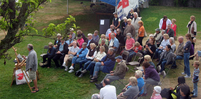
Brian Romer demonstrating at the Harmony Arts Festival, West Vancouver, Canada   The Workshop Calendar provides up-to-date selected workshops and seminars arranged in chronological order. 
    woa  
081010_andy-thomas

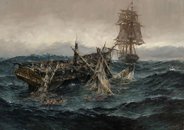
USS Constitution Vs. HMS Guerriere

oil painting by Andy Thomas, USA

  You may be interested to know that artists from every state in the USA, every province in Canada, and at least 115 countries worldwide have visited these pages since January 1, 2013. That includes Jack Pepper who wrote, “A good test of transparency is to drag out a gob of paint with a piece of card or a knife. Over a white ground you get an idea of the difference between poor quality and excellent.” And also Hwang Eng who wrote, “The main enemy of acrylic painting is water. Glazes, particularly, used with too much water and not enough medium will turn chalky after a while and dust off. Note the corners of your older acrylics and see if they are scuffing down to the support.”    

Archived Comments

Enjoy the past comments below for In praise of inexpensive materials

   
From: John Ferrie — Aug 09, 2010

Dear Robert, I always tell artists that a good painting starts with quality materials. I would rather see two good pieces then 20 pieces of half-baked work. Student quality paint is good for Elementary school students! I remember meeting with an upscale gallery once who actually took time to view my paintings. They said “what is the antiquitous qualities of your work?” I responded with “that what?” The point the gallery was making is that they want to make sure the painting, once sold, is not returned five years later all faded or cracking. I am also a Golden Paint artist. I, however, am a Golden Purist and would NEVER mix anything but Golden Paint with Golden paint. But i have to disagree Robert as the most important thing in paint is not the medium, it is the pigment. The pigment delivers the colour and at the end of the day, nothing is more important to a painting than colour. “…I want my paintings to be exquisite, therefore the chosen materials are the very best…” I just made up that quote! John Ferrie

From: Patsy, Antrim — Aug 10, 2010

I’m getting in before the other South Africans on this mailing list! In South Africa, it has long been a common sight to see small boys playing with toy cars they had fashioned out of galvanised wire. Considering the youth (usually between eight and 12 years old) of the young craftsmen, one has to admire their ability. In recent years wire work has become a sophisticated art form, with many adult artists taking it to breathtaking levels. I have taken the liberty of inserting a few website links, though if you were to google African wire art you would find far more. Granted, many items are created to sell to tourists, and could be seen as a bit kitsch, but look closely – the skill is incredible. The well-known African art-form of intricate beading is incorporated in many pieces, as are cleverly-cut and integrated pieces of metal, from soft-drink cans! Ladies, note also the cute bracelets, made of beaded safety pins. ;-) http://www.africa-adventure.org/s/streetwiresarts/index.html http://news.bbc.co.uk/1/shared/spl/hi/picture_gallery/07/africa_wire_art_exhibition_in_south_africa/html/1.stm http://www.sbmastore.net/south-african-safety-pin-bracelet-pr-16270.html http://www.africasmiles.co.za/wirework.htm

From: David — Aug 10, 2010

I am a tempera painter and former ceramist, and have found that the inexpensive metal oxides and Mason Stains I bought years ago from my ceramic supplier serve just as well as the pigments sold by art suppliers. I can’t get absolutely everything I need from the ceramic world, but given the abundance of choices and relatively low prices, I always look there first.

From: Jackie Knott — Aug 10, 2010

A fine artist with inexpensive materials will produce a superior piece while a less able one with the most expensive of materials will still produce mediocre work. At some point ability replaces materials cost. Beyond saturation permanency is the dividing line. Maybe I’m wrong, but I don’t see curators agonizing over restoring my paintings four hundred years from now. That’s their challenge. Manipulating wire is similar to an art school exercise of putting pen or pencil to paper and drawing without lifting the tool from the surface. It demands economy of movement and produces an abbreviated drawing that can be more appealing than a detailed composition. One of the most amazing sculptures I’ve ever seen was an elaborate Nativity scene formed entirely in chicken wire. The wire was fabricated into three dimensional figures as the wire was curved, depressed, puckered, folded, and pulled, giving each piece remarkable detail. One could see eyes, lips, nose, and mouth, even hands. The same attention was given to forming a camel, sheep, and donkey. The amateur (not!) sculptor spray painted eight life sized pieces with white spray paint and the whole scene was lighted at night. I’ve never forgotten the skill exhibited by that sculptor and it inspired me to one day try my hand at it.

From: Mallory Pesta — Aug 10, 2010

Franz Kline often used marginal or inappropriate materials. Perhaps he felt that what he was doing deserved the materials he used to do it (I don’t know). In any case, many of his fine abstractions are falling apart, having been crafted of newsprint and house paint. (It must be disturbing to have paid a large sum for one of those works, only to have it decomposes.) The lesson, I suppose, is that there are limits to the effective substitution of “more humble” materials, when others are available. It would be nice to believe that such substitutions only occur when it’s germane to the nature of either the other materials, or the work itself.

From: Waldemar Fonseca — Aug 10, 2010

If we begin to utilize materials of lesser value (read: functionality) can we really know what the ultimate impact will be on our work? It might take scores of years for the cheap material to begin to degrade, and we might never understand it to be inevitable, happily cobbling together materials into compounds that are doomed. It’s like playing at dice.

From: Darla — Aug 10, 2010

I love gesso and acrylic matte and gloss mediums! You can use them to isolate the surface of any flat, durable materiel and paint on it. I’m not getting into whether it’s OK to paint oils over acrylic mediums or paints, but it’s worked fine for me for decades with no sign of deterioration. I use mat cut-outs, gessoed on both sides to reduce warping, for inexpensive paint panels — and you can make them any size you please and save a trip to the art store. You can also glue canvas to them with acrylic medium to make canvas panels. Another favorite is pre-primed canvas on rolls. You can use it for canvas panels and it works great for plein air painting and color studies that you can pin to your easel to look at. I’ve also found that with oil paints, sometimes the most expensive is best, but sometimes cheaper paints have a more usable consistency. It often depends on the color paint per brand. One of my most useful tools is a panel with drag-down samples of each color and brand of paint that I use. That way I can see at a glance which one is right for what I want to do.

From: LeslieAnn — Aug 10, 2010

Yes, Jackson Pollock often used house paint.

From: Carol Ann Cain — Aug 10, 2010

Bravo and inspirational. If I cannot afford paints, I will draw. If I cannot afford pencil and paper, I will buy wire.

From: Rene — Aug 10, 2010

It’s not the arrow; it’s the Indian.

From: Carol Bobb — Aug 11, 2010

There is an art supply company in New Zealand which has started producing its own acrylic paints and they are loaded with pigment. The intention of the manufacturer is, I believe, to produce a quality paint at a price which schools and students can afford. NZ

From: Barbara — Aug 13, 2010

Please tell us the name of the wire Tony Cavelti uses and where to buy it in Vancouver. Many thanks

From: Gabriella — Aug 13, 2010

I think it must be what used to be called ‘baling wire’ an iron wire used to hold bales of hay. it bends easily, holds bent form well and is very inexpensive. Call around to good hardware stores and farmers’ supply outlets.

From: anon — Aug 13, 2010

Carl Bobb, beware of cheap paints. Real pigments come from few sources in the world that all manufacturers use, so prices of pigments are controlled. Paint can only be cheap it pigments are not artificial, or lot of filler is added. There is no other way.

From: Michael — Aug 13, 2010

Da Vinci invented his own paint formula for the Last Supper and it’s been falling apart ever since. Having said that; I’m an architect and one of the big names of the last few years is a Japanese architect named Shigeru Ban who makes wonderful, and very large, structures, out of cardboard, initially I think because he was frustrated at the lack of commissions and because cardboard is cheap. He turned people’s expectatations upside down and really changed things. Finally, as Norman Rockwell said [he used good materials but did things like varnish over wet paint to meet deadlines]‘people say the pictures won’t last: well, let the next generation paint its own pictures!’.

From: M. Browett — Aug 13, 2010

Can someone tell me the name of the music in the background of Tony Cavelti’s interview, please.

From: Toni Cavelti — Aug 14, 2010

It’s absolutely fantastic. I’ve had as many views as I would get in two years in my fancy jewellery establishment. I have received mail from an art teacher who is going to use my story as a teaching tool, I have been offered a free book by a lady who actually published a book in praise of wire bending techniques, I have heard from a lady whose friend went to Art School and, upon presenting a wire bird as a piece of his art, was told by the teacher that this was not art, the guy dropped out and was never heard of again, ( he could be today’s Alexander Calder ..!!! ) I received mail from a retired metallurgist who is willing to teach me brass and copper soldering and how to treat metal to make it durable and shiny and I heard from a long forgotten customer if I could remake a ring , a beautiful ring with colourful stones,that I had made for her many years ago. Robert, you and my new friend Dragan (who made the video) have opened a new door to excitement for me. thcavelti@gmail.com

From: Jen — Sep 19, 2010

As a hobbyist painter I can say that I love quality materials. However, paintings that I did as a middle-school student 30 years ago have survived intact, and are no worse for wear, and I used pretty cheap materials back then… I think I’ll let my children worry about preserving my artwork. I also have discovered that as volunteer in a local thrift store, a number of paintings that were once some family’s treasure now sell for $5. Making the art is the point for some, not necessarily the end result.

 
Share.

Robert and Sara Genn Twice-Weekly Letters

Subscribe and receive the Twice-Weekly letter on art. You’ll be joining a worldwide community of artists.
Subscription is free.