Dear Artist,
Last week, the most frequent questions jingling my inbox concerned artist’s websites. Fact is, most of them don’t work very well and artists often don’t know why. Some of course contain art that is substandard and any amount of smoke and mirrors won’t make them the dream machines that their owners desire. Having said that, many artist sites are wrongheaded and poorly done. I know this because over a period of several years I’ve had some pretty smart people fine-tuning my own site with an eye to troubleshooting and making it effective. Mine, www.robertgenn.com may not be fancy, but it has a fairly unique feature — it works. It’s a site that empowers the people who handle my work. I’ve always said that a site that attracted ten of the right kind of folks in a month would be a successful site. Mine picks up in the thousands and the click-through rate to my dealers is remarkable. Believe me, it’s appreciated. Here are a few ideas to consider if you are thinking about building a site or improving the one you have:
Make your site fast-loading with images of your work on the opening page. Make it a free-standing site with your own dot-com. Make it a service so that interested parties can check prices, basic history, and make the connections you want them to make. Repeat your essential key words, your name, etc., on the home page for easy search-engine collection and high placement. Give people a reason to come back. ie: change images often and keep the work you illustrate of the best quality you can muster. Make it possible for people to enlarge work. Put a face on yourself — even if you’re funny looking — let people know what you look like. Without going overboard, let your personality shine through. Include links to other sites, especially to those who handle your work — as well as frequently visited sites such as “The Painter’s Keys.” Avoid sound, flash, white-on-black lettering, weird fonts, sparkly dingbats, streaming video, too much intellectual info, pontificating and general baloney. Your site should understate and over-prove. If you have a prestigious C.V. — include it. Don’t put a counter on your site — subscribe to a simple stats report. Even if you have as few as three dealers or agents, consider just empowering them. Other dealers will come after you when they see that you operate generously.
Best regards,
Robert
PS: “The stereotyped mythology about artists, galleries and auction services are undergoing a substantial re-examination. The rules are changing, as are the rule makers.” (Marques Vickers)
Esoterica: California artist Marques Vickers is currently selling an e-book called Marketing and Buying Fine Art Online: A Right-Brained Guide to A Left-Brained Industry. It’s good. We have it printed out in my studio and I recommend it for anyone who wants to learn more. Marques Vickers is at http://www.marquesv.com/
(RG note) Today I’ve asked our resident web guru Andrew Niculescu to reply to some of your letters. Andrew has been responsible ongoing design and development of The Painter’s Keys website. He has also built RobertGenn.com into a more effective site. Andrew comes from a background of web development.
The following are selected responses to the above and other letters. Thanks for writing.
No face needed
by Nina Meledandri, New York, NY, USA

painting by Nina Meledandri
I basically agree with all the suggestions made concerning artists’ websites with the exception of including a photo of the artist. For me, “putting a face to the artist” doesn’t feel necessary or relevant to establishing a connection to the work (on a personal level, this has nothing to do with how I feel about my appearance).
(Andrew Niculescu note) Putting your face on your site is a personal decision. Research has shown that there are a few things to consider. Across a wide range of art galleries who use the Theo Digital Gallery System, for example, those that illustrate the brick and mortar presence of their gallery are more effective than those that do not. Even a doorway or other part of an edifice puts a sense of place to the dealer’s website. So too does a face or a figure put the human element into a connection. It’s valuable to give consideration to both a sense of place and a sense of personality. That’s why Robert suggested I put my mug up there. Besides, a picture is a search engine friendly component.
Success via the web
by Barbara Thibodeaux, Louisiana, USA

painting by Barbara Thibodeaux
I was recently asked the question of how having a website had affected my life. I have to tell you, I would not be the successful artist I am today without it! My site is proof that the internet works when the right combinations of simple design, marketing, and of course, art that you believe in, are used. There are so many artists out there that are intimidated by the thought of a website…I tell them, go for it. What do you have to lose?
(Andrew Niculescu note) It is important to remember that a website is a communication tool. The design and marketing will attract attention, the content will keep an increasing and steady audience. Professional web development communicates outstanding content through an eye-pleasing design that caters to an ever increasing audience. Artists’ websites can be accessed on our Premium Artists page.
Focus on artwork
by Hyedie Hashimoto
I absolutely agree with you. For artists especially (assuming that you have a website that is up and running) the most important visual message should be the artwork. Flashy graphics, animated gimmicks distracts from the artwork that is being showcased. The singular message that a visitor receives from the website should be ‘what great art!’ Last year I completed a website for contemporary artist Astrid Kihl. I made sure that the interface of the website was secondary to her art. Also a clearly defined navigation system ensures that the focus remains on the artist and the art. She has told me that she has received many compliments from galleries.
(Andrew Niculescu Note) The Internet as a medium has its limits. Web development should be a creative problem solving task where, out of all the tools available, the combination that best suites the task is implemented. There are situations where Flash animation, for example, is the better choice even if it’s transparent to the end user. Developers should not set limits, but utilize all the available technology in creating a robust web presence.
More tips for website optimization
by Bruce Meisterman

photo by Bruce Meisterman
My website is already undergoing a redesign and overhaul. The things I’ve learned about one’s website are exactly what you stated. I’d add a few more things to it:
1. Make it easy to navigate. The more user-friendly it is, the deeper the viewer will go.
2. Make sure all your images are optimized for faster downloading.
3. Do not forget to insert Meta tags. These are the keywords that describe what you do. An average number of Meta tags per site is 20.
4. Descriptions of the kind of work you do, your name, your field: painter-oils, painter-acrylic; artist-oils; artist-acrylic; watercolor artist; etc. The further you go with this will result in appearing in more searches.
5. There are many hosting companies out there. Find one that can provide you with daily stats on your site’s activity. This is invaluable because you can see which pages are and aren’t working; where your visitors are coming from; whether you’re getting hits or click-throughs; and much more. Some of them will also submit your site to search engines as an added feature.
6. Get on as many search engines as possible. There are companies that will do this for you. I’ve found one that will re-submit my site to over 300 search engines for only a couple of bucks a month. Make sure Google is one of the engines you get on. They supply a lot of other engines with their information so you get in on them via an activity called “spidering.” Also look for search engines that will include you for free.
7. Have text on every gallery page. These aid search engines in seeking you out.
8. Get a web designer who knows what they’re doing. (My experience the first time out was akin to a root canal.)
9. Make it easy for viewers to contact you. Have multiple links to call up a pre-addressed e-mail to you from the viewer. This aids in increasing contacts.
(Andrew Niculescu Note) The above are valuable tips for creating well-rounded web sites. Note the term web designer refers to a person in charge of the ‘look’ of a web site. A dealer friendly web site is meant to ultimately help you sell your artwork and its development should not be treated superficially. To create a web site you need: Planning, Design, Development, Marketing and Maintenance. This used to require at least 3 people. Now, professional developers have perfected the marketing and design techniques in order to provide complete solutions.
Successful promotion through website
by Karin Wells

painting by Karin Wells
Two weeks ago, I had a new website design completed for my landscape paintings. With it, I had hoped to introduce galleries to my work… and it worked! Due to the poor economy, my portrait business is slow and I have been painting landscapes but had no way to market them, as it is a completely different kind of business. Already because of my new website, I have been contacted by a gallery in Atlanta and have shipped them some paintings. And at the present time I have two more galleries in the pipeline and am keeping my fingers crossed.
Increasing website traffic
by Pat Kammer
I am impressed that you get so much traffic. I know you can have the best web site ever created and still not get traffic. How did you get that amount of people coming to your site? Search Engines, Popups, eZines, Newsletters, Banners… how?
(RG note) Google is a big supplier of visitors. Some have seen my work in galleries and come to the site to check me out and find out what else might be available. A high percentage of people who write to me from my site have earlier works of mine in their possession. Very often they just want to know something about them — when painted, value, etc., or to have them added to the online archive. It’s a pleasurable way to keep connected. Others are interested in when I’m next going to make a delivery to such and such a gallery, or where I’m going to be painting next. Sometimes they write to me to tell me they have just purchased a painting from one of my dealers. With regard to banners and popups — the operative word around here is “Never.”
Inconsistent web sites
by Eva Kosinski, Louisville, CO, USA

painting by Eva Kosinski
One of the most frustrating things I have observed is the tendency for different website vendors to tailor their web language to just one vendor’s machines and/or use what are called “proprietary tags.” Why some sites don’t work has more to do with the fact that the web document on an artist’s machine designed to do all kinds of cool web effects, will do them correctly Only if the viewing machine is configured similarly to the artist’s. Some tags used in “Front Page” for example, will only work on machines using Microsoft Internet Explorer as their web browser. Some web documents use tags that only work if you are using either Netscape or Mozilla as your browser, and sometimes you get hosed if you are using an older version and the website only wants to use the cool new stuff that won’t work on your old browser. They just don’t realize, or their marketing departments just don’t realize, we want to SHARE information. That’s the point of the net. So if you have someone working on your website for you, tell them you want it “portable” — you want the Macintosh folks to read it, the PC folks to read it, the Netscape folks to read it, the explorer folks … you get the idea. They will tell you that you should be using the “latest and greatest” (probably what they are most comfortable with), but you don’t know that the person who is out there waiting to buy your painting isn’t using an old macII ci running an ancient Netscape so they can save their money to buy art.
(Andrew Niculescu note) Eva is addressing the ever-present issue of cross-platform web development. Platforms being the different computer systems that exist on the market. A knowledgeable web developer will know to test website compatibility with most popular web browsers (Internet Explorer, Netscape, Opera, etc.) screen sizes and Internet connection speeds (dial-up modem, DSL, Cable, etc.) across all platforms (Windows, Mac OS, Unix, Linux, etc.). Also, proprietary tags are the building blocks of the Hypertext Markup Language (html), which is the technology at the basis of web development. img is a tag for describing an image object, for example.
Technical tips for a better optimized website
by TD Yandt
After years of producing my own sites, and creating sites for others, I’ve learned certain things. Doorways don’t work, music doesn’t work, flashy sites with overdone graphics don’t work. Simple, understated, and content loaded sites are the ones that get listed. The ones that get listed are the ones that bring in visitors. For example, use all of your image tags to your advantage, describe the image, or use words that describe your site in general.
Instead of using: IMG src=”http://clicks.robertgenn.com/html/painting.jpg” Try something like this:
IMG src=”http://clicks.robertgenn.com/html/woman.jpg” WIDTH=”125″ HEIGHT=”161″ ALT=”An Impressionist nude painting entitled ‘Woman,’ very vibrant and colourful.”
Suddenly you’ve added some great search terms that a buyer or dealer might use to help them find you. “colourful nude,” “vibrant woman,” “impressionist painting.” Use your code to your advantage. Every bit of code is there for a reason, and every bit of it can help promote your website. My art site may not be high traffic but since redoing it a few months back, traffic was improved from a few search engine hits a month to a few hits a day from various search engines. It really does make a big difference.
(Andrew Niculescu note) The author is quoting Hypertext Markup Language (HTML) code examples.
If it sells it works
by John Ferrie
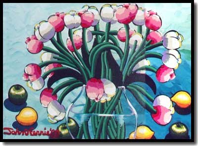
painting by John Ferrie
I started my site about 8 years ago when the Internet was about 99% pornography. I can remember thinking, “…who is going to buy art off the Internet? I put up my little 15-page site and was thrilled. I had all these web-designers who said they could do all sorts of fuss and fan-air. I remember thinking it should be kept simple, make the artwork pop off the screen and make sure my grandmother could navigate the site if she was on the Internet for the first time. I have kept this simple formula on my site ever since. I had four sales in the first six weeks the site was up and running. I get all these reports every month telling me how many people have visited, what country they are from and how they found my site, bla bla bla. It was the sales that I wanted. Yes, art does sell off the Internet. I can now write an international waybill in my sleep. These are the nuts and bolts that you learn as an artist. My site has now over 250 pages. I usually upgrade my site three or four times a year. I send out announcements to people on my email list to come and view my new works. I spend a great deal of time fussing with the site to make it all look perfect.
One of the things you did over look was getting a good designer. There are also all sorts of cheesy products that show you how to make a home page in the comfort of your own home. Getting a good designer is difficult, but well worth shopping around for. I also recommend staying away from having “Available,” “price reduced” and other desperate sales techniques on the paintings. And artists should steer clear of these “coral” sites where there are thousands of other artists on the site as well. They may claim to get 1,000,000 hits a month but this is no way to find a target market, nor will it generate any sales. A lot of artists are annoyed when they don’t see the sales coming over the net. I would suggest that it is all part of the presentation that makes an artist better. I am asked if I am on the net more than I am asked if I show with a gallery. It seems to me that the Internet is the wave of the future and the gallery will become obsolete. Consumers are becoming more savvy with their purchases. While I am not convinced it is good to have prices listed on a website, it is important to show that a sale can be made through a website. International buyers have trouble converting prices from the Canadian dollar. But the net, more than anything, can get artist work shown.
Your comment about links bothers me. Any link to another site sends people off your site faster than when they got there. If someone has chosen to view an artist site, then the longer they spend on there, the better. Having interesting links does not improve an artist’s site.
(Andrew Niculescu Note) Linking with other sites and hosting others’ links, increases popularity. Example: I host a link to a popular art community page. A person searches for this art community and indirectly my website gets an impression (where an audience is given the opportunity to access a site). Out of many impressions there will be some traffic. Links increase traffic to your site and quality links exchanges increase the quality and credibility of your web site.
Simple, fast loading websites work
by Sandy Sandy

painting by Sandy Sandy
I don’t think you are the only person whose web site actually works for them, even if the majority do not. I agree with most of the points you make, however not all sites are geared towards attaining gallery representation. Sites may work for people in different ways. For instance in my case, my site deals mostly in direct selling and getting people to come out to my shows. When I can raise my prices enough to interest and afford dealers, I will gladly change the format of my site to fit that need. In the meantime, I have to pound out a living at this. I have had my website visited over 30,000 times in the past three years. Many viewers come back often because I usually update my web site weekly and post updates on my home page. What is your aversion to counters if they are discrete and tasteful anyway? Much worse than counters are some of the god-awful background colors people use. Remember everyone sees colors and type sizes and formatting differently, according to their own computer, monitor, browser, Mac or PC. I have viewed many artists’ web sites (all on your links page as of last weekend) and the worst problem I see are SLOW loading pages. That, as we all know, comes from image files that are way too big or too many images on a page. I try to keep my pages under 50K and my site is often praised by viewers for being fast and easy to navigate. I, like you, believe simpler is better and some of the flashy, intricate, professionally designed “skill show-off” sites are the worst offenders in this department. What they don’t take into consideration is they’ve probably lost half their audience in the first few minutes. Living in the country, where cable hookup is unavailable, I am forced to use a phone connection that travels old wires and although I have a 56K modem, can only connect at 28800bps. This is a blessing in that I see my site in the worst case scenario as far as speed. The link issue is a debatable one. Jack White, author of The Mystery of Making It, never puts any on his sites because as he says, “It’s your store, why are you sending them to someone else’s?” Once someone leaves your site, you never know if they’ll be back. Since his advice, I’ve made some changes to my site and have tucked my links away in a more secluded part of it. That way, I feel my viewers have poked around and checked out the bulk of my material before getting side tracked and going elsewhere.
(Andrew Niculescu note) Counters have a commercial quality to them and do not market the value of your web site’s content. It helps having a counter only if the site sells a common product — in this case a counter showing a large, increasing number gives credibility.
Web design made easy
by Sherry Preston
Websites are a wonderful outlet to show works. I am currently rebuilding my own site to make it more professional. The first site I built works well but it is too big and has too much information along with the images not being ordered by date. So I am currently rebuilding my site using Dreamweaver. I am updating images from thumbnails of my images to have them click to the large image. I will be taking new digital photos of my works to display on my site. I have made many connections with my art through the Internet, mainly with other artists, which is very valuable in this type of life style. Contacts are so very important to move forward in the art world. I am keeping my lettering easy to read along with having higher quality images for people to view. I have built a few sites and I learn as I go. I am self-taught in building websites so I definitely do not know everything such as html coding. It is not impossible to build on the Internet, it is the willingness to try.
Website with a focus on the art
by Chuck Rawle

painting by Chuck Rawle
It has been difficult to convince some clients that too many bells and whistles actually detract from a web site, especially an art related site. Such a site is already heavy in graphics and additional “gee-whiz” and flash just make the site slower to load and detracts from the art it is supposed to promote. The art itself should be the star of the site, not the ability of the designer. One other suggestion: when adding links to galleries on an artist’s web site, use the address of the actual page that contains that artist’s artwork, instead of the gallery’s home page. So if someone is interested in Robert Genn’s work, they don’t have to wade through the galleries’ sites and other artists’ pages. They go directly to Robert Genn’s images.
Dogs get disrespect
by Carolyn Smith, Vancouver Island, BC, Canada
I assume some people don’t know how “dogs” is an old saying. “Life is going to the dogs!” “They are leading a (poor) dog’s life.” Swear word — “Dog gone it, now you’ve done it! — something’s ruined. “Kick the dog, you’ll feel better.” “You’re in the doghouse now!” “Let sleeping dogs lie.inc” There are more and probably Emily has heard them all. I’m sure as rain she just politely pants, smiles and blinks knowingly that you can “teach a dog new tricks!” by changing the way you do things.
(RG note) I was doggedly going about the business of painting and I noticed that Emily looked up and growled when this one came in.

 Lucette Bourdin, Claremont, CA, USA  Tibetan Window |
You may be interested to know that artists from every state in the USA, every province in Canada, and at least 115 countries worldwide have visited these pages since January 1, 2003.


