Dear Artist,
While it may be academic to know your light source before you begin, it’s also possible — particularly in darker climes — to make light sources and light effects arbitrary and after the fact. Keep them in your pocket, so to speak. Leaving options open while work is in progress lays the groundwork for surprise. Surrendering to a felt need is part of a creator’s joy. Our game is art, not slavery.

“Daden’s Sunrise” (2007)
acrylic painting
by Robert Genn
Several days ago in the Queen Charlotte Islands I was faced with a particularly flat day. Overcast and grey, it wasn’t even foreboding. Not much was wrong with the small canvas I painted down on the beach, but during the windup strokes I realized it needed something more. Changing the light is a painter’s prerogative. Remembering the sunset of the previous evening — and the rain squalls passing through it — I thought, “Why not?”
Light takes top billing as a principle actor. Apart from adding drama, mood and condition, it’s the main tool for describing form and volume. In the great outdoors, light takes its cues from the sky. At the same time, light is often the key to colour and gradation. To have the blessing of lightness, you need shadow. Dark is light’s friend.
Here are a few “light motifs” worth looking for:
Light source inside the picture plane
Light source outside the picture plane
Dappled impressions or “scrim” lighting
Against the light and “contraluz” effects
Edge lighting for separation and description
Aerial perspective through intervening light
Two-source lighting — often a warm and a cool
Reflected lighting to enhance form, space or realism
Amorphous lighting to promote mystery and strangeness
Selective lighting — e.g. lit background, foreground shade
Standard “set” lighting: fill, focus, and eye-light, etc.
Artists need to know when and when not to come to light. Flatness and lightlessness, for example, can be used to draw attention to graphic sensibilities. It’s clear that the use of light in art runs the gamut from restraint to schmaltz. Light is sacred; it’s important not to abuse it. “Let there be light.”
Best regards,
Robert
PS: “The substance of painting is light.” (Andre Derain)
Esoterica: Never forget light’s greater values — optimism, hope, promise, truth, wisdom. “Truly, it is in the darkness that one finds the light, so when we are in sorrow, then this light is nearest of all to us.” (Meister Johann Eckhart) Perhaps more than any other element, it is light that gives spirit to the soul. “Oh mysterious world of all light, thou hast made a light shine within me.” (Paul Gauguin)
Learning from Rembrandt
by Tony Kampwerth, Knoxville, TN, USA

“Pilgrims at Emmaus”
oil painting
by Rembrandt van Rijn (1628-29)
I have recently taken another look at Rembrandt’s paintings (prompted by a PBS special on his work and a local exhibit of his etchings). Since most of the portraits were completed indoors, he had to create the light source and locate the light areas in the paintings. One of the paintings has a group of men seated at a table and the table actually glows. While it is an un-natural scene, the impact is outstanding. We should look back at the work of the master painters from time to time for lessons learned and forgotten.
Reading light’s temperature
by Michael Chesley Johnson, ME, USA / NB, Canada

“Dry Creek Sycamore”
oil painting
by Michael Chesley Johnson
Changing the light is something I do frequently. Lately, I’ve been playing with colour temperature. I always try to “read” the light to see if it is warm or cool. However, I find it difficult to do. My solution is to “read” the shadow instead. I think the eye has a lot easier time telling if shadow is warm or cool. Once I’ve made a determination, I assume the light is the opposite, and I paint it as such. Sometimes, if there’s any doubt in my mind about temperature, I just make a decision, accurate or not, and then stick with it. These practices lead to paintings that seem to work.
Bright red pants
by Naomi Brotherton, Carrollton, TX, USA

“Citrus”
watercolour painting, 14.5 x 21 inches
by Naomi Brotherton
When I looked at your video I was shocked at the bright red pants you were wearing. Probably on a gray day, it wouldn’t matter, but on a sunshiny day, wouldn’t that red affect the colors in your painting? A friend used to say that if we were painting a white house and a red truck passed that it would change the colors in the shadows especially. “Light bounce” is the term we use for that. Deer hunters wear red caps and perhaps red clothing, so that other hunters will see them and not mistake their movement for a deer. Perhaps something like that is your reason for the red attire.
(RG note) Thanks, Naomi. The red pants were part of a floater-pant and jacket outfit that they give you at fishing lodges. I painted in the mornings and fished in the afternoons. Even on grey mornings those pants reflected on the paintings, but in the afternoons they didn’t seem to bother the fish.
Artistic licence
by Geri VanHeuverswyn, San Antonio, TX, USA

“La Mansion”
watercolour painting, 8 x 10 inches
by Geri VanHeuverswyn
On a dreary cold day a few years ago, I painted a scene of our local Salado Creek and then added a rising sun on the far bank. As my son was framing the painting, he asked me the name, and I told him, “Sunrise on the Salado”. He told me that I would have to change the name, since the sun didn’t rise on that side of the Salado… I informed him that I was an artist and that I could make the sun rise and set where ever I wanted.
Reliving the moment
by Gregory Packard, Montrose, CO, USA

Greg Packard painting on location
Much like the nature of life imposes challenges on each of our souls and requires us to adapt on the fly or unwillingly fade, plein air painting forces us to improvise and make quick decisions or end up with a frustrated painting experience. I find myself often being inspired by a scene outdoors and setting up to paint only for the light and conditions to change, then painting virtually from memory or going an entirely different direction from the original intent. The joy and honor of painting plein air is the first-hand experience of being inspired by nature. That inspiration carries way beyond the field. It carries into my imagination where things remain vivid, dynamic and alive. I can revisit it at will at the studio or wherever, where the sun and light can slip around this cloud or that mountain at my discretion. It’s not the control that’s exciting — that’s a stalemate at best. Rather, it’s the exploration of creativity among the thrill of nature, the original creation, a sunburst on a bright red rose!
Seeing with chiaroscuro
by Gavin Calf, Cape Town, South Africa

“Hesitation Tango”
oil painting
by Gavin Calf
I was struck by your comments on light. I’ve begun a word scrapbook to refer to when I need it. I was schooled in painting the nude: set model, point a light at her/him and then work away at the chiaroscuro (clear/obscure) of Rembrandt. So for a while when I worked alone I sat almost in complete darkness and my work was dark like planets in outer space, almost no secondary light — mono-colour. After returning to outdoor work things lit up again.
Arbitrary lighting
by Cheryl Lobenberg, Sacramento, CA, USA

acrylic painting
by Cheryl Lobenberg
Imagine my surprise when I read your latest missive titled “Changing the light”! I go out with fellow plein air painters here in Sacramento every Monday morning. We paint from 8 a.m. to about 11 a.m. It’s the same thing! I captured the colors in the water, tree lines and distant city buildings. Only one problem… boring! I’ve spent a number of hours now in my studio simply changing the colors. I work in acrylic, so this is easy to do within short periods of time. I think I’m finally there. We’re looking south down the Sacramento River. It can’t be a summertime sunrise or an anytime sunset. Maybe it’s an early morning winter view. Ah, who cares — sometime in the future, I may paint over it.
Replicating light with models
by Theresa Bayer, Austin, TX, USA

watercolour painting
by Theresa Bayer
Keeping lighting consistent is a challenge especially when working with photo reference from varied sources (yet another reason why it’s way better to take your own photos), or when making up a composition from your own head. That’s when you can fall back on drawing experience. Shadows make certain patterns and with enough drawing practice, these patterns can be programmed into your head — enough so you can produce something convincing. The “Rembrandt lighting” on a three quarters view face is a classic example — the nose casts a shadow on the cheek and oftentimes there is a little triangle of light on the cheek of the shadowed side of the face. Also the head of a figure casts a certain shadow over the shoulder, and sometimes that shadow has a little “nose shape” sticking out of it. So that’s where drawing experience can help. But sometimes you just have to have a model, whether it’s a real one or something made up. Sometimes when I’m stuck with lighting I build a small clay model, or buy plastic animals, or build a whole scene with cardboard, fabric, paper, etc., and then just light it all up.
Vibrancy of the outdoors
by Carol Morrison, Oakville, NS, Canada

“Cliffs and hayfields in Burlington”
plein-air painting
by Carol Morrison
I have been trying to grapple with the problem of producing vibrant studio work for some time. I am mainly a plein-air painter and very much enjoy being surrounded by nature. However, one big limitation of plein air work is size, and I am trying to find a way of working from plein air sketches and/or photographs that I take from paintings created in the studio. Mind you, in a show of work by Tom Thomson that I saw in Ottawa a few years ago, I felt that his initial sketches were much more expressive than his studio works based on them, so maybe this is a problem no matter what the caliber of the artist. I would appreciate any hints on how to make the transition.
(RG note) Thanks, Carol. It’s a given that field work is going to be cursory and yet often expressive, while studio work, when derived from field work tends to be more contrived and stiff. It’s a constant fight to keep studio work fresh.
Over 20 years in the making
by Terry Krysak, Penticton, BC, Canada

“Mayne Island Arbutus”
watercolor painting
by Terry Krysak
Having spent 26 years in Vancouver, B.C., I experienced my fair share of dark gloomy rain-filled days. The air is usually electric during these days, charged with ozone, and quite unlike any other weather experience. In 1984 I spent a weekend on Mayne Island, and it was dark and gloomy the whole time, with a constant “rain mist” falling continuously. It was a weekend for photography, not painting. A dry spot could not be found anywhere outdoors. I stumbled upon a beautiful arbutus tree (madrona) stretching its limbs out toward the horizon. I started the watercolor in 1984, and became stuck because I couldn’t figure out how to paint the arbutus. I pulled it out of storage a few months ago and after much pondering what to do and how to do it, finished the piece last week.
Playing with light is my favorite part of being an artist. Even creating something that did not exist at the time it was witnessed, as is the case with Mayne Island Arbutus. I could not see the painting in my mind without some measure of light in it, as it creates the mood of the entire painting. In addition to that, I couldn’t find the original slide which turned out to be a blessing. I had to use my imagination and memory to finish the painting.
Pushing the envelope
by Elsie Kilguss, Wickford, RI, USA

“Misty Seashore”
oil painting, 18 x 24 inches
by Elsie Kilguss
As an outdoor painter I learned a long time ago that light is the key to everything but I was always ingrained with the truth of what I saw. Exaggerating the light effects in nature helped to create more dramatic paintings in my studio when I worked from small pochade paintings done outdoors. When on location I often have “pushed the envelope” of light that day or night but it wasn’t until I saw your latest clickback that I realized that “changing the light” on location was a unique and valid approach also. It is one more way that enables us to communicate to the viewer the special elements evident to us in the outdoor scene that has caught our eye, our heart and as a result our response to that experience. The changing light challenges us to depict it in such a way that it commands our attention if only for a minute and is a reminder of a moment of beauty in our universe.
Finding colours in darkness
by Celeste Vaught, Tulsa, OK, USA
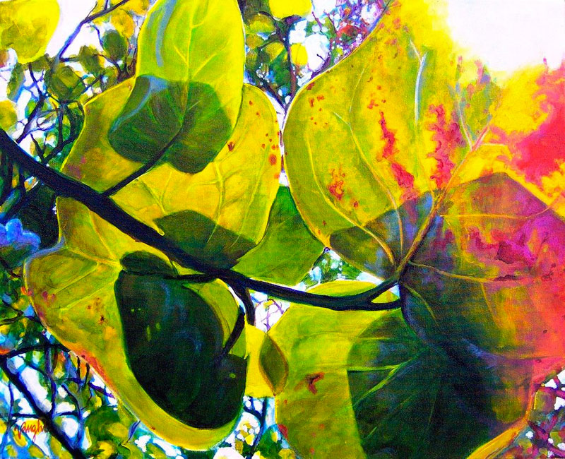
“Sea grapes”
acrylic painting, 16 x 20 inches
by Celeste Vaught
From the time I was very young, my mother, also an artist, taught me to pay attention to the light, to see colors in reflections and shadows beyond the obvious. We’d play a game “can you see this color in that shadow?” I felt like I knew a secret that not everyone knew when we played that game! Shadows enchant me inviting me to see a world of colors and forms in such a mysterious way and I love to incorporate them into my art whenever possible.
Recently I completed a painting based on a photo I took of some backlit Sea Grapes leaves. The leaves gave way to beautiful colors and geometric forms and I’ve since learned that the attached painting is an example of what you call “contraluz.”
(RG note) Thanks, Celeste. So many artists wrote to ask for a definition of “Contraluz.” It’s a Spanish word meaning a painting that involves one or another of the “against the light” effects. “Burnout” removes detail from an overexposed area. “Aura” gives a halo around backlit subjects. “Flare” is where backlit subjects themselves light up with colour — often bright red or orange.
Texture on OSB
by Barbara Mulligan, Panama City, FL, USA

“Sarah in shadows”
watercolour painting
16 x 24 inches
by Barbara Mulligan
Recently I have been working on twenty portraits using light and shadow as my theme. Your letter was so appropriate! I tried to create drama and mood in the two-source lighting for warm and cool effects. I paint many layers of gesso on OSB (oriented strand board) and then proceed with watercolor. I wanted to promote mystery in each subject’s portrait with a focus on strong lights and darks. But I also wanted to use restraint so as not to overcome the personality. Your reference list aptly described what I am trying to do.
Artist and non-artist views
by Tatjana Mirkov-Popovicki, Port Moody, BC, Canada

“Indian Point Sunset, Savary Island”
acrylic painting, 8 x 10 inches
by Tatjana Mirkov-Popovicki
My family members who have mixed levels of art appreciation were all in awe last night as we attended an exhibition at a public gallery. This was sure proof that great art crosses all boundaries. Their delight was caused by different aspects of the paintings, some that would never cross my mind — it was great to see them illuminated by art. Interesting difference I noticed between my viewing and theirs was that they always look for a story behind the painting — who did it, why, what is interesting about it… if there is no story, they try to invent one… while I was satisfied by the beauty, quality or confidence of the painting on it’s own. It’s almost like the artist is concerned to create, educate, love, feed and dress up the painting and send it into the world, knowing that the world will make a story out of it.
Archived Comments
Enjoy the past comments below for Changing the light…
I appreciate the fact that you printed my statement (although disappointed that you didn’t show my tapestry), however the city I was in is BERWYN which you misspelled. Now my home-studio is in EXTON PA.
Thank you for another lovely video. I was looking for the other ones and couldn’t easily find them. How about a link on your site to all your videos. Thanks again.
As I explore light in a painting, I am in awe. I am totally interested in your mention of “Aura” and “Flash”. Would you site a few paintings that display that phenomena, please?
What a delightful web-site. I miss not having other painters with which to exchange thoughts, ideas etc…. It’s like connecting with a whole new world. I am new to the computer. I’ve only had one for a year. Amazing!! I look forward to the letter.10ten
In looking at ‘over the shoulder 6’ I notice, as I have on most of your videos, that you place the details of the painting – trees, rocks, the line between sea and sky, etc. – before placing in the sky, the lake, the sea, whatever ! I visited an office today, where 4 of your paintings are displayed in the reception area (they are, I believe, earlier works, as are the ones I own) and, looking closely, I could see the same technique had been used on them. As a watercolorist, for now at least, I have been taught that it is generally best to lay in the backgrounds first and the details second, though that is not necessarily carved in stone. When I have deviated from that general rule my work, equally generally, is screwed up ! Why did you choose then to follow your path – because the paints allow you to do so, or you find that laying in the details is more interesting/fun or because you prefer to do it that way ? I note too, that you frequently will apply what I assume is a wash across the entire painting often when about half done: the effect seems to tone down the entire painting or to add a harmonizing influence; is that what it is about ? As always I appreciate your work, as your work appreciates in my home ! With regards, Peter T
Is this not one of the general public’s main problems with all art (but especially Modern or Abstract). This “demand” for a narrative to help them, to explain to them what “Art” is. It is as if they fear missing out on something and want to “join the club”. If they are not consoled by any information at all – an expressive title even – they tend to become negative and hostile. The answer is to just look at or in it, not at what “it” means. Think of Art as an answerless question. Probably a multiple choice without any correct answer.
This is my first hit on the URL which I heard about in The Artist’s magazine. I am pretty impressed with my first quick skim through. If I wished to submit a painting (in this theme or another) how would I go about it?
I too am wondering about the wash laid with a rag over the entire painting – I like the effect, but what is it? thks…
Hello,
I am attempting to confirm as being a work of yours – a print of a winter forestscape entitled ContraLuz. Could you confirm this, perhaps provide a link to an online gallery or portfolio where I could see this work? or perhaps I could send you a photo of the work in question? Thank you.


Old Man oil painting |
You may be interested to know that artists from every state in the USA, every province in Canada, and at least 115 countries worldwide have visited these pages since January 1, 2013.
That includes Glenn Tompkins of Mesa, AZ, USA who wrote, “You really have a nice way of encouraging the artist to plow the depths of light, imagination, and the crust of the earth.”
And also Helen Webber of Exton, PA, USA who wrote, “Light expresses my deepest feelings, of how I express myself in my art. I don’t ignore the darkness in our existence, but somehow if it is in the splattering paint in shimmering colors, or the use of light and dark contrast in fabric, the theme of hope peeks through.”
And also Brad Greek of Mary Esther, FL, USA who wrote, “It’s great to be an artist but it’s overwhelming to do it in nature’s presence.”
And also Rick McClung of Atlanta, GA, USA who wrote, “You said a mouthful. Your words of wisdom will make more and more sense as time passes.”
And also Joe Kazimierczyk of Neshanic Station, NJ, USA who wrote, “I sometimes think of light as a great magician — how it’s always transforming what’s in front of us, and how it can conjure up something out of nothing, like a tree’s shadow on an otherwise empty wall. This stuff is pure magic to me.”

And also Bernard Victor of London, England who wrote, “I enjoyed watching your ‘Changing the light’ video. I was intrigued by your pochade box. Is it custom made or a commercial one?”
(RG note) Thanks, Victor. It’s an adapted commercial one. The locked-in and slanted canvas holder and stabilizing arms are my modifications.


While reading this “Keys,” I remembered that I stopped taking vacation photographs after a trip where I couldn’t really recall what I had seen, I only could view the photos! Now, when I travel, I only take photos of people; for landscapes and buildings, etc. I look at them carefully, particularly noting where the light comes from and what quality it is. All this was before I began painting. Now, of course, I’m painting the scene within my head!