Dear Artist,
Yesterday, Kelly Borsheim of Cedar Creek, Texas, wrote, “I’ve been struggling with a large acrylic ramp, or gradation. I was striving for no blotches and no brush marks. I’ve really been having difficulty touching up, because I’ve not yet gotten the feel for how much acrylic darkens as it dries.”

The Swell on Mudge, 1980
acrylic on canvas
24 x 47.5 inches
by Robert Genn (1936-2014)
Thanks for that, Kelly. Whether you call them gradations, ramps, or blends, and whether they’re big or small, they’re one of the most valuable visual devices. The simplest system for large acrylic gradations is to pre-mix two colours representing the extremes of the desired gradation. Using yogurt cups, make them slightly more dilute than normal, or add retarder. Work fast. Establish both ends of the gradation with a big brush and then feather wet into wet in the middle. Put lids on the cups and you will always have at least the extremes in case you have to touch up. I’ve had artists tell me that it’s very near impossible to do a big gradation in acrylic — only to prove themselves wrong using this method.
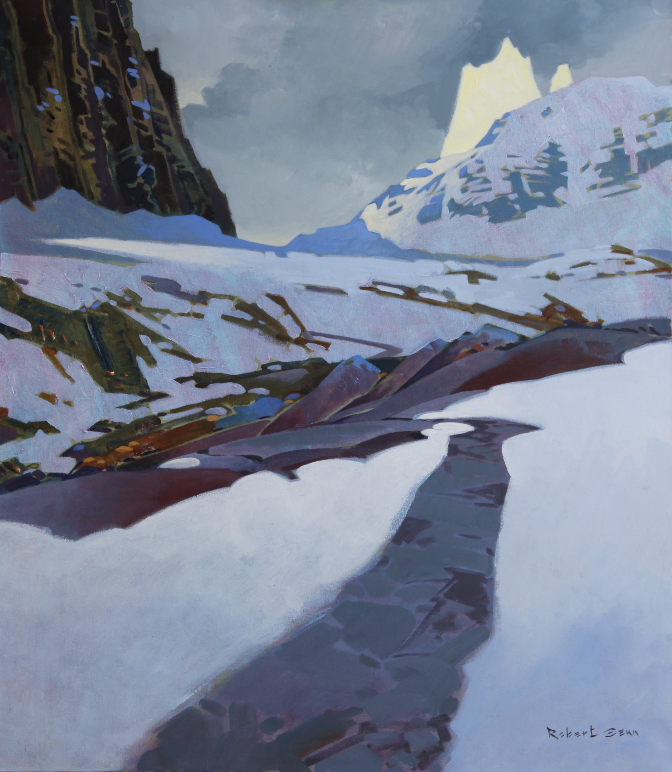
On Opabin Pass, c. 2009
acrylic on canvas
30 x 34 inches
by Robert Genn
Smaller gradations are a piece of cake. Very often with a properly loaded brush you can make them happen with one stroke. Another system is to flick them on top of one end of previously painted flat areas. Colour choice is important. If you want gradations to “come to light” then you slide up the colour wheel and add white. Thus, for a local red you might mix orange with white. To “come to dark” you slide down the colour wheel and add black. Gradations add excitement, sophistication, and give “zip” to all types of dull paintings.
Masking and frisketing are effective ways to get even gradations. There’s now a popular product called a “Masquepen.” Having curved and straight card-blocks or templates on hand is a quick system. Also, simple gradations can be made with big and small paint rollers. To do this, puddle the extremity colours on a rolling-board and blend them onto the roller. When your roller looks right, test and apply it to your work. Roller-tip and paper stencil add to the joy. You can also go roller-wild preparing ready-made or suggestive gradations as fun-primers on new canvases. The most facile gradations have always been made with an air-brush, so don’t overlook the possibility of blowing them on, or using spray cans.

Blackie Spit from Secret Beach, c. 2000
acrylic on canvas
24 x 30 inches
by Robert Genn
Best regards,
Robert
PS: “To get the effect of distance in a flat field or an area of water, use a gradation. Either from the front to the back, or side to side. It can often solve the problem of what to do with your foreground.” (Ron Ranson)
Esoterica: The introduction of gradations is like a troupe of acrobats and magicians brought in to enliven an otherwise flat performance. “The eye and soul are caressed in the contemplation of subtle changes of colour over a surface — transitions that are like music — intangible in their reaction upon us. There is an immediate sensual appeal.” (John F. Carlson)
This letter was originally published as “Some ways with gradations” on April 9, 2004.

Village in the Mist, c. 1996
acrylic on canvas
30 x 30 inches
by Robert Genn
I wish each and every one of you well during this global health crisis and encourage you to flatten the curve by staying at home with your creative materials. I hope our Painter’s Keys community can be a source of friendship and creative inspiration during this time and always.
In friendship, Sara
Have you considered a Premium Artist Listing? With each letter, an artist is featured at the bottom of this page. The Premium Artist Listings are a means of connecting artist subscribers through their work. Proceeds from each listing contribute to the production of The Painter’s Keys.
“Great paintings have gradations, large and small… They serve to lift the subject off the two-dimensionality of the canvas. Gradations are an essential abstract convention.” (Robert Genn)
Featured Workshop

Experience beautiful early spring in Santa Fe, NM. Develop your own unique marks and painting vocabulary in this 2 1/2 day abstract acrylic workshop.
We will work on paper, and for those who like, unstretched canvas, using conventional and unconventional mark making tools and drawing media. Via guided exercises you will practice a variety of marks and learn how to create a work rich with history and depth through the process of layering these marks with acrylic paint.
This class is suitable for beginning and intermediate painters. Cost is $595.00 Materials list provided one month prior to the workshop or can be provided at an additional cost of $100.00
https://julieschumer.com/julie-schumer-workshops/
 HOPE
HOPEOil on Canvas
48" x 60"
Featured Artist
Sometimes we see what no one looks for–images that have waited for us to find them. If we are lucky, these images will wait while we try to capture them with paint on canvas. They will probably change as we reach for them. I believe that if we clearly and honestly record what we see, we will be surprised, enriched, and sometimes stunned by what we’ve found.
There is almost always a narrative in my paintings as I believe that a story may be introduced in a scene. The viewer must fill in the before and after with unique eyes and experience, but enough can be presented to set a challenging stage if the work is successful.
Along with being a visual story teller, I’ve been called a colorist, surrealist, patternist, and sometimes a texturist. I’m an Atlanta artist–an oil painter for over twenty-five years–with a studio in Brookhaven. I love working with oils because each painting session results in a new revelation of what they might do. There is a mystical quality to each painting and each day for me.


12 Comments
Thanks for this!
Another way to ‘graduate’ /blend the dark with the light is to leave an open untouched strip between the paint.. Take a clean brush that’s really juicy with clear water and paint a clear strip of water…not touching the dark or light paint.
NOW take that wide dampened brush…one swipe..touching the dark on one side and light on the other…. it’s pure magic seeing them blend!
Stay safe.
Use your creative mind to help you during this crisis. And share ideas like this to keep us connected!!
Thanks Lynda. A great idea!
Another possibility is to switch to Winsor Newton Artist Acrylics, the colors do not darken from wet to dry.
Boy, “Blackie Spit…” is a great painting! Thank you for sharing and for the consistent inspiration.
On another topic: has anyone researched artist relief funds and can recommend legitimate ones? I work for a very small non-profit visual arts organization which is, gratefully, keeping us on payroll (for now) while we work from home. As the gallery coordinator, I would like to compile info for my member artists on where help can be found, should they need it. Thank you in advance…Cathy
The topic of gradation couldn’t have come at a better time. I thought it was just me – having missed all the Art 101 basics. I’m literally tackling this issue now on a big canvas with a small roller.
Calm, when you get it right, frustrating when streaks or rogue blobs get in on the act.
At some point you just have to call it a night, return when there’s better light, build more insight.
Keep calm, tarry on.
Did Robert use acrylics as well as oils? His gradation instructions made me assume he used acrylics.
So many interesting and beautiful paintings fit in with the text so well. Thank you.
Hi Barbara,
My father worked in oils until 1979 when, after reading the Michael McCann’s book “Artist Beware,” he switched to acrylic.
Stay well and thanks for your friendship,
Sara
WOW! What great suggestions and fantastic examples of a master’s work! Thanks Sara!
I believe he used primarily acrylics.
I believe the quality of the paint plays a huge role in achieving technical excellence. This person is struggling because they are probably using cheap paints. The brush also matters, as does the surface or stock. Yes! You can blame your tools!
Thanks very much for the helpful painting tips.
What is so challenging with paint, is so easy with Photoshop, when it comes to gradients. I use both.
Whether it’s watercolor, acrylic, or oil, nothing makes smooth transitions as fast and easy, as an airbrush.
I have learned to use different tools to get the effects I want, instead of forcing one tool to do everything.
I do have respect and admiration for those have the skills to do that, it’s just no my preferred way.
In addition to the painting tips, I really enjoy the beautifully descriptive words, and quotes that you share with us.
They add another dimension of pleasure to art making/viewing.
Stay safe everyone, sending my love from El Dorado Hills, CA.
DA
VE
“Graydations”…bb