Dear Artist,
The “literary colour” of a decent cigar is some sort of brown. On close examination, this Cuban I’ve been looking at for two years, thinking about smoking, and resisting, has a “local colour” of raw umber with traces of sap green and yellow ochre. On the windowsill, with the evening light raking, its “reality colour” is bright cadmium yellow coming to cadmium orange with a deep violet shadow. Now that’s a cigar!
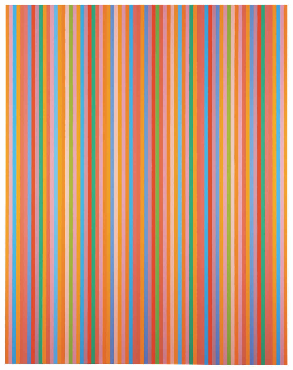
Aria, 2012
oil on canvas
by Bridget Riley (b. 1931)
Painting it in these conditions, I can practically smell the darned thing, almost enough to take up smoking again. Thinking about the above paragraph, we see that literary colours and local colours and colours as seen are not the same. Further, my description was in English and uses the names of pigments I’m familiar with. Also, those reality colours, in that light, demand an even more precise language. Or do they? Some painters, it seems, have an uncanny colour sense. They are able to see colours truthfully and mix them accurately without naming them. Linguists and anthropologists are now giving new credence to the idea that the human eye is most often a prisoner of language. Further, colours are perceived through the lens of our mother tongue. Just as the Inuit have dozens of words for “snow,” green and blue are distinct colors in English but are considered shades of the same color in some other languages. Further, in English, for example, we narrow down broad terms like “green” to even more specific nuances — emerald, jade, Kelly, lime, mint, myrtle, olive, teal, Hooker’s, viridian, British racing, etc. According to linguistic experts, when we refine our visual sensitivity to color differences in reality, our brains are trained to exaggerate the distance between shades of color if these happen to have different names in our particular language.
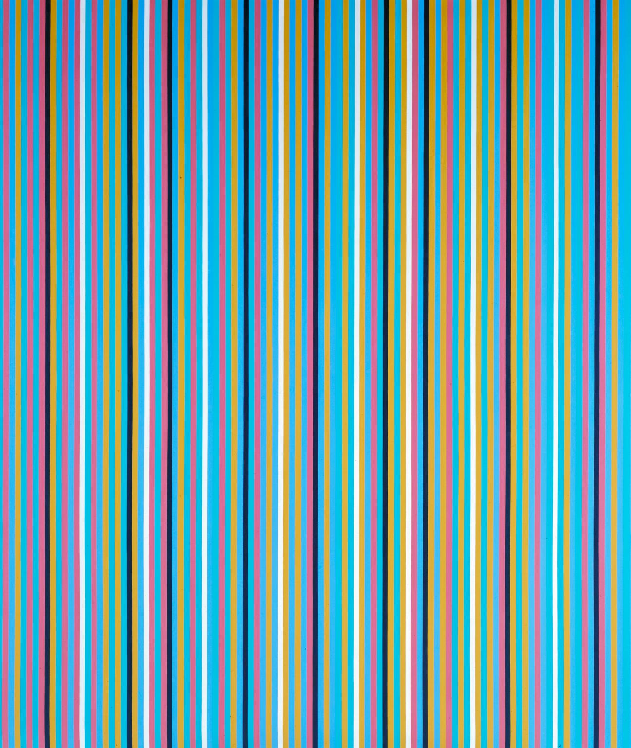
Achæan, 1981
oil on canvas
by Bridget Riley
It follows that art appreciation may depend on unique linguistic forms. This insight may, in part, account for the frequent public donnybrooks over artistic quality and worthiness. For those of us who struggle with colour and painting every day, my current conclusion regarding this research is to be of two eyes. Your honest, truthful eye sees the colour, and your knowledgeable eye knows how to mix it. You need to address your pigments on a first-name basis. Not all of us can intuit the transition. My other current conclusion? Try to paint it, don’t talk about it, and certainly don’t try to smoke it.
Best regards,
Robert
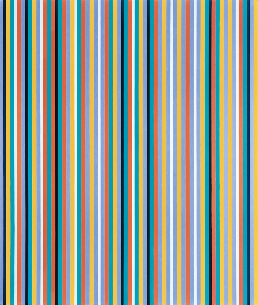
Cool Edge, 1982
Oil on canvas
by Bridget Riley
PS: “When we learn our mother tongue, we acquire certain habits of thought that shape our experience in significant and often surprising ways.” (Guy Deutscher, Linguist, University of Manchester, UK)
Esoterica: Literary constructs such as red barn, green grass and blue sky are generalizations that forever haunt us. Those of us who might seek truth from our world need to reinvent our vision in a pure way. Barring the miracle of talent or some sort of blessed autism, we need to undo certain aspects of language. In studio and field, some of this can be achieved by voluntary mutism. I’ll stop talking now.
This letter was originally published as “Talking about colour” on September 3, 2010.

Bridget Riley with her work Rajasthan at Hayward Gallery, 2012.
Guy Bell/Rex photo.
Have you considered a Premium Artist Listing? With each letter, an artist is featured at the bottom of this page. The Premium Artist Listings are a means of connecting artist subscribers through their work. Proceeds from each listing contribute to the production of The Painter’s Keys.
“The actual basis of colour is instability. Once you accept that in lieu of something which is stable, which is form, you are dealing with something which is unstable in its basic character, you begin to get a way of dealing with it.” (Bridget Riley)
Featured Workshop
 The Killarney are of Ontario is in what is called the ‘near north’. The landscape is wild and rugged. Giant granite cliffs plunging deep into the glacial lakes. There are no roads leading to our painting locations. We travel by a large, sturdy pontoon boat. This is a self-catered retreat. You bring your own provisions and cook your own meals in our fully equip cabins at a northern camp. Our instructor, Keith Thirgood, has been teaching artists his own unique approach to painting for over 12 years. Learn how to find order in the chaos, control your colours and create paintings that work. Learn modern colour theory, values, shapes and lines, what makes for a good painting. This retreat is suitable for beginners wanting to learn to paint in a fun, outdoor location, as well as more experienced studio artists who want to try plein air, plus artists who are looking to loosen up and paint in a more post-impressionist style. To find out more and register, please visit www.wilsonstreetstudios.
 Melanie Islet
acrylic on canvas
24 x 30 inches
Featured Artist
Shawn’s paintings evoke the feelings of the West Coast, its shores and islands, ponds and lakes.


11 Comments
I am wondering if cataract surgery affects an artists ability to mix colors?
No, but it does affect the color you see. I’ve had it twice, one in each eye, and the discoloration of the lens, once removed, brightened and cleared my sight, removing a cloud of yellow in one case, and blue/grey in the second surgery.
I’ve had the same experience. I hadn’t realized the extent of the colour muting and distortion the cataract had been making until I looked in the mirror! And then, wow! I looked at my artwork with a whole new experience!
I think it should make it better. I realized that I had been seeing everything with a yellow cast for a long time before surgery. Like seeing color under regular indoor lights. Much better and truer now.
Hi Barbara, I should think it would enhance one’s ability to mix colour as it does enhance the ability to see colour! My dear old dad had a very lovely landscape painting on his wall for years that featured muted pinks and greens in a sunset forest/water scene. After his cataract surgery he exclaimed many times about how excited he was to see those colours, because prior to the surgery he had seen them as variations of greys.
Fascinating how it’s reality can be indescribable . In our attempt to share in its beauty we apply labels : I used cobalt mixed with quinacridone magenta and zinc white….. art speak ! :)
Finding colour is such an interesting process and I totally get how it is developed through our context of living. I grew up very rural and spent much of my time outside and still do. Colour, fro landscapes in particular, were recorded in my memory with full sensory awareness related to time of day, weather conditions and the time of year. The combination of light effects on subjects had always seemed endless in a four season geography. Then, when I moved to the southwest coast of Canada, I found I that I could learn the less dramatic colour changes of this climate and still recognize all four seasons as well. When teaching painting a few years ago was the first time that I realized that other people couldn’t just look at a colour, mix it and all its siblings and cousins as needed. I was so surprised. I went through the basics of colour theory which I had learned in grade two from my home schooling textbook and then explained this was well and good but when you were actually out painting plein air, you don’t have time to think about colour theory if you want to capture natural light effects. Since the class was about painting from life in natural light, another approach was needed. Secret number one (that I didn’t even know as a secret) was to set up the pigments on your palette the same way so you can use muscle memory to find them. After that I taught them to give it their best guess and then adjust for which way the colour needed to lean. All of this helped some but mostly, the actual “seeing” of colour variation so then they could be mix it was the bigger challenge. They would tease me that I had different eyes than they did. Over a couple of years, with lots of practice they became much better at it of course. But it is a learned skill to find the mystery in a landscape, if life experience hasn’t already provided this experience. Some students now come to me and say… I am so glad that you taught us how to mix greens and paint without using black. I reply, that now they know, they can use all the tube greens and black if they want…. but they probably won’t like it. Yet, I know painters that do an amazing job with colour systems and will use equivalent of recipes to mix a colour they want. Makes my head hurt just to think about it. A totally different approach and seems to work well for studio work or if working on extremely large surfaces where you don’t necessarily want to try to get a gallon of paint to “lean” in a slightly different direction. All this to say, isn’t it interesting? Fascinating even! Now I am off to start the second of a pair of oil paintings of an arbutus grove. Have a great day everyone!
Hi Terrill,
I love your detailed and delightful response. I had the same experience of realizing that not everyone can mix colour, while teaching a painting class. Colour is endlessly fascinating. I love that colour is so affected by whatever is near, whether it’s another part of the painting, or some background colour of environs outside the canvas. In art as in life, I think.
I don’t try to get a color to exactly match what I see in the landscape. The canvas is a world unto itself. I think it is more important that the colors within the canvas all work together than that I struggle to make them match what I see. I like that art has opened my eyes to the broader range of color, seeing the nuances of how light and shadow and the proximity of one lit (or unlit) and coloured thing next to the other influences the colour that I see. Reflections of one thing on another and into negative spaces that shape the air.
decades ago I gave up to talk about colors – Defining colors now by wavelength and their place in the spectrum – to see when they are mixed with other parts of the spectrum to create light-dark or in-between shades – this is the only – ONLY way I will have a conversation about color. Did you know that in old -Homer’s -greek -the Mediterranean was considered wine-colored – food for thought.
While in grade school, I took up oil painting and basically learned through the scientific method – trial and error. One of my first attempts at still life involved a bowl of fruit. Bananas are yellow, right? It took almost an entire weekend to realize that “yellow” is not a suitable designation. After discovering the plethora of colors in that banana, it was apparent that I needed to take a lot more time looking before starting to sketch or paint anything. Learning to see is crucial.
I have suggested the same exercise for several others just starting out, and it almost always elicits the same response – I never knew there were so many browns and greens in a yellow banana!