Archived Comments
Enjoy the past comments below for Talking about colour…
Too true. Colour is very much a victim of language. I’m lucky to have a good awareness of colour. I can match any given color e.g. when buying clothes, accessories or sewing materials, without taking a sample with me. My mother was good at it, too. It’s a big help in painting. But it can be learnt and I think the best starting point is actually black. Black is probably the best example of colour not being all it seems. Is black a colour or an absence of colour? Quite a lot of painters argue about that. Watercolorists (the ones who deny themselves the joy of black) make it with all sorts of mixes. It’s there in nature in the form of carbon, jet etc. Charcoal is loved by all. It doesn’t take much white to stop black being black, though. But try matching a sweater with a pair of pants and you’ll be lucky if it’s the same. Old garments take on a green sheen. Blacks can be bluish, reddish, yellowish etc. (back+ a yellow shade makes a reliable green in every medium). For painting I can choose between many versions of black or mix one from other colours. All this is very elementary stuff. Or is it elemental? There’s a subtle difference. I find it interesting that we can often only describe a colour by mentioning something universal e.g. blood red. If you then say poppy red your brain immediately switches over (unless you’ve never seen blood or startlingly red (wild) poppies). In German, pink is actually shocking pink and the German word for pink is generally “rosa”, which I find highly misleading since there are countless pink shades and types of roses and of course, the word for rose in German is also Rose (with a capital). If we say rose pink in English we are thinking of a specially soft, pretty color – and that is also a feature of language. Germans describe some pinks as “Schweinchenrosa” = pig pink, which leaves little to the imagination. At the other end of the scale is white, which is undeniably another color conundrum – at the very latest when you try to describe it. Tell someone who has never seen snow that something is as white as snow and they won’t really know what you are talking about. Fortunately, kind manufacturers put colour labels on their products. Mind you, a color from one manufacturer won’t necessarily be the same as that color from a different manufacturer. The clue for the painter is probably association….
Great Article. I spent yesterday afternoon battling through practical perception issues with communication science students. Your succinctness would have helped a lot.
Even if you could go to the art supply store and buy “cigar brown”, you would still have some mixing to do in order to paint all the colors you’ve perceived in your cigar. That’s why I teach the (Un)limited palette in workshops and on my website, http://johnfarnsworth.com/%28un%29limited-palette.html. With the right three and white, you can paint all that you see. With a little practice, finding the right color can be so much easier. But you still have to see beyond “brown cigar” “green tree” “blue sky”, etc. John Farnsworth
Great article, really enjoyed it. I have struggled with trying to explain to students how very small differences in color make a huge difference! One think I found that helps is to learn to create neutral colors from combining complementary colors- it is absolutely an eye opener to see how many neutrals there are. And learning with hands-on color mixing exercises, for those who cannot yet see the hues that subtle neutrals are made from, is alot of fun, too. After mixing black into color to try to create unusual neutrals, students are amazed how easy it is to see the difference once these exercises are accomplished with complementary colors instead. You will never take a neutral color for granted again! And you will also know better how to harmonize your palette for your paintings or, in the case of my students, for interior design.
Whereas I agree with the content of Talking about Colour and enjoyed the comments I’ve read so far, I have to say that I see nothing except joy in the fact that there are so many ways to perceive, name and identify color! If you are speaking to the public through color it is good for your work to ‘learn THEIR language’…you will never suffer from being bilingual…and THEY may learn something new from you because when you speak in tongues of pigment and paint in terms that others understand the language becomes universal.
I thought there was something wrong with my color approach for I always have been able to instinctively work with color without bothering to learn the names. It is my main objective in life. Even the neutrals are a form of color to me. Color mixing is a playful joy. www.colormejulianne.com Let the beauty you love be what you do. Rumi Inside you there is an artist you don’t know about… say yes quickly, if you know, if you’ve known it from the beginning of the universe. Rumi When you do things from your soul, you find a river moving in you, a joy. Rumi
This is the old ‘duality of language’ of Buddhists. Just look, just do, don’t define. It’s so much deeper than verbalizing, the looking and the doing.
Especially when painting something “ordinary” like sky, I need to allow myself to paint it the color I “see” in my mind, not what “they” tell me is the color of sky.
Recently this point has been coming up regarding writing. That your first language colors the way you see and therefore the way you write. A suggested remedy is to learn another language and see how it changes your perspective and approach to writing. It seems like a valuable exercise for understanding people for different cultures as well and perhaps bridging gaps caused by biases or prejudices.
The other night, at an auction of Bonsai articles at our yearly fundraiser, an interesting wisteria came up for bid…had no flowers on it, and someone asked what color they would be…the bidding was going kind of slow…and someone replied they were red. Now wisterias usually flower in bluish mauve or white…we don’t usually see ‘red’….bidding was still sluggish, and I stood up and told the audience, this isn’t a coca cola red, this is an AGGIE red! Bidding then picked up, and we sold it at a good price….I’m in Texas, so of course, the AGGIE red is in reference to our Texas A&M University in Bryan/College Station in the heart of Texas. Yes, I agree with you, when you get the colors right, you get progress.
Robert, your eye is obviously not a “prisoner of language” – your two spellings of “colour” roam free and borderless!
The May 2010 issue of the Saskatoon Express contained an article I’d written on the subject of color. Robert’s comments about language prompt me to share some of it. “Could you describe your home using only two colour words? Primitive languages have only two and they are for black and white, or more accurately, for dark & bright. If a language has only three colour words, the third is for red. Probably because red is associated with blood, and therefore with life and death. Colour terms are added in a fixed order as a language evolves. First in are green and/or yellow (first one, then the other); then blue. All languages distinguishing six colours contain terms for black, white, red, green, yellow and blue. As languages develop, they add a term for brown, followed by orange, pink, and purple and/or gray, in no particular order. Finally, a basic term for light blue appears. Not all languages have words for colours that are equivalent to our English words. Hungarian recognizes two shades of red as separate and distinct: piros and vörös. Vörös – related to the word for blood refers to a deeper red and typically refers to animate, natural, serious or emotionally charged subjects. Piros is learned by children first, and is generally used to describe inanimate, artificial, or cheerful things. In many cases either word is adequate. Irish uses two words for “green”: glas denotes the green colour of plants, while uaithne describes artificial greens of dyes, paints etc. Apparently this distinction is made even if two shades are identical. Mandarin has words for “blue” and “green,” as well as a word that covers both. Japanese also has two terms for “green,” one of classical origin and one derived from English. In Japan, although the traffic lights have the same coloured lights as other countries, the green light is called the blue light, because green is considered a shade of blue. Languages also split hues into different colour names based on how light or dark they are. For example, English splits red and pink, and orange and brown. To English speakers, these pairs of colours, which are really no more different from one another than light green and dark green, belong to different categories. A Russian will make the same red-pink and orange-brown distinctions, and will further distinguish between sinii and goluboi, which English speakers would call dark blue and light blue. To Russian speakers, sinii and goluboi are as separate as red and pink are to us.”
See today’s article in the NY Times about language affects you: http://www.nytimes.com/2010/08/29/magazine/29language-t.html?ref=general&src=me&pagewanted=print
Sixty-seven years ago the veils were lifted from my eyes with a set of watercolors.From the 3rd floor windows of my high-school art class we were directed to paint a scene from the autumn neighborhood below (a working-class neighborhood in Chicago). I thought of the dreariness of greys and browns, until I poured out the pigments from umbers, ochres and siennas. I had never heard the names before and never seen the richness that had always been surrounding me. I still drink in the earth colors that are so abundant. The wabisabi remains of decaying farm buildings in my present rural Michigan environs beg to be preserved. At the very least I can photograph them, but so far the camera hasn’t been at the ready when the sunlight has glorified them, but perhaps there is still time? At least I have rubbings of old barn wood. I call them knot art, with allusions to greatness “to be or knot to be!” A bit of punography…..
Very interesting and though provoking. I learned to paint in oils from Kevin McPherson who teaches his students to use only three colors plus white. His book on the subject of painting en plein air using just those colors is a true discovery. It teaches the ability to correctly paint what you see without naming the colors, since there are no named colors on the palette. You mix what you see from the three primaries, forget the names.
The amazing thing about color is the way it becomes enhanced or defined by the presence of more color… Take for example a small red circle…as soon as you add that dot of white or yellow – it shines! Add a touch of orange to a grape and you get a “glow”. It’s like reading a single word versus seeing the word in context; So much more meaning then! I guess that’s why artists and people in general are attracted by multi-colored images over black & white. It’s the language of color in full context…no matter what language we speak!
As a decorative painter , I understand immensely that people see color differently ….A designer may have her eye on a color in a fabric that she wants to see in a mural…and yet, she and I may see it differently…i.e. more green or more brown, etc… after painting with designers for over thirty years and also very involved with house painters…I can assure you that a “yellow” in one person’s eye, is a much different “yellow” in another person’s eye…..We are all special and we see and feel and wonder at our own pace…that is the beauty of the beauty of color!
I was intrigued by this color subject as I had just completed a color chart for experimentation to develop more color hue and blending awareness. I followed an exercise in a college art school book to make a chart of all the basic colors on the color wheel and how the complimentary colors blend to make a neutral. Plus how each of the twelve colors on the wheel gradate in value with the addition of white or black. I chose a limited palette of red, yellow, alizaron crimson, ultramarine blue, violet, black and white to mix all my secondary colors. It was an exercise that was fun, but also a pain to finish. I would rather be painting, but I felt this was a growing measure I had to do. On the left side of the image is the complimentary colors like yellow blended with violet in steps, blue blended with orange, etc… On the right side is each color blended with white on one end or a chromatic on the other end. As I mixed each addition of color, I thought to myself, what color in nature can I identify these with? I came up with some color names, but after awhile, I just decided I will know it when I see it in reality. Don’t ask me to name them all, not now. When I mixed them, I realized that one spot of color too much skewed the portions, it was a drill. I enjoyed the gradation of colors in the right chart. But in the complimentary chart, I think they turned to muddy brown or green in the middle. You can see those colors any day in the dirt or leaves, mold, tree trunks and on and on. I will just call them muddy colors. This will hang in my studio for reference. I will make more neatly arranged charts again, it really taught me something about color`s many hues.
That is indeed a very enlightening concept. I have never thought of it in that way. How about the play of light and shadows that influence our perception of the color we see. I just had a trip to the Grand Canyon in Arizona and the colors that is displayed as the time of day moves on the colors are always changing depending on the light and shadows that is caused by the sun as it rises and sets as the earth revolves around the sun. I also think that our mind set also influence our perception. Some of my fellow artist I paint with have affinities to certain colors they like. Some like to play with colors in their abstract painting and others like realism in their work so that they lay colors as they see it.
A big problem I find when teaching students is this constant attempt to put a name on a particular color, which in my estimation is a big waste of time and effort. When I show them how and what to mix to get a particular “hue” , I start with the general terms of the colors they have on their pallet. i.e red, blue, green. But when mixing “true” color, I try and get them to think in “grays” i.e bluish gray, reddish gray, green gray. This, to me, is where the true colors lay. Most everyone sees the primaries, few of us see in between these colors. Seeing in between takes years of painting. I try and make them create a “value” color from what they see in the blue, red, green. And these have no names. The names on tubes are the from manufactures, not artists. I use the names of colors only when I purchase my paint.
Try talking color with someone when you are “color blind”. At least I am according to those eye charts of little dots that have numbers in them. You couldn’t prove it by me that there are numbers. But I paint and have a long list of national shows that have accepted and sometimes awarded my work. So I ask the doctor how is it that I paint in colors everyone accepts but I don”t see color the way a “normal” person sees color? His answer was that I have learned to identify colors for myself so red is red and green is green even though I can’t pick out a red flag in a bunch of green trees. I see color, just not like everyone else. When I paint I can mix a color that matches what I see, which in term matches what others see. It is a skill I have learned with years of practice. I’m just not good at verbally identifying color to someone else. So, what is that color? Green or ultra marine with cad yellow deep and a touch or alizarin?
A couple of years ago in an art forum, several artists became embroiled in a controversy over color. One pushed neutrals as the key to proper painting and said neutrals were all important to many of the “great” painters of the past; another advocated true color and claimed these same “greats” relied on color to bring life to both shadows and high key passages. Turns out the battlers were simply using different names for the same hue. One guy’s neutral was the other’s violet, etc. I use a limited palette of primaries plus white and have found it helps me to see the difference in neutrals. All greys are not equal; all browns are not the same and black can be many, many things from blue-black to dark, dark red.
I find any discussion about color, there is always lacking the principle aspect of color which is value. We can do more and say more with value than with color. Many of us see color differently and thus get different points of view from a work. Reduce the work to black and white and many pictures get “clearer”. Color is a tool and works for us to make a certain point. But not all viewers will get the same point, because we all see color differently. We not only respond to color differently, color also can obfuscate our intentions if color is used for colors’ sake only. I was taught to minimize color and keep my work to three or four values (no matter the colors) I think a painting is stronger and has a better chance of being understood and appreciated if colors are minimal and subdued as well as values being no more than three or four. To prove this theory, look at some master paintings and you will see what I mean. Look at Velazquez, Sargent, Bouguereau or Sorolla who painted outdoor sunlight. The adage “less is more” has much truth when it comes to color.
The production of beauty for the purpose of giving plesure is art it has no limits, purly personal it is wonderfull
“Soul-Mates’, yes a true connection with art, with Pure Love! Thanks
“Name it and claim it” are overtaken by “see it and feel it.”


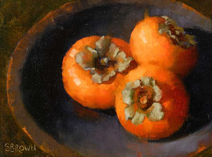
Persimmons on Purple oil painting by Sydney Brown, AZ, USA |


… non-verbal response …. consciousness slips out of the verbal …. I really like your descriptions of how our brain handles color.