Dear Artist,
These days no self-respecting workshop instructor goes half an hour without mentioning negative space. So prevalent has this stylistic concept become that it’s currently central to practically all types of pictorial composition. In my own work, the “backwardosis” of negative space is as vital as breathing. Here are a few tips if you too would like to see it happen:
Negative space strengthens compositions by solidifying form and building design. It also helps work to look “painterly.” In order to make magic with negative forms you need to “set up” your positive forms. In the early stages of a composition these positive forms — in realistic work they are often foreground objects — can be juggled and juxtaposed with an eye to the potential shapes and “holes” that form around them. This requires what I call “one-two thinking” — the ability to think ahead to further moves that might happen later in the game. Watching some painters, particularly beginning painters, it’s this one-two thinking that is most frequently lacking. Simply stated, one-two thinking permits creators to make plans where lights or darks might later be spotted through foliage, furniture, figuration, or some other veil. If you’re not sure about this, try doing some regular “one-one thinking” — and see how relatively uninteresting the stuff starts to look. “One-one” is okay for sign painters, but not for fine painters.
Think of negative space as a sort of musical counterpoint. It’s an embellishment to a main theme, played in pianoforte, pianissimo, or somewhere between. Counterpoint adds a secondary motif that rings the clear bells of beauty, mystique and quality. Here begins the magic of abstraction. It’s this abstraction, subtle or strong, that makes your work live as a thing-in-itself and become something unique and different from what it represents. Taken to extreme, I call it “contrapuntal overemphasis,” terminology that when thrown around the studio, makes visitors groan. I have to tell you that high action around negative space is the moxie that brings noses right up to the work. Even though it’s “negative,” it’s good stuff.
As all this may seem a bit theoretical, I’ve asked Andrew, now fully down from the mountains, to illustrate some of these ideas in close-up. They’re below.
Best regards,
Robert
PS: “Spaces between the forms, or the negative shapes, play just as great a role as the positives. The positives make the negatives and negatives make the positives.” (Stan Smith) “A painter is a choreographer of space.” (Barnett Newman) “Fill a space in a beautiful way.” (Georgia O’Keeffe)
Esoterica: The rendering of negative space can be confusing. As Charles Reid says, “A positive object in relation to one background area can become a negative shape when another object cuts in front of it.” A simple exercise is to devise and execute a composition where you concentrate on painting the areas around objects rather than the objects themselves. Just keep saying this mantra: “Objects are held by the backgrounds that are cut into them.”
Negative space in action
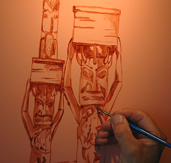
In the early stages — as in this one of Tsimshian funerary poles — foreground elements are moved around so as to provide the possibility of interesting shapes and holes where the totems press against the sky.
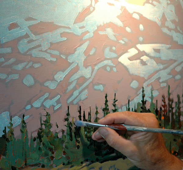
“One-two” thinking provides the set up here to go in and loosely describe the trees and the foreground meadow. Mountain scenery provides constant opportunities for foreground-background interaction.
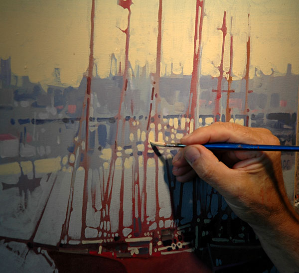
These whaling schooners sit “over-shot” and ready to have their silhouettes “cut in” with negative areas around the masts, etc. Variety and counter-light in the background adds the potential for abstraction.
Music for the eyes
by Mary Kilbreath, Ft Lauderdale, FL, USA
It is interesting that you use the term “contrapuntal” in describing what goes on in a painting in the negative space. This term is used widely in music, and most successfully by J. S. Bach, whose compositions are full of contrapuntal passages. While you will be listening to a melody in the treble, you will also hear a beautiful “other melody” working alongside in the base, or from one instrument to the other. It is this complexity of melody which makes his music so beautiful and memorable, just as the negative spaces make a painting work and creates that “other melody.” So when next at the easel, remember we are making music for the eyes.
Spacial training from lettering background
by Susan Levenson, Ogunquit, ME, USA
Three years ago I started to paint in watercolors rather than oils and acrylics after a hiatus of 36 years (I am art school trained). I have found that my many years as a competent calligrapher gave me a background that is incomparable to any experience I could have otherwise received. From the ages of 12 to 26 I was a serious painter in oils and then acrylics, but not with watercolors. No education could have prepared me for the technique I now employ as an “old lady” doing very successful watercolors. When one does lettering, it is the spaces in the letter that the eye sees, not the line. Negative spaces. Applied to watercolors, I am having the time of my life in my retirement from teaching art. Good art is governed by the spaces the paint creates. The alphabet is the epitome of spacial equations.
Assembled like a mosaic
by Eleanor Blair, Gainesville, FL, USA

The gardens around Karen Blixen’s house in Kenya
When people watch me paint, one of the most frequently asked questions is why don’t I paint the whole sky first, and then paint the trees. It does seem like common sense, to save myself the challenge of painting in all the complex negative spaces between palm fronds. I explain that I want the sky shapes to be just as consciously painted as the tree shapes. Too often, in unsuccessful landscape paintings, the sky is just what’s left over after all the ‘objects’ have been painted. I believe every square inch of the surface of a painting should be consciously considered. It’s a bit of a contradiction that in order to create a believable illusion of three-dimensional space, the shapes on the surface of the painting must be assembled like a mosaic.
Contrapuntal confusiosity
by Andrea Pratt, Delta, BC, Canada

“Golden Top Minnows”
acrylic painting
by Andrea Pratt
Contrapuntal overemphasis is often achieved by the incongruous juxtaposition of conspicuous negative space. But marginalization of principal compositional elements can neutralize effectiveness and must be judicially applied. My recommendation for evading this quagmire of perplexity? Keep it simple, stupid.
Difficulties with negative space
by Leith Nance

“Inner Space”
watercolor and acrylic painting
by Leith Nance
I’m fascinated by negative space and consider some of my work to be good examples of it. Of the fifteen of us in our art group, there are several who find negative space almost impossible. It does take an ability to “see” something that is not there — and to provide a new form for what is there.
(RG note) Thanks, Leith. The inability to see negative space may be due to an extreme tendency toward honesty. While this is not bad in itself, art hinges on the understanding that successful works are often an illusion. This “dishonesty” — the manipulation of reality — is precisely what, in most cases, makes art fun for both the doer and the viewer.
Positive and negative in life
by Dyan Law, Pipersville, PA, USA

“Old Mill at Cuttalossa”
oil on canvas
by Dyan Law
I’m working on a painting which has bare tree branches in the foggy background of the painting’s main focal point. It wasn’t until I intensified the color of the negative space between the branches and twigs that I recognized excitement and life. What are bare tree branches without the light peeking through? One can’t exist in harmony without the other. In turn, what would the human figure be like without the play of space between and around our limbs? What would hair look like without the “feel” of air beneath, around and through it? Pretty nasty for sure! Without that all-important negative space wouldn’t we all be “fallen” artists? Each day we confront the positive and negative issues of our lives. By simply ignoring the negative how would we appreciate the positive in our art and in our lives?
Place where the pot is not
by Jim Willett, Edmonton, Alberta, Canada

Ceramic beanpot
Cindy and I often will place a pot with handles, or shoulders, or compound curves in front of a white wall so we can view the negative space created by the outline. The area where the pot is not. If a handle has a “kink” or the relation of the curve of the handle to the curve of the pot is not just right, the silhouette against the wall will make it very clear. It is difficult to explain the difference between “good” space and “bad” space until you see an example of the bad, then it becomes abundantly clear. This is our fourth attempt at getting all the lines just right. We think we are getting close. We have drawn our inspiration from a 150 year old bean pot from Quebec that a gentleman recently brought in to the studio. At the time the bean pot was thrown it was a piece of utilitarian ware, very strong, very functional. We are trying to bring that strength and functionality into the 21st Century.
Watercolour habits hard to break
by Bill Kerr, Courtenay, BC, Canada
People who started their painting endeavors with watercolours automatically deal with backgrounds first. As a beginner, one starts with sky, then mountains and so forth. Any other approach is really taxing. The trick is then to deal creatively with this “non-subject matter.” This usually means paying attention to having different shapes and sizes in the segments of the painting surrounding “the subject(s)” and of course avoiding having repetitive non-subject matter. Because new painters often view this as sort of filler or mood creation they often don’t pay attention. This results in the inevitable three similar mountains in a row.
Place obliterated by the march of time
by Sandra Chantry, Loughborough, UK
‘A place at a point in time’ is how I would describe the spots of time phenomenon. I live just 3 miles from where Wordsworth wrote many of his poems and lived for a period of his life. His poems of the area are all that remains of much of what he saw — the rest has been obliterated by the march of time and industry. His verse gives a unique insight into ‘A place at a point in time.’
World of encouragement
by Dave Edwards, Blyth, Northumberland, England

“Steve’s first carving”
watercolour painting
by Dave Edwards
A while ago, my cousin, Steve Walters, of 108 Mile Ranch in British Columbia, Canada, kindly bought me a copy of your Painter’s Keys book, which I found very inspiring. I have been trying to persuade him to find time in his busy life for some artistic expression and earlier this year he finally succumbed and has proved himself to be a natural-born wood-carver, an occupation he now fits in between house renovations and airplane maintenance, as he’s a self-confessed workaholic. Steve e-mails me photos of his work and I have been inspired by his carvings and have done watercolours of a few. Across these great distances we now encourage each other towards further artistic activity.
Fine tuning your donation
by Coulter Watt, Quakertown, PA, USA

oil painting
by Elizabeth Garet
Elizabeth Garat’s letter Artists and privacy laws, in the last clickback indicates her intention to support her local PBS-TV station. This is wonderful and generous, but it is not without self-serving ends in mind, some free publicity which I think is a very reasonable thing to expect. We all want publicity for our work, which helps build name recognition, which in turn helps raise the prices of our work so we can eat. It’s all part of the business of being an artist.
Here are a few thoughts for Elizabeth: You could reframe your position as raised in “Artists and privacy laws.” If you were to offer a painting for sale to which you are retaining the copyright, as you should with all your paintings in the bill of sale and in your written agreement with a gallery, then you would have the legal right to exercise reasonable access to your copyrighted material. That would include the purchaser’s name and address..
On the other hand, you have the right to withdraw from the auction, or not donate a painting in the first place. Or, you could exercise your copyrights first by putting a “C” in a circle in front of your name and the date on the canvas where a frame will not obstruct the signature (© Elizabeth Garat, 2005), digitally capture the image and produce a print, (any kind of print and keep it in your records which legally establishes publication). Naturally, the PBS station has the right to decline your donation..
Then again, why not offer Giclee prints of your paintings for sale at auctions. The PR value to you would be the same and after all, isn’t that what is of value to you? If Public Television is important to you, you should write letters to all your elected federal legislators expressing your discontent that Congress has decided to cut federal funding to the Corp. for Public Broadcasting and the arts in general. You can do this by going online and finding your elected senatorial officials.
Not in the mood
by Arlene Taylor, Salem, OR, USA
I also like to paint, mostly oils, but will tackle anything my heart desires to do when in the mood. The real problem for me is to “get into the mood.” My husband and friends keep telling me that I have a great talent, but I don’t put it to useful purposes. I would like to know how an artist such as yourself can create the mood or the aura to paint productively. I have sold most of my work over the years, and have about 8 paintings that need to be finalized and framed. They just sit in a dark closet, collecting dust.
(RG note) Thanks, Arlene. I’m not speaking for everybody of course, but I may have a serious psychological malfunction. I’m practically always in the mood. I put it down to history, habit, curiosity, and the situation that, when I’m not going anywhere, there’s nothing else to do that’s more interesting than working a path through the jungle of my painterly demons.
India a signatory to Berne convention
by oliver, Austin, TX, USA
Regarding S. K. Sahni’s letter on copyright protection in India: India is a signatory to the Berne convention (1971 Paris text) and is under international obligation to have laws protecting artistic and literary works. Under the treaty, signatory countries are required to pass laws protecting copyrights. The minimum protection for works under Berne is: “the minimum duration for copyright protection is the life of the author plus 50 years (Art. 7(1)). Signatory nations may provide longer durations if they so choose. (ibid) Piet Mondrian died in 1944, and unless India has extended the length of protection, the copyright protection on his work would have expired in 1999, so copying his work is fair game under Indian law and international treaty. Although some ethical issues may be apparent. Given India’s international treaty obligations and the amount of software, movies etc., produced there, you must be mistaken that there are no laws to prevent copying, and I’m sure that increasing enforcement will become evident as India continues to develop and emerge. I believe that all art and business schools should have a basic instruction on copyright law.
(RG note) Oliver, who goes by the name of oliver (small o) formerly negotiated intellectual property agreements — patents and copyrights in the high tech industry as well as many agreements with companies in India.
Vanity Galleries
by Jerry Lucey, Guadalajara, Mexico

“Art Sale”
acrylic painting
by Jerry Lucey
I wondered if you have anything to say about Vanity Galleries. I believe that well administered VGs have a place within the marketing structure of some artists. To say all VGs are rip-offs taking advantage of artists seems to be too broad a swipe of the brush. Is it then safe to say all galleries operating on consignment will do an honest job for the artist?
My view is there are galleries and there are galleries, the latter have an interest in truly supporting the artists they represent. And within the good group, there should be some Vanity Galleries well worth spending your money with. A good business plan should at least consider if a VG might be in the best interests of obtaining the desired exposure.
(RG note) Thanks, Jerry. This is a subject that artists ask about pretty well every day. As most artists know, Vanity Galleries are usually would-be dealers who charge for wall space and/or gallery time. They often promise advertising and promotion. Rather than taking money from the art buyers, their concept is to take it from the artists. Sometimes they manage to take a bit from both. Sometimes they do a job and sometimes they don’t. Artists must realize that these days there are far more enthusiastically creative people than there are enthusiastic consumers of creativity. Add to this the problem that so much creative work is substandard. Tragically, this is often not recognized by the creators themselves, and they sail along thinking it’s just a matter of getting known. It’s not. For many artists it’s a matter of getting proficient. This naivete turns perfectly nice creative folks into prey. In my experience, fine art dealers who know what they’re doing and run decent galleries with normal commissions are the way to go. While there may be a few rotten apples in the barrel, it’s still the best route to good friendships and good business. Consider the VGs, yes, but keep in mind that you seldom hear of anyone who is long-term happy with them. To my thinking, there’s a way to beat the odds — and if it was easy, everyone would be doing it: buckle down, get good, be discovered.

Loving pair free-style chinese painting |
You may be interested to know that artists from every state in the USA, every province in Canada, and at least 105 countries worldwide have visited these pages since January 1, 2005.


