Dear Artist,
I apologize for the confusion I caused by illustrating Tuesday’s letter with the compositional genius of the woodcuts of Walter J. Phillips. Of course, artists of all stripes make compositional boo-boos. Walter J. Phillips just isn’t one of them, and I made the assumption that this was obvious. I’m reminded of the words of Jenny Haddleton, my grade 7 ceramics teacher: “You are standing on the top of a hill, strapped into a pair of skis. Don’t hit a tree.” Here again is my Dad’s list of boo-boos, with a few ideas on how to address them, illustrated with the compositional mastery of Edgar Degas:
An absolutely killer foreground.
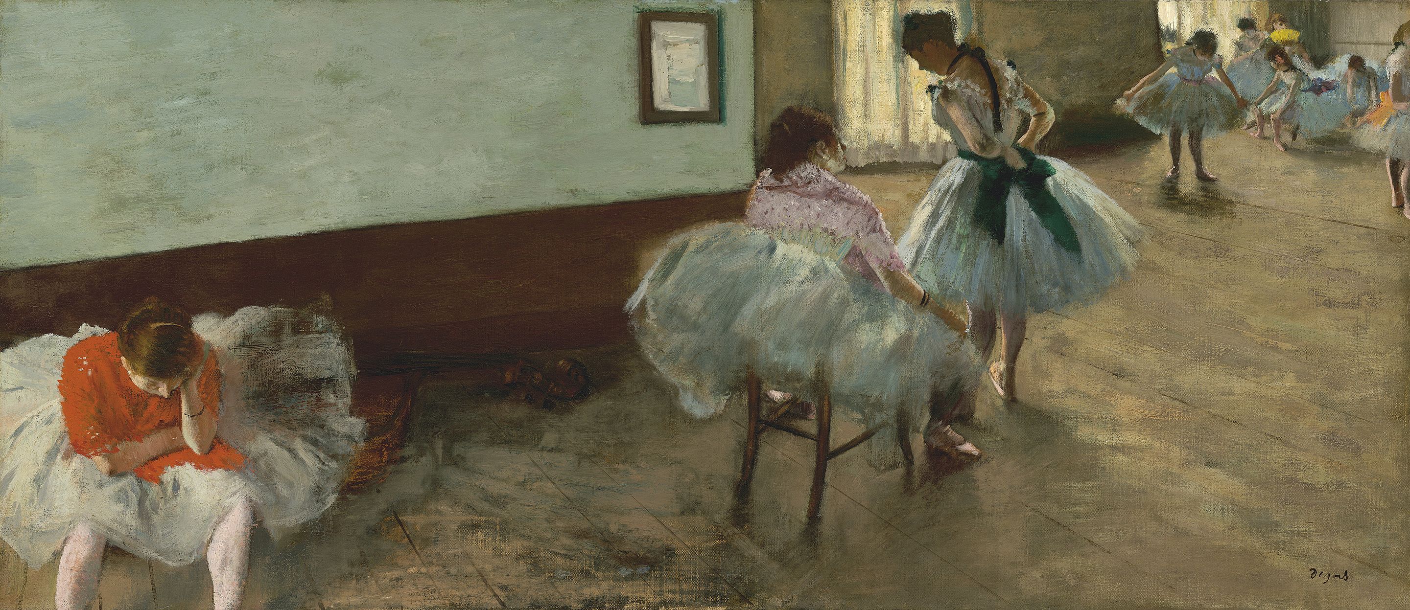
The Dance Lesson, ca. 1879
Oil on canvas
38 x 88 cm
by Edgar Degas (1834-1917)
Weak foreground – “The foreground appears as an afterthought,” wrote my Dad. “Even in abstract or mystical work, a foreground needs to be implied and understood as a vital contributor to the whole.” In plein-air work, study the foreground as a design device and refine its elements, looking for opportunities to create depth and to lead the eye into the painting and towards your center of interest: moss covered rocks, stepping stones, waves, a road, shadows, driftwood, lowland scrub. In abstraction, where the foreground is the dilettante’s bottom of the painting, the foreground should instead anchor and can provide an exciting entry or highlight to a visual poem. It must not block, stop or eject the viewer’s eyes but rather lead them in a confident journey around the picture plane.
Top marks for not being homeostatic.
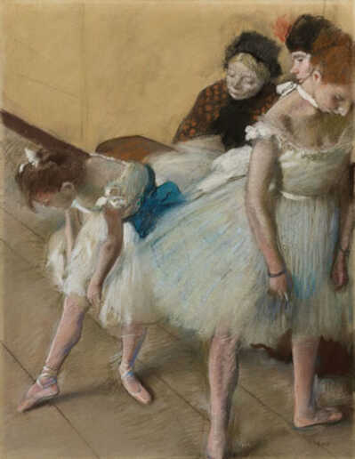
Dance Examination (Examen de Danse), 1880
Pastel on paper
30.5 × 45.7 cm
by Edgar Degas
Homeostatic conditions — “Even in front of nature one must compose,” said Edgar Degas. Look for places in your work where you’ve inadvertently lined things up and instead, inject variety and randomness into the pattern. Alter the size of objects, or try staggering or spacing them in threes or fives. Create a depth of field. Spread the sitter’s fingers unevenly. Slightly unresolved patterns are more mysterious and alluring than perfectly resolved ones – they make a tension that echoes the human experience. Add a gradation. Paint your flowers wilting. Like when arranging them, beauty exists in the irregularity and unevenness of what is already in a state of transformation.
Amorphous design — “The general design lacks conviction.” “Everything that is placed within the enclosing borders of the picture rectangle relates in some way to everything else that is already there. Some attribute must be shared between all of them.”(Ted Smuskiewicz) Pay attention to this connectedness, and beware of “potato-itus.” Look around for individual potatoes lurking within the one, big potato that is an amorphous painting. Potatoes appear around neglected edges, in clouds, in rocks, in abstract forms and blobs. Now that I’ve brought them to your attention, you should see them clearly. De-potato by sharpening edges and shaping forms with better, more seductive angles, a light source, contrast, and by defining what’s behind or in front of things.
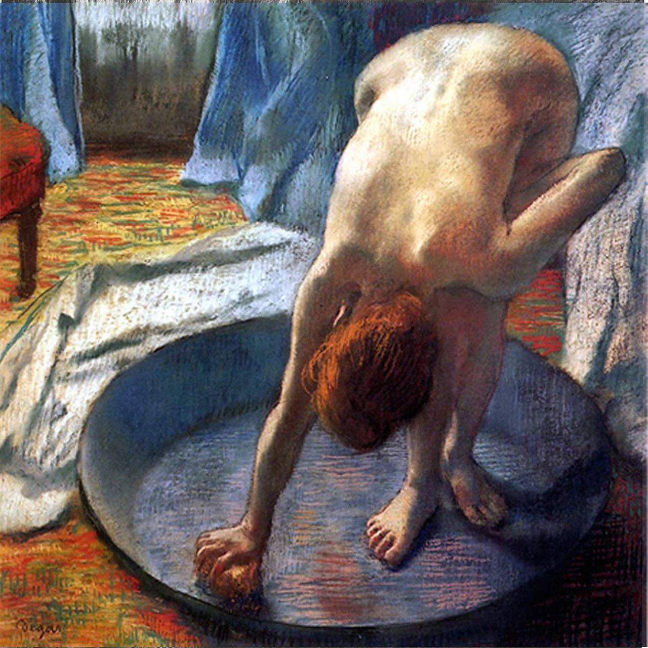
Not a potato in sight.
The Tub, 1886
Pastel on blue-grey paper
69.9 cm × 69.9 cm
by Edgar Degas
Lack of flow — “Composition,” said Robert Henri, “is controlling the eye of the observer.” Stand back and let your eye travel. Take note of where you enter the work, if you’re circulating around it and if you get stopped. The eye wants to travel but stay contained within the picture, resting in places of delicious brushwork, colour surprise or a beguiling curve or point. “Try to paint one neat area,” my Dad suggested to me. In abstraction, eye control is what turns a flat plane, repetitive motif or chaos of gestures into a work of magic.
Too much going on — “Take something out,” said the American painter and illustrator Harvey Dunn. You are making poetry, not a technical manual. Pay attention to the arrangement of things. Possibly, take out a lot. Curated spaces bring intention, focus and specialness to sitelines, objects, subjects and meaning. The eye also needs a place to rest in order to appreciate what is presented and to prevent clutter blindness. Look around your painting and choose a center of interest. Ask how other elements serve this center – waves washing towards it, a seagull interwoven into the rhythm of the sea, echoing curves, a tree gesturing with prevailing wind, a quiet sky. Show the eye the way. “A designer knows he has achieved perfection not when there is nothing left to add, but when there is nothing left to take away.” (Antoine de Saint-Exupery)
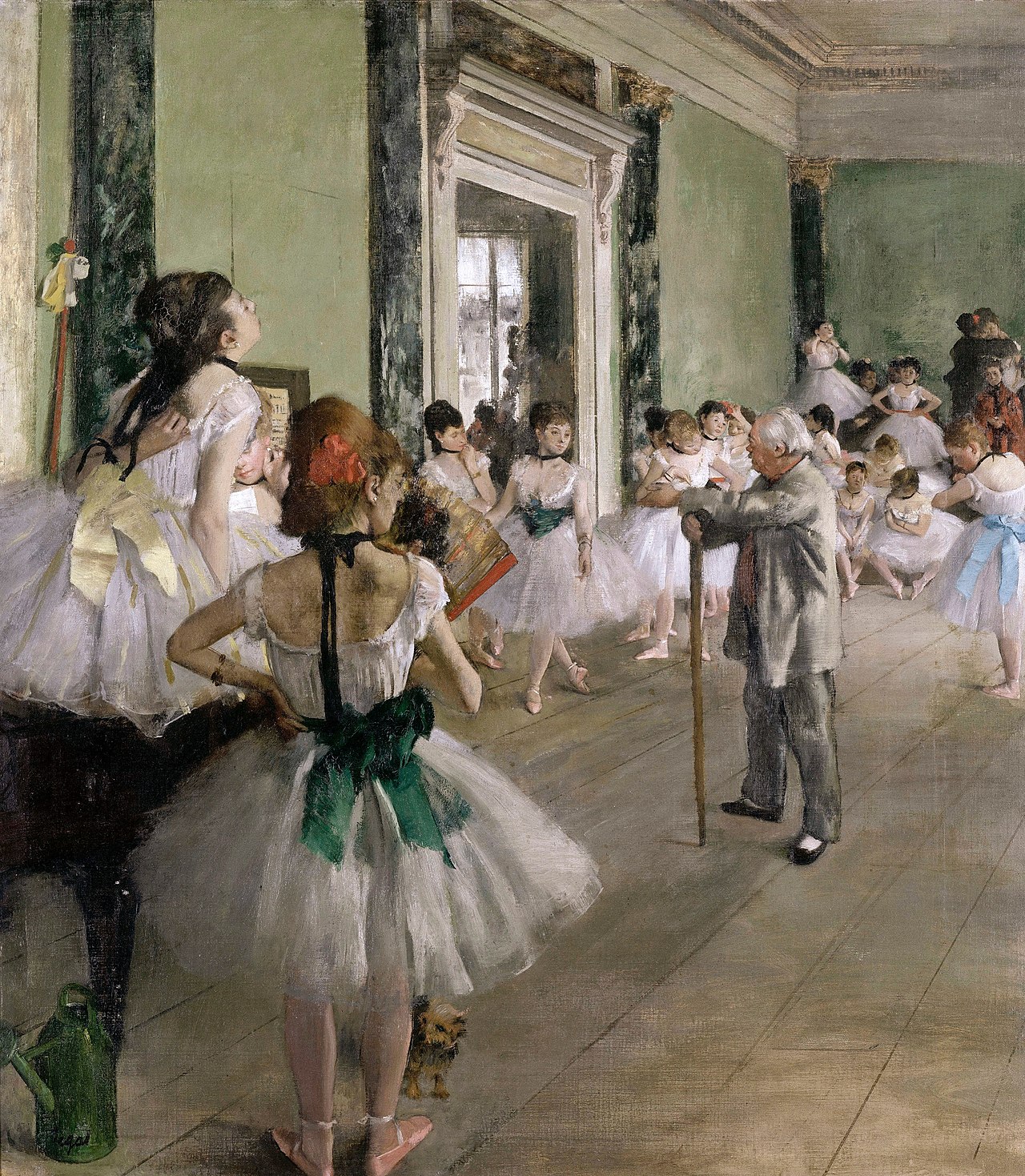
The most ambitious of Degas’ works devoted to dance, with 21 ballerinas (and their mothers), who wait to perform for ballet master Jules Perrot. Yet, there is room to breathe and for the eyes to joyfully wander around the picture. In the foreground, almost first position and a Yorkie.
The Dance Class, 1875
Oil on canvas
85 × 75 cm
by Edgar Degas
Defeated by size — “The larger the area to be painted,” says Alfred Muma, “the harder it is to have a good composition.” Make studies to get an understanding of your composition on a smaller scale before enlarging it. Slap-dashing until things “feel right” is the amateur’s credo – instead, take the time to plan and compose. Study the compositions of the masters, including Phillips, Cassatt, Kandinsky. “I play better tennis,” wrote Robert Frost, “because the court is there.”
Sincerely,
Sara
PS: “No design is possible until the materials with which you design are completely understood.” (Ludwig Mies van der Rohe)
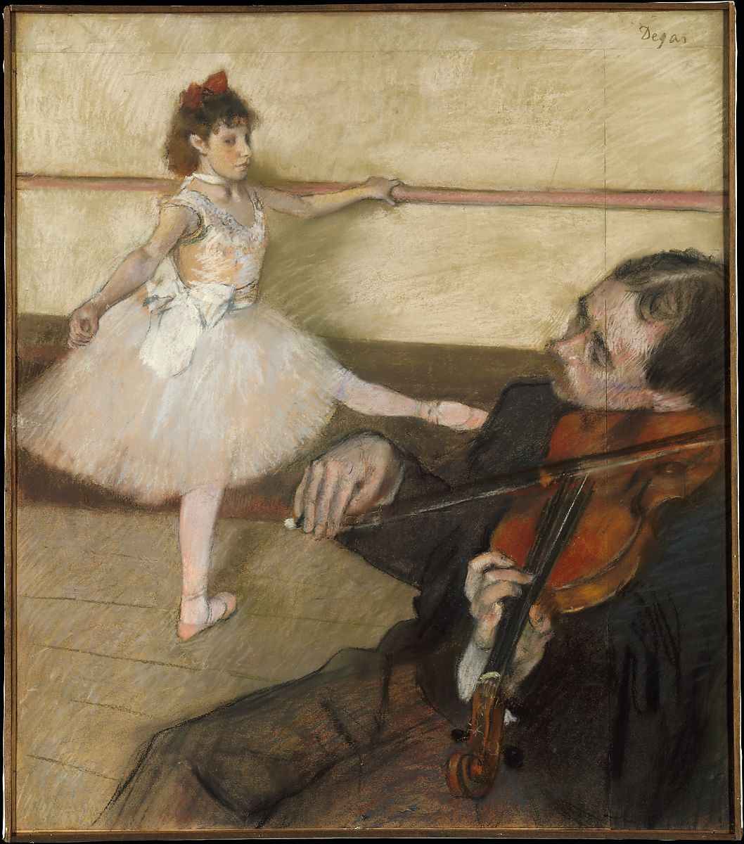
Degas added strips of paper at the top and right in order to improve the composition and include the violinist.
The Dance Lesson, ca. 1879
Pastel and black chalk on three pieces of wove paper, joined together
64.5 x 56.2 cm
by Edgar Degas
Esoterica: At the risk of buzz-killing those tempted to skip this step, being a creative person asks that we also bear a responsibility to acquire a basic understanding of what we’re doing. This then opens a door to making competent work. As a carrot, I will dangle that a skillful composition breaks through the noise of a million other paintings and beguiles the viewer with a mysterious attraction, clear communication of message and a visual pleasure. Someone may even get their wallet out. More important than this, no one benefits from a world clogged with bad design. In art, ignorance is not a virtue – even outsider art and “primitive” art value masterfully harnessing the principles of design, both by way of intuitive talent and a time-honoured system of apprenticeship. Only after we’ve put in a few thousand hours to get an understanding of what we’re doing, can “breaking the rules” become a skill-filled arrow in the quiver of not only personal expression but the advancement of our artforms.
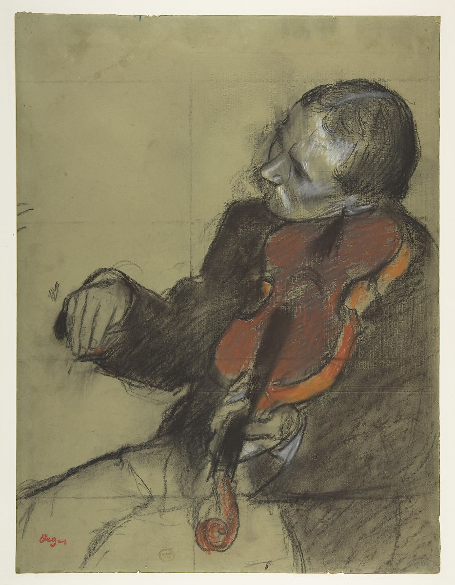
Violinist, Study for “The Dance Lesson”, ca. 1878–79
Pastel and charcoal on green wove paper; squared for transfer in charcoal
39.1 x 29.8 cm
by Edgar Degas
Have you considered a Premium Artist Listing? With each letter, an artist is featured at the bottom of this page. The Premium Artist Listings are a means of connecting artist subscribers through their work. Proceeds from each listing contribute to the production of The Painter’s Keys.
“To learn is to broaden, to experience more, to snatch new aspects of life for yourself. To refuse to learn or to be relieved at not having to learn is to commit a form of suicide; in the long run, a more meaningful type of suicide than the mere ending of physical life… Knowledge is not only power; it is happiness, and being taught is the intellectual analog of being loved.” (Isaac Asimov)
Featured Workshop
 Permission to Paint Expressively Series Session 2
August 22-25, 2022
Join Ellie Harold for “Expressive Painting: Making Your Marks.” With a focus on intuitive mark-making, this workshop is designed to facilitate a fuller expression of your deepest and most essential artist Self. Content, process and lightly structured exercises give you permission to create the art that wants to be made by you in the safe space of Ellie’s studio and the fresh air and cool light of northern Michigan near Sleeping Bear Dunes. You’ll return home with a specific art “care plan” to assure support for “Making Your Marks” in the world. Details and registration at www.EllieHarold.com.


12 Comments
Again, the Degas paintings are beautiful. I love his ballerinas paintings and other work. The Dance Class is an excellent composition and painting! And the advice from painter and illustrator Harvey Dunn, about “taking something out” was advice I received from an art teacher, in college. I used to do portraits with art pencils, pen and ink and charcoals. I would meticulously do everything “perfectly”. Putting every line and detail into a portrait. But, when I tried that advice, I found that leaving some things out, actually made the portraits more fresh and alive. I found beauty in each type of work, but it’s interesting how it made a difference. Thanks for another interesting letter, Sara!
Thanks! Good article. I will add one more amateurish mistake: juxtaposition.
I see what you mean. I just finished a canvas of my grandmother having sexual relations with a turkey. It’s has a good composition to it though. See: Robert Williams
Also, what I learned about composition, sounds very simplistic, but it works. You start from a point in the foreground, and you zig-zag back through the painting. Maybe that is a stated rule, but that is what I learned. And then each artist puts their own creativity and stamp on their work.
Great come back from the previous posting! Love them both and I have printed them to keep on hand to help guide me through my work! Perfect for me!!
Thank you, Sara, for identifying how and why composition works and when composition doesn’t work.
It is very interesting to see that Degas added strips of paper to The Dance Lesson. I find I do this when editing/cropping a photograph. I love the abstract aspect that can happen when zooming into the detail you can get from a digital photograph.
Adding or removing periphery areas is part of the decision and choice-making process.
Hi Sara,
This was engaging and so helpful, thank you. Just what I needed for now.
Would you please say more about the potato-itis, perhaps with a few examples. I don’t understand it. A picture would do the job I think.
Not a bad idea to post these ideas by the step-back area where we stop to take a look at what we’ve painted. It must be exhausting for jurors to go through hundreds of paintings, checking to see if the work falls into good executing of all the composition rules needed to be followed. I was part of a jury once and said “never again” after. I’m not a teacher, more a perpetual student who lacks confidence in learning from what I already know, nevermind thrusting what I don’t know on others. I do believe jurors should be asked to do so not based on the asked person’s appearance to paint well, but based on their understanding of what makes a successful artwork. Like, uh, knowing the rules. Sure, after years of bashing away at making art, our eyes catch obvious failures in execution, but that’s not worthy enough to be handed the axe. Gee, do I sound cranky today? :) Yes, my struggle painting is still not singing, I’ll print and post this article by my step-back area today. Thank you, Sara!
After re reading , on the painting in progress the “in line objects” jumped out at me! Thanks,
My landscapes used to suffer from “potato-itus” and a weak foreground. The shapes merged into blobs, the eye couldn’t move, and the paintings came out flat until I started cutting out the excess and adding corners for flow. To share my progress, I organized an online exhibition for fellow artists. I read about an event management platform at https://www.pissedconsumer.com/company/eventsquid/customer-service.html . I chose EventSquid for registration and virtual galleries. The setup went smoothly, and guests praised the convenience. Now I have regular exhibitions, the feedback is motivating, and my creativity has blossomed!
block blast invites players to think strategically, complete daily tasks, beat personal records, and share progress with friends for extra motivation.
I agree that mastering the fundamentals is essential before trying to break the rules.