Dear Artist,
Last night, while on jury duty, my fellow juror and I agreed the most common fault seen among entries was in composition. Well drawn, well rendered and well coloured — all came to naught when the composition had significant faults. I’ve often written about what an artist should do. In this letter I’m giving six common pitfalls. Last night we noticed them all:
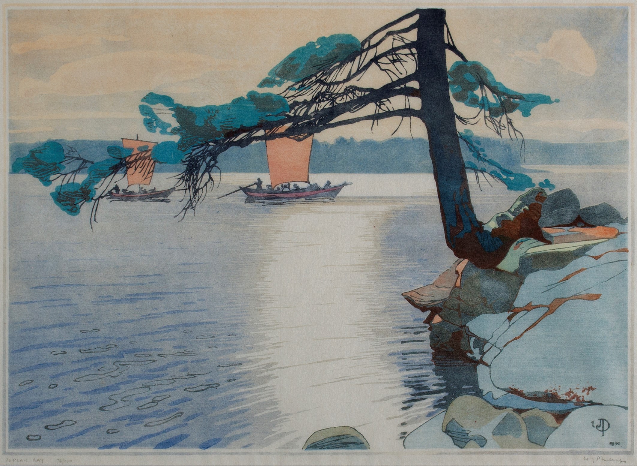
Poplar Bay, Lake of the Woods, 1930
Colour woodcut
23.9 x 33.5 cm
by Walter Joseph (W.J.) Phillips (1884–1963)
Weak foreground — The foreground appears as an afterthought. Wishy-washy, unresolved or inconsequential — it fails to set the subject onto a reasonable ground or to lead the eye to what the artist would have us see. Even in abstract or mystical work, a foreground needs to be implied and understood as a vital contributor to the whole.
Homeostatic conditions — Homeostasis means equidistant lineups of trees, rocks, blocks of colour, or other patterns that are too mechanical or regular. It includes trees growing out of the tops of people’s heads. While sometimes seen in nature, homeostasis is a natural human tendency — a subconscious reordering and regularizing within the brain. “Even in front of nature one must compose,” said Edgar Degas.

Gloaming, 1921
Colour woodcut
24 x 21 cm
by Walter J. Phillips
Amorphous design — The general design lacks conviction. A woolly, lopsided or wandering pattern makes for a weak one. Often, the work has unresolved areas and lacks cohesiveness and unity. “Everything that is placed within the enclosing borders of the picture rectangle relates in some way to everything else that is already there. Some attribute must be shared between all of them.” (Ted Smuskiewicz)
Lack of flow — Rather than circulating the eye from one delight to another, the work blocks, peters out and invites you to look somewhere else. “Composition,” said Robert Henri, “is controlling the eye of the observer.” Effective compositions often contain planned activation (spots like stepping stones that take you around), and serpentinity (curves that beguile and take you in.)
Too much going on — Overly busy works tire the eye, induce boredom and make it difficult to find a centre of interest or focus. Less is often more. “Take something out,” said the American painter and illustrator Harvey Dunn.
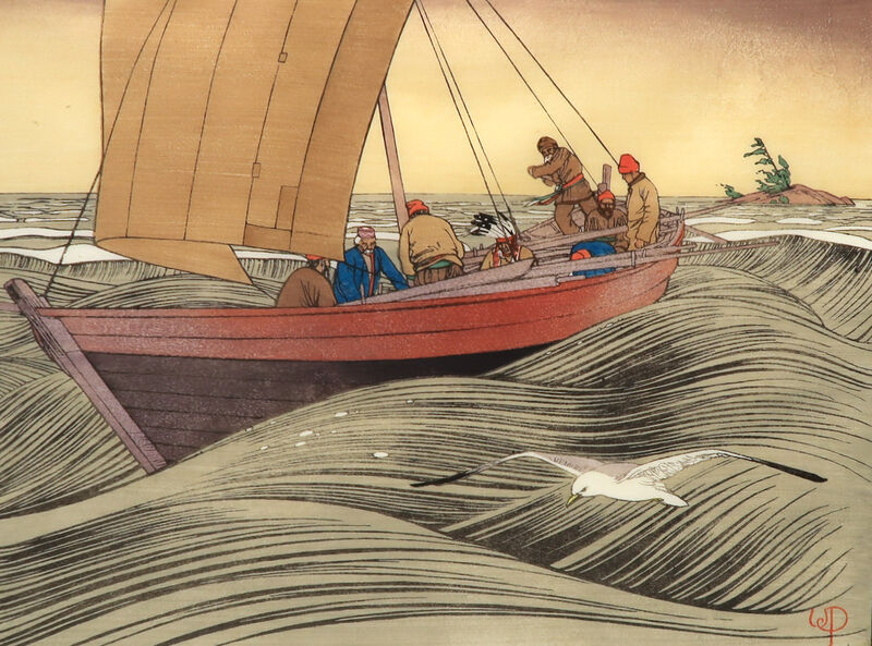
York Boats on Lake Winnipeg, 1930
Colour woodcut
26 × 34.9 cm
by Walter J. Phillips
Defeated by size — Effective small paintings often work well because they are simple and limited in scope. But when artists make larger paintings they often lose control of the basic idea and what is ironically called “the big picture.” “The larger the area to be painted,” says Alfred Muma, “the harder it is to have a good composition.”
Best regards,
Robert
PS: “A well-composed painting is half done.” (Pierre Bonnard)
Esoterica: The path to stellar composition is spotted with potholes. Further, compositional design can be unique to the individual, and intuitive. This approach can be unreliable. Habitual poor composition can have long-term effects on otherwise excellent work. After our engaging juror effort (there were many excellent, compositionally sound paintings), over a straight-up gin Martini (for a change), my friend and I loftily decided to found a “School of Composition” — where only composition would be taught. Like the tattoos on the girl’s back, it seemed like a good idea at the time.

The Stump (n.d.)
Colour woodcut
17.8 x 24.1 cm
by Walter J. Phillips
This letter was originally published as “Six compositional boo-boos” on March 2, 2012.
Have you considered a Premium Artist Listing? With each letter, an artist is featured at the bottom of this page. The Premium Artist Listings are a means of connecting artist subscribers through their work. Proceeds from each listing contribute to the production of The Painter’s Keys.
“There must be a judicious arrangement of all the parts. Considered conversely, the artist’s task is to fill his panel with a design that conforms to its shape and is beautiful in itself.” (Walter J. Phillips)
Featured Workshop
 Permission to Paint Expressively Series Session 1
June 27-30, 2022
Join Ellie Harold for “Expressive Painting: Color from the Inside Out.” Do you struggle with color? For chromophobics or anyone who would like greater freedom in their use of color, this workshop focuses on activating and applying your innate color sense. Content, process and lightly structured exercises allow you access to a wider range of color expression in the safe space of Ellie’s studio, located only 3 blocks from Lake Michigan near Sleeping Bear Dunes. “Expressive Painting: Color from the Inside Out” has the potential to transform not only your art but your life! Details and registration at www.EllieHarold.com.
 Awakening, 2016
Acrylic
10 x 10 inches
Featured Artist
My art, like my art making practice is about discovery. The alluring push and pull of wet pigment on the surface, the intermingling of colors joining to make new hues in an ever-changing kaleidoscope of shapes and textures. Gently nudging the chaos is exciting and keeps me motivated to make art. Each piece provides unique challenges. Those challenges open the door to my inner world and help me understand more about myself and my relationship to the outer world.
The resulting images from my practice often have aquatic themes. Water has been a big part of my life and those memories come back again and again. Often my audience tell me they sense a spiritual element in my work, and they feel the works are meditative. I love that my audience senses that and it reminds me of our connectedness.


24 Comments
Mr Genn mentioned ‘bravery’ as one of the forces in powerful composition. He once cited Andrew Wyeth as being fearless in this regard, mentioning (if memory serves me) these two pieces – Christina’s World and Winter 1946 as prime examples. The opposite, then, I guess, the thing to avoid; would be timid compositional design. To avoid the obvious when one can, try to be aware of the book, but not necessarily live by it. Yes, perhaps that book that seemed a good idea at the time, but left unwritten.
Your inspiration lives on Mr Genn. Thank you
There is such great value in this article. It is the intersection. Meaning my mind in the middle of the intersection and I have so many ideas, directs I would like to take you. Do we end south? North? Composition, is it limited to painting? Music? Composition, for me occurred in the late 80s. I was working in a few different mediums that get the title: Composition. A friend said to me what color are these pants? I replied: “Grey.” Nope, “they are European weighted wool grey.” That changed everything for me. From that moment on not only did I learn more about clothing; how it drapes, feels, the textures, the lines, I was able to go beyond the surface. What I took away from it was everything was a composition. That we cannot limit ourselves to just one domain (composition). When you watch the documentary titled: “Sketches of Frank Gehry,” from 2006, on the life of Frank Gehry. We see his buildings, their lines. textures. The compositions work. Yet, we look at Frank Gehry, the person, and his own composition doesn’t work. His lines don’t work. Over weight. Not in the great shape. His buildings are. But he isn’t. He never learned that the texture of his pants and tops don’t work together. That everything applies. Everything is a composition. It’s exciting, thinking. And we talk boo-boo’s. Photographer Nikolitsa Boutieros asked me to title one of her photographs. I did. I called it: “Angels Causing Accidents.” She loved it, replying: Yes, even angels can make “boo-boos.” In this article by artist “Alissa Hewison” we learn more about boo-boos. https://salmonstudio.wixsite.com/yohnke/post/pottery
I even tough I was a boo-boo. A mistake for over 50 years. To learn more: https://salmonstudio.wixsite.com/yohnke/post/thanksgiving
There are other directions I’d like to take you, but I’ll stop there.
As always, love is the way,
Miles Patrick Yohnke
https://yohnke.com
306.227.6379
306.652.3898
Thanks for the excellent advice given in easy to understand directions coupled with great quotes
Maybe it’s just me but the first image is a good example of the first booboo. Who do I think I am criticizing WJPhillips? Or was this image included to illustrate the mistake. I am a fan of Phillips work and a giant fan of Mr Genn ( you too Sara), so please accept this as only one guy’s opinion
Hi I was wondering the same thing. Are these illustrations of poor composition ( by noted Canadian artists !) that you have shown ? Or examples of good composition ?
Lois
I was wondering too. Especially “The Stump”
The four examples of Walter Philiips’ woodcuts had me wondering too if they were meant to represent examples of bad or good composition, especially as I had trouble actually deciding for each of them.
Beautiful art work by Walter J.Phillips! Thanks for the letter, Robert and Sara!
I appreciate the listing of these important principles but it would be helpful to include examples of what they are talking about here. For instance, just how does one employ points which lead the viewer’s eye around a painting! I’’m not a pro but trying to get there!
The four examples of Walter Philiips’ woodcuts had me wondering too if they were meant to represent examples of bad or good composition, especially as I had trouble actually deciding for each of them.
Atmospheric is important in the composition too. I gives the illusion of depth to the piece. To create the feeling of distance you need to remember that things get smaller and lighter in value and bluer in color. A red car in the far distance will appear blue. If you remember these three you will always have a good atmospheric
Matisse would’ve giggled at these academic pronouncements.
I was wondering the same! Would it be possible Sara to do another, follow up to this letter, showing an example of each, good and bad? It would be a great help to me and many of us who are so visual, but don’t always “see” the verbal description! Thank you for this and all the wonderful letters. A grateful novice!
These are examples that illustrate the points being made amply. There is an adherence to the law of thirds in each, which is based on the golden mean. In poplar bay, the eye enters on the cropped stone and can either be swept up that channel of light to the boat at the centre of the upper third, there, a more hidden boat can be discovered along the line of the upper third also, a nice “bonus”. I also found myself going along the shore, scaling the tree and being gently dropped on the the distant boats on the upper third. In gloaming, you come in at the stick on the lower left and are brought across the lily pads along the reflection of the boat right up to the girl in the upper corner, who’s head echos the stick at entry in both colour and tone, giving a kind of echo or visual rhyme. The entire boat, is in the upper third, held by the bulk of the painting surface under neath. The next is my personal favourite compositionally. Again the sky occupies the upper third with the ocean is on the lower two thirds. Great tension and movement is created by the sail on the left third dropping on the point of the front of the boat where its point hit the lower left third on the head…cut to that dramatic point by the diagonal curl of the waves, cutting it on a sharp incline and we are swept towards the crew and on past them to the island, which we can feel, even though static, is soon to be left behind. Brilliant! The last one is a very quiet composition; we come into the picture on the branches that though they sweep down, lift us up and into the body of the tree on the left hand third. It comes to an abrupt halt where it is snapped, nothing is in the air above it, which makes me aware that its life has ended…nothingness. When the eye drops down again, it is onto the gentle orb of a setting sun in the lower and left third…quiet and poetic. As far as I can see, great compositions all, because even though they are well informed and deliberate, they are as though one would catch them in life, full of nuance, subtlety and drama.
Wow, your description, Catherine, makes me realize I don’t “enter” pictures by the same route that others do. Was hardly aware of the stick in Gloaming until you pointed it out. Totally agree with your “nothingness” statement regarding The Stump, and this blankness is what I saw first. To me, these paintings illustrate the compositional points being made but are masterful examples of how one can break each rule and still get away with it. They are superb!
And there is so much more going on than I mentioned…true mastery of relationships…the lines of sail boat heading up out of picture making us aware of the scale of the unseen sail, and that gull in the foreground, almost like a wave itself, shows us the actual waves, making another triangular dynamic, bringing us back to that island again….a yes…composition is the sentence that gives the “words” coherence, and this guy is a poet.
Catherine yes so much poetry! As the sun could be a sunset so it could also be a sunrise giving the observer the power of interpretation. The same as for the stamp -> it could be a metaphor of death whoever there is the fresh green bush set right behind it which could be a metaphor for new life. So the poetry of coming and going, of death and life are all conveyed in one beautiful print.
Thank you for your beautiful description of the eyes journey!
I remember my composition teacher, Geoff Rees, many years ago, in art school, got me to see that I had too much going on in the work he was critiquing and from that moment on, I began to understand and to value the rules of composition.
I still show my work to another artist – whose opinion I value – for an occasional critique.
Beautiful woodcuts! Are they woodcuts?
Compositional rules are to be thoroughly learned, understood and then chucked out the window in the red hot crucible of creativity. Don’t get too hung up on the focal point, folks, or you risk sliding into the slough of didacticism.
We are artists and we don’t look back! Break those rules with abandon, but make sure you’ve learned your lessons first. It’s a wild world out there beyond the classroom.
Try everything, it might work. Art is about taking risks. We are not bureaucrats.
Oh, good reminders. I’m working on a “stinker that’s fighting me” on my easel right now. Taking things out, changing tones and colours, darkening, lightening, pushing over, covering up. I don’t know why this one is being so difficult, it’s a landscape of an area I’ve painted many times before. But I’ll get it. Struggles are sometimes what pushes that obsessive gene in our artistic make up. Constant problem solving to myself, with random I KNOW sending me back to the easel to do something else. It’s good to have difficult ones, it forces us to focus and think.
I too wonder if the
York Boats on Lake Winnipeg, 1930
Colour woodcut by Walter J. Phillips is an example of a too busy painting. To me it could not be presented any better. The stormy sea and the white of the waves and seagull is a perfect bd image.
I loved the comments above as I too didn’t think any of the paintings were well composed, especially the first one where my eyes were taken immediately up the tree and to the boats which look as though they are hanging from one of its branches! (or maybe he was ahead of his time and meant it to be surrealist?)
In Gloaming I think the woman looks transparent and Claude Monet would have done so much better with the boat and it’s reflection. I can’t comment on York boats because it’s in a style that doesn’t appeal to me at all.
But yes, in all three I would love to know which point each of them relates to – are they supposed to be great examples of excellent composition or really bad ones showing in each case where Walter Phillips went wrong?
Sara I love your and your father’s writing but in this case I’m as confused as several other readers are – I’d love you to explain please?
I used to frequently make tangents and bad mergers in my landscapes—the edges of objects would blur, the composition would lose its strength, and the paintings would come out flat and boring. To better analyze my mistakes, I started printing sketches and drafts on high-quality paper. I learned how to contact brother and called support about a new artist printer. A consultant helped me choose a model with accurate color reproduction, and it was delivered within a day. Now I print my work, see any mistakes immediately, and correct them—my composition has improved dramatically!