Dear Artist,
Composition is the relative positioning of shapes and forms within a picture plane. “The composition,” said pioneer abstractionist Wassily Kandinsky, “is the organized sum of the interior functions of every part of the work.”
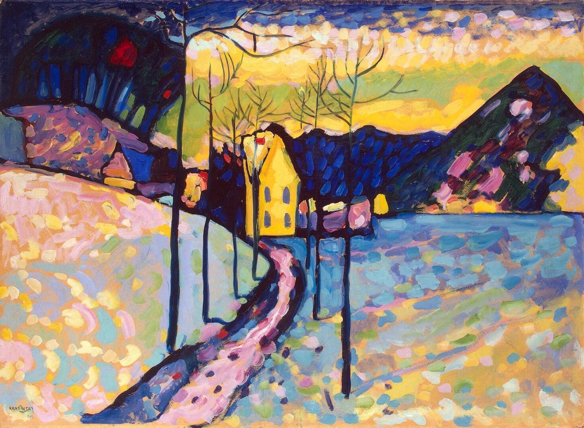
Winter Landscape, 1909
Oil on cardboard
29.7 × 38.4 inches
by Wassily Kandisnky (1866-1944)
As a frequent juror, I notice the tendency of my fellow jurors to reject work thought to be poorly composed. Many artists, often photo bound to start with, fail to redesign their reference and take control of compositions. Consequently, in my occasional sorties into workshopping, I sometimes hand out a list of compositional keys. They are not rules — even if they were, they would have to be regularly broken. They are meant to be guidelines. Coincidentally, there are eleven keys on any ordinary keyboard that are useful in understanding them: they are S, O, (), !, L, ?, ^, M, P, H and X.
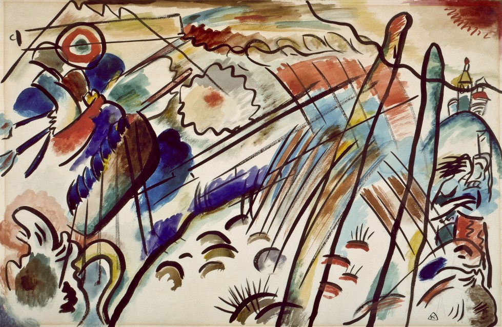
Study for “Improvisation 28” (Second Version), 1912 Watercolor, india ink, and graphite on paper
15 3/8 x 22 1/8 inches
by Wassily Kandinsky
S is the famous old eye-control lead-in where the river meanders, the path winds, the road disappears.
O is the circular imperative that keeps the viewer’s eyes moving around within the work.
() is the inclusion of eye-returning verticals that parenthesize on the left and right.
! is the long and the short of linear design. Exclamation brings excitement, finality and visual interest.
L is the rectilinear lineup that gives compositional solidity. Objects sit on a secure ground.
? is the eternal question “What could be?” as well as “What is it?” and “What isn’t it?”
^ is for softening near the edges. Equal focus bores the eye. Humans don’t like to be bored.
M is for mystery, paucity and lack of disclosure. A good composition doesn’t need to tell the whole story.
P is for patches. Patches trump lines. Better compositions are often an assembly of patches.
H is for homeostasis. Overly regular, evenly spaced, mechanical interstices need to be scouted out and fixed.
X is fraught with danger. While it’s great to have a central confluence of interest — X marks the spot — it’s also important to watch where any of those four legs might point or turn up. Watch the corners of your picture. Shooting the eye out of one of them can be bad news for you and good news for the painting next door.
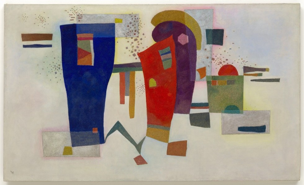
Accompanied Contrast (Contraste accompagné), 1935
Oil with sand on canvas
97.1 × 162.1 cm
by Wassily Kandinsky
Best regards,
Robert
PS: “A well-composed painting is half done.” (Pierre Bonnard) “Even in front of nature one must compose.” (Edgar Degas)
Esoterica: The main test of composition is engagement. How does it grab and hold you? The answer gives a key as to how it might grab and hold others. “Get the art of controlling the observer — that is composition,” said the American teacher Robert Henri. Hint: Pay early attention to what happens in the lower third of your painting. Often called “the foreground,” this is generally where the viewer’s eye first enters the picture. This is the place on the picture where composition begins.
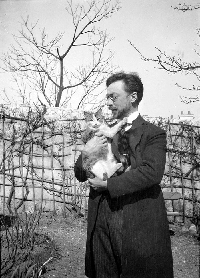
Wassily Kandinsky and Vaska
This letter was originally published as “Compositional keys” on January 23, 2009.
The Letters: Vol. 1 and 2, narrated by Dave Genn, are available for download on Amazon, here. Proceeds of sales contribute to the production of The Painter’s Keys.
“Of all the arts, abstract painting is the most difficult. It demands that you know how to draw well, that you have a heightened sensitivity for composition and for color, and that you be a true poet. This last is essential.” (Wassily Kandinsky)
Featured Workshop

Join award-winning Plein air painter Sharon Rusch Shaver as she conducts her next exciting workshop to the Dingle Peninsula of Ireland. Painting daily in your chosen medium: oil; watercolor; pastel; pen and ink artists as well as photographers will find plenty of inspiration where the sea defines the life and creates excitement on this amazing Island. Daily demonstrations and one-on-one help will be provided for those wanting to learn how to work quickly capturing that changing light and color in their paintings.
Delicious chef prepared gourmet meals and a well-appointed ensuite rooms, as well as all ground transfers are included. All-inclusive* 9 nights accommodation, transfers, meals, and instruction. Go to: Adventure-Artists.com
Artist Sharon Rusch Shaver has postponed the Ireland Adventure until 2021. If you would like updated information about this an other upcoming adventures, you can get on her mailing list by visiting: Adventure-Artists
Join us!
 Sunrise Over the Farm #2
original pastel 15 x 15 inches
Featured Artist
Mary’s interest in pastel painting began during her years at Whitworth College in Spokane, WA where she majored in art and elementary education. Though she has worked in watercolor and oil as well as calligraphy, her interest has consistently turned primarily to pastel because of the medium’s potential for glowing, vibrant color and the harmony achieved in bringing together lights and shadows.


6 Comments
If not Robert’s best, then mighty close to it. WONDERFUL !! And if your new at this sport save this and always have it handy.
Could not agree more, with Robert and with Levi. Very good letter, Robert. We miss you. Yes, Yes, Yes. Know the ideas, break them if you have a purpose to do so, but know them.
Composition is what makes ART….ART! Different mediums have different requirements, but the way the artist (poet) composes and controls those requirements is the key to the visual excitement called ART. The eleven keys discussed here are definitely worth practicing, and for assemblage artists, I would include another; finesse finish. What a great post Sara….your father lives on!
Yes! An excellent list of keys from Robert. I like that they are guidelines so we can come back to them again and again and organize them in different ways and adjust our work in reference to these keys.
There is a painter Lotte Laserstein, who had to leave Germany in 1937 and moved to Sweden where she stayed the rest fo her life. Her work is said to never have the same strength after that but there are two large long figurative paintings of hers that I love and are magnificent compositions. I used her “Evening Over Potsdam ” (1928) all the time as an example when I have taught composition. My painting has taken over now so I don’t have time to teach. But there is still a 10 lesson class available for independent study for this year. After that, I will likely archive all three classes until sometime in the distant future when I can no longer paint. ;)
Would love to take your online course!
Please send me information.
“…the relative positioning of shapes and forms within the picture plane”. To understand what is being said here It must be understood that forms when used as applied to composition is not another word for the representation of 3 dimensional shapes. Form in relation to composition has a much greater scope of meaning. It includes color relationships, value relationships, texture relationships, line and point as shapes in themselves and the directed movement of attention being attracted to the various contrast points . All being presented to express and communicate through the applied process of “Formal Empathy”. Just as Musical “FORM” includes notes, scales, volume, timbre, rhythm etc., in the “Elements of Form” of music; so the “Elements of Form” of Visual ART are all included in the meaning of the word “FORM”. After all, Painting and Drawing are composing Visual Music…not picture making. There’s nothing wrong with the craft of picture making , unless you call it Fine Art.
There is a distinct advantage in knowing that, In Fine Art, it’s not what it is…..It’s HOW it is what it is!
I once plugged my book “Composition and the Elements of Form” by Leonard Melkus Jr. on this vary site. I’m doing it again. It is an introduction to the concept Of Formal Empathy. It’s still available(Amazon etc.) . You might want check it out if you don’t know this stuff………………………………..