
“The Priest of Dark Flight”
original illustration
by Jos A. Smith

“Minnesota Shiners”
watercolour painting
by Terrie Christian

Untitled
pastel painting
by Sandy Davison

Untitled
oil painting
by Peter Brown

Untitled
original painting
by Kitty Gorrell

“Cool-of-Day — Coronado”
watercolour painting
by William McAllister

“I used to be a superhero/Anxiety”
oil painting
by Nick Rosal

“Seedlings”
acrylic painting
by Michal Ashkenasi
Archived Comments
Enjoy the past comments below for Framing and matting…
Framing is a ‘painful’ word for me. Excuse me for the expression. I have spent many thousands of Swiss Francs for shows to present work beautifully (in my eyes). When I hear comments for example: ‘Oh, the frame is not the right colour’, or size or style, dosen’t work over my sofa, or the best one is No comment on the painting but ‘I love the frame!!’ I have stopped spending my hard earned cash for the framing and the equipment and suggest that the buyer chooses his own. Of course an example of a framed painting is always important. Art suppliers and Framers are the ones earning the money on us pooooor artists. BUT — I am a passionate artist and love painting and can’t stop……
As a slight deviation from framing and matting, I knew a very eccentric artist/writer and story teller in Adelaide, Australia.His name was Bernard Hessling,Born in Yorkshire.U.K. As a identity, he was always asked at Art Shows etc. what he thought of the artworks on the wall. Puffing out his pear-shaped belly, he said in his Yorkshire accent “Beautiful Frames “!! This was his universal response. !! Michael Morgan Australia
I follow what I consider a good rule of thumb: never use a mat that is lighter than the lightest light within your painting. Seems to avoid much of that glaring, garish distraction. I paint primarilly in pastels and have noticed that mats are increasingly being abandoned altogether. One related pet peeve is when shows and exhibits oulaw all but ‘neutral, off white mats’ for all entries. My view: let the artist decide which, if any, mat best sets off their paintings and then judge them on the total impact. PS: Even without a ‘Caritas Easel’ I somehow find it relatively easy to “sit back, have a cigar, drink scotch”…and, if I can do all that, I feel pretty darn ‘wealthy’ in my own way, too.
Convention in mat selection for watercolor is predominately an off-white such as linen or a very light beige. Sometimes a contrasting double mat works well. In watercolor competitions a plain simple mat and light colored oak or maple frame is often advised. The key to success in art work is presentation. Your art work should be the focus not the frame or mat.
Is it me or has framing become even more outrageous in late years? We all know a cheap frame can kill a sale but still must display a painting properly; even when you know the buyer is going to replace the frame. I saw one guy at a show who had about twenty-five paintings all with the same frame – he bought the stock and made his own. The design may have worked for several but not all. Just curious, is anyone satisfied with buying your frames online? I discovered my favorite gallery has their back storage room crammed with frames they have replaced. I have bought some magnificent frames from them, some slightly knicked and some pristine, for an embarassingly low price. All I had to do was ask.
The biggest problem I have with white– as an oil pastellist– is keeping it clean during the matting and framing process. I don’t care for white, but see it as a one-size(color)-fits-all solution. Unfortunately even on my best day the pristine white becomes adulterated and often unusable. Gray is my most common solution.
Art is like a house, the décor must suite the house, the custom framing must suite the artwork. That is why one has it custom framed. Otherwise, why pay to get it professionally framed…? There are many considerations when you frame a piece and having the artwork there in front of you is very important… King’s Framing & Art Gallery
I agree that a frame that would be acceptable in one part of the country would not be in another. In South Carolina I heard a gallery owner speak about frames and she said most people like the skinny frames similar to the Pottery Barn Look. When I traveled North a few months later many of the frames I saw in the galleries were wide heavy gold or even black frames. I go with the less expensive frames thinking that when someone buys the painting they often replace the frame anyway. If they can’t afford to at least the painting is the center of interest and not the frame. I’m sure that 10 years from now artists will be having the same discussion.
Didn’t Turner want his paintings hung on, if not maroon, something like a cross between deep barn red and choco…no…that is not correct either…whatever…found at the Tate….???
I have an artist friend who frames his paintings in black frames. He recently was asked by a gallery to change his frames (before he could exhibit) to warm brown frames so that they would fit better in the gallery’s “warm” interior. I was appalled by the request. I assume you’ve heard of everything but I’d never heard this.
But Robert, that doesn’t answer the basic question. If entering a watercolor in a show, the mats must be subdued, the frames simple metal with plexiglass glazing. If you sell online, do you bother to mat a painting at all? From what I’ve seen, most people re-frame a painting to their particular taste and furnishings so I would think the simpler and least expensive without being cheap, would be the best way to go. I was hoping for a more definitive answer as I truly value your input on all subjects re art.
It should be obvious. White or light mats work best with dark pictures, and darker mats or inserts work better with light pictures.
Perhaps your friends found the interior designers were improved by a bit of char-broiling!
Disturbing is the word for the current trend, even in local art leagues, to dictate the color and styles of frames and matts. To me it’s one package. Who died and decided things had to be framed and matted their way? Jeanie Zaimes
A few years ago I attended a reception for a juried show at our local gallery. The judge commented negatively on a bold painting of an Indian woman where the matting was cut out to include a couple small graffic Indian motifs. I was sitting next to the artist and couldn’t resist telling her, that hers was the only painting in the room that my eyes kept coming back to over and over. The others weren’t worth any more than a glance. The frame, the matting and the picture were cohesive and stunning.
I think it is wise to avoid anything “gimmicky” when framing if you want your work to be looked at seriously. I stick with shades of white for most of my watercolours when it comes to matting with a thin, wood or metal frame. I have been using IKEA frames for my watercolours for years with success. They are tasteful and they even give you an acid free mat, but it is never the right size of course. I had small watercolours done at a framing gallery years ago for $80. each. for a white mat and thin black frame. Nicely done, but when you sell a picture for $300. or so you don’t want $80. going to the framer. The other method is economical, can be built into the selling price and allows for the client to change it if they want. Ultimately, I think the frame should be chosen for the artwork only – forget about décor and interior colour schemes. A good artwork will stand on its own and look well regardless. I learned that by observing art in museums. I was looking at a beautiful French impressionist work in oils in Chicago. I like to examine art close up and I saw that the frame was solid wood, carved , painted many times and honestly beat up. Perhaps it came from Paris 100 years ago. I don’t know. But It embraced the painting beautifully and I loved it. Wouldn’t change a thing. And it was the only frame like it in the gallery room of many works.
In a way the ultimate “caritas” frame is the golden one. While it pays no attention to the colour-coordinated needs of the painting it surrounds, it does honour it with at least an imitation of a most valuable metal. Early ormolu frames were gilded bronze and thought to befit the holy paintings they embellished. U.K.
Framing is a matter for personal preferences and fashion to decide. Colored matts, however, make my skin crawl. Certainly not for any aversion to color (I am an artist after all), but because colored matts are very acidic. Archival purity is a matter of special importance to me. Watercolors take an unwarranted back seat to oil paintings, because many feel that they will not last as long as an oil painting. But I will match any painting of mine against 99% of the oils being painted today. So many painters have lost any knowledge of the chemistry in the art, that my work will outlast theirs. Certain environments create their own framing requirements as well. Collectors of my work, in Hong Kong, must have special frames made that include desiccants to absorb the heavy moisture in the air and prevent mold and mildew from forming. But don’t let a colored matt come in contact with your paintings.
I am often appalled to see horrible matting and framing that distracts from an otherwise great painting. For me, the thing I hate to see most is an overly ornamental frame on a very soft and subtle landscape, etc. I know those ornamental frames have their place, but the painting should be the central focus, not the frame. I have often thought that artists who make poor choices in matting or framing really don’t have a truly integrated sense of what makes good art. I can apply the analogy of quilting; it is often said that the quilting is what makes or breaks the quilt. When I see a quilt where someone has had a longarm quilter quilt over the entire piece with the same pantogram, it is really disturbing. There is just no excuse for quilting running across a person’s face or body, or across an important design element without consideration for form and function. I feel the same way about matting and framing. I am OK with people who know what they are doing making unique choices in mats and frames. There is a time and place for the unusual. But overall, it is always the matting and framing that makes or breaks the painting. Calimesa, CA, USA
Hi Anne! Quilters make (functional) quilts. Artists make (fine) art. And I’ve know quilters who couldn’t even decide if they were artists- who stay in a safer less-demanding reality that- beyond technique- doesn’t require them to have to explain anything to anybody. Some artists (who work with textiles) still farm-out the (verb) ‘quilting’ to quilters who have little to no relationship to the art-making process- but have simply been hired by the artist/quilter to finish their art/quilt- because for some reason the (verb) ‘quilting’- the process that ends up holding all the supposed layers together- making it a (noun) ‘quilt’- is not something the artist/quilter wants to do. And I’ve known both women and men who fit this profile- but Nancy Crow immediately comes to mind as a person who makes the visual surface- but then has her wannabe minions do the (hand or machine) finish work. I once heard a long-arm sewing machine ‘teacher’ on a television show state that if the machine’s not running- the quilter isn’t making any money. So stitching and stitching and stitching is how a long-arm machine operator makes money. And a machine-made stitch is a continuous line- which is why so many (noun) quilters who (verb) quilt other people’s functional ‘quilts’ and/or art simply agree upon a repetitive pattern. Then- both artist and quilter accept the finished product as is- even though the ‘quilting stitch’ may have nothing to do with the visual art- because nobody wants to stop again and again to tie off all the loose threads so the thing doesn’t fall apart after it’s made. Myself? I make art. It’s layered and (mostly) hand stitched on the surface- though constructed with a regular sewing machine. My surface work is totally integrated into my structural and visual pattern. I would never let- or even engage someone else in this process- as it would be impossible to explain to anyone what I wanted them to do- as the surface work is as much a part of the finished art as any other part- and only happens as I’m finishing something. Also- I rarely use a single line method- preferring shorter stop-and-go lines- often in dozens of different colors that play out against the hundreds of textile colors and surface patterns- and have to be individually tied off. In other words- I have an interlocking construction pattern that fits together upwards of a hundred different surface design/pattern textiles- using every color- that when built is then finished with even more stitch patterns (in multiple colors) up on the surface. And beyond that- my binding (mat/frame) is an integrated textile that’s usually in the piece. And folks look at a finished piece and then comment to their friends that I must be insane!
Your comment on to do or not to do certain mat colors must be up to the individual artist to figure out? If you have a choice of bright white or ecru which would you likely choose?
Adding to the confusion…..the archival acid-free museum matboard at our art supply store only comes in white and are expensive. The acid free matboards may come in different colors but are not archival quality, so start to turn yellow after a number of years. The decorative mat boards are inexpensive but are not acid free and will yellow within a few years.
As I commented before, the acid turning the matt yellow is also being absorbed by the paper you painted on. Using colored matts is a sure way to drastically shorten the life of your work, and contributed to giving watercolors a bad rep. Suck it up, pay a bit more for the matt and then you can call yourself an artist.
I recently had a pastel painting accepted into a national juried show. The juror conducted a “walk-through” before handing out the award and shared her thoughts about each painting she had selected. When she got to mine, she told me that she was immediately attracted to my painting when she had viewed in on the submission digital image. But that she was very disappointed that I had matted it in a dark mat and that my frame looked cheap. I was humiliated. The juror didn’t know that my framer had talked me into changing the mat from white to a complimentary dark green. The framer said that white mats were passe. After the walk-through, I approached the director of the show to find out some more information. The director told me that the juror had been going to award me a prize based on the submission image, but because she was so turned off by the mat and frame, I didn’t get even honorable mention. The juror wanted only white mats but didn’t bother publish that in the show’s prospectus. Ironically, she awarded best in show to a watercolor that had a brown mat!
The best way to test, if the mat and frame are correct for the painting, is: close your eye and then open them. If you see the painting first, then it is framed correctly. If you see the mat and frame first, then it is framed incorrectly. I like wide white mats with 1/8″ inner of a colour that is dominant in the painting and very simple frames.
I have the same problem with white mats as Ramona, above. The issue must be common among oil pastellists who do not apply any sort of fixative. Fixative seems widely considered to be a mistake for oil pastels which never completely dry, though I’ve yet to read anything on the subject from preservation expert. I have somewhat diminished the problem by using a hair drier on the finished work to help the odd “flakes and bits” bond to the underlying OP film, and so far have not seen any deleterious effects from the application of heat. But, to get back to one of the issues, pure white is one of my last resorts with an oil pastel.
Looking now at the various va Megeren fakes of Vermeer one can see the stylistic nuances of the 20’s and 30’s in them. We have all become more visualy literate now. It is hard to imagine how the dealers and collectors were fooled, unless the simply collected the ‘name’
I think that you must be a great painter when someone tries to copy your work. Are you the least a tiny bit flattered?
A way that I have solved the archival need of the artwork is that I buy white mats and then paint them with Gesso, black often, or white, or with acrylic paints that enhance the artwork. This gives the artist more creative control and the assurance that the work will last for years.
Hello Mr. Genn!!! I had to laugh when I loked and the “fake” Genn… It looks NOTHING like your beautiful work!!! My goodness it was obvious without even having to click on the thumbnail!!! What freak tried to pass this horror as one of yours? Sometimes fakes are hard to confirm but this? Unbelievable… Kudos to the gallery owner who contacted you but I think any collector who knows your work would have had no problem noticing the poor attempt at copying you… Take Care! Isabelle
As a would be artist l have to agree with a responder that the matting/frame should match the mood of the painting – although in a juried show one is advised to have white matting only. What never fails to astound me – is this – people looking for a painting to – lets say – match the sofa or the pillows on the sofa (interior decorators are to fault for this all too often) – l just have to bite my tongue and say – “beauty is in the eyes of the beholder’ nough said – love your letters.
When I first began painting 14 years ago, I was doing watercolor ( which I was not very good at, by the way). Matting & framing became major considerations, both aesthetically & financially, were often drawback to my showing work. Nowadays I always tell buyers the frame ( they choose) should not “rob” the painting and that would be about all I say regarding framing. I switched over to Oils many years ago and haven’t looked back; the whole mat thing became a non-issue. I think art associations & galleries that literally penalize artists for using what they consider to be the “wrong” mat or frame is preposterous. I feel this practice throws the baby out with the bathwater and bypasses the value of the work itself. I began doing print-on-demand a few years back and the framing nightmare went away. Now when I have to frame, I frame conservatively ( unless it is portraiture) and stick with gold plein air or black plein air frames, which are a non-competitive & classic setting for my intense palette. As for gallery walls necessarily being a certain pale/neutral color, I’ve been in an excellent Newport RI gallery with cobalt blue walls; the work is curated of course, literally pops out at you ( in a good way) from those walls. Also have seen galleries with kind of cadmium red dark walls, and peach/terracotta walls; amazing how the work “lives” in those settings. The legendary & peerless Barnes Collection was housed in rooms with various color walls including a sort of Naples Yellow and a soft peach, which even Matisse himself approved. I think certain factions of the art community can get carried away with their self-importance and daunting “rules”, not saying there shouldn’t be respect for convention & cultural habits, just that they shouldn’t over-rule the gravitas of the work they’re supposed to be promulgating.
THE RETURN OF JOHN THE BAPTIST – FAKING CARAVAGGIO Robert: Seeing your newsletter on painting fakes, I couldn’t help but share an event which took place when working on the film Cleopatra in Rome. My father and I had the habit of visiting Porta Portese, (the Sunday morning flea market). Our mission was to hunt down props and dressing for the film sets. One morning we discovered an old piece of canvas, speckled with droppings, that looked like it had been used as part of a chicken coop. On returning home it was cleaned and we discovered that nearly all the oil had fallen off the surface of the canvas, except for a few patches of paint. I challenged my father as to why he would have wasted time and money on such a worthless piece of junk canvas. He then turned the canvas over and showed me the signature on the back. It read Caravaggio. For many months of weekends my father worked over that canvas, painting oil overlays on the unpainted sections, baking each layer in order to build up his layers of paint to match the depth of the original patches of paint. Concurrently he thoroughly researched the life and work of Caravaggio. It would appear that Caravaggio had painted a series of paintings on the theme of John the Baptist. On the remaining patches of paint, there was just enough information to discern the re-occurring reed cross and the petulant chin of Cecco, his model. After a careful analysis, dad induced that the discovered painting was one of the Baptist series (Caravaggio and his pupils painted many in this series). Upon completing his version of the painting he submitted it to the Accademia di Belle Arte in Rome for an opinion as to authenticity. Months went by and finally a letter came confirming the originality of the canvas, stretcher, nails and most importantly the signature. The letter went on to confirm the veracity of some portions of the painting. However, they were sorry to say that the majority of the painting was a forgery. The letter did note that the faked portions were done with great skill and of considerable merit and that it had taken the staff several weeks of study to come to their conclusions. Dad was very proud of the letter and had it framed and hung next to the painting. Unfortunately his apartment was burgled and (while leaving many other fine and expensive paintings) the “Caravaggio” was stolen. Later he told me that the thieves were caught and the painting returned. The police report was framed and hung next to the returned painting. Dad would joke that he valued the police report far more than the letter from the Belle Arte. It seems he felt the thieves had a better eye for classic art, as they were often forced to appraise what to steal and what not to steal in a matter of minutes, …before making a run for it…
 Carolyn Caldwell Workshops
Held in Stonington, ME, USA
The Workshop Calendar provides up-to-date selected workshops and seminars arranged in chronological order.
Carolyn Caldwell Workshops
Held in Stonington, ME, USA
The Workshop Calendar provides up-to-date selected workshops and seminars arranged in chronological order.
|

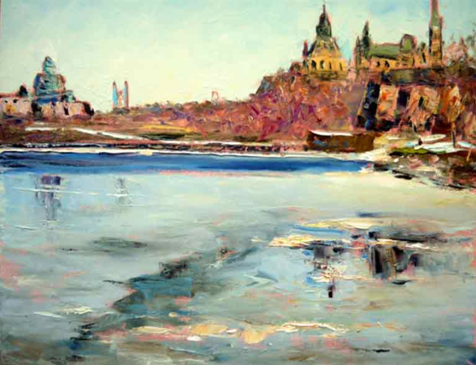
Spring thaw oil painting by Sylvio Gagnon, Canada |


“Eye-ease Green” was hailed as the finest color to aid viewing of things on paper, when I was a girl, and I will go and find “Eye-ease Green” for fonts and mats and frames and more sometimes. But then, after exhaustive study, I revert to white mats to help the viewer enjoy watercolor’s famous sparkling whites, and quality but not-too-heavy frames, except when doing historical images that ask for them. I do concur with John Churchill and Elizabeth with the use of stock studio framing. Then the decorator or buyer can frame as they desire.