Dear Artist,
Not everyone knows what I’m talking about when I drag the word “homeomorphic” out in mixed company. Specifically to do with equality of shapes in differing chemicals, it’s not in the art books. But it’s a valuable creative concept. Without always knowing its name, homeomorphism is generally pointed out as a type of compositional problem. Typically in amateur work it’s a lineup of equidistant trees, or a mountain that rises up conveniently in order to avoid colliding with a foreground element. It’s a natural tendency of the human mind to automatically organize things neatly and in a regular manner. You can probably see an example of architectural homeomorphism from where you sit — window panes are generally divided from one another by equidistant mullions.
Many artists instinctively fight it. Too much homeomorphism, unimaginatively used, gives a “ruler-regularity” that tends to make work boring. Nature’s not like that. Nature tends to be uneven, random, even chaotic. This means big against small, recession against protrusion, foreground against background, dark against light, warm against cool.
There’s a parallel in music. Music often depends on a regular and reliable rhythmic beat. But in a lot of jazz, reggae and stride piano for example, the beat is given on the off-note. Rather than conformation, there’s counterpoint. While providing a safe haven, homeomorphism tends to snuff natural dynamism and neutralize creative surprise.
But homeomorphism is also a valuable design device. It can add interest, mystery, magic and strength. Lineups, repetition, transfers, rhythm and spottification are some of the tools of abstraction. Free from nature’s reality, the creative eye can decide to “hold” a shape with another, or “confuse” by allowing a shape (or a line) to be drawn to another. Homeomorphism is one way to beguile the eye. The next time you’re dragging a brush and wondering where your stroke might end, remember that you have choices. Your stroke can go to something, veer away from something, fall short, overtake, or bump nicely into the middle of something. It’s an esoteric little business but it’s good to be aware that it exists.
Best regards,
Robert
PS: “I pay close attention to the variety of shapes and sizes, and place the objects so that the lines and edges create a rhythm that guides the viewer’s eye around the image and into the focal point.” (Sergei Forostovskii)
Esoterica: Homeomorphism comes from two Greek words homeos — identical, and morphe — shape. I fret about it every day and I’m willing to discuss it openly. Frankly, it drives me nuts. Some days I’m particularly homeomorphic and I just let go and it works to some advantage. One day my late friend Toni Onley remarked how he wallowed in it — and below is his work that I’m using to demonstrate it. I’d be very much interested in what you think of it.
Homeomorphism in the watercolours of Toni Onley
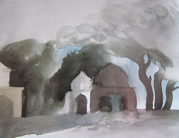
“Lodi Tombs, Delhi”
watercolour
The tree trunk on the right echoes the form of the tomb. The tree on the left echoes the form of the white tomb. All elements sit on a common line.
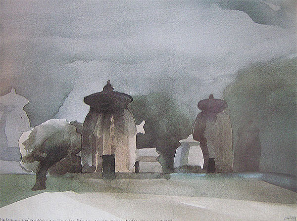
“Mukteswara and Siddeswara temples” – watercolour
The tree on the left leans on the temple which is well behind it. The dark form on the right presses against the temple on the right.
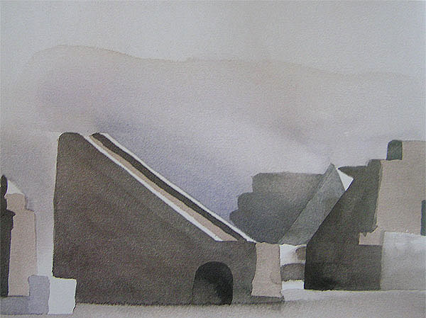
“Jantar Mantar”
watercolour
The block at the base of the observatory aligns with the light behind and with the corner of the building on the right. The pyramid form joins into the illusion.
Illusions dominate reality
by Philip Mix, Victoria, BC, Canada

“Eden”
original painting
by Philip Mix

I noticed this years ago in a show I saw of Toni Onley’s and thought it a very clever way to manipulate space. Objects move in and out, back and forth unexpectedly, and create a disturbing but interesting effect. After I saw it I played with collage for several years which seemed to lend itself to creating such ambiguities. I found it difficult to maintain the intrigue since my mind always sought to order everything as we perceive it in nature. Recently I went back to this idea in paintings using a concept that Cezanne referred to as passage. Now, in my new paintings I am intent to purposely manipulate space so that time and space are solvent and illusions dominate reality. It’s more difficult than it appears. Homeomorphism is a device I use because it gives a naïve, almost other-worldly presence to objects. I didn’t know what it was called though until you defined it.
A sure and steady hand
by Virginia Wieringa, Grand Rapids, MI, USA

“Fallen Leaves 3”
original painting
by Virginia Wieringa
Regarding homeomorphic tendencies, my mantra from years of teaching the elements of art is that repetition and variety create unity. This is something your friend Toni Onley achieved with his wonderful monochromatic watercolors. Yes, the shapes repeat, but there’s enough variation to keep the eye interested. This is also true of the colors he used. Black-white-gray and then a little touch of green or blue or reddish brown for a surprise. Thanks for the link to his website. I enjoyed seeing more of his paintings and reading about how he did them. What a sure and steady hand he had! About one sensational sunset over Pitt Lake, he wrote that he’d painted it in a half an hour on the wing of his plane. He said, “The good watercolours take a lifetime — plus a half an hour.” He was a gifted artist and it sounds like he lived life to the fullest.
One trick Toni?
by Anonymous
I am writing this anonymously because the last time I disagreed with you I received 200 angry letters. You have a lot of friends out there, Robert. Toni Onley’s work suffers from the limitations of which you speak, and so becomes boring. To my eye it is simply loaded with amateurisms. They also look like what I call “lazy.” He may have been your friend and his work is indeed different, but it appears to have been thoughtlessly knocked off. Too much speed leads to compositional errors, design faults and glib, two-dimensional homeomorphic problems. The amazing thing was that he kept repeating his errors and even “wallowed” in them. Toni was a one trick pony.
Open minded approach
by Jean Wilson, Des Moines, KY, USA
Your letter does a good job of explaining the homeomorphic concept — and makes it clear that it is not a matter of good or bad. It depends on how you use it in your work. But the point made about landscapes where everything is fit into the picture conveniently hits the nail on the head. This is why some people do not care for the Bob Ross style of painting where nature is composed in too orderly a fashion.
Of course, you can go out into nature and find scenes that are pretty much composed into an orderly snapshot. But, I think maybe you can deduce that the more composed scenes are like elevator music compared to some of the more dynamic styles of music. And I am not saying that one is better than the other. They both deserve their spots in the world. I can say that I prefer art that is less ‘organized’ even though I love abstract art that is well organized. If it is representational, then I prefer something that adds a layer to the subject matter.
It’s in the name
by Nina Allen Freeman, Tallahassee, FL, USA
Thank you for giving me a name for this thing I keep talking about to my students. I have printed out your letter to pass around my classes this week. As much as I remind them to be random, be repetitious with variation and avoid lining up things like solders, I somehow find myself doing the same thing if I don’t pay attention to what I am doing. Maybe it will help all of us to have a name for this problem.
The same, only different
by Suzanne Northcott, Vancouver, BC, Canada

“The Body of My Garden II”
acrylic on canvas
by Suzanne Northcott
I have a feeling that one of the principles of beauty (and therefore one of the organizing principles of the universe and messages of divinity) is “the same, only different”. So a repeated shape that is not actually the same — a line of trees with its anomalies, a row of dancers putting on their slippers, is beautiful to us. Of course, nature is sneaky and wants us to look closer, so the more subtle, the more poetic this repeat is, the more we feel that resonant pulse.
I remember hearing Robert Bateman speak about composition. He showed a slide of a raven in a bare tree. The form of the open beak of the raven was repeated in the branches of the tree and in the negative shapes at the edges of the paintings. The light went on for me. I think somebody, something, wants us to know we are the same, only different.
Her heart says “don’t”
by June Szueber, Perris, CA, USA
Creative homeomorphism hit home with me. I have had a 30″ x 40″ painting hanging on my studio wall for well over a year causing great conflict in my soul, saying, “Do I finish it the way I started it or do I make a major “correction?” I began this painting with much excitement in anticipation of entering it in a competition. My very realistic daughter saw it and said, “Your perspective is all off in that building,” from her point of view that is. The painting is a collage of buildings and scenery of a certain area with a large glass building covering the background. The viewpoint of the perspective of this building only, comes from the top right corner (it could only be viewed from high in the sky. This view causes much creative excitement in my mind). Every time I look at it my mind says change it, my heart says don’t. This painting may or may not be finished some day. It seems to me you have labeled my Creative Homeomorphism. I have painted nearly all my life and I find great pleasure in your mentioning a new term I had never heard before.
Use of diagonal in composition
by Gail Siptak, Houston, TX, USA

“Find”
original painting
by Gail Siptak
So that’s what you call what I’ve been avoiding all my life: homeomorphism. I’m a big fan of the diagonal. Maybe because I spent a lot of years doing window and case display, my painting has almost always been compositional first, subject second. The diagonal gives energy to a composition. To jumble and tweak the balance is my spice of preference.
In praise of spottification
by Faith Puleston, Wetter, Germany
I’m sure you’ll get lots of queries from desperate readers wanting to know what “spottification” is! I googled it and there’s not much, but my worst suspicions were confirmed. I have been spottifying for dear life for many moons! No painting is safe from my spottifying splurges. My walls are hung with spottified canvases. I hang around art shops looking for spottifiable paints (you need transparent ones so you don’t lose sight of previous spottifications). If there’s a useless corner on a canvas, I immediately spottify it and go to bed gratified. When my friends visit me they ask, “What’s that spot in the centre? It looks like a hole” and I reply, “That’s a spot of spottification, done on the spot with not a spot of hesitation.” “Ah,” they nod understandingly, “is it catching?” But do they really understand? Would they like it better if I linified, trianglified or squarified? Are my synapses senilifying or my ideas deidentifying? Am I becoming derealistified in my dotification?
Dynamic symmetry
by Tatjana Mirkov-Popovicki, Coquitlam, BC, Canada

“Perfect Camping Site”
acrylic painting, 11 x 14 inches
by Tatjana Mirkov-Popovicki
Since absorbing Jay Hambidge’s Dynamic Symmetry, I am much happier composing the geometry of my art. It’s a dry read, as dry as you can imagine, and if you are not math-inclined you are likely to suffer. I happen to love geometry and math. It’s music to my mind, and Dynamic Symmetry just ties the nature, science, and art for me. Old Greek artists and architects used it, and these guys really knew their stuff. Even the Egyptian hieroglyphs, Christian Icons, works of old masters comply with its rules. Very powerful stuff.
Golden Mean
by Mary Madsen, Henderson, NV, USA

“Golden Mean panel”
original design
by Mary Madsen
When the team I was working on for the Triad Tower, a collaborative work of architectural/ sculptural ceramics, was trying to figure out how to express spirituality on one of the panels without suggesting any specific religion, I came up with a design that incorporated the Golden Mean. I had a hard time explaining it to the others, and how it was central to everything in this world. Luckily, they trusted me, and we went with the design. When it was finished and I looked at the 6 foot panel incorporated into the tower, I worried that viewers wouldn’t understand what in the world it was. My worrying was for naught. When the tower was brought into the museum for installation, the staff were thrilled. You cannot see the central design of this museum when you walk into it, but we were told by the staff that the building itself was designed using the mathematics of the Golden Mean, and that our tower would be installed at the building’s tail of the Mean’s spiral. We were all left speechless at the coincidence.
Any work of art, if done from a place of calm and flow, regardless of homeomorphism, is merely a section of the Golden Mean taken out of context. The work may appear to disregard the so-called rules of composition, but if it somehow pleases the viewer, you can bet your last nickel it’s because we sense how small we are within this beautiful, graceful pattern that envelopes our lives, our world, our existence and our art.
Starts out homeomorphic
by Angela Treat Lyon, Kailua, Hawaii

“I Feel Your Heart Inside Mine”
gouache painting
by Angela Treat Lyon
Sometimes I start with a deliberately “homeomorphic” layout just to stick my tongue out at the rules — then I see if I can make the composition work. Most times it ends up with the elements changing themselves around until it “feels” right. Good fun.
With regard to “on the road” experiences, I had a similar experience to the guy who lost his paintings hitching across country. I did a series of incredible, beautiful gem-like gouaches — my first ever with the medium — and big — 30″ x 40″ — while I was away from home in the early ’90s. I carefully packed them all up with heavy-duty cardboard and put them in a nice portfolio, hand-carried them on the plane, and carefully carried them out to the sidewalk to wait for my ride. After we got home, an hour and a half drive from the airport, I realized I’d left them under the concrete stanchion where I’d rested them so we could load the suitcases in the car first. Gone. Fifteen big, luscious, eye-poppers. I sure hope whoever found them enjoys them!
Half sheet does double duty
by Don Getz, Louisville, KY USA

“Monhegan Harbor, Maine”
watercolour painting
by Don Getz
My best sale on the road was on the main trail on Monhegan Island. I was painting a watercolor of some old traps and other sea junk — along comes a group of ladies on tour from the Booth Bay Tour Boat and one asks about my project and compliments the effort. “I’d buy that in a minute,” she said. Surely spoken to impress her friends. Well, an hour or so later, I’m now working on the next subject, the trail to Swim Beach, when the ladies return — headed for the dock. Same lady asks about my earlier project and I pull it out of my folder — she asks the price, I tell her and she writes out the check. A half sheet, I explain that I would like to take the piece back to Ohio, so that I might do a larger version and then ship it off to her. She agrees. She happens to be the president of a Connecticut ad agency. The new larger piece, 40″ x 30″ is now in the American Watercolor Society International Exhibit in New York.
(RG note) A letter and responses regarding Don Getz’s activities can be found here.
Ran out of hot tea and toes
by Richard Paris
It was February and three of us decided to take a week and go painting in Algonquin Park in Northern Ontario. The cabin had no electricity and the only heat was a wood stove. It was well below freezing. We managed to warm it up, got settled and the next morning we each went our separate ways. I traveled to an area known as High Falls, found a spot and setup my gear. I painted with oils on 12″ x 14″ wooden panels. In about an hour it was so cold I couldn’t squeeze the paint out of the tubes. I took my thermos of tea, poured a cup, immersed several tubes of paint and was able to thaw them enough to do a few quick paintings before I ran out of hot tea and toes. When I returned to the cabin, both my companions had fallen to the same fate. The next day we took basic palettes and carried the tubes under our shirts. When I returned to High Falls I made a lean-to using an oil skin boat tarp, built a small fire and sat inside while I painted. It was a wonderful experience and the paintings I created during those times were as true and honest as I can ever hope them to be.
Florida artist loves art fairs
by Deborah Elmquist, Port Orange, FL, USA
Your comments about selling “on the road” struck an uneasy cord with me. I’m an artist who sells her work at art festivals outdoors. I don’t disagree with the ideas, in fact, my first professor said, “Outdoor art shows are one step up from the flea market.” Saying that, I’m really torn between the two worlds of outdoor festivals and the galleries. I’ve heard horror stories about galleries that went bankrupt or just closed their doors, taking the person’s art with them never to be found (this was in Taos, NM). All the literature tells you that you must form close relationships with your galleries to encourage their promoting your work and not just storing it in the back room. On top of that, they are taking 50 percent for their expenses. Is this worth the prestige that comes from selling in a gallery?
The one thing I am sure of is when I sell a piece of work, I get to meet the customer, learn a little about them, and sometimes even go to their home to hang the work. There seems to be some prestige for the customer in that they “know” the artist and have had them to their home. Yes, I have weekends when sales have been slow, the weather not ideal, or had a bad location. But I have also had weekends where I have walked away with $10,000 plus, met some great people, and got to do a little sightseeing on the way.
I live in Florida where the majority of outdoor art shows are held. Is this snobbery a product of jolly old England and us Yanks are too unsophisticated to care? I’m really interested in what others think about selling “on the road?”

Bless the Harvest original painting |
You may be interested to know that artists from every state in the USA, every province in Canada, and at least 105 countries worldwide have visited these pages since January 1, 2005.
That includes Jean P. Roberts who wrote, “Boy oh boy! Not only do I need to learn how to paint — I also have to get the dictionary out! I loved this letter especially as I would like to learn abstract painting.”
And also Highland Laura who wrote, “This was one of the most interesting letters I’ve read. I love the work of Toni Onley. This was a most helpful letter. I’ll try all the more to ‘loosen up’ instead of ‘line-up’ things in my paintings.”
And also Jim Kirkpatrick who wrote, “I’m glad you wrote this one. I have to admit I have a severe case of homeomorphism. Thanks for slapping me in the face a gentle way.”
And also Jeff (weseye) Wesley who wrote, “I am unable to lift heavy objects. I like to make metal sculptures. I am forced to make sculptures big enough to count, but light in weight.
And also Ken Mosby, Nanaimo, BC, Canada who wrote, “Even Picasso at his most bizarre was bound by a kind of formal architecture within the frame. Of course it’s one thing to know what you’re looking for, it’s another to find it.”
And also Paul Kane who wrote, “Painting is a matter of finding the right balance between consoling and reassuring the eye and challenging and disturbing the eye.”


