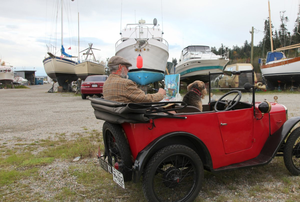
Light and shade

0
Dear Artist, Just below where we live in Crescent Beach, B. C., there’s a fine public marina. I’ve been wandering down there for years. Some of the locals occasionally drop by to see what I’m up to. One day an unknown passerby paused to ask me if this were my day off work.
110210_robert-genn9

Perambulatory easel
Patent Pending

More recently, a more evolved watcher asked, “What is it with you guys about boats propped up on land?” I told him that down here they keep moving things around, especially during the fall and spring, and different relationships are often seen, so the light and shade are a challenge. While this system might not float everyone’s boat, I find it best to rough in general shapes and patterns early on, while keeping only a partial eye on the eventual lay of the light. In other words, the strongest light areas go in at about the half-way stage of the painting. Adjusting the right tones for light and shade can be tricky and if you commit yourself too early, things can get pasty or, worse still, murky.
110210_robert-genn11

“Antes del bano”
oil painting
by Joaquin Sorolla

I look for light patterns that are of unusual shapes, big and small, with abstract potential. Making up this pattern is important, but it’s also an opportunity to change a few of the local, impinging colours. Having brushed paint on our own boats a few times, I can tell you it’s a darn sight easier to change the colour of a boat on canvas. The bottom coats in my subjects this day were green. Lead oxide seemed a better choice. Better for barnacles, too. It’s also a good idea to overdazzle your lights, even softening the edges of the bright parts so the light glows. Leave the details, complexities and nuances to the shadows. The rule here is “Light burns out detail.” Finessing a more or less correct but often subtle relationship between light and shade is one of the tough orders. A valuable idea is “look three times, think twice, paint once.” The acrylic medium permits endless corrections, rethinks and resurrections. I figure if you can get the tonal and colour relationships within ten percent of reality you’re doing well. It’s all an illusion, but a fresh, confident-looking light-and-shade gives joy to your sortie.
110210_robert-genn10

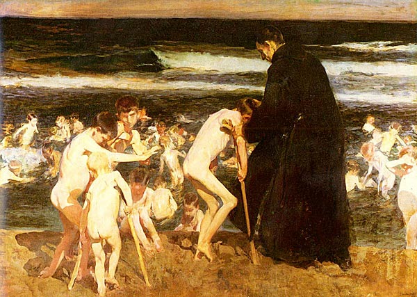
“El bano del caballo”
oil painting
by Joaquin Sorolla

Best regards, Robert PS: “Of the original phenomena, light is the most enthralling.” (Leonardo da Vinci) Esoterica: If you want to better understand the nuances of light and shade, study the work of Joaquin Sorolla. “Let there be no mincing of comparisons,” said James G. Huneker, “not Turner, not Monet, painted so directly blinding shafts of sunlight as has this Spaniard.” Down by the boats and beaches of Andalusia, working mainly in the Magic Hour when lights were warm and shadows were cool, Sorolla paid close attention to reflected light bouncing around in the shadows. How does one achieve this deadly eye? Practicar. (Practice)   Sunlight and Shadow
110210_robert-genn

I didn’t like the look of that Toyota over there so I left it out.

110210_robert-genn2

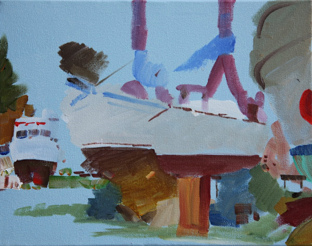
Light blue ground and general shapes roughed in.

110210_robert-genn3

Laying on a Phthalo blue glaze for ‘Mother colour.’

110210_robert-genn4

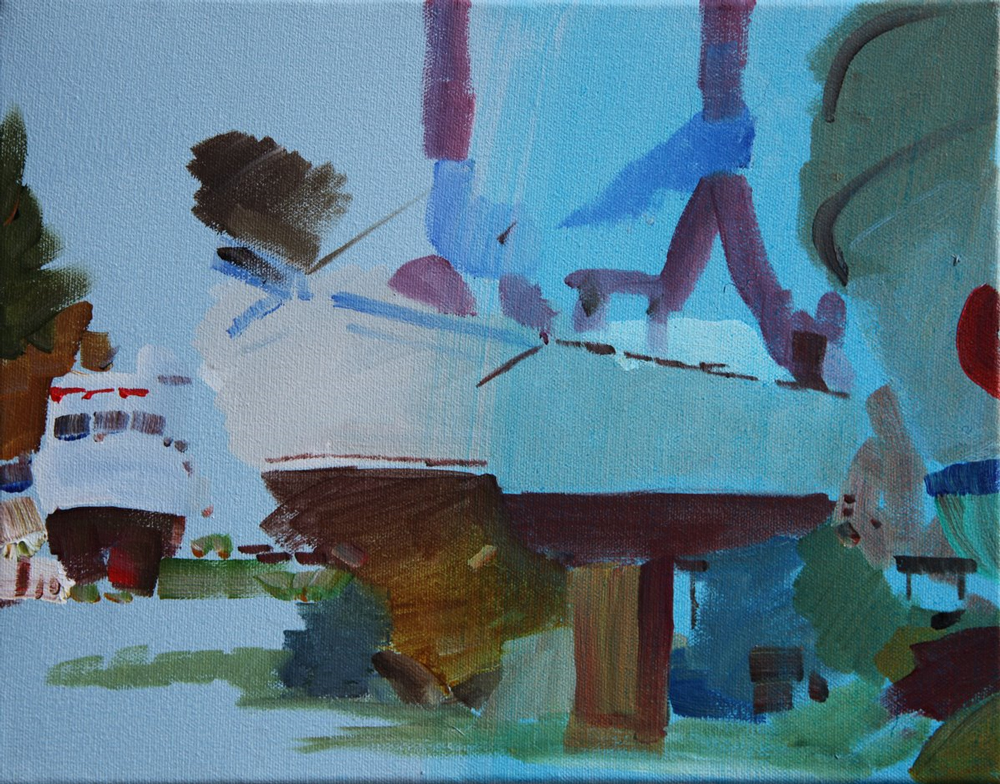
Brighter than in reality, laying on areas of light.

         
110210_robert-genn5

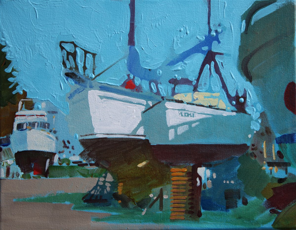
General energy. Cutting in negative areas.

110210_robert-genn6

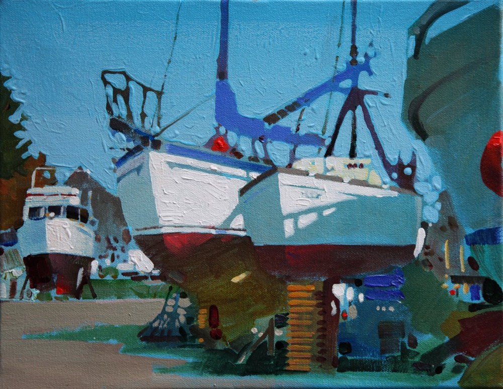
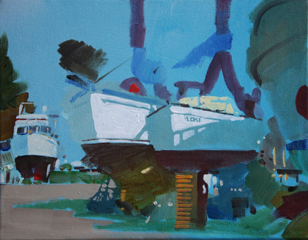
Strengthening design, heightening colours, gradating sky.

110210_robert-genn7

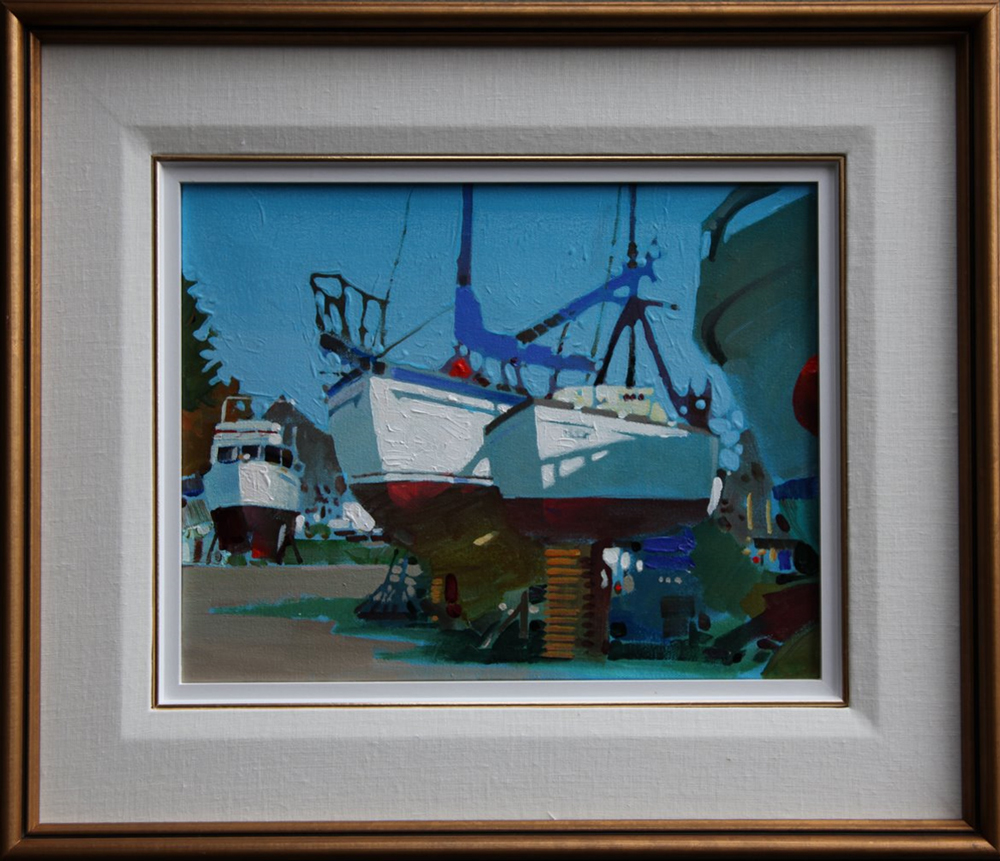
Get it stopped and think about it in a frame.
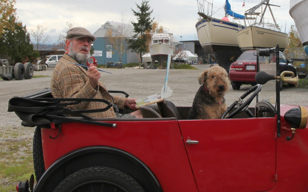
110210_robert-genn8

Always on the road

            Colour and form by Ruth Kamenev, Winnipeg, MB, Canada  
110510_ruth-kamenev

“The last days of summer”
photograph
by Ruth Kamenev

I recently read in a portraiture magazine about using colour instead of tones to create form. The method was described as warming or cooling the colour, while squinting to ensure that the value of the colours did not change. Unfortunately, magazine articles tend to be short and not very detailed. How could this create volume? Can you use this method for subjects other than portraits? Could you please elaborate on this and explain exactly what this means? (RG note) Thanks, Ruth. This is a valuable concept. Rich colours of equal or similar intensity when laid side by side give a sense of form, density and solidity, to say nothing of allowing variety within a subject. The idea is certainly not limited to portraits. Cezanne’s fruit are a good example. “When the color achieves richness, the form attains its fullness also.” (Paul Cezanne)   The trickery of light by Robin Shillcock, Groningen, Netherlands  
110510_robin-shillcock

“Lumiere de Septembre I”
watercolour painting
by Robin Shillcock

For us illusionists, harmonizing light and shade in a painting is more than important, it’s primordial. To find a convincing balance between warm light and cool shadows is indeed tricky, but since it’s all about “trickery,” I’d say that’s where the fun lies. I prefer doing watercolours in situ, but 20 years of painting oils en plein air has given me a bit of an understanding of how to tackle chiaroscuro. Working in watercolours, one has to work around the light, i.e. the virginal white paper, and build the image with washes of colour, starting with the darker tones to achieve a sense of contrast from minute one. In oils roughing in patterns and darker tones comes first, but I tend to leave the lightest tones for last. I find that “burning out” the highlights is letting oneself off the hook too easily! In a way too photographic an effect. It’s a problem that jumps out from all those painters working exclusively from photos: the whites are too lardy-white and too hard-edged. Alas! As an observational painter I have learned that the whites often also contain colour, gradations of warmer and/or cooler tones. Sorolla, the Danish impressionist P. Krøyer, (both are hung together in the Musée d’Orsay in Paris) but Monet, too, understood this perfectly, as does contemporary English painter Anne Shingleton. Capturing reality in luminous paint is one of the most difficult aspects of painting, and requires, indeed: Practicar y practicar, y practicar mas!   Learning to trust the eye by Elizabeth Patterson, Hollis Center, ME, USA  
110510_elizabeth-patterson

“Grace’s Alpaca Hat”
pastel painting, 11 x 11 inches
by Elizabeth Patterson

It’s not uncommon for me to create a still life with a big emphasis on that wonderfully dramatic look of bright light against interesting shadows and reflections. I do love how it really gives a sense of dimension, and so clearly defines the shape of an object in a simple way. However, while working on this portrait recently, I found that rendering those abstract shapes of light and shadow when there is also the matter of a likeness to capture becomes serious business! It forced me to look way more than three times, and think a lot more than twice, and trust my eye completely. Altering the brightly lit shapes even a little bit would change the features. Where the light obliterated detail and color on my model’s face, my brain wanted to put it back! At times, it was like a mental wrestling match. I think the bright abstract shapes won, and thank goodness, because they gave me my likeness. There are 3 comments for Learning to trust the eye by Elizabeth Patterson
From: Liz P — Nov 05, 2010

What a lovely surprise to see my letter and portrait here this morning! Please allow me to make one correction, however. It is actually colored pencil, not pastel. And, Robert, thank you for drawing my attention to Joaquin Sorolla’s work. It is positively alive!

From: Anonymous — Nov 05, 2010

Elizabeth, this is a stunning portrait. great job wrestling with those light patterns.

From: Sandy Donn — Nov 05, 2010

This is gorgeous Elizabeth!

  The magic of Joaquin Sorolla by Karen R. Phinney, Halifax, NS, Canada  
110510_robert-genn16

“Another Marguerite” 1892
oil painting
by Joaquin Sorolla

110510_robert-genn15

“Sad Inheritance”
1899
oil painting
by Joaquin Sorolla

110510_robert-genn17

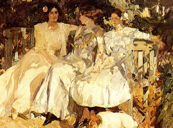
“My Wife and Daughters in the Garden” 1910
oil painting
by Joaquin Sorolla

110510_robert-genn14

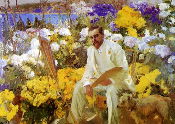
“Louis Comfort Tiffany” 1911
oil painting
by Joaquin Sorolla

          Once again in the latest letter, you have referred to a favorite artist of mine, Joaquin Sorolla. After seeing his work in Madrid a couple of decades ago, I was smitten! You are right; he uses light, as in sunlight, like no one else! The colours leap to the eye, and the figures play in the Mediterranean light with such moving force. He is an inspiration, for sure. He paints with love and light, a combination hard to beat.   The great value painter by Rick Rotante, Tujunga, CA, USA  
110510_rick-rotante

“Thinking on Tomorrow”
oil painting
by Rick Rotante

Ahh! Sorolla. You picked my quintessential value painter. He is a master of color, reflected light, pattern and overall design and value. I reference him almost daily for inspiration. Sorolla’s special gift is his ability to work in such large sizes and quickly on location. No photos for him. A true plein air painter. There are pictures of him painting on the beach. I’ve read that when the children in his works got too water logged or sun burned, he changed them out with others and kept painting. I wish he were more known in the USA. There are 2 comments for The great value painter by Rick Rotante
From: Bell Seaborne — Dec 06, 2010

Your work is terrific. Simple and direct. It has such a sense of peace.

From: Rick Rotante — Dec 06, 2010

Thanks Bell. This was one that just “fell out”, if you know what I mean.

  The effects of heritage and environment by Iola Benton, Mexico  
110510_iola-benton

Untitled
original painting
by Iola Benton

Like you, landscapes are my favorite subject. I have generally worked in oils, but the technique I use more frequently these days is mixed media. Somehow it helps to enrich the final outcome. I have been painting for more than fifty years and every day I get more satisfaction out of it. I was born in Mexico, a country which has a special feeling about the primitive, with so many cultures, and of the mysterious. I believe that environment and heritage are elements that form your art expression.       Who are you? by Cheryl Braganza, Montreal, QC, Canada  
110510_cheryl-braganza

“Quake”
acrylic painting
by Cheryl Braganza

I attended a lecture at the McCord Museum last week by a woman artist who was speaking about her art at the Montreal Women Arts Society. She quoted Robert Genn (pronounced the g like gate). I was astonished. All these past 9 years that I have subscribed to your website, written to you and thought I knew you, you were for me Robert Genn (like George). Now please sort out my dilemma and tell me who you really are. (RG note) Thanks, Cheryl. I’m a bit confused myself, but most of us Genns say it like the “g” in getaway and not like the “g” in gentleman.   What colour is it? by Linda Bean, Bothell, WA,USA  
110510_linda-bean

“Forest trail”
oil painting, 12 x 16 inches
by Linda Bean

Your letter re light and shade is most timely. I am so interested in the painting of light and shadow these days. I see and understand the value relationships but am quite stymied by “What color is it?” I have a substantial library of art books and don’t find the color of shadow — as it pertains to what the shadow falls on or otherwise — addressed anywhere. Of course there is the blue from the sky. In art magazines the colors can be most anything — believable or not — from blues to violets. (RG note) Thanks, Linda. Getting the proper relationship between light and shade requires both observation and intuition. Paintings are illusions and often “What colour is it?” can have more than one answer. Guidelines can be had in some popular books I can recommend: Painting Light and Shade by Patricia Seligman. Dramatic Light by Patrick Howe (primarily for watercolourists) and Mastering Color by Vicki McMurry. There are 2 comments for What colour is it? by Linda Bean
From: Marsha Hamby Savage — Nov 05, 2010

Linda, I read in one of these books: a cast shadow is the color of the object cast upon, darker with a little of the opposite on the color wheel and a bit of the color of the light. It can also contain a reflected color from the object casting the shadow right near the object. It also gets lighter and more diffused as it moves away from the object. I did pharaphrase a little, but this was what I remember.

From: Michael Jorden — Nov 05, 2010

There is another clue in Robert’s letter. When the light is warm, as at dawn and dusk, shadows move to cool. When the light is cool on the Kelvin scale – as at midday – shadows can be warm. According to Richard Schmid this is not so much a natural law as a function of how we see opposites. As always, value relationships are equally important.

  Beating procrastination by Larry Fentz, Muncie, IN, USA  
110510_larry-fentz

Larry at work

I was wondering if there is a book on the divided self or if you could recommend a book on beating procrastination for the creative person? I am easily distracted and need help to break the mold. I’ve had a passion for watercolor painting for years. But at the end of a work day, I feel guilty for not painting, yet oddly content in not going back to a drawing board or computer when I get home. I’ve been an artist on a syndicated comic strip for 27 years. Inking at a drawing board and Photoshop airbrush color work at my Mac computer all day. So I deal with my divided selves when I get home and there are many. I need to know how not to fill up my day-timer with the little stuff and make the time for the larger priorities like painting. Now I’m having difficulty organizing and shooting digital art for a website. And everything else that goes with that. Back to the book. (RG note) Thanks, Larry. There is an excellent overview called “Later” by James Surowiecki in the Oct 11, 2010 issue of The New Yorker. He draws attention to The Thief of Time edited by Chrisoula Andreau and Mark D. White. It’s a definitive collection of essays and recent research by top people in the procrastination and divided self business. For some time I have put off ordering it from Amazon but I am now happy to report it’s on its way. It’s expensive …about $65.  

Archived Comments

Enjoy the past comments below for Light and shade

   
From: Catherine Stock — Nov 02, 2010

There is a fabulous series on drawing by James McMullen running on The New York Times website at the moment. Have a look: http://opinionator.blogs.nytimes.com/category/line-by-line/

From: Ron Unruh — Nov 02, 2010

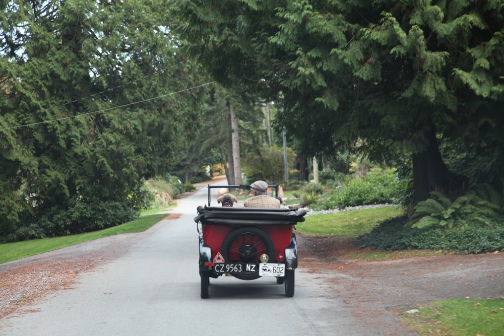
Thank you Robert, the light-and-shade counsel this morning was enlightening for me. I appreciated the clickback example very much. A line or two in your piece particularly stay with me, such as “Light burns out detail.” What a good bit of advice! And, looking “for light patterns that are of unusual shapes, big and small, with abstract potential.” One more thing, You and your dog and your car are a work of art.

From: Sophia Moore — Nov 02, 2010

I had never heard of you (probably not surprising since I was living in Australia) until I found your Painter’s Keys book. Well, I didn’t actually find it, I bought it. Don’t even remember what first brought it to my attention. Now, everybody I know knows about you and your book and I’m actually painting again after 18 years of occasional workshop participation and no finished works. So, thanks for inspiring me with the book and the Twice Weeklies. I hope you will be around for a very, very long time.

From: M. Grey Darden — Nov 02, 2010

I found Joaquin Sorolla painting’s on the internet under The Complete Works of . The examples of his way with light are astounding. Thank you for introducing him to me.

From: María Eskenasy — Nov 02, 2010

The way to creativity is silence.

From: John DeCuir — Nov 02, 2010

You can drain away the color till near black and white and still offer a meaningful piece, but try and take away the light. I still regret not getting my old MG in a right wheel drive, love the car and the dog.

From: Thierry Talon — Nov 02, 2010

Sorolla is one of my shining lights.

From: anonymous — Nov 02, 2010

I enjoy harmony both visually and simplistically with sophisticated work coming together — Thanks for the “sujet éclairé”. It’s our objective to be informed and to produce work that gives valuable benefits in various formats. I try not to be disheartened by doubt (which at time cast a long shadow) — though it appears to be part of a problem I must consider it as a background process. I also imagine the KISS program helps the work of the day take care of itself. To find that magical hour of inconceivable joy; once bare, the canvas now absolute with desire, I take preference to the subject at hand. There are differences in works of art and yet Artist rarely differ in goals and aspirations. Quite possibly we make it harder on ourselves than it has to be. The life of an Artist is at times is painful. That hurt which goes sight unseen and yet how mysterious its unveiling when approached with love or rather – light, as its been shown here.

From: Alan Behenna — Nov 02, 2010

I am so impressed with the framed finish to the boats painting in ‘Light and Shade’ As an Aussie I would love information on the moulded (linen textured?) mat/inner surround you have used. Thankyou

From: J.C. — Nov 02, 2010

“Colour helps to express light, not the physical phenomenon, but the only light that really exists, that in the artist’s brain.” -Henri Matisse

From: Nina Allen Freeman — Nov 03, 2010

Thanks for the Light and shade talk, Robert, we can never have too much of this! I loved your term “overdazzle” your lights. That describes the look so well; you want to have to put on sunglasses to look at the painting. Also putting the details in the shadow areas is something I needed to be reminded of. In watercolor, shadows are the opportunities for wonderful color, the lights are bare white paper. The two together done well are amazing.

From: Lorne Gutierrez — Nov 04, 2010

Light was the main principle of most of the Impressionists. Many painters these days just can’t pull it off. Finding a proper light effect in subjects makes paintings so much more attractive. I can’t paint, but I do buy paintings, and the thing that most often attracts me is how the artist has achieved the effect of light.

From: Jenny Baillie — Nov 04, 2010

Thank you ‘RG’ for replying to my email. I appreciate the ‘featured response’! I received your note with mixed feelings: relief – that you were NOT born with the silver spoon (instead the OCPD) and disappointment – I can’t say: “oh well, he’s had this or that…….”! Instead you are indeed just like the rest of most of us….work work work and practice practice practice in any field we want to “get good” in…..have been/was – an O/C Powder Skier for many years (Rossland/Red Mt having some of the BEST powder skiing in N. America) and since I developed this hankering to paint have always felt that in order to achieve/reach/grow I needed to attain that same obsessive – compulsiveness that enabled me to become a more than adequate skier. SO – ‘yes’ to the OCP Disorder – shall continue to nurture and nourish……and whilst I have come to believe that the act of making paintings is not “all about money”, the fact that someone is willing to exchange their dollars for something I create is inspiring in itself.

From: Tatyana Tsankova — Nov 04, 2010
From: Patricia Paine — Nov 04, 2010

Do our gifts of creating, seeing beauty offer an uplifting healing effect on the world , so should we in these troubled times be putting our works everywhere people congregate …restaurants , libraries, banks,clinics hospitals hospices… should we be offering pieces for raffle and auction to help others // or is it about awards improving our skills and reputation ..what is our time asking of us

From: Deb Sims — Nov 05, 2010

Robert, the photos of you in your jitney with your wonderful dog elevate my spirit every time I see them! My two rescued dogs would absolutely love a drive in a little red auto like yours!

From: Brian, Upstate NY — Nov 05, 2010

Ah light & shade, shade & light. Without either our forms are flat, dull and lifeless! But, you add in a bit of subtle light combined with slight shading and suddenly your boring portrait now stands off the canvas and says “Look at me!!!”

From: Gary Gordon — Nov 05, 2010

Light and shade are primordial. They are the basic yin and yang, good and evil, truth and falsehood. Virtually all religions use light as a metaphor. Artists also need to attempt it and exploit it. Otherwise they are just moving paint.

From: Ray Neufeld — Nov 05, 2010
From: Helen Opie — Nov 06, 2010

On the right coast of Canada, here on the Bay of Fundy we paint boats out of the water because, unless you are also afloat, the boats go up & down so fast (an inch or more a minute) that you don’t have the same perspective for very long. Makes for some interesting distortions, though.

From: Connie — Nov 11, 2010

Catherine Stock: thank you for calling my attention to the series in the NYTimes. It’s been very helpful.

From: BARBARA STURGILL — Nov 26, 2010

Patricia Paine: Your letter on 11/2/10 should we do our art to learn our craft, place in public places to brighten the spirits of others in hard times or sell for self. I have for the past several yrs been trying to improve my artistic abilities and have given many to those asking for my work in trade for a donation to a charity of my choice, whatever the person making a request can afford, or feels the painting is worth to them. I do not dictate the price of their donation. They must make it without anyones name attached to the donation. A remark was made to me,”but anyone could just take the painting and ‘tell’ you whatever they want.” This has always been obvious to me. However my feelling has always been, I recieve a lesson every time I paint a picture no matter what the subject matter. Those I keep I can constantly critique and improve my next work. When I give it to others they can help a charity or they can cheat the charity. or take a tax deduction which I state is against my wishes. Their honesty is their choice. I have already been paid with the experience of the work and the strength I have received by showing symbolsof strength in the art. No one is a looser. I asign these works a special signature not my own. I have gained more from these gifts than I have ever gained in workshops. What a gift we recieve in teaching children the gift of art. My Art heals me, and I hope inspires others.

   Featured Workshop: American Academy of Equine Art
102910_robert-genn 
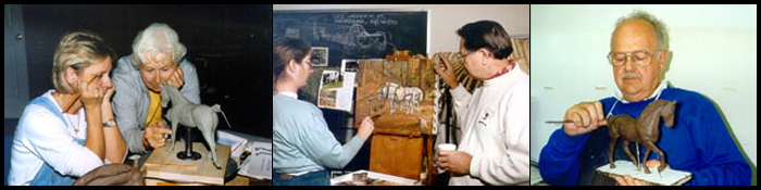
American Academy of Equine Art Workshops   The Workshop Calendar provides up-to-date selected workshops and seminars arranged in chronological order. 
    woa  
 
110210_scott-anderson

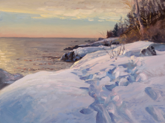
Steps Along the Lake Superior Shore

oil painting by Scott Lloyd Anderson, Minneapolis, MN, USA

  You may be interested to know that artists from every state in the USA, every province in Canada, and at least 115 countries worldwide have visited these pages since January 1, 2013. That includes Joan Ashenhurst of Surrey, B.C., Canada, who wrote, “Did you get that jacket in a garage sale?”
110510_robert-genn13

“Make me an offer.”

(RG note) Thanks, Joan. The jacket was formerly owned by a doctor who smoked. His wife had it dry-cleaned for 15 bucks and put it in a garage sale and I gave 2 bucks for it. Several people have offered me 3. Do you think the jacket’s fortunes have turned around? And also Gabriele Stehle of Denmark, who wrote, “I don’t have the time or the interest to read a lot of the stuff that is out there on the Internet, but your letters are among the few I wouldn’t want to miss. They are witty and modest in tone of voice.”    
Share.