Dear Artist,
Notan is a Japanese word that means “lightness-darkness.” It represents one of the basic principles that help compositions stick to the wall. Notan has nothing to do with local or chosen colour. It’s the ability to see things in terms of black and white, and to consequently build strength in imagery. When compositions work in black and white — they work.
Whether they put a name to it or not, artists in all cultures have long recognized the value of notan. Devices have been invented to look for and find it. The “Claude glass” is a convex, black glass used to reflect a landscape in a reduced size with muted colours and less detail. The French painter Claude Lorraine (1600-1683) is thought to have invented it. While the odd one is still seen among “plein air” painters, the more common approach is to view work with half-closed eyes — or to get way back. Another system is to view art and subjects through generally blue or green camera filters or gels. But more than anything notan is a learned skill. For those of us who struggle daily at the painting game — the enemy is “wishy-washy,” and the desired object is to yin and yang with the viewer’s sensibilities. In the words of Junichiro Tanizaki, “Find beauty not only in the thing itself but in the pattern of the shadows, the light and dark which that thing provides.”
There are two types of notan — planned notan and developmental notan. Planned notan is often figured out in a preparatory sketch, or is “ready made” in the subject matter. Developmental notan is where you find notan — indeed you make notan — as you go along. Notan is also a matter of degree — it can be a strong, interactive pattern with negative and positive, even an eye-fooling optical illusion. In abstract work the job of finding notan can be the main joy and source of magic. In more realistic work it can be a skittish but nevertheless satisfying pattern discovered and built during the process. Tuned-in artists find themselves saying, “This is good notan.” An exercise that never hurt anybody is to simply plan and calculate good notan into a work — then make sure it stays put.
Best Regards,
Robert
PS: “Notan is a synthetic arrangement of dark and light that creates an impression of beauty, regardless of either the colors used or of the subject matter. A strong notan design is therefore the key to a strong painting. Without it, both color and line fail to reach their full impact. Many of the most powerful paintings have the simplest value structures. That is to say, they only use two, three, or four major values.” (Barry John Raybould)
Esoterica: Very often the quality of a work can slip because artists simply fail to work things out in the best order. A carefully drawn and even beautifully prepared work may, for example, have poor notan. Never forget that drawing and line can be the enemies of pattern. “Think pattern first, then drawing, then color. The character of your painting is resolved in the pattern.” (Edgar Whitney)
Definitive notan book
by Thubten Yeshe, Eudlo, QLD, Australia
The definitive book in English is Notan: The Dark-Light Principle of Design by Dorr Bothwell and Marlys Mayfield. It was originally published by Dorr Bothwell in 1968, after she had retired from teaching at the San Francisco Art Institute and the California School of Fine Arts. It has since been reprinted by Dover in 1991. Dorr was one of the great design teachers at the Art Institute. This is a truly precious resource for any artist.
Black and white anchors artwork
by Linda Anderson

“Lonesome Pine”
watercolour painting
by Linda Anderson
I’ve been doing a workshop using black and white photocopies (or black and white prints from computers) to determine if the notan of any given piece created is in fact there. I’ve found that just about every new artist will take a watercolor to 60% or 75% value but fearing to ruin a piece of paper, will stop painting. If they take a black and white copy at that stage and with a soft pencil and a piece of white chalk, darken some areas and whiten others (several different ones can be worked up), they experience the freedom to go to both ends of the value spectrum and discover a black and white abstract pattern to anchor their artwork.
Balance necessary in notan?
by Phyllis McDonough
I’ve been practicing this with black and white cutouts and seem to do fairly well until it comes to transferring this idea to a painting and then I am stumped… because I get into a “debate” with myself over balance. Notan seems to suggest an equal division of light and dark which I translate as a symmetrical balance and that is a No-No (isn’t it?), well at least in a general way. Your article seems to suggest that I have missed the point totally and I thank you for renewing my interest but would like to know how you and others translate this idea into a painting.
(RG note) In the classical Japanese tradition notan sometimes signifies an even balance. Generally, a fifty-fifty balance is not necessary, nor desirable.
Andrew Loomis and Howard Pyle
by David Sharpe, Toronto, ON, Canada
The master of notan could have been Howard Pyle himself. In Andrew Loomis’s classic book on illustration , he gives Pyle’s actual painting values ‘secret’ (in Pyle’s own words no less!) and then his own interpretation after. Pyle’s total and absolute conviction was that light determines all form and unless every element in a piece of representational art held to one of the two families of light and dark it was almost impossible to render truth in form. Loomis then goes on in the book to break down some of Pyle’s classic paintings into simple value masses. What an education in notan! He also shows several ways to plan and paint values. His book is well worth the investment if you can find a copy!
How a unique style is made
by Beate Epp, Saskatchewan, Canada
The longer you paint, the more you are automatically drawn to notan. It used to be the drama of the landscape and all the different colours that excited you. Now you look at the same landscape and you get excited about shadows and shapes and what you could do with them. You now look deeper and become involved in a different way. That’s the moment when a unique style is made and a special picture is born — the most exciting discovery of all.
Design brings notan naturally
by Sara Genn, New York, NY, USA

untitled
oil painting, 48 x 48 inches
by Sara Genn
If an artist comes intuitively from the point of design, notan is natural. Notan is illusive to artists who habitually over-think the details. But drawing and notan can work together when line is as important as subject. I print out images of my colourist paintings in black and white. Sometimes the values are so purposefully similar that the design disappears. My value choices are intuitive and this is a fun exercise. It’s fun to see how much you can get without leaning on contrast.
Value sketches for paintings
by Lorna Dockstader, Calgary, AB, Canada

“Wasootch, Kananaskis”
watercolour, 11 x 14 inches
by Lorna Dockstader
Known by most of us as value sketches, most of us are too lazy to do them, yet we know they can strengthen our work. Values created need not be those that were present at the time. They are imposed upon an image and can all be the result of personal choices. I will often test one of my pieces in Photoshop by turning off the colour and looking at its values. If it’s not working as it is I push the contrasts, print it out and repaint it.
Don’t think
by Carolyn Smith
I’m learning how to paint traditional Chinese Brush style, landscapes, bamboo, flowers and calligraphy. It is done in black ink, with variations of light and dark gray. You must think simple, uncluttered lines. My teacher says, “Put the brush down, think before you paint, and don’t think when you paint.”
Black and white on digital camera
by Aleta Pippin, Santa Fe, NM, USA

“Beneath the Deep Blue Sea”
Acrylic, 30 x 40 inches
by Aleta Pippin
A good way to check for notan is by taking digital photos into your computer in one of the photo or graphic programs and changing the color to grayscale or no color, rendering the image black and white.
Students of Edgar Whitney
by Ardath Davis

“Beaver Pond”
watercolour, 14 x 21 inches
by Ardath Davis
Your letter on notan took me back to a course in Maine that I took with the most generous teacher I have known: Ed Whitney. With his eight principles and seven elements of design etc. the very first thing we always did was to start with a 3 or 4 value thumbnail sketch either using the existing values, sometimes enhanced, or trying arbitrary values. That having been established, we drew the scene, carefully deciding on a horizontal or vertical dominance throughout the painting. Local fishing piers with their pilings would very naturally fall into a vertical dominance, even the sky adhered to the rule, then the decision was made whether to have a cool or warm dominance throughout the painting, and so it went. Whenever I read an instructional watercolour book, I can very often see that this or that teacher was a Whitney student.
Let the clay talk
by Bill Danzig, Grand Rapids, MI, USA
I am a sculptor who is still working at a job in the business world. I have a very good friend who is a potter. When my friend starts a day and he has that feeling of “what am I going to do?”, he immediately gets his hands in the clay and makes beads of every shape and size. Or he may start with a simple small pot. He may do this for several hours, but all of a sudden the creativity kicks in and he is off. I have heard him say a hundred times he never starts with an idea, he lets the clay talk to him and show him what it wants to be. The idea is to keep your hands busy doing what you love. He also says the more you keep your hands in the clay the more you learn. He teaches many people and teaching helps him learn as much, if not more than the students. He shares his knowledge with anyone who wants to try or learn. In addition to pottery he ventures into other media or projects. When one isn’t clicking he works in another, but it all leads back to his pottery. The secret is to keep creating, create something.
Left her ego at the door
by Mary Madsen
Thank you so much for giving me a word to put to my lessons learned. My drawing teacher, who studied in Madrid and whose work now hangs in the White House and many other collections, would have the class put their drawings up on the wall for critique and ask us, “Whata do thesea alla have ina common?” We Drawing 101 students couldn’t find the common denominator. After giving us the chance to find it for ourselves, he’d finally answer, “Crap! They’re all crap!” Of course, many students felt he was vulgar, insensitive, crazy, or whatever, and left. Those of us who stayed eventually learned what he meant — value, contrast, life. By the end of the semester, through the use of strong value contrasts, we were all producing simple drawings of random objects that kept the eye fascinated. Even students like me, who came to art late in life and a quart low on both talent and experience, were able to turn still life settings, constructed at random and without beauty, into something beautiful. I spent many nights attacking my drawings with an electric eraser, trying to get the whitest whites, then going back and trying to master the subtle cadence of shadow. Through his relentless criticism, then jubilation when we grasped his concepts, we all created drawings we never thought possible. I left my ego at the door of his classroom when I entered, and left with a portfolio of drawings I still can’t believe I produced.
I think I’ll visit him tomorrow at the university to thank him again for teaching me how to see the world in a new way… and suggest he adopt “notan” instead of “crap” so more can benefit from his lessons.

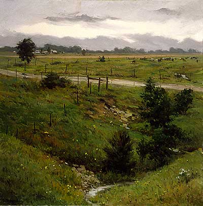
After a Brief Shower oil painting, 36 x 36 inches, |
You may be interested to know that artists from every state in the USA, every province in Canada, and at least 115 countries worldwide have visited these pages since January 1, 2004.
That includes Larry Moore who wrote, “So, next time you are painting in some shadows and your spouse walks in and asks ‘Whatcha doin?’ you can say ‘Notan Honey!’ Sorry.”
And also Charlene who wrote, “I’m at the beach and painting on the balcony. I often paint abstract figures, and this morning I sat on the sofa and looked out at my painting on the balcony and thought about notan and design.”
And also W. Frieske of Udine, Italy who wrote, “I thought notan was a skin product for people who didn’t want to get a tan.”
Also Jerry Waese who wrote, “Now I have a word for what I do.”


