Dear Artist,
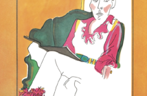
There’s a marvelous painting by John Singer Sargent called The Artist in his Studio. It shows a balding man in obviously reduced circumstances, his canvas half onto his mussed bed. He’s attempting to match colours from what appears to be a postcard.

“An Artist in His Studio”
John Singer Sargent, c. 1903
oil on canvas, 22 x 28 inches
Museum of Fine Arts, Boston, Charles Henry Hayden Fund
The painting is bitter-sweet, and in a way, sad. By the window’s clean light, the old fellow is trying to get it right. It’s even sadder when we realize that these days “trying to get it right” is in danger of becoming a lost art. We are in the days of anything goes. Verisimilitude is often suspect, and many artists bend toward fashion, decoration and expediency. In times such as ours, matching suffers.
In one of my earlier incarnations I took a flyer at ornithological art. Birds. In those days I laboured over found kills — “road pizza” — the remains of falcons or bluebirds. Pinning out the wings I attempted to match the colours of nature. There was the miraculous gray-blue of a heron’s breast and the iridescent head of a mallard drake. Local colour aside, this sort of work is complicated by the colour of the ground, and nearby colours reflecting their light on the subject. I can tell you that the job turns decent young chaps into incoherent babblers. Maybe that’s why bird artists are such odd ducks.
But what lessons these efforts hold! What an education is in the wings of a teal. I don’t regret a feather. Next time you’re looking over your subject — a head of sandy hair, a sandbar, a Sandhill Crane — ask yourself — how do I match that colour? Nowadays you have your choice — you may not have to get it right. But it’s good to know that you can.
How? Patience. Trial and error. Going to bed with your tubes. Like the old man in the Sargent painting — getting by the window-light and looking — back and forth — really looking and seeing. Mixing and matching. Did I mention patience?
Best regards,
Robert
PS: “Any ground subtracts its own hue from the colors which it carries and therefore influences.” (Josef Albers) “Drawing is feeling. Color is an act of reason.” (Pierre Bonnard)
Esoterica: Many artists have realized that you can match most of the tones found in nature with a variety of pigments, from a variety of directions. Furthermore, some ingredients seem to simply disappear in the brew, and yet they make their contribution. Bright cadmiums, as mentioned in my last letter, are surprisingly useful for neutralizing and sophisticating earth tones into luminous grays.
Singing colours
by Dave Louis, Coventry, UK
The Artist in his Studio is one of my personal favourites. I first saw it in a book years ago and thought it must have been a big canvas because of the looseness and the aura of this painting. I was surprised at how small it actually was. Then I thought it was painted in situ. If it was, imagine the messy scene with John also included painting away with his foot up against the door. Now that’s genius!
Putting first things first
by Luann Udell, Keene, NH, USA
I thought The Artist in his Studio was marvelously moving and inspirational. The artist is obviously intent on his work, totally absorbed in the process of painting. Most likely, he doesn’t even “see” his dreary room any longer — only the intriguing work before him. Unlike most women I know, he didn’t even bother to make his bed before he jumped into the day to do what meant so much to him — make art.
Relationships acutely detected
by Jerry Waese
The Artist in his Studio is a great example of a painting of actuality. Figuration and dimension, life and feelings are ‘actualized’ through patience, humility, and some repetition. This art of matching colors by paintbrush is essentially different than a kind of Kodachrome or Pantone by hand and eye, because the actuality produced on canvas involves simplified or abstracted color relationships. Light and dark contrasted shapes cascade from golden illumination, while the furniture and sheets blush eager for the next moment, and all the essentials of life wait in the cool creamy greens. These colors are selected less as real colors than they are selected to convey the actual relationships of the colors in reality. These relationships are acutely detected, judiciously revealed, and are more REAL than real.
Rembrandt Rose
by Eleanor Blair, FL, USA
Color matching is an endless challenge. It’s one of my strengths, but I learn something new every day. Some colors are particularly difficult;the glowing soft pink of azaleas that blanket our town every March, for instance. There is simply just no way to mix that color. Adding white to any of the reds and roses and carmines only gives me pink paste. Yuck. Finally, fooling around with transparent pigments, I discovered that a glaze of Rembrandt Rose over white does it for me. Of course (and this is another subject altogether) the minute I discover an indispensable pigment the company discontinues it. So now I am down to my last precious tube of Rembrandt Rose, and searching for a good replacement. Wish me luck.
(RG note) Rembrandt Rose is a Quinacridone product that has been traditionally made by Talens.
Colour matching synergy
by Lisa Ann Glass
Your letter blew me away, it is just what I am working on — color study. Thank you so much for this! I can’t tell you how you made my heart soar as I have gone back to the basics. I am doing color studies, simple still lifes, matching color photographs and working from a limited palette to force myself to mix and SEE and MATCH and LEARN like a beginner. Kevin MacPherson’s book, Fill Your Oil Paintings with Light & Color & Frank Serrano’s Plein Air Painting in Oil are 2 that I am using right now to do 100 starts; putting down color quickly (30 min) and matching color, painting big masses and not doing detail. It is so easy to not think I am making progress in this area because we as humans aren’t used to seeing something partially completed. We think it is “wrong” or “bad.” Where is all the pretty detail? It is the foundation that is the most crucial. This is a revelation to me. Doing these studies actually improves everything from drawing to color perception. When I was in school and working with other painters they kept telling me to do this, to not go too far too fast or you would be sorry in the end. I am now on number 25 and have high hopes of turning in something good for the California Art Club Gold Medal Competition this year. Two years ago I didn’t get in, it would be a great achievement for me to get in.
Meaning shared by everyone
by Robert Wanka, ON, Canada
The idea of “getting it right,” is very much a part of my adventure as an artist. Sometimes I think of myself as more of a scientist rather than an artist. I use this discipline called art to look, to really see the colour, the complexity and the variety of reality around and within me. I have realized that life is about forming relationships, not just with others but with the natural world. We all see things from our own points of view, yet the reality of this world is a shared experience. Some modern artists have deliberately turned their backs on having a relationship with the natural world and with our shared experience of that world. This may be why long written descriptions usually accompany their creations, as well as the need for experts to explain meaning where none can be found. The natural world explains nothing, yet meaning is everywhere apparent. Being an artist means looking silently and honestly at the natural world. An artist becomes a creator — having a relationship with that which is created. The results of this kind of art making can be shared and understood by everyone.
The bridges of life
by Lori S. Lukasewich
In one of my “previous lives” I worked as a palaeontological restoration artist. Once the sculptural aspects of reconstructing a fossil were completed, it was my job to paint the repaired part to match the real fossil material of the piece. I worked on many ammonites, the iridescent kind that produce the gemstone ammolite, as well as on dinosaur material and fossil fish. In my personal practice I was totally involved in very complex works of color, pattern and symbol. Then I had the closest thing I’ve ever had to what they used to call a nervous breakdown. I found I could not think the same way at all. It was a terrifying time for me because I could not imagine myself not painting. So, as a sort of bridge to whatever kind of painting I would do next, I thought that if I just put an object in front of me it would be simple. I wouldn’t have to think about it at all. I’d just trust my skills. I thought that I would be loose and impressionistic but it turned out super real instead. The slowness of seeing — I now revel in it — my still-life set ups along with the “training” I received as a restoration artist had resulted in something that I was not expecting. I found still-life painting to be a very real pleasure and have been seduced by it for the last five years. Alas — or not — I find myself in a creative weird flux again (downright painful) and am very anxious to see what metamorphosis I make this time.
Exposed to view
by Sue Bussoli
The letters about id/ego I found valuable as it can relate to everything. It is so very hard to play/act egotistical but it is vital during an art show. I am so vulnerable, like laundry on a clothesline — everyone can see my undies. I use ego as support when I feel all my thoughts are insecure, as I analyze my watercolours hung on display with such severe scrutiny.
(RG note) The letters and responses to Ego and Id start at Triumph of the id.
Creating incentives
by B. J. Adams, Washington, DC, USA
How can you come up with so many subjects of interest twice a week and still produce many paintings? Each letter is eloquent, always; educational, sometimes; and humorous, other times. When I am away on trips I must come home and immediately pull up the letters I’ve missed. They all keep me thinking and often change an idea. Your color letters prompt me to check all the color of the day and their nuances and perhaps create with them immediately. My work consists of mixing colored pencil lines to produce the intended color for realistic images and then translating these drawings into thread… mixing many threads (in free sewing machine embroidery) to create a different texture of the image.
(RG note) Immersing in art thought stimulates art work and art work stimulates art thought. The newest feature on the Painter’s Keys site is the ability to print out — in one stroke — all the letters so far this year.
Simple palette
by Ron Gang, Israel
A big thank you to all the artists who write in, sharing their most profound insights. The high quality of your site is remarkable. With regard to “Getting it right,” in my plein air and painting from life efforts, I have taken to the most simple palette… paralleling that of the printers.’
Quinacridone Red (“Magenta”)
Phthalocyanine Blue (“Cyan”)
Arylide Yellow PY3 (“Lemon Yellow”)
Zinc White
This combination can duplicate, or should I say quite closely approximate, most any colour when you get the hang of it, and with practice becomes quite easy to manipulate. Almost any colour “out there” combines all three primaries. Albeit the brilliance of exact pigments cannot be duplicated, yet proper juxtapositioning of hues creates brilliance. The advantage is a lighter (in weight) paintbox, and because there are only three colours being mixed, one can easily get out of the mud just as easily as one got into it, whereas when you use earth colours to darken your paints, the muddying of hues is not reversible… so it seems to me. These pigments are transparent, so you can have a lot of fun with underpainting and layering for optical mixing of colours. With this combination, I can combine the colours on the palette, hold it up to what I’m painting, and match the colours “out there”. With regard to “red underpainting” Keena Friedrichsmeier is after my own heart! Warm underpainting for cool overpainting, and vice versa. Really richens the colours. With regard to the subject of “Recovery mode,” it seems that some of my best paintings came from hopeless situations that an act of desperation forced me to get out on thin ice and try something new.
What are you trying to say?
by Sara Genn, Canada
In my opinion, this letter would be more effective if you didn’t alienate me in the second paragraph. Save your context and let the noble exercise speak for itself. Otherwise I am tempted to jump to argue that rendering is not even art, and get muddied in the big “what is art” question, instead of following you on your worthy concept of “getting it right” as an exercise. Even this title lends it some snobbery.
Try your best to identify what it is you REALLY are trying to say. Are you saying:
A) Only art that is true to nature is worth my praise and consideration?
B) Decorative painters or people who take artistic license are bad artists?
C) I’m so old and conservative that I think art that is any good is a lost art?
D) Like Sargent’s “everyartist” we are all, good and bad, professional or hobbyist, in a brotherhood and sisterhood of our own artistic struggles? — what I believe Sargent was trying to communicate with his painting.
E) Making an effort, as an exercise or a lifelong art-form to paint true to nature and really LOOK and study my subject before I squeeze my tubes is a worthwhile and noble effort, and I also have some loving and nostalgic feelings about the whole concept?
(RG note) In the hour before your letter goes out to you, I send my proposed letter to a half dozen artists and writers who we call “letter reviewers.” While they are looking for grammar and other errors, they are also on the lookout for flashes of ignorance and stupidity that I may be having. One of my best critics is my daughter, Sara. She makes me think. The above was the letter she sent to me just before you got yours. She’s the best daughter a guy could ever have.

Dream marble sculpture |
You may be interested to know that artists from every state in the USA, every province in Canada, and at least 115 countries worldwide have visited these pages since January 1, 2003.
That includes Loyal White of Wimberley, Texas, U.S.A. who writes, “If you think the Teal’s colors are “fun,” try the Wood Duck — their colors will change almost every minute.”
And Lida van Bers who writes, “Getting it right is just as hard as in Sargent’s days.”


1 Comment
I have a seemingly unrelated question if you don’t mind. I have a very old nicely framed print, it seems to match everything I unintentionally put aroundit. Do you think the artist had this in mind while painting it. After many years with this piece, I feel that I didn’t choose it, it chose me.