Dear Artist,
When the invention of photography transformed portraiture from luxury art item to affordable record-keeping, portrait painters found themselves slightly freed from the vanities of their sitters. Once used solely as an instrument of power, portrait painting was quickly replaced by photography, democratizing the representation of people. Instead of just portraying the wealth, importance, taste and virtues of its narrow swatch of subjects, portraiture inched its way towards a wider characterization of the human experience.
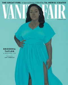
Portrait of Breonna Taylor for the cover of the September, 2020 issue of Vanity Fair
by Amy Sherald (b. 1973)
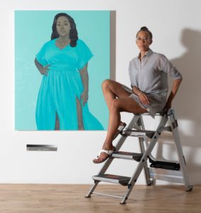
Almost 200 years later, portrait painting has — this week at least — taken photography’s place. In an effort to connect the most intimate links to our collective cultural experiences and to aesthetically disrupt the tidal wave of photographic imagery we all now see on a daily basis, two big-time magazines — ones in recent history almost exclusively reliant on photography, used portrait paintings for their Fall covers. For Vogue’s September issue, portraitists Kerry James Marshall and Jordan Casteel were each given carte blanche to make portraits of any subject, real or imagined, with the only stipulation that the subjects wear dresses by one of four designers chosen by the magazine and that the portrait embody the theme of “hope.” In this very same moment, Vanity Fair commissioned Michelle Obama portraitist Amy Sherald for a painting of 26 year-old Breonna Taylor who, in March, was shot by police while asleep in her Louisville, Kentucky apartment. For Sherald’s portrait, she included the engagement ring Taylor hadn’t yet received from her boyfriend, Kenneth Walker, and posed her in a Lady Liberty-style gown in the colour of her birthstone. In her signature style, Sherald colour-blocked her subject’s environment and painted Taylor’s skin en grisaille — her way of challenging colour’s multi-layered vocabulary, especially in how it describes race.
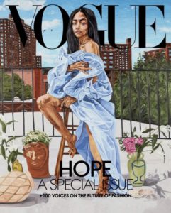
Portrait of designer and activist Aurora James wearing a dress by Kerby Jean-Raymond for Pyer Moss for the cover of the September, 2020 issue of Vogue
by Jordan Casteel (b. 1989)
Both magazines have received praise and criticism for their commissions, accused of concealing a truthful portrayal of the violence of Taylor’s death with the decorative — in the case of Sherald’s portrait, and the opulence, elitism and opportunism of Vogue’s use of highly bankable artists to scrabble at relevance while it gasps for air and sales amidst the death of print publishing. But art and representation are about looking and seeing. In this moment, a way to go beyond just being present in our reality is to try to harness its meaning through the handmade. Painting, through its archaic technology, strives for intimacy and if successful, can point towards what is possible in the imagination, including justice and fairness and invention. Portrait painting, in the ineffable magic of its strokes, its interpretation and human lens, holds the potential for a kind of advanced, futuristic storytelling. Like 1826’s new paradigm of photography, the new, new paradigm of portraiture ushers in not just new seeing, but perhaps a vision of something not yet photographable.
Sincerely,
Sara

Portrait of a woman wearing a dress by Virgil Abloh for White Label for the cover of the September, 2020 issue of Vogue
by Kerry James Marshall (b. 1955)
PS: “The hand on the hip is not passive, her gaze is not passive. She looks strong! I wanted this image to stand as a piece of inspiration to keep fighting for justice for her. When I look at the dress, it kind of reminds me of Lady Justice.” (Amy Sherald)
Esoterica: Because painting cannot be mistaken for journalism, it still holds onto a special context and power in transmitting our experiences. We accept painting’s fantasy and fiction while recognizing our universal human truths in its depictions. Is Goya’s 1814 historical tableau The 3rd of May, 1808 any less real than the story a photojournalist could have told of the same violence? When Goya painted it, the world’s first photograph would not be made for another 12 years. And in true human mutability, since then, our most beloved and iconic photos insist on residing in our imaginations as works of art — lionized and more emblematic now than even the sharpest details of their subjects. What we do with our dearest images is store them in our hearts and mythologize them as folkloric markers of meaning. “If you say, ‘Black is beautiful,’ you have to show it. And what I’m doing is showing it to the extreme. Yes, it is black — very black — and it is very beautiful.” (Kerry James Marshall)
Have you considered a Premium Artist Listing? With each letter, an artist is featured at the bottom of this page. The Premium Artist Listings are a means of connecting artist subscribers through their work. Proceeds from each listing contribute to the production of The Painter’s Keys.
“There are not enough images of us.” (Amy Sherald)
Featured Workshop
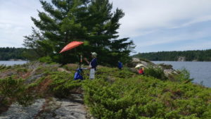 The Killarney are of Ontario is in what is called the ‘near north’. The landscape is wild and rugged. Giant granite cliffs plunging deep into the glacial lakes. There are no roads leading to our painting locations. We travel by a large, sturdy pontoon boat. This is a self-catered retreat. You bring your own provisions and cook your own meals in our fully equip cabins at a northern camp. Our instructor, Keith Thirgood, has been teaching artists his own unique approach to painting for over 12 years. Learn how to find order in the chaos, control your colours and create paintings that work. Learn modern colour theory, values, shapes and lines, what makes for a good painting. This retreat is suitable for beginners wanting to learn to paint in a fun, outdoor location, as well as more experienced studio artists who want to try plein air, plus artists who are looking to loosen up and paint in a more post-impressionist style. To find out more and register, please visit www.wilsonstreetstudios.
Featured Artist
I grew up on a farm in Ohio, and that experience gave me a love of nature and the seasons and a deep belief in personal independence, as well as a love of experimentation. These have been the foundations of my work as a painter. I believe that learning in art or any subject is lifelong, and that the most important lessons we learn are through our personal interests and experimentation. After my husband’s death in 2018, I visited Israel the next year, and was inspired by the amazing landscape colors, and especially the old city of Jerusalem, with its crumbling walls, and its deep religious importance. I found my way out of grief by painting the Eight Gates of the old city.

18 Comments
Whatever the motives of Vogue and Vanity Fair the fact that they chose to have people of color on their covers to me is a good thing as not often enough are they included in the circle of the elites like this
Also the choice of paintings not photos is a statement about representation that has the hand of the artist shown along with the image that is made
Photography has had a significant influence on how we see and believe what is Real Since digital photography and photo shop we know that any photo can be manipulated to have an appearance that is different from the “facts” out front of the lenses
So, we have the painter’s hand made object with their personal experience being the filter in the translation of fact into the image that is so important in our experience of the work
Really interesting piece, Sara. Thank you for taking us into this corner of the modern art world and giving us something to contemplate.
Re. these covers… Amy Sherald and Kerry James Marshall get a thumbs up from me but not Jordan Casteel.. not worthy in my opinion.
I believe representational art can change the world (as it has done over centuries) reflecting the artist’s desire to link his/her experiences with what influences that individual to the environment they are exposed to on both a regional and national level. All artists are “people of colour”, as it our means of communicating with the world at large. As artists and painters, we recognize both the value and importance of colour in our work as well as the differences colour can make to interpreting the proper mood and feeling of the message delivered. Art speaks the truth in what we find meaningful in our relationship with our audience, but leaves the matter of approval to the viewer and the personal nature of their observations and beliefs. All colours matter to the true artist and in realizing that both “black” and “white” are not real colours but show only the absence of colour in the object, they are still important in portraying the true image in our interpretation. If only all people of all backgrounds, race, gender and age could realize the importance of colour in our lives and accept the fact that is what makes us both similar and independent the way artists portray the world and its inhabitants, the world would be a better place and even more beautiful to capture in imagery and documented for future generations. Supporting independent art and culture is the best way to make the changes necessary to our cultural heritage and free expression is the means of developing a more democratic society. Real art, representational art will make the difference in how we see the world.
Refreshing. Vogue, Harpers Bazaar etc used to almost exclusively use art on its covers until the 40’s I believe. Wonderful covers by artists like Erte. I have a few and they have always been a source of inspiration. These magazines celebrate fashion which does support many artisans, people skilled in dressmaking, fabric designing, weaving etc at the top of their craft. Yes we could use more inclusivity as is being done, but, there is nothing like Italian and French craftsmanship in clothing. Fine craftsmanship costs money.
This is so great to see! I used to collect magazine covers (during the 70s, 80s, & 90s) because of the fantastic portraits done by the best illustrators of the day. To be sure, photography is a wonderful medium, however, in my opinion, illustrated / painted portraiture has given our culture so much beautiful, creative imagery to enjoy forever! Hope it comes back more and more.
Thank you, Sara, for your immediate response, and for your most insightful letter. I’m reminded of the fine – or maybe only imagined – line between Art and Design.
Beautiful piece, Sara, thank you! It DOES make me hopeful as a painter, occasional portraitist, woman and human.
These magazine covers were entirely predictable given the popular media’s reaction to current events. They’ll appeal to some, for awhile, but are not going to stop the decline of print publishing. It’s going to take a lot more than magazine covers with paintings of black women to do that.
Very insightful and thoughtful text Sara, well done and thank you.
BRAVA! I think it’s wonderful to see international recognition given to these women doing what is one of the most tribal and archaic things left on the planet.
Check out Grace Haynes portrait of Sojourner Truth on the cover of the Aug 3 & 10 issue of the New Yorker. There is also a video of Grace talking about her process.
Must the pendulum really have to sway to the side of discrimination against anyone who is now not black, before it may simply rest in the middle? I feel as if I have had the “Black Lives Matter’ slogan pushed at me from every conceivable angle now…..from online retailers selling children’s clothes to this art newsletter that I used to enjoy. Suffice it to say that I have unsubscribed from other sites for this very reason.
No one should be discriminated against…”All Lives Matter!” Let’s not just single out one segment of society like this, for in doing so, we really are practicing discrimination. If you really think all people are the same/equal, then singling out one group is practicing discrimination. Think about it.
I am a white woman just so you know up front. When three family members had breast cancer, we didn’t get upset if someone said they supported finding a cure for colon cancer. If I say “Save the whales” it doesn’t mean I think dolphins or turtles (or any other creatures) don’t matter. You are right in that no one should be discriminated against. However, if Black (and Brown and Native American, etc.) lives hadn’t been discriminated against for the whole part of this countries existence, it wouldn’t be necessary to change the situation. Equality only comes when those without it demand it and then go on to make everybody’s lives uncomfortable enough to where giving away the equality seems like the better deal.
If you ever got pulled over by a police officer while driving and thought , “I hope I don’t get a ticket” instead of “I wonder if this is where I’ll be jailed or killed today”, you have benefitted from white privilege. I hope you think about that.
There were days during my Vietnam war service that I wondered if I’d be killed today, but I never thought about that back in the states when pulled over by the police or arrested. If “white privilege” means having the common sense to obey the law, to produce license and registration and give it to the officer promptly without argument, and submit to the arresting officer without fighting, trying to run away and resisting arrest, then I guess I’ve benefitted from it. I recommend this common sense approach to people of all colors who want the benefits of “white privilege”.
Well done. You did it again to combine the reality of the world with the magic of the creator to show the world and its people in a different light. When it comes to black women you hit it out of the park. Zora Neale Hurston once said in one of her books ” Black women are the mules of the earth “. Creatures uniquely created by the world to do a variety of tasks well. Unfortunately, they are each one of a kind, but they must be captured in their element. Your photos did that perfectly…. a tip of the hat to Amy Sherald. They (mules) were created to have the grace, the will to win, and the beauty of the thoroughbred, the power of the plowhorse and the smartness of a donkey. A great combination!
I love Kerry James Marshall’s paintings. He has made a painting of a woman within the limitations posed by the commission and has stamped it with his own unique pictorial conventions and has done so in this painting with his usual passion and brilliance. Successful and memorable portrait paintings are not determined by who the subject is but by skillful and sympathetic expression of the painter’s ideas about and feelings for the person sitting with him or her. This can be also done by a photographer, but is much more difficult to do, because of the close verisimilitude of a photo image with a person sitting for the photo portrait. The likeness constrains.
This is one reason I’ve moved toward building a simpler, more intentional wardrobe based on a few well-made items. I no longer see value in a closet full of clothes I barely wear. Instead, I look for classic clothes for women that are designed as the fundamental “tools” of style—a perfectly tailored blazer, a silk camisole, high-quality trousers. Brands that focus on creating these essential pieces, like Classic Six, allow you to build endless outfits from a small, loved collection, giving you that same sense of personal power and creative confidence that a trusted paintbrush does. It’s about quality and versatility over quantity.