Dear Artist,
Yesterday, Amanda Jackson of Bahrain wrote, “Lively greys! It’s a breakthrough. My work was over-coloured and sometimes in a trite way. I was working ‘en grisaille’ but lately I’ve actually started to see the world in paint — and wow! Some greys are a scumble of orange over a dry layer of blue, some browns are deep purple with a hot orange-red glaze. When Rubens said, ‘Forty layers are not enough,’ he wasn’t kidding! It’s absolutely everywhere now — these muted colours are in fact alive with the vibration of the stronger colours I’ve been seeing all my life. I’m joyful!”

Amanda Jackson
Thanks, Amanda. Greys are indeed the key to both painterly joy and advanced tonal quality. As you suggest, the best are obtained by using opposites on the colour wheel. Painters who feel the need to liven up their greys might consider starting with a light grey ground or imprimatura. This personal and predetermined tone, warm or cool, is a benchmark. It covers the entire canvas and sets the key so every “note” that plays afterward goes on either side of it — darker darks, lighter lights.
Early on, paintings develop a general tone that inevitably affects everything that follows. You cannot always go into a painting with a theory and simply execute. Each piece has to be worked out on its own. Improvisation is where art happens. In later stages, painters often need to search out and tone down loud colours and harsh passages. “Better grey than garishness,” said Ingres.
Further, vibrating greys can be achieved with equal-intensity colours that essentially fight one another for attention. Pointillist and other impressionist techniques create light-effusing passages. These effects may promote “glow” or simply “character.” Used intelligently, they are some of the painterly sophistications that hold a viewer’s interest.
Grey is not only the key to classy work, it’s the key to understanding relative values. Advanced artists think in terms of the “grey scale” — a photographer’s device that determines relative tone values from white to black. Painters do well to develop a “grey-scale in the head” and an interminable willingness to make adjustments. Thus significant mid-range tones are born, laying the groundwork for lively greys.

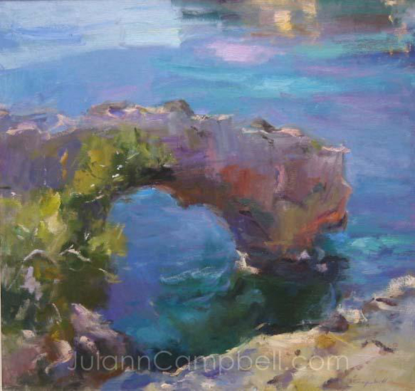
“A new friend, an old favorite”
oil painting
by Amanda Jackson
Best regards,
Robert
PS: “The fundamental grey, which differentiates the masters, is the soul of all colour.” (Odilon Redon)
Esoterica: There’s a difference between external truth and pictorial truth. It’s often the painter’s job to understand and craft this difference. Avoided at your peril, a “lack of luminosity” is the cause of many a dull painting. “The most basic, primitive and necessary visual information is found in luminance variations.” (Margaret Livingstone) It’s not always easy. “The real difficulty in painting,” said John Collier, “is in getting the general truth of tone and tint.” Restraint is valuable too. “Do not exhaust all combinations on one canvas.” (John F. Carlson)
Quiller books made a difference
by Milind Mulick

“Behind Taj Hotel, Mumbai”
watercolour painting
by Milind Mulick
I agree with Amanda Jackson. Lively gray is indeed a breakthrough. In subtractive color addition the primary hues mixed together will end up in gray (in theory black). Thus eventually gray also harmonizes as well as compliments any hue. Well arranged lively grays act as a backbone support for any color. Very rarely did I consciously attempt a color scheme until Stephen Quiller’s two books about color made me unhappy and shaken. Many thanks to Stephen. His books have made a considerable difference.
Looking for color in grey tones
by Ellen McCord, Grass Valley, CA, USA

“Fenced”
watercolour painting
by Ellen McCord
This push to go grey is completely opposite the direction I’m currently going. I read the letter and thought, oh no, I’m running down a road toward the Land of Garish. I painted this painting on a grey day, on a grey island, looking at a grey horizon, surrounded by… well, everything was grey. Pushing color into what I saw created fun and excitement. Lately, I’ve been painting falling down buildings, old structures — grey. Looking for the color is like a game of hide and seek. Thinking of these as garish would take the fun out of it.
Endless grey supply
by Luz Perez, Riverside, CA, USA

“A walk in my garden”
oil painting
by Luz Perez
Love those greys! I have learned to save all the paint that is left on my pallet after a day of painting. I mix all the colors up into a giant mess of grey and save in tubes that I purchased just for this purpose. The tubes are open at the bottom end for one to fill with leftover paint and then one simply rolls them up tightly to close. I then use this grey as a ground for future paintings. Hint: label the tube “warm grey,” “cool grey,” “greenish grey,” etc.
Overcoming color blindness
by J. Douglas Thompson, Whitby, ON, Canada

“Prairie thunderhead”
acrylic painting
by J. Douglas Thompson
I was diagnosed as being color-blind in early high school when taking an air force test, where I got virtually all the colors wrong in a test. It has been a struggle to paint and to find the secrets to becoming a successful painter with that limitation. Over the years, I’ve purchased and read many books and taken seminars on color theory etc., and through being persistent have pieced together the solution for me, which involves searching out sophisticated greys as proposed in your letter. The wonder of grays/neutrals derived from complementary colors. The vast number of neutrals derived from using just two complementary colors plus white and a very dark mix gives me the basis for effective painting. I tend to use just two complements and then add a touch of another color to punch up the piece at the end of the process. With this I am freed from having to think about color, and can concentrate on values instead.
Artistically tone-deaf
by Maryann Kovalski, Toronto, ON, Canada

Illustration from the short story “Sarah and the Cyclops”
Lively greys touched a nerve with me. I’ve been a professional children’s books illustrator for thirty years who’s now turning her hand to painting. In all my thirty five years of working, I’ve bobbed and weaved around my great weakness: I am ‘tone deaf’ to color. This was pointed out by a teacher at SVA in New York. I’ve worked around it with pretty good drawing skills, composition and color, but boy oh boy; I’ve always hoped they’d never notice my greatest weakness. But now I face the canvas and I can’t hide any more, especially my area of painterly interest is steel mills!
Navigating color space with Gamblin
by Chris Bolmeier, Omaha, ME, USA

“Ochrescape”
oil painting
by Chris Bolmeier
Working with color has been the bane of my existence. Usually the first exercise taught in drawing class is the student does a value scale study, i.e. drawing 8 squares next to each other in a strip, using a pencil to fill in values of grey from black to white. One of the first exercises completed in a painting class is to paint a color wheel. These two exercises are one and the same when the concepts are later provided in depth. The problem with beginning in this fashion is that we’re learning about color space in a 2 dimensional format. On the Gamblin website, there is a section called Navigating Color Space by Robert Gamblin. I found this to be so helpful in the understanding of the color model in space rather than viewing it on a flat piece of paper. I find that returning to the studies over and over helps, but learning color mixing to achieve luminosity is more in the practice of paint, paint, paint, and paint some more.
Substituting white with Portland greys
by Andrea Harris, Chicago, IL, USA

“Beyond Boundaries Mosaic”
oil and wax painting
by Andrea Harris
Someone has discovered my favorite color! Grey is like the “Rodney Dangerfield” of colors — it often gets “no respect.” Thank you for including “Lively Greys” in your letters. Grey is integrated into all of my paintings and can be found where you may least expect it. I am not only in love with grey as a stand alone color, but adore all the subtleties it helps me achieve in my paintings. I also used grey in imprimatura painting, and when I discovered the Gamblin (artist’s oil colors) array of Portland Greys, I became ecstatic! Gamblin’s Portland Grey Light, Portland Grey Medium and Portland Grey Deep offer a wonderful alternative to mixing with white a more natural looking alternative when mixing with high key tints.
Grey unites composition
by Barbara Sutherland, Scarborough, ON, Canada

“Self-Portrait 2007”
oil painting
by Barbara Sutherland
Greys are a great asset indeed when relatively close tonal relationships lead the way. I found while doing this self-portrait in my studio that tertiary tones found their way into everything which added unity within a challenging composition. They also allowed the subtle use of stronger greens and orange/reds to sparkle. From the start I chose to split the canvas almost in two, creating a tension between the person and her surroundings. The overall use of greyed colors suited my mood and what I wanted to say. What would we do without greys?
Glow with glazing
by Roger Asselin, St. Petersburg, FL, USA

A photograph I took of my challenge. The finished work is still in progress.
As an immature artist I really struggled with luminosity up to and including last Friday morning at my art group get together. They all paint watercolor. I paint with acrylics. I was trying to paint a lily pad that had a bluish glow to it. Fact is, I never thought of any other way of painting except to physically mix my paints to get what I thought was a pretty good color match of what I saw. It always bothered me that that my paintings never really glowed the way I thought they should – except a few by accident. I found out that just piling paint on the canvas and physical mixing was not always the best way. Glazing (optical mixing of your paint) was the way to get the glow I wanted! Wow! What a difference! I started with a white foundation and built up with a yellow glaze; graduated to a blue glaze and used a red glaze to darken my paint for my shadows and the rest as they say, was history.
Longevity according to material’s quality
by Mark D. Gottsegen, Greensboro, NC, USA
I note that you published my letter regarding inkjet printing inks. Maybe you would care to define “dry ink” printing? Perhaps you mean by that “pigment printing,” a term I have recently seen used more and more. There are good pigments and bad pigments, so “pigment printing” is a meaningless term unless the ingredients in the inks are defined. There are no artists’ standards for these inks, no matter what the form or the terms used to describe them. In your RG note you also remark on the vulnerability of watercolors. Very true. The same for any paint, really — depending on the kind of environmental exposure the painting receives. Colored pencils are even more vulnerable. But again, if we define the ingredients in a labeling standard and define the exhibition/storage environment for the client, there is a better chance for durability.
Grey’s colorful complexity
by Joseph Guggino, Ellensburg, WA, USA

“Skycorner #10”
acrylic painting, 60 x 40 inches
by Joseph Guggino
Some of the most exciting things can happen through the use of grays. It’s kind of like how the colors on winter days are almost nicer than the rest of the year from the shear vibrancy of the juxtaposition against the grayer atmosphere. I had always been an impressionist and only interested in pure nature until I happened to paint a building into one of my landscapes. I had such fun painting color into the shaded side of a cement wall that I did another and another. One of them won a “Best of Show” award at our local gallery and I was off and running with buildings which often are various types of gray. Now I paint buildings almost exclusively. They get into juried shows around America and some win awards too. It’s amazing to me how colorful gray can be.
Palette reflects environment
by TJ Miles, Spain

“Signs of life”
acrylic painting
by TJ Miles
I have been exhibiting alongside Amanda Jackson at one of my representing galleries in Ireland for the past few years, and actually invested in one of her paintings when she first arrived on the Irish art scene. It’s strange, but when I was living and painting professionally in Ireland my palette was filled with the same greys that filled my mind. However, since moving to Spain to live and work, my paintings have lost all their shades of grey, to be replaced by bright strong colors reflecting a change in my subconscious thought processes. A sea-change literally, as it has been brought on by the reflections of the ever-changing moods of the Mediterranean and the daily interaction with the sunlight.
I much prefer where I am going now with the so called ‘garish’ color palette than where I came from previously. Does that mean I am the lesser artist for it? Price increases and constant demand for my work surely argue otherwise. Does that mean that I am not as advanced as grey-toned artists who suffer for their art in darkened studios and darkened moods? I doubt it. Does that mean that my paintings are only one dimensional because the layers are more defined and simplistic? Perhaps, but I am a happier person for it, and surely that must count for something too.
Art reflects mood
by Lesa Ullig, Jacksonville, FL, USA
I really enjoyed Amanda Jackson’s thoughts about lively grays! I seem to be stuck in a certain color range no matter how hard I try to do lighter colors. My landscapes, waterscapes etc. all end up being really dark and I don’t intend to start out that way. It seems like my painting has a mind of its own. I have experienced some depression. Can this be the cause? I paint in acrylic and even if I start out light I get so involved in my painting, well guess you can say that I lose myself while painting and when I am done it’s a dark painting and I never use black paint. I am just wondering how I can get out of this type of painting. I never had this problem before.
Create your own earth tones
by Mary Anne Jacobsen, Venice, FL, USA

“Le Mas Trille”
oil painting, 16 x 20 inches
by Mary Anne Jacobsen
I am a colorist that has an aversion to grays, browns and earth colors from the tube. I’ve also been told that I need to use more grays as players in my paintings in order to allow my radiant colors to shine through as principals. Since I was taught through the Hawthorne/ Hensche method to work from a white ground, I sometimes struggle with values as well, so it stands to reason that most would think that there’s little I could contribute here within your experienced artist base. If I could share anything with your readers, it is that I think mixing complements to make grays is not always the best choice, since this can dull or dirty the grays. Instead, I try to use a different color from the same side of the color wheel, (as long as this color is already part of my palette) and this seems to produce beautiful grays and browns that harmonize well overall. For example, I consider cerulean blue a hue that is both cool and warm depending on what color is next to it. If I mix cerulean blue with Winsor emerald, I get a lovely cool green. If I add a touch of permanent magenta to the mixture I have grayed the green while still keeping it cool and vibrant. On the other hand, a mixture of permanent green light with cerulean blue makes a lovely warm green. Adding a little cadmium orange will gray it but keep it warm and still radiant. So if I had simply added red (the complement of green) to my mixtures, the likely result would have been a gray I would not have been happy with.
Ironically, I have had teachers who always warn not to mix more than 4 colors together on a palette or mud will result. Yet these same teachers advocate store-bought burnt sienna, yellow ochre and burnt umber in the palette in spite of the fact that these tints already have 3 color mixtures within them. Since these three earth colors are simply the results of mixing the three primaries with their complements, it’s best to avoid them entirely in a tube where the manufacturer has controlled the mixture, and mix them instead yourself on the palette from pure color to create gorgeous earth colors that can be slightly modified to produce vibrant grays and browns as well.
It’s probably best to remember that gray is a value of light that doesn’t actually exist in nature as a color. If one keeps this in mind it is easy to understand why mixing grays from pure color combinations on the same side of the color wheel will always produce a better effect than a tube of Payne’s Gray or a haphazard mixture of complements.
One grain at a time
by Karen Broadbent

Kali Chakra Ritual performed by talented Tibetan artisans –photograph
Last week I had the privilege of photographing this unique Buddhist Kali Chakra ritual which was performed by talented Tibetan monks at Glenhyrst Art Gallery in Brantford, Ontario. The Mandela (offering) was painted in multi-colored sand, tapped one grain at a time through brass straws. After painstakingly labouring for a week, it was dismantled and the sand deposited into the local Grand river — exemplifying the impermanence of life with its ever-changing nature. This ostensibly imparts a special blessing to the area where the offering is made. How cool is that? They were traveling through North America to raise money for their monastery in India.
Archived Comments
Enjoy the past comments below for Lively greys…
Hi. Despite, that, I’m not a painter, being a miniature sculptor, I believe grey is a must to any drawing/painting. I invite you to visit my photosite: http://minisculpture.photosite.com Sincerely, Jacques
Speaking of greys, I started underpainting in greys only a few weeks ago. The absence of “colors”, surpirisingly, made me focus more on lighting source, shadows, reflections, focal points, etc. In fact the final painting with “colors” was rich and greatly improved. The old masters sure knew how to START a painting with simplicity before layering with complexity. This was a revelation for me. Thanks for all the comments. In this instance, I painted the same painting over several times. 1) Going straight to color, 2) In greys only, and 3) Starting with the greys fully worked out and finishing in color. A very very revealing process.
Nita Leland has written extensively about how to mix your greys (and other colors) by paying attention to whether your primary colors are “Warm” or “Cool”. Check out her book EXPLORING COLOR.
I enjoy your letters each week. I am a self-teaching senior, so I am learning all the time. I like the comments from other artists and it makes me feel like I am part of a larger community. I also know what you mean about small spaces.
I participated in the San Clemente Paintout and received a free gift from Gamblin, which I sent for, it was a tube of Grey, I was going to give it away, several artists wanted it and said it was lovely, upon trying it I found it to be wonderful, kept it for myself and am using it, I was the one who “hated grey”, and now love what it is doing for my figurative work!! Thank you to Gamblin!
I really love the music in your videos,especially the “I’m Not Going Anywhere! I had it going in the background all the time I was reading the clickbacks. Also I have just begun really appreciating the grays. Thanks.
Dear Robert, It was so much fun watching this video! I think your chair is brilliant, and I loved the music. I have a friend who is an amazing painter, and we often do events together where she creates a painting while I play music. Usually we are in a concert setting, and the music is already planned, and she paints to the music as I play. That’s fun because I can influence the speed of her brush strokes! But the other day we did it the opposite way–she painted and I played improvised music to accompany the painting process. Both ways are great. This time was really special as she was doing a very large canvas, painting it in the lobby of our hospital (we are both with Shands Arts in Medicine in Gainesville FL, and have written you before) while I played piano. Many people stopped to watch on their way in or out of the building. She is an incredibly fast painter–in fact, I call her “Fast Ellie.” Her name is Eleanor Blair. The whole painting was completed in less than an hour and a half. Of course, you looked pretty fast on that 3-minute video too! Best to you, Cathy DeWitt www.cathydewitt.com Gainesville FL
Before I get into a long winded tirade about greys, mixing etc. I should like to complement Robert on his generosity in sharing his considerable knowledge with people like me. I have been painting for 60 years sometimes financially very successful sometimes not. (Mostly in between.) I now have stopped taking every bit of advice and do no comparing of artists’ work with my own. In some instances I would probably throw my brushes away or whatever I’m working with. Carry on fellow artists whatever your disciplines and follow your intrinsic inner advice. I have stopped paying attention to all these marvelously talented people. I admire and appreciate their work but leave it there and get on with whatever I am trying to express. I am currently working in encaustic and I ignore most of the masters in that field also. I would be doing this if I were stone broke. I am now 76 and have been invested with new energy to keep on my own path and do the best I can. I have taken in and absorbed, by osmosis, so much information from so many sources, that it’s time to go back to the beginning. I get all the recognition I need from the finished project one way or the other. Keep up the excellent work with these columns and I certainly admire your paintings. Best Regards, Nick Arena
Early on in my journey of painting, you were the first painter I came across on the web. I think it was 1999. Today, I found your clips through searching on greys. I have really enjoyed watching them and learning more from you. I decided to link onto my blog http://pilan.blogspot.com/

Amazing Grace oil painting |
You may be interested to know that artists from every state in the USA, every province in Canada, and at least 115 countries worldwide have visited these pages since January 1, 2013.
That includes Helene Groulx of Sault Ste. Marie, ON, Canada who wrote, “I never think of using the opposite side of the color wheel.”
And also Scott Carlson of Mill Creek, WA, USA who wrote, “My lack of consistent success is in not understanding how I reach that desired luminosity, at least without 40 layers of paint, sometimes I get there sometimes I don’t!”
And also Ted Pankowski of Woodinville, WA, USA who wrote, “Sergei Bongard refers to them as ‘the Noble Greys.’ ”
And also Teresa Hitch who wrote, “It is you I have to thank for opening up the beautiful world of greys. (My web-site might have been a gawdawful garish green had you not come along.) Thanks for the wonderful letter.”


1 Comment
It is intriguing to see how artists like J. Douglas Thompson navigate and overcome challenges like color blindness through the exploration of sophisticated gray tones. Their journey highlights the diverse ways artistry can thrive amidst obstacles.
Residential Cleaning Services in Renton WA