Dear Artist,
Here’s a decluttering idea:
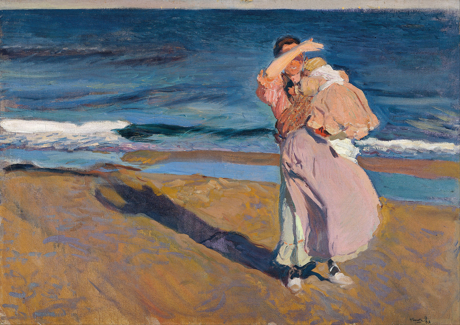
Fisherwoman with her Son, 1908
Oil on canvas
90.5 x 128.5 cm
by Joaquín Sorolla y Bastida (1863-1923)
1. For this exercise, commit to 30 minutes and a palette of six mixable colours, warm to cool, avoiding black. (Hint: mixing Phthalo Green with Alizarin Crimson, or Ultramarine with Burnt Umber make fabulous darker darks.)
2. Prepare your support with a neutral imprimatura, preferably a warm grey, mixed from complementaries and without black. For the moment, avoid the instant excitement of a garish imprimatura. (Hint: a neutral imprimatura helps with judging values better than painting directly onto a white ground and provides a sophisticated base for optimal vibrations and warm and cool associations.)
3. Mix, in the same value, a complementary colour to your imprimatura. Set it aside in preparation for laying in luminous shadows. (Hint: a soft, dusty lilac or cool pink — check it on your imprimatura for a satisfactory vibration.)
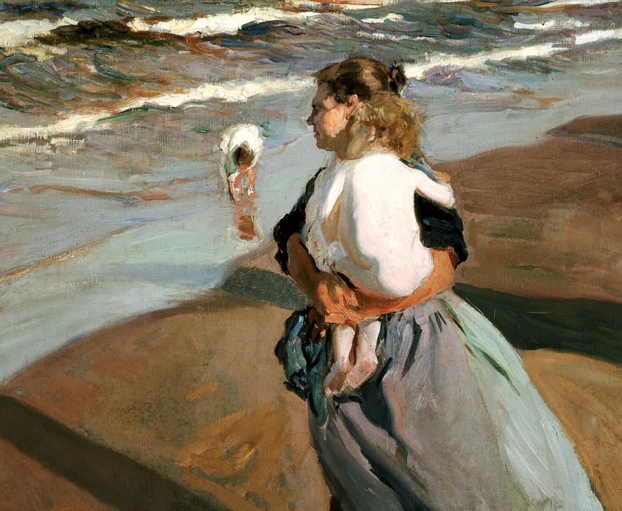
The Little Granddaughter, 1908
Oil on canvas
206.5 x 267.7 cm
by Joaquín Sorolla
4. In a darker neutral, map the shapes of your composition, resisting the urge to draw. Try not to overdo it. This will flatten the perspective for a moment, abstracting the subject — a good thing. (Hint: choose the largest and darkest area and lay in, without drawing, a second, semi-transparent imprimatura with a large scumbling brush. Include a subtle gradation from warm to cool, from left to right or right to left.)
5. Identify your lightest light and darkest dark and make a note of where you want them. Now, establish the middle values and cut into and around your large interesting patch, forcing it to recede. (Hint: this big patch could be a mountain, a stand of trees, a distant island, a wet strand, a stack of fruit, a dress in shadow or an inclement sky.)
6. Move around in temperature, transparency, brush size and complimentary, abutting areas. (Hint: a few savvy and luminous, lighter-than-you-think shadows observed and laid in can pull a flat abstract towards a magical and mysterious interpretation of something real.)

After the Bath, 1902
Oil on canvas
by Joaquín Sorolla
7. Is there an opportunity to pull the darker shapes together even further into larger designy zones? (Hint: be bold.)
8. When coming-to-light, amp up opacity but stay fluid between warms and cools. As with the darkest darks, can the lightest areas be connected, too, to strengthen design? Developing your intuition with weighting, balance and eye control is a lifelong pursuit. Remember the golden ratio, resist the urge to line things up and, as my Dad used to advise me, “try to paint one neat area.”
Sincerely,
Sara
PS: “Leave your strokes alone.” (Robert Genn)
Esoterica: 9. Your last step, should you choose, is a glaze. Shake up a small amount of Phthalo Blue with equal parts water and gloss medium in a jar. Puddle it on your very dry painting in an area that could use a shadow or surface interest or drama. With a lint-free rag, wipe off the glaze, leaving only a trace amount tinting the area or clinging to the crannies of your scumbling. For an instant gradation, vary the pressure of your wiping as you move across the zone. Adhere to your compositional cut-ins for even further drama. When your glaze is dry, you can come-to-light again. You can glaze your coming-to-light in something warmer, too — Magenta, Cadmium Red or Indian Yellow. (Hint: the possibilities await, 30 minutes at a time, for the next 10,000 hours.)
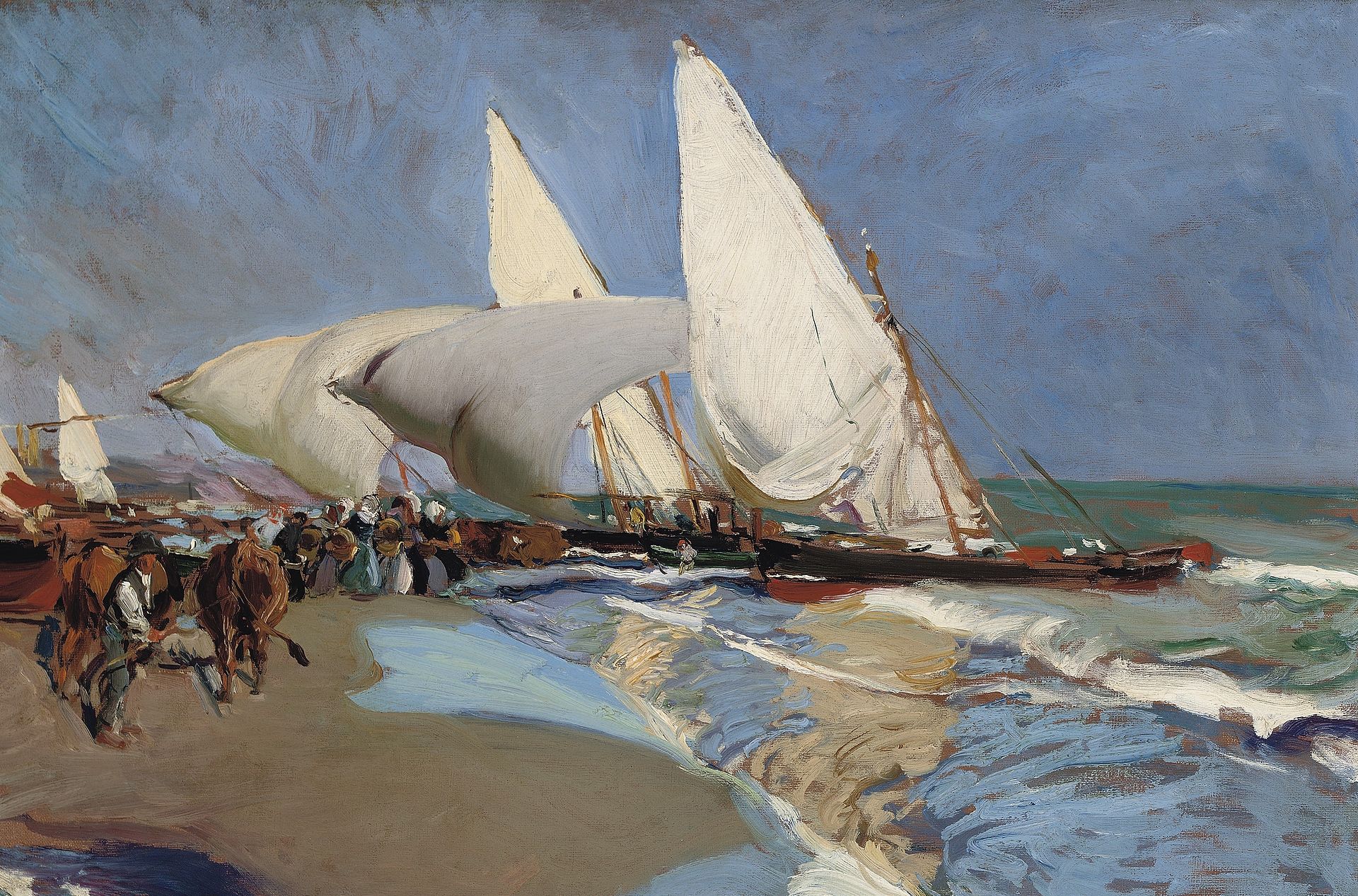
Beach at Valencia, 1908
Oil on canvas
by Joaquín Sorolla
Have you considered a Premium Artist Listing? With each letter, an artist is featured at the bottom of this page. The Premium Artist Listings are a means of connecting artist subscribers through their work. Proceeds from each listing contribute to the production of The Painter’s Keys.
“I could not paint at all if I had to paint slowly. Every effect is so transient, it must be rapidly painted.” (Joaquín Sorolla)
 Broken Neomosaic
Mixed Media
30 x 30 inches
Featured Artist
We live in a fractured world. Wars, famine and power games are forcing people to abandon their homes and their way of life in hopes of finding peace. For lack of education or specialized skills, the poor are not accepted into our northern communities. They stay in the camps on the borders of turmoil, separated from local community. Animals are caught in the crossfire. Even the trees and the rocks suffer the agony of imbalance. This chaos is evident in my work. In between the rivulets of paint and the textural accidents I choose colours and forms to suggest a landscape where beauty continues to reign. We can still change the tide and build a new world harmony. Certainly, contemporary will focuses on gold instead of beauty. Yet, beauty is essential to the wellbeing of the planet. She is essential to the survival of humanity.


22 Comments
Thank you! And for your next trick, you could translate this into Watercolour Speak? Lol
A lot of praying is involved with watercolour – (At least with mine!)
When you say “…remember the golden ratio,” you mean…?
https://en.wikipedia.org/wiki/Golden_ratio#Art
a nice proportion for paper/canvas – 1:1.6 or so and also a way to place things in the composition.
Thank you, Mary Beth
Thank you for these tips. Just love the Sorolla’s work and you selected some great examples.
This is a tantalizing set of directions, rather like being on a treasure hunt! I was really (really) wishing for visuals to go with it, so much quicker and easier to grasp for this old visual learner! I’m going to print it out, though, and give it a spin. And pass it on—hmmm, maybe it can be a group experiment?! Thank you! Betty
Always interesting and motivational to hear exacting ideas. I love using glazes to emphasize certain areas. Baby oil works for me on watercolor or walnut oil on portraits. Thanks for the wonderful insights.
Jerry
I would love to see this process in video. Words alone are hard to grasp. I sense this would be a good exercise but my (lazy,fearful) brain protests.
What an ambitious and wonderful challenge! Thank you Sara.. I haven’t looked at painterskeys for quite a while Covid and 2 lockdowns pushed me to the practical rather than the motivational read inspiring and sweet as these can be . But oh this audacious challenge! Re Sorolla the secret not so secret key. !Of course it needs visual translation that is OUR job .. I fear that too many ‘how to do ‘etc Demos are actually often anti creative and can be forgotten. This process described of course needs careful translation: I will accept the challenge which will need some translation of terms for some :warm and cool and complements hues etc . Good for you Sarah with this fabulous challenge! Thank you, Ann
I want to try this with an abstract.
“try to paint one neat area.” Love it! Terrific post.
This is fascinating but rather confusing. Would like to see it illustrated, step by step. Thanks.
I agree. And I find that artists don’t all agree on what is “warm” and what is “cool”.
Love this. Good timing for me as i need to break out of long used formulas. I have been thinking of switching things up a bit to inject a bit of “surprise” for myself, in a good way that is. We often get emotionally stuck within our own way of painting. Even tho those formulas offer success, is that success only in the predictable work we have come to paint on a regular basis? Nothing wrong with taking time to challenge ourselves to step out of long used formulas. Then hopefully learn from the exercise and use that to compliment the long used formulas. Sounds like a recipe for good artist soul fun, thanks, Sara!
I need something to break me out of the doldrums. Thank you Sara!
I’ve had one go at the directions, using oil paints. I think I get it, but a video demo would be wonderful. Thank you, Sara
Hi Sara,
For many years, I’ve followed your father’s delightful and informative letters- and now yours. This is the first time I write something back as I’m not usually inclined to commenting on line. However this letter has a lot of relevance to my present stage of development so I want to carry out these exercises. I’m not sure I understand what is meant by the complementary colour of a neutral colour since a neutral is made with two already complementary colours. Did you mean one of the two colours making the imprematura’s neutral colour?
This also had me puzzled. Then I thought of neutral in terms of value since the imprimatura was supposed to be on the warm side and the second color on the cool side. So then it made more sense. More comments on this concept would be welcome.
This was not an easy exercise to follow. Is there any way for you to do a video so I could follow your process? I am lost even understanding what subject to use to do this. Is there any way you could do that? I know your info is very good but I’m at a lose here. Lorraine
Thank you Sara!
Five years ago, I found this article to be quite bewildering in places. I saved it and just stumbled upon it today. It’s still bewildering in those same places. I wonder if she ever made a video?